The Bobby Berk-Favored Paint Color That Takes Living Rooms From Bland To Grand

Picking the perfect paint color for your living room is no easy task. One of the most high-traffic rooms in your house, your living room is a cornerstone of your home's interior design and speaks volumes about your style, preferences, and personality. Creating a cohesive living room style requires the right paint colors, your ideal furniture styles and shades, and complimentary decor and lighting. Undoubtedly, choosing the wrong paint color can throw off your design scheme and detract from your room's ambiance, rather than adding to it.
Before settling for a tried and true minimalist or farmhouse look and painting your walls white, or opting for the ever-popular but overdone color palette for a coastal home decor style, you may consider creating an atmosphere of opulence by selecting a color scheme that's bold, grand, and celebrity-designer approved. For those who are unafraid to shy away from the trend toward neutral and earthy in favor of a look that's more grandiose, celebrity interior designer Bobby Berk's go-to shade of blue is dark, broody, and, as its namesake says, bold and blue.
Bold Blue by Benjamin Moore stands out from Berk's eleven other favorites, shared on Instagram, as one of the deepest, richest selections for a wall color. Below, we break down why this color is a stellar choice for living room bliss, along with how and why Berk uses it in his own home design projects, and we share tips for expertly utilizing bold blue in your own living room.
Why bold blue is the striking shade you need
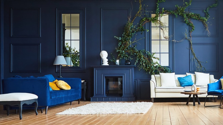
This vibrant shade of navy blue stands out for its depth and inky indigo undertones. The "Queer Eye" star is a big fan of the shade, having used it in many home projects, For one media room makeover, Berk shared on his blog that his team used this color because it "sets the tone for relaxing, and allows other pieces to really pop." Adding, "As the spot in the home to watch tv, hang out, and generally chill, we wanted the room to feel totally inviting and have a sense of playfulness." Pairing the bold blue walls with a large brown leather sectional, colorful pillows, and yellow ottomans — Berk demonstrated that this polished paint color is versatile enough to be both sophisticated and fun.
Berk's comments to People about his childhood preferences show that his love affair with blue started at a young age. "I was sitting in my room and I realized that the all-red my mother had decorated my room in really gave me anxiety," he explained. "I saved up my birthday money, and I changed everything to all blue because I knew that blue just made me feel better." And while favorite colors are subjective, color psychology tends to agree. One study by the Journal of Psychological Science reports that individuals tend to associate blue with feelings of relief. The psychologists at Verywell Mind purport that blue, when used in design, symbolizes wisdom, hope, reason, and peace.
How to use bold blue in your living room
If updating your living room to exude those feel-good emotions is what you need, bold blue is the perfect selection to do so with confidence and sophistication. Plus, the shade is also dynamic enough to pair well with a variety of other themes and tones. If you're wondering what interior design styles bold blue pairs well with, consider traditional to modern and nearly everything in between. Berk states in his blog for another of his projects that bold blue "not only is synonymous with Mid-Century design but still reads as a subtle tone." The designer is a big fan of using this shade for his mid-century designs and pairing it with both bright tones and earthy leather and wood textures, showing that it's not too bold to let other pieces take center stage. He has also used it for traditional eclectic projects to create a backdrop for light-colored furniture and decor.
To create a cohesive color palette once you've selected bold blue for your walls, design and paint websites provide great inspiration. Benjamin Moore's website suggests peachy creams or bright whites, but Bobby Berk's designs have erred on the adventurous side, with his mid-century office makeover using a palette of blue, red, yellow, black and wood. For those who love the shade but aren't ready to take the leap, dipping your toes in with an accent wall might be just the right amount of bold blue that you need.