Fixer Upper: Joanna Gaines' Best Kitchen Design Tips To Add To Your Arsenal
Whether you're renovating a wholly gutted kitchen or looking to spruce up the one you have with a few simple upgrades, there is no better designer to turn to for tips than Joanna Gaines. The Magnolia star has renovated her fair share of kitchens during her long tenure on "Fixer Upper" and its subsequent spinoffs. She has tackled everything from dilapidated spaces to outdated '90s kitchens and has found a way to make each one unique, stylish, and memorable. Because of that, she has an arsenal of kitchen design tips that can help you create your own Pinterest-worthy kitchen, no matter your situation.
Her ideas run the gamut from big-ticket upgrades to budget-friendly changes. For instance, if you're undertaking a major renovation and can redo your cabinets, Gaines has a plethora of ideas around you can design them to make your kitchen more functional and inviting. From removing upper cabinets to make a small kitchen feel airier to investing in slim cabinets to free up extra room for an island, she has a ton of valuable tips. On the other hand, if you just want to make some minor design tweaks, her suggestions range from updating kitchen bar stools for visual continuity to creating vignettes on your countertops. Here's a closer look at some of Joanna Gaines' best kitchen design tips.
Ditch upper cabinets to make a small kitchen feel bigger
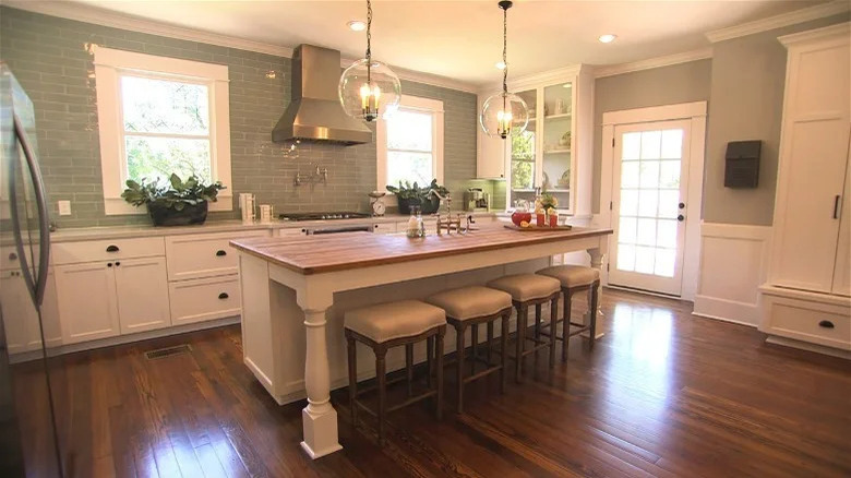
Not everyone is blessed with ample square footage to cook in, but even small kitchens can look Instagrammable. The trick is to design in such a way that makes the space feel airy rather than cramped. That can seem like a tough nut to crack, but Joanna Gaines shows how you can make a small kitchen feel more spacious by implementing one simple trick, and that is to forgo upper cabinets. You can see that at work in Season 3, Episode 1, of "Fixer Upper," where the designer skipped adding back uppers to the walls and instead let ample light in with two windows on either side of the stove. The space looks visually light because of this decision.
If you want to implement this in your own home but want more storage space, there are several workarounds to consider. The first is to add a large china cabinet in your dining area to serve up some additional storage. Gaines placed a sizeable white hutch between the open-concept kitchen and dining room, allowing the owners to store everything from plates and glassware to pantry items and surplus food. You can also create more storage by adding a couple of glass countertop cabinets into your design. These sit on the counter and extend to the ceiling, which pulls the eye upward and makes the space feel bigger. Glass doors allow the design to still feel airy instead of crowded.
Keep upper cabinets pale in small kitchens
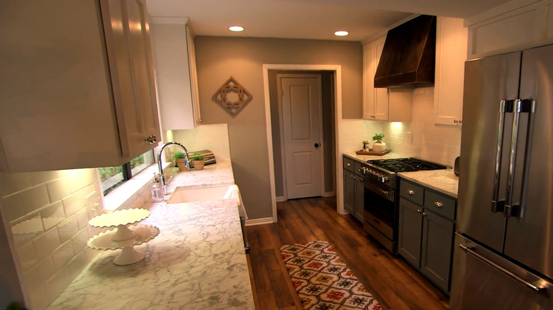
If you don't think you can forgo that much storage space, another trick Gaines recommends for balancing small kitchens is to paint lower cabinets a dark color and upper cabinets a light one. This is a color rule Joanna Gaines swears by for making small kitchens feel bigger because it moves all the visual weight to the bottom, similar to how the space would look without any uppers. In an HGTV web exclusive, Gaines tells her fans, "I love to play with color because it's all about an illusion." She showed how she revamped a small 150-square-foot galley kitchen, explaining, "One of the things I tell people is anything from the countertop up, keep light in a space that's this small." She painted the lowers a dark green and the uppers a crisp white because it "really gives the feel of a light and airy space."
To implement this tip, utilize the same color grouping, starting with a dark color for your base cabinets. Joanna Gaines says nature-inspired green is a perfect paint color for kitchen cabinets and she's been loving the Magnolia Home colors Cottage Grove and Magnolia Green. As for the uppers, opt for something light and neutral, like white, cream, or light gray. One of Gaines' favorite shades is Shiplap by Magnolia Home, a creamy, gentle white.
Install hanging shelves for extra storage
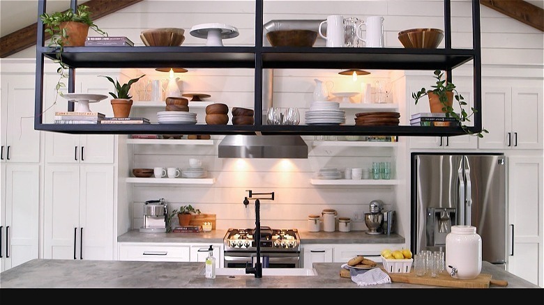
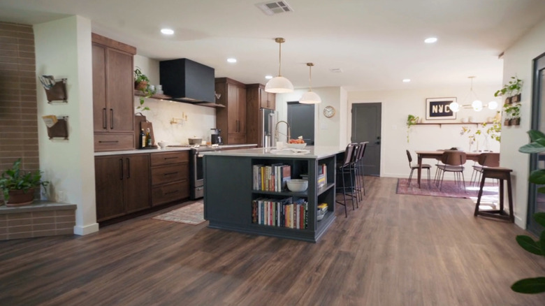
Alternatively, even if your kitchen is packed with cabinets, maybe you require even more organizational space. In such situations, Joanna Gaines has a clever trick you can use: Install hanging shelving over the kitchen island. This ingenious idea, showcased in Season 4, Episode 17, involved metal shelves suspended over a concrete waterfall. Not only did this move add four more shelves, but it also helped to visually separate the kitchen and dining room by creating a "wall" between them.
Since this trick utilizes open shelving, you want to avoid storing super utilitarian pieces on the rack, like burnt-bottom pans or dingy mixing bowls. Instead, it's a great opportunity to display some of your more design-worthy kitchen items, such as matching plate sets, artistic mugs, or your favorite serving dishes. For convenience, store things like holiday dishes or rarely used items on the uppermost shelves, since you will likely need to grab a step ladder to reach them.
Add character to the space with tile
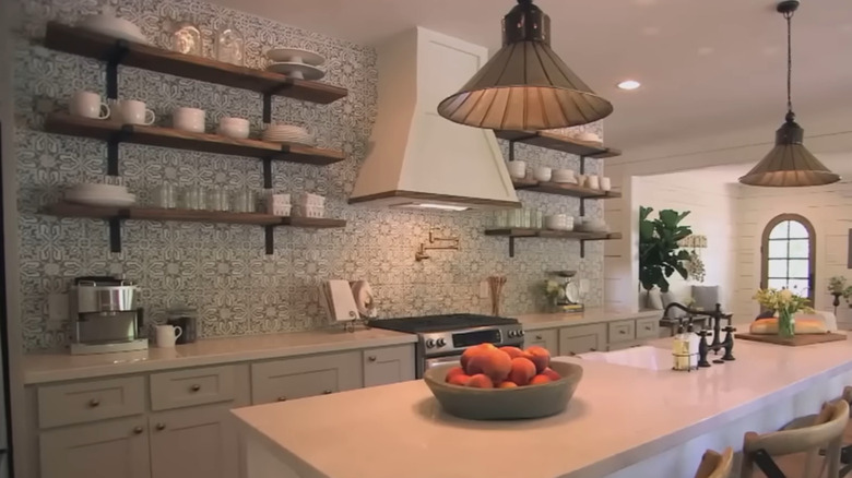
If you're after a simple kitchen but don't want it to feel uninspired, Joanna Gaines recommends incorporating statement tile to make it more memorable. When renovating The Beanstalk Bungalow for the Childers family in Season 3, Episode 12 of "Fixer Upper," Gaines designed a simple, tasteful kitchen that matched her client's aesthetic but gave it some personality with tile. "She wanted charm, she wanted character, but she also wanted simplicity," Gaines explained in another HGTV web exclusive video segment. "We found this really fun, handmade tile that I think really sets the stage for this kitchen." In a Magnolia blog post, Gaines explained that she chose the tile to help counterbalance the whiteness of the kitchen. "To break up the white and add something unique, I decided to go with this fun backsplash and took it all the way up to the ceiling," the designer wrote.
Whether you decide to take your backsplash up to the ceiling or create a more traditional layout underneath cabinets, make sure to choose a busier tile that will stand out. If you think patterns are too loud for your taste, you can instead go with a boldly colored matte cement tile, such as this one from TileBar, or focus on texture by opting for something like these zellige tiles from Zia Tile. You can also add pattern via natural stone, such as going with marble tiles in a graphic veining pattern, such as these calacatta viola tiles from Stone Tile Depot.
Choose slimmer kitchen cabinets if you don't have enough room for an island
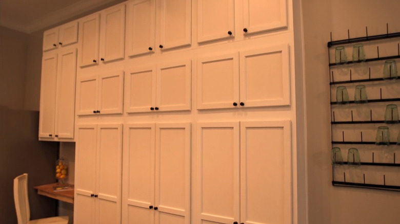
If you're working with a tight galley kitchen and can't tear down a wall to open it up, you might find it difficult to add a kitchen island. The industry standard is to have between 42 to 48 inches of space between the cabinets and the island in order to move around the kitchen comfortably. Ignoring that can make the room feel cramped and unusable. But you might be able to fit an island into a small kitchen with Joanna Gaines' genius tip. Simply carve out more space by making one set of cabinets slimmer than the standard 24 inches. In Season 1, Episode 6 of "Fixer Upper," Gaines decided to add an entire wall of floor-to-ceiling cabinets to give the homeowners extra storage. To accommodate an island as well, she decided to install slimmer cabinets.
If you have an empty wall in your kitchen and are struggling with storage space, creating a similar setup can help solve your problem. Slim cabinets might hold less, but they allow for easier access to items, which is why pantry cabinets often measure a mere 12 inches deep. Gaines' bank of cabinets look like they're a similar depth. By going right up the wall, you'll make up for any lost space. For extra pizzazz and practicality, you can also consider installing a rolling ladder, rather than relying on a step ladder for accessing the top cupboards.
Add antiques to inject character into a kitchen
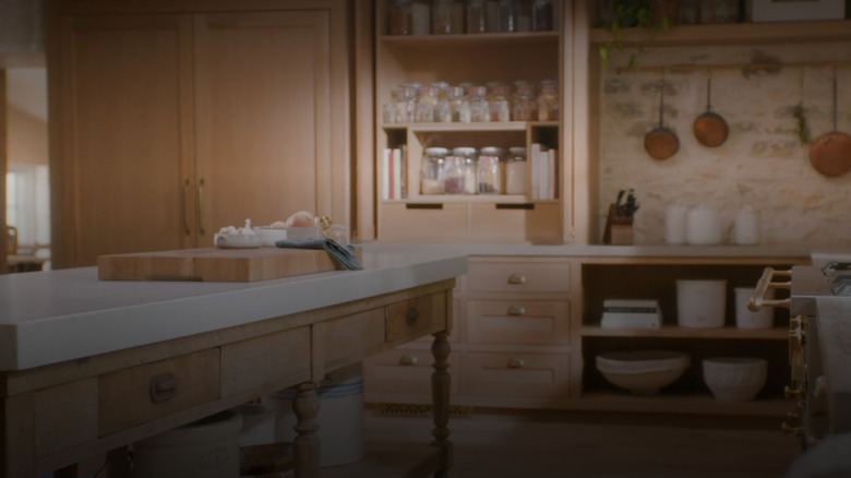
Joanna Gaines is known for her modern farmhouse aesthetic, but one way she ensures her designs don't become too modern is by accenting the room with a few statement gems from the flea market. For instance, in a since deleted post on Magnolia, Gaines explained how one of the focal points in her kitchen was an old communion table that came from a church. "Underneath the countertops was a container that held the holy water," she explained (via Homes & Gardens). "I just love this piece because of its story and the detail. It is now the focal point and anchor for my kitchen. Once I determined where I wanted it, the rest of the kitchen fell into place."
To utilize this tip in your own kitchen, narrow down which antiques would fit your aesthetic. If you love farmhouse, you can choose anything from old chandeliers to rustic mason jars. On the other hand, if you like industrial kitchens, opt for pendant lamps on pulleys or antique metal stools that look like they're from an old military veteran bar. Or, if you want a more minimalistic, modern kitchen, see if you can find a true mid-century piece in a mid-tone wood to add some warmth and interest to the simple space.
Your hardware selection can cinch the theme
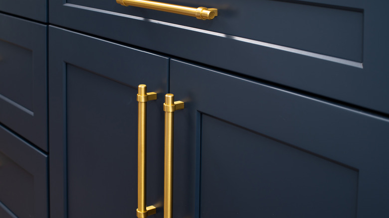
Most people have a hard time picking out cabinet doors, colors, and materials, so come the time to choose hardware, they pick whatever is easiest. But according to Gaines, hardware can really transform your kitchen, so it's important to pay attention to it. "I think that hardware plays such a huge part in the style of a space," she told PureWow. It can really help cinch your theme. For instance, if you want to convey a contemporary feel, choose long, chrome, or matte black handles. But if you want a more mid-century aesthetic, opt for small brass knobs.
To recreate this in your own home, take a few days to gather intel on what sort of hardware designers use in the type of kitchen you wish to create. For example, if you want a French country inspired kitchen, save photos of these spaces on Pinterest and Instagram. Once you have a comprehensive selection, scroll through them and take notes on what kind of pulls and knobs were chosen. Also pay attention to what sorts of hinges the cabinets have — are they exposed and decorative or sleek and hidden away? All these small details add up and support your chosen theme. However, once you choose a particular knob or pull, make sure you repeat it throughout. "Using the same cabinet hardware and cabinet pulls on every cabinet in the kitchen — whether in the island or on the perimeter — creates consistency," Gaines explained in a Magnolia post.
Consider a double island if you have an aesthetically pleasing oven you want to show off
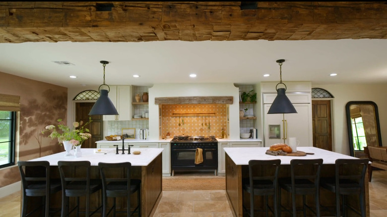
Some ovens are practical and simply serve as utilitarian appliances. Others are more like architectural works of art, incorporating decorative knobs, elaborate pulls, and charming accents, like antique-inspired bolts and hinges. They also come at a major cost because of these details. Ranges are often hidden by islands, so it can seem pointless to invest in such a premium piece. If you have your eye on such a stove and want to showcase it, Gaines suggests utilizing double islands. "The range is the showstopper in this kitchen, and splitting the island allowed it to be the star," Gaines explained, referencing a stunning dual island design in a Magnolia blog post. Not only that, but there are plenty of other benefits involved in a split island. "If space permits, a double island offers double the function. It can create a space for prep work where the sink is located, and additional space for serving. Even more, breaking up one long island helps people move around the kitchen more easily," she wrote.
When designing your own double islands, plan for a minimum of 3 feet between them and the counters to ensure there is enough space for movement and adequate clearance for appliance doors. You also want the islands to match so they feel like a continuation of the same piece rather than like you have two separate islands. This means ensuring they're mirror duplicates of each other.
Add a waterfall island for major impact
If you're looking for a way to create a massive visual impact in your kitchen design, Joanna Gaines thinks you can't go wrong with a waterfall countertop on the kitchen island. It creates a "moment" in the kitchen. That's exactly what the Gaineses did in Season 1, Episode 1 of "Fixer Upper: Welcome Home." The couple they renovated for wanted a Scandinavian and mid-century aesthetic, so Joanna Gaines created a sleek kitchen with a waterfall quartz countertop. "A waterfall edge extends the countertop material from the top of the island to the floor for a striking visual effect," she wrote in a Magnolia blog post. "It's a design choice I made in order to emphasize the material and also create a dramatic impact, turning the island into a true focal point of the kitchen."
When creating your own waterfall island, there are some things to keep in mind. The first is that for the countertop to have a waterfall effect, your fabricator needs to combine two slabs together. If you use a stone with veining, such as marble or quartz, you want to ensure that the veining matches up and "spills" from one slab into the other. Keep in mind that waterfall islands are more expensive as you'll need additional material, and fabrication costs can increase by up to $2,000.
Make sure your kitchen stools match your dining chairs
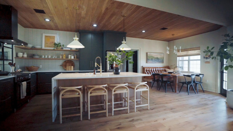
When your cabinets are in and your countertops are installed, it might feel like you're done designing the kitchen. But choosing small accents like kitchen stools is just as important as selecting the major features. It's not enough just to pick out a stool that complements the kitchen. According to Joanna Gaines, you also want it to match your dining room so there is a sense of continuity in the space. "Though chairs are usually chosen after the island is designed, finding the right seats should be much more than an afterthought," the "Fixer Upper" host wrote in a Magnolia blog post. "If your kitchen also holds a dining table with chairs, think through how the chairs will play off each other."
There are multiple ways you can go about this. The first is to get matching chairs from the same set. That means that the island chairs come from the same collection as the dining chairs, so they're the exact same style. The second is to have them coordinate but not be carbon copies of each other. For instance, if the kitchen stools are rattan and boho-inspired, then the kitchen chairs could have cane accents to play off that look. Another way to coordinate them is to select the same finish. For example, if you have mahogany stain island stools, pair them with mahogany stain kitchen chairs.
Simply swap the backsplash if you don't have the budget for a full remodel
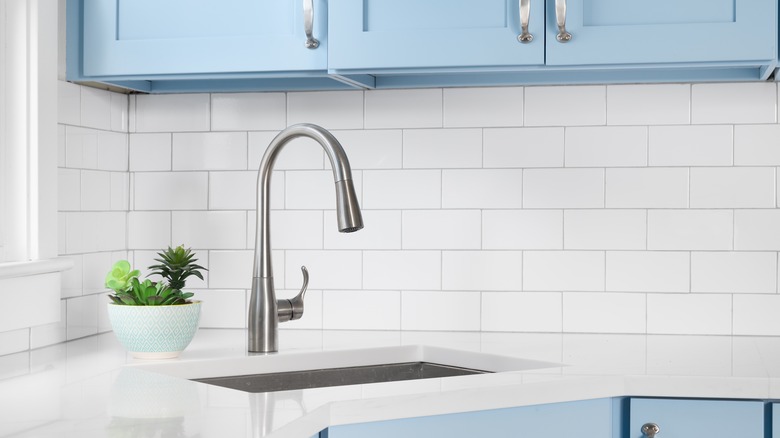
If you're itching to update your kitchen but your bank account isn't ready for a full gut-job, then you can breathe new life into the space with strategic tweaks. According to Joanna Gaines, you can completely transform your kitchen by updating tired tile. "I always like to start with the backsplash — that's an easy DIY," Gaines told Country Living. It's also one of the more budget-conscious projects you can do, since you probably won't need much material. "The good thing about a backsplash in smaller spaces is you don't have a ton of square footage that you have to work with, so you can go find a nice, affordable tile, and have fun with the pattern," Gaines explained.
If you want to save even more money, you can also consider updating the space with peel-and-stick tile. There's no demo involved; all you have to do is thoroughly clean your existing backsplash to ensure the adhesive will stick to the tile and smooth the decals down. There are many different types of peel-and-stick tile that are perfect for a backsplash, from faux marble to geometric designs to classic subway tiles.
Focus on tidy vignettes to minimize clutter in the kitchen
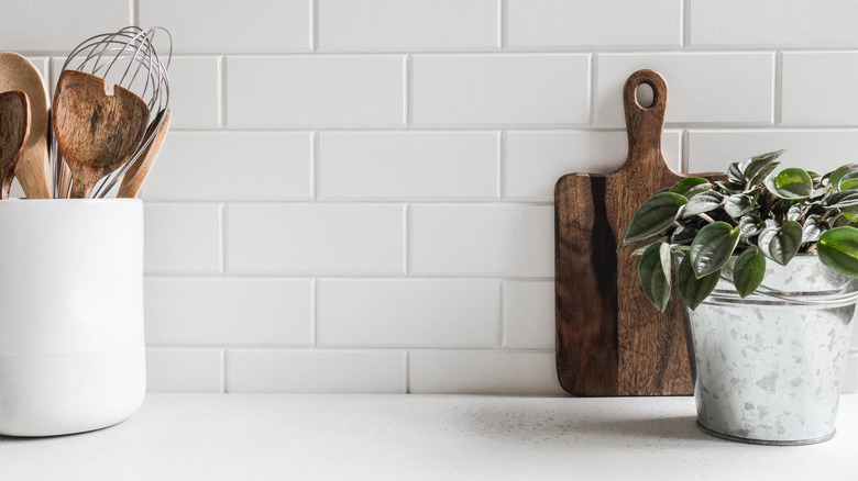
Everyone loves a pristine countertop, but it's very easy for small appliances and random items to build up. To combat this, Joanna Gaines recommends creating vignettes on your counters to make these pieces seem more intentional. In a promotional video for Target (via Pinterest), the designer shares what requirements her counter décor needs to meet: It has to be attractive and functional. Some of her favorite pieces are bread boards and candles. "When styling countertops, I like to keep these spaces simple and clutter-free," she said. "One of my favorite pieces to keep out on the countertops are bread boards. They're beautiful for serving food. You can also turn them on their sides and lean them against the backsplash to add texture and dimension without taking up too much countertop space."
To copy this tip in your own design, clear everything off your counters and edit your selection. Try to only keep decorative items that serve a purpose, like attractive cutting boards, stylish salt and pepper holders, or your favorite cookbooks. You can then group these items together to create small vignettes. Corral them on trays, stands, or risers to make objects look like they're part of a set. Everything else — like small gadgets — can go inside of cupboards and be taken out when needed. This simple countertop styling tip will keep your kitchen clutter-free.

