HGTV's Ugliest House In America Divides Viewers With A Controversial Paint Choice
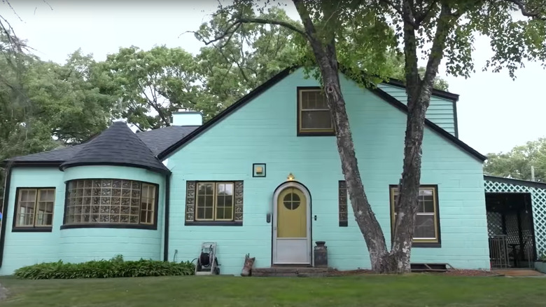
People love to see incredible before and after reveals of exterior remodel transformations, so HGTV's fan-favorite "Ugliest House in America" wrapped up its Season 5 finale by giving the home selected as the season's ugliest a $150,000 makeover by designer Alison Victoria. The winner was a 1940s cinder block home in St. Cloud, Minnesota, lovingly nicknamed the "technicolor prison." When the Season 5, Episode 6 makeover was revealed, viewers almost unanimously agreed that the house was only chosen for the finale because it was the one most easily renovated within the designated budget, rather than actually the "ugliest." But this is where viewers stopped seeing eye-to-eye, as the actual exterior paint colors chosen for the transformation left them firmly in two different camps.
Previously famous (or infamous – depends who you ask!) in the neighborhood for its vibrant presence, Victoria opted to paint the outside of this once-aqua home a bright white with black trim, adding a pop of color with a light mint on the exterior doors. This exterior paint palette had some viewers up in arms, claiming she stripped the unique home of its character and joy with the boring choice. Other viewers felt the color change was refreshing and much-needed to modernize this previously over-the-top property. The controversy heated up on social media, with both sides weighing in on this polarizing exterior paint job.
Team bland, soulless, and stark
The majority of viewers commenting on social media seemed to be very disappointed with the exterior black and white paint scheme chosen by designer Alison Victoria, claiming the home looked sterile and generic compared to its original artsy, playful vibes. They argued that the home was stripped of its unique and colorful exterior charm that attracted the homeowners to buy the house sight unseen in the first place and that the new neutral color scheme is blasé and typical of generic flipped homes. These viewers felt that the fun, funky spirit of the colorful wonderland had been crushed, replaced with a run-of-the-mill whitewashed remodel that lacked personality and visual interest.
Others felt that, bland aesthetics aside, painting a home's exterior white is a big mistake because of maintenance and discoloration issues over the long haul, saying the new exterior color wouldn't age well. Still, others chimed in, saying that rather than use a safe, trending modern color palette on a 1940s home, Victoria should have chosen a timeless color scheme appropriate to the period of the house to preserve the integrity of the character and enhance the quirky, one-of-a-kind structure. Regardless of which concern bothered them most, this group of viewers whole-heartedly felt that this transformation was a soulless flop.
Team fresh, modern, and lovely
Not everyone hated Alison Victoria's "Ugliest Houses in America" makeover. A second crowd of viewers said that the black and white exterior paint palette was a long overdue modern restoration of this neighborhood icon. These fans claimed that the original house, while certainly interesting, was too wild to be taken seriously, while the new look is a major improvement that feels like an inviting cottage home. The transformation's admirers loved the homage that Victoria paid to the original wacky color with the pretty pop of mint on the arched exterior doors, saying it kept the former charm without overdoing it. Finally, they smartly pointed out that homeowners who participated in the show knew exactly what they were signing up for before renovation began, meaning they were likely genuine with their emphatic on-air excitement over the changes.
So, which side are you on? Regardless of anyone's opinions on the actual final paint color, this transformation should teach us all one thing: designing with your own unique aesthetic at the forefront will always yield best results and gain respect. Designers swear by using this 'anti-trend' approach for curating a timeless and one-of-a-kind home. Choosing design ideas strictly for the sake of being on trend or for future resale value will inevitably stir up a controversial response for its lack of personality and creativity. So that leaves you to decide which camp you think this "technicolor prison" makeover lands in, boring disappointment or refreshing success.
