Strange Design Details We All Ignore On HGTV's Brother Vs. Brother

Even HGTV experts like Jonathan and Drew Scott can make strange design choices. On "Brother vs. Brother," Jonathan and Drew go head-to-head in a home-flipping battle. Each brother selects a fixer-upper to renovate, and they have the entire season to transform their property. Every episode concludes with a challenge winner, and the season ends with an overall champion. While the rivalry has undoubtedly produced some stunning reveals, there are a few design details that have left us scratching our heads. These quirky design choices are proof that even the Property Brothers sometimes make mistakes.
From the strange utilization of space to missing out on a major upgrade, these errors offer excellent learning opportunities. Sometimes learning what to avoid is just as valuable as learning what you should do. Taking note of these awkward details will help you design your own dream home. Discover clever alternatives and fixes that will keep you from falling into the same pitfalls as the Property Brothers.
The awkward, tiny nook in Drew's hillside house
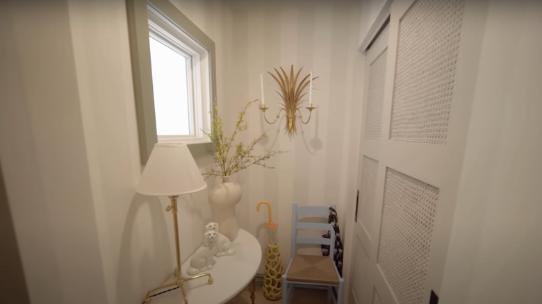
In Season 8 of "Brother vs. Brother", Drew went $100,000 over budget with his colorful renovation. While his bold interior was certainly memorable, there was one design choice we can't help but question. The entryway of the home included a tiny nook that appeared crowded and less than functional. While the half-moon console table was a decent use of space, the children's chair created a strange and inconvenient layout. The elaborate sconce also looked awkward in such a narrow space.
To turn this space into a welcoming and open area, Drew could have cleared the half-moon table and swapped out the table lamp for a vase with flowers. The chair and umbrella holder could be replaced with a standing or wall-mounted coat rack. Rather than the eccentric sconce, a small piece of wall art would help the space appear curated, instead of unbalanced. If you have an odd nook you want to transform, avoid overwhelming it with furniture. Instead, focus on adding functional storage pieces like a bowl for keys or hooks for outerwear.
A laundry room with a messy curtain and oversized sink
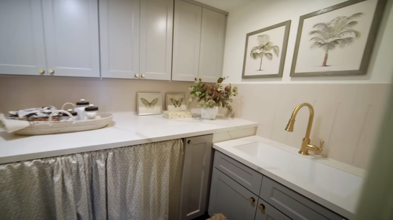
Another questionable design choice in Drew's Season 8 renovation was the layout of the laundry room. The curtain shielding the machines looked sloppy in the reveal. While it may seem like a minor feature, in such a compact space, every detail counts. It also had a pattern that appeared busy, rather than being clean and simple. In addition to the chaotic curtain, the sink was unnecessarily large for the narrow area.
The trick to organizing a laundry room that feels clean is to create the illusion of a clutter-free space. You don't want your storage to appear as if you have something to hide. A more solid and sleek solution would be to install proper cabinets. To fix the issue of a cramped space, Drew could have chosen to install the sink directly into the countertop to create a more spacious laundry area. The washing machine has access to water and drainage, which means it would be possible to install a sink along the same line.
An excess of unused space in Jonathan's Las Vegas reveal
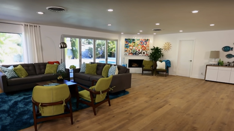
In the Season 4 living room reveal, there were some visible issues with Jonathan's final layout. Rather than utilizing the entire living space, the furniture looked cramped with excessive unused space. While an open, airy interior is always a great goal, this floor plan could have benefited from more balance. In Jonathan's arrangement, the seating area appeared cut off from the rest of the living space, and the sliding door was partially covered by the sofa. There were also unnecessary chairs in front of the fireplace.
The asymmetry of Jonathan's layout was not visually pleasing, and the sofas were facing away from the desirable focal points. Ideally, your seating area should face something with visual interest. For example, in Jonathan's space, the couches would be more appropriately positioned facing the fireplace or the sliding doors. There should also be a cozy seating or dining area directly under the large window. The space appears large enough to create multiple designated areas, which is ideal for making a large living area look intentional.
An unnecessary seating area in Drew's glam home
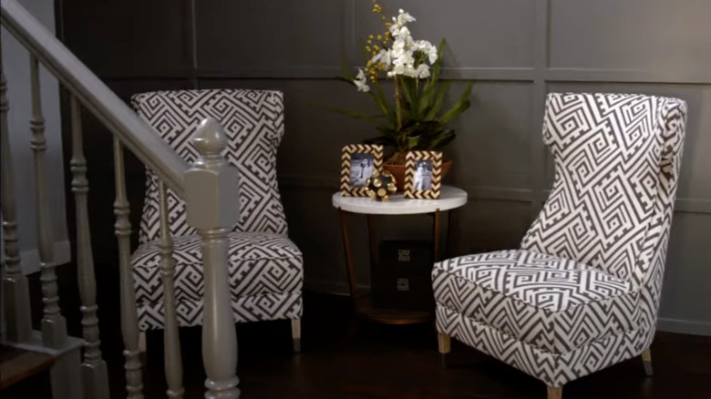
Drew designed a glamorous interior throughout Season 4, but there was one area that didn't quite make sense. Upon entering the home, nobody mentioned the awkward seating area that faces the staircase. Two large chairs framed a tiny end table, which was filled with picture frames and plants. While the entryway should set the tone for the opulent space ahead, leaving it open or selecting more low-profile furniture would have made the foyer feel larger.
If the seating area will hardly be used, it's often best to avoid adding bulky furniture. The large armchairs in Drew's entryway design are just for looks – which isn't an ideal use of space. Because your entry is the first area guests observe, the goal should be to create a welcoming atmosphere that still feels open. Rather than two armchairs, Drew could have added a sleek entryway bench with storage and a velvet cushion to emphasize the luxurious interior. For the perfect accessory that won't overwhelm an entry space, consider an organic touch of live greenery. These two additions are all you need to curate a simple, yet well-utilized, entryway.
The modern black accents in Jonathan's kids' room
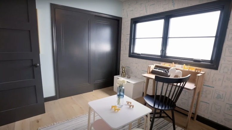
Dark colors are certainly trendy, but they are a major risk when designing a space for kids. In Season 8, Jonathan made a few daring choices in his Oceanside, CA renovation. While he added some playful elements to the kids' bedroom, the window trim and closet doors were painted black. Rather than adding contrast to the quirky wallpaper and kid-friendly elements, the dark accents look more appropriate for a mature space.
A children's room doesn't follow the same design rules as other rooms in the home. While vibrant colors might appear too bold in other areas, a children's room is the perfect space to explore saturated shades. Black accents are more suitable for contemporary, adult spaces. The notable exception to this rule would be to paint a black chalkboard wall for creative fun! For additional inspiration, discover the most beautiful paint colors for a small child's room.
A cheap substitution for historic stone details
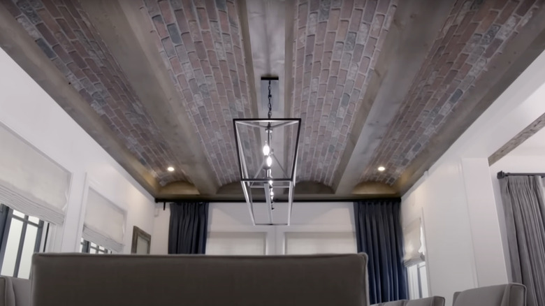
In Season 7, Episode 2, Jonathan wanted to add historic-inspired details to his Hancock Park, Los Angeles mini-mansion. While the final result was superior to his original idea of wallpapering the barreled ceiling, it still appeared inauthentic. He chose textured paper made by a Hollywood set designer, crafted to mimic the look of bricks. While this technique may work for the movies, it looked kitschy in a multi-million dollar home.
If you're lucky enough to have vaulted ceilings with exposed beams, they can be striking in their natural state. Adding elements like wallpaper or textural details can add personality, but too much visual noise can distract from their natural beauty. A subtler alternative is painting the ceiling white, while letting the beams retain their natural wood finish. This is a great way to highlight the charm that is already there. Curating your interior is a process, and even the Property Brothers make design mistakes. Focus on prioritizing high-quality materials, thoughtful layouts, and intentional pieces.