Joanna Gaines' 9 Best Bathroom Renovation Design Tips
We may receive a commission on purchases made from links.
Joanna Gaines has helmed her fair share of renovations. With five seasons of HGTV's "Fixer Upper" under her belt, along with countless spin-offs that aired on her Magnolia network, from "Fixer Upper: Welcome Home" to "Fixer Upper: Castle," the designer knows a thing or two about remodeling. And while she's famous for her modern farmhouse kitchens and cozily rustic living rooms, she also has countless tips on how to make bathrooms better. She has swooped into hundreds of cramped, outdated, and falling apart bathrooms, and made them modern and spa-like. If you're considering your own remodel, then you can learn a thing or two from her bathroom renovation advice.
Her tips run the gamut, from what to do when the walls are torn down to the studs to how to approach choosing accessories like vanities and light fixtures. For example, if you're tearing out drywall and working with a clean slate, the home reno star would urge you to add in extra electrical to double your bathroom's lighting. This is especially helpful for small bathrooms that can feel gloomy and cramped. She also has some thoughts on what kind of floor tiles to choose, depending on the size and aesthetic of your space. If you're not down to the studs but swapping out vanities and light fixtures, she has tips on how to cut costs, add more character to the space, and make it feel more memorable. Ahead are some of the best bathroom renovation ideas from Joanna Gaines.
Add extra lights to a small bathroom
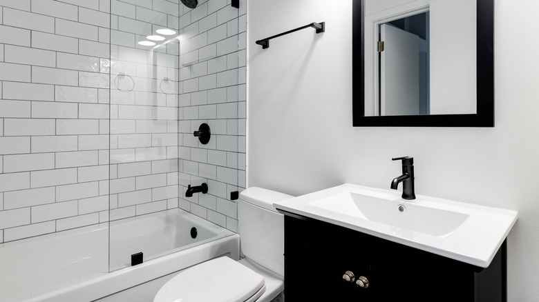
Small bathrooms are tricky to design because you want to ensure they don't feel too cramped. While your instinct might be to create an all-white space to make it appear airier and larger, Joanna Gaines has a different suggestion. Instead of focusing on color, shift your attention to your lighting plan. She showed why this works when she renovated a tiny bathroom for a family. "It was really important to make the space light and airy because it's only 45 square feet. One of the biggest things I find in small spaces is there's not enough lighting," Joanna Gaines said in a video for HGTV. "I always encourage people, if you have some room in the budget, add extra lighting."
To ensure there's sufficient lighting in the space, first make sure you have an overhead fixture and lights over the vanity. This is a great starting point, since it not only illuminates the room but also provides task lighting. If you have vanity lights over the mirror, consider adding two sconces on either side of the glass to create another layer of illumination. You can also install recessed lights above the shower or ceiling over the bathtub, to better illuminate that portion of the room. And if you really want a glow, consider getting a lighted mirror, which has built-in lights that circle the entire feature (such as this dimmable one from Amazon), or conceal an LED strip (also available on Amazon) behind the edge of your mirror for some elevated ambiance.
Repurpose a vintage dresser as a vanity
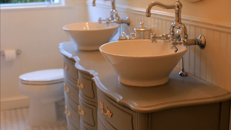
One of the best bathroom renovation tips in "Fixer Upper" has to be how Joanna Gaines uses vintage dressers as vanities. In Season 2, Episode 2 of "Fixer Upper", Joanna Gaines showed fans that you don't have to think inside the box when it comes to bathroom vanities. If you think all the big box options look the same and have outrageous prices, then take a page out of Joanna Gaines' book and use a vintage dresser instead. This will not only add charm and character to the space, but it will also be significantly cheaper. While a 4-foot vanity can run you anywhere from $600 to $1,000, a vintage dresser can be as affordable as $100 if you get it secondhand. In that particular episode, Gaines painted the dresser a dusty green to better match the color palette and used wall-mounted faucets to optimize cupboard space inside.
To try this out yourself, start by selecting a dresser that is deep enough to be a vanity so it can comfortably house the plumbing. Most vanities are a minimum of 20 inches deep, so ensure the piece you're eyeing meets this size requirement. Once you have your dresser, change its appearance to your liking, whether that's painting it or sanding it down and restaining the wood. Then, measure the space for your sink. Some sinks come with a template you can trace, so check if yours does to create the most precise outline. Lastly, see which drawers need to be retrofitted to allow space for the pipes, and cut out niches to accommodate the plumbing.
Use white, gray, black, and navy for kids' bathrooms so they can grow with them
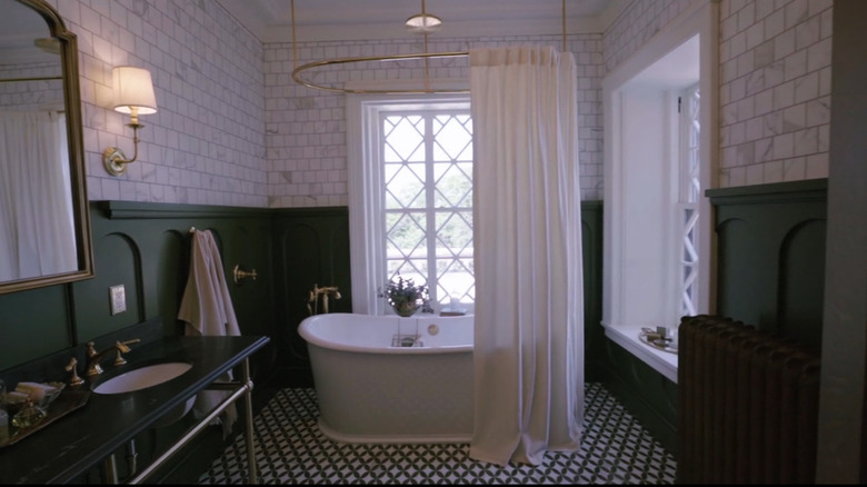
If you have renovated a bathroom before, you know that it's hard work. Because of that, most people aren't a rush to repeat the process in a couple of years. However, keeping the same finishes for a decade or more can be tricky, especially if it's a kids' bathroom. In Season 1, Episode 8 of "Fixer Upper: Behind the Design," Joanna Gaines tackled a boys' bathroom. "I want to make it timeless, so even when they're 16, they won't grow out of it," she said on the episode (via Realtor). She did that by using shades of gray, navy, black, and white, which is the perfect color scheme for a timeless bathroom.
If you want to use a neutral color scheme but still render it kid-appropriate, consider adding some graphic tiles like Gaines did on the bathroom floor. Pattern can be an easy way to make a space feel more interesting, playful, and youthful. To create cohesion, it's best to choose floor tiles in the same color scheme as the rest of the room, though you can select a combination of hues. For example, if you want a darker floor, opt for navy and gray patterns. But if you want a lighter look, you can select a pattern that is white and pale gray. This still sticks to the room's designated motif, but allows you some design wiggle room.
Go all out with design in the bathroom
There are two rooms Joanna Gaines recommends going all out in when designing a home, and one of them is the bathroom. "It can be fun to go over the top in spaces that you don't use a ton, like a formal dining room or library, because you're not constantly in that space. I always say that bathrooms and entryways are a great place to go crazy, because they are smaller, high-traffic areas, but not as much time is spent in them," she explained to Elle Decor. While you might like soaking in the tub, you probably don't spend as much time in your bathroom as, say, your living room, so you can afford to be a little riskier with your design choices. Bathrooms also have a smaller footprint. Splashing out on playful wallpaper is much more affordable in a small powder room than in a large family den.
To go all out with your own bathroom design, consider what theme you want to portray. If you love color and prints, experiment with louder wallpaper with playful patterns. For example, floral wallpaper is always in style, such as the Barney's Fields Wallpaper from Milton & King. If you like a more masculine look, consider swapping white subway tile for black terra cotta instead. Or, if you want a more subdued aesthetic, consider making a statement with your grout. For example, if you choose white tiles, consider making them more graphic by using black grout, which will create geometric lines throughout the space. Take this as your opportunity to experiment with your style.
Add interest with unexpected light features, like chandeliers
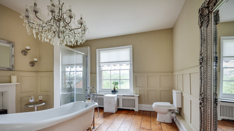
When it comes to selecting the perfect bathroom lighting fixtures, you might think that the only sensible choice for the ceiling is either recessed or flush-mounted ceiling lights. However, Joanna Gaines doesn't believe you need to stick to such safe picks. You can dare to go bolder. "I also did an antique chandelier to add interest, which gives plenty of light," Joanna Gaines said in an HGTV clip. Not only is this an unexpected design move that will inject a punch of personality into your bathroom remodel, but incorporating a fixture like a chandelier will also contribute more illumination.
If chandeliers aren't your style, you can opt for a pendant instead. When doing this, there are a few things to keep in mind to ensure the pendant won't be too dim. First, asses how much light your bathroom needs. Is there a large, south-facing window, or have you added vanity lights? If the majority of the light is coming from the overhead pendant, then it might make sense to choose one with a shade that is clear rather than opaque, such as this hanging globe from Amazon. This will allow more light to disperse, making the room brighter. If you decide that the aesthetic of the fixture is more important than incorporating extra lumens into the space, then a workaround is to add some recessed cans to the ceiling. That way, you have multiple light sources, and the space won't feel dim with a more opaque light fixture.
Source antique tiles to give the room more gravitas
Joanna Gaines is known for her appreciation for historic materials, from white shiplap walls to antique bathroom tiles. Incorporating the latter can help infuse your WC with character. An article on Joanna Gaines' blog advises, "To add depth and history to a space, consider vintage and antique tiles." The post also recommends choosing handmade or hand-painted tiles if you want to make your bathroom design feel one-of-a-kind, cozy, and personal.
So, where can you source such unique tiles? It depends on what look you want. If you love the intricate, geometric designs of Moroccan tile, then you can choose from hand-painted options at stores like My Moroccan Tile. If you prefer the type of delicate motifs that are found in an English cottage, then Marlborough Tiles might be more up your alley. If you want a modern design or just crave some imperfect texture (like the handmade bumpiness of zellige tiles) then you can shop at more mainstream sites, such as TileBar or Fireclay Tile.
Experiment with wallpaper in bathrooms
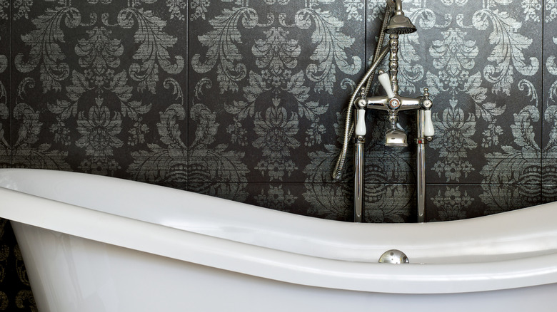
Have you always wanted to experiment with wallpaper but were too nervous to commit the money and time to such a large project? Or are you not convinced you will completely love the results? If that's the case, but you feel constantly pulled to spaces that utilize it, then try experimenting with the papered product in your bathroom. An article on Magnolia (Joanna Gaines' blog) states that "small spaces like bathrooms, mudrooms, and entryways are ideal for trying out a bold pattern because they're fairly low-risk in terms of the amount of real estate you're covering."
When it comes to what print you should use, narrowing down the selection depends on the space. Choosing a larger print is great for smaller bathrooms since oversized patterns can make small rooms appear larger. Choosing a tiny, tightly packed print can make small spaces feel more compressed. You may also want to choose a busier print if you're working with limited square footage. That's because the energetic design will force the eye to roam around the entire space to try and soak it in, making the area feel bigger. On the other hand, if you have a big bathroom and a feature you want to drag the eye to — such as a freestanding tub you paid an arm and a leg for — consider only wallpapering the wall behind it to turn the area into a focal point. The rest can be painted to match the pattern's color scheme.
Avoid large tiles in small bathrooms
While selecting a large-scale pattern for the walls will help a small bathroom appear bigger, you want to avoid selecting large format tiles for the floor. It doesn't quite have the same effect as patterned wallpaper. Installing smaller tiles is a clever tile trick Joanna Gaines uses to make rooms feel larger, and you can see this play out in the above Instagram post. Here, Gaines chose a hexagonal marble floor tile that's smaller than the rectangular tiles on the walls. In her caption, the design star states "The tile is the real show stopper in this bathroom at the Castle."
Why does this trick work? The answer is scale, which refers to the size of the tiles compared to the size of the room. Having large format tiles in a postage-stamp-sized space won't look appropriately scaled, throwing more attention on the lack of floor space. Instead, try to choose a size and shape that works with the scale of the room.
One of the most common floor tile sizes is 12-by-12 inches, but if you have a more compact area to cover, consider going down to 4-by-4-inch tiles. This will not only look more proportional to the room, but the tiles will also be easier to cut and fit around the perimeter. The cut tiles will also look more seamless, where larger tiles would look choppier. If you want to go really small, consider using mosaic tiles.. An example of these is the hexagonal penny tiles seen in vintage bathrooms. They not only add historic charm, but are also easier to install in small spaces since less cutting and measuring is involved, especially where you have to fit them around cabinets or toilets. Penny tiles typically range in size from ½ an inch to 1 inch.
Your grout will change the vibe of the space
Most people think that choosing tile designs and sizes is the hardest part of a bathroom remodel. However, selecting the grout is just as important. It might seem like an afterthought, but the color you pick can transform the look of a bathroom. According to an article published on Joanna Gaines' website, "If you choose a grout color that's complementary, the grout blends in and lets the tile speak for itself, giving it a classic, traditional feel." The article goes on to say that contrasting grout colors that stand out from your tile choice can be a great option if you want to turn your bathroom tile into a graphic moment, give it a modern feel, or go a little bolder.
Grout can also make a space feel bigger or smaller. For example, a light grout paired with white tiles can allow a small bathroom to appear larger since the two elements seamlessly blend together. The wall tiles appear more continuous, since there aren't stark lines dividing them, making the room itself seem more expansive. Once you have decided which grout to go with — dark or light — you then need to narrow down the specific shade. For example, a light grout can be anything from stark white to creamy bone to cool frost to warm gray. You can help narrow down your selection by matching undertones. If you have a warm white tile, choose a warm undertone for the grout.

