Home Design Choices You Likely Won't See In Martha Stewart's Home
Martha Stewart may be a home and living mogul who appears to have a complex system for better living. But, if you ask her, her philosophy is anything but complicated. As she explained in the documentary "The Many Lives of Martha Stewart," "Make it beautiful, but simple." Whether it's business, life, entertaining, or home decor, Martha feels a more minimal mindset allows for beauty to trump decadence every time.
We can't help but agree. There is a freedom that comes along with opting for less is more, especially when it comes to home decorating. Whether you're a fan of industrial or farmhouse, there's always a way to make your spaces both beautiful and simple. That said, simplicity doesn't mean anything goes, especially in one of Martha's homes. If anything, it means there are very specific ways of decorating she just won't go for. Here are the top things you likely won't find in any of her homes, plus a few tips for incorporating each rule into your own decor style.
New decor in place of hand-me-downs
Martha loves a good statement piece — especially if it's old and meaningful. That's why you'll find her decorating books full of well-loved pieces that are front in center instead of the latest trends. As she explains to her website during a house tour, "If your grandma gives you a beautiful set, use it." She believes that adding heirloom or antique pieces to a setting can show both a love of decorating and an appreciation for good craftsmanship. And, in her book "Entertaining," she told her fans it was important to have "an appreciation of the old and antique."
Don't stash those family heirlooms in the attic if you want to be like Martha. Adding a few family items like passed-down teacups or even old photos can be a great way to appreciate the past. But don't worry; you don't need to be an expert on the Arts and Crafts movement or Jadeite to find the right pieces. Simply start with things that speak to you. Once you start to get the hang of purchasing antique furniture and decor, it's a good idea to have a little knowledge of what makes a piece high-quality. That way, you don't fall for a cheap replica knock-off that won't stand the test of time.
The same old landscape designs
If there's one thing (and it's a Good Thing!) we can learn from Martha, it's that we shouldn't be afraid to break the rules once in a while; you might be surprised at how well it turns out. Martha's always been willing to experiment, especially when it comes to her gardens. As she explained on her website, "I never tire of trying new plants and experimenting with new varieties."
Even though sticking to the plants and flowers that are most likely to flourish in your USDA zone makes sense, that doesn't mean you add a little bit of the exotic here and there. If you want to dip your toe into a more experimental bloomscape, try adding a few tropical plants in pots. Not only will you be able to add unusual plants or flowers to your outdoor space, but landscape designers explain that containers can trick the eye to make your garden look bigger. Plus, using containers lets you bring the less hardy plants inside if it gets too cold for them to flourish.
Martha doesn't carelessly store items
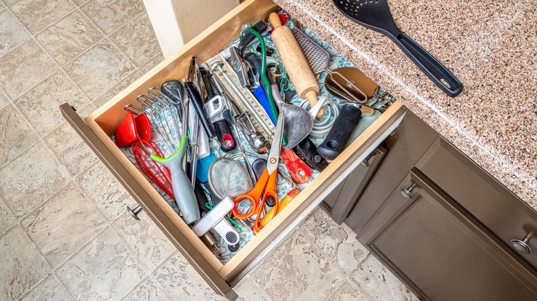
It's probably safe to say that Martha doesn't have a junk drawer in any of her homes. During one of her kitchen renovations, she took on the challenge of finding intentional ways to store the baking sheets and other knick knacks that one needs for baking but can often end up being stashed in the back of a cabinet somewhere. "Upright steel slats provide perfect spots for heavy baking sheets," Stewart tells her readers on her website.
Everything, even storage, can be beautiful if you set your mind to "Martha Mode!" Take a look at your cabinets and closets. Can you rethink the layouts to prevent clutter? Baking, linen, and other things that get pulled out only occasionally can all be redone to look magazine-worthy with just a few additions. If you need a little help figuring out how to make your storage functional, take a tip from Martha and start with organizing linens in an island drawer. "They should be neatly folded and stacked for easy access."
Minimalist desk aesethics
Martha knows that it's more important to have what you need handy when it comes to work, even if that means a little bit of clutter here and there. When she decided to renovate her front porch and turn it into a home office, she knew practicality had to be prioritized above all. She explained on her site, "My desktop is never empty. I prefer to keep supplies at my fingertips, along with my Apple laptop."
Thank you, Martha, for giving us permission to have a little clutter when it makes sense! Don't feel like you've got to achieve the minimalist desk look just to keep up with design trends. Think about the way you typically go about your day and make sure you've got whatever you need to be your absolute most productive. You can even get a cute desk organizer set, like this one from Wayfair, that ensures you have what you need while still keeping things tidy.
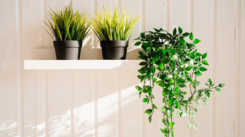
Martha likely doesn't opt for fake plants
You may not have the greenest of thumbs, but Martha still believes you, too, can learn to love and maintain houseplants if only for the beautiful touch they add to any home. She gave readers a tour of her winter indoor houseplant setup via her blog, explaining why they're such a staple in her decor. "Not only do houseplants enhance the overall appearance of a space, but they've also been known to increase creativity, reduce stress, and eliminate air pollutants. I always keep a small selection of potted plants in my home."
Adding a few potted varieties to your indoor space doesn't need to be overwhelming, especially if you learn how to use the plants as parts of your decor. Start with a few hardy plants like a pothos or cast iron plant and check out some care guides. That way, you'll get the benefits the foliage brings to an indoor space without needing to care for high-maintenance, exotic plants.
Haphazard wall hangings
"Intention" is probably one of the best words to associate with Martha's decor style, so it's no surprise she takes the decision of what to hang where seriously. On her blog, she recounts the process of deciding how to position and hang a pair of antique Japanese screens, making sure that they were hung both safely and with consideration for how they'll compliment the space. "We consider height, width, and placement next to any moldings." and "Art and photos should always be hung after other decorations have been decided. The height and width of pieces will always affect the hanging of any print or painting."
You can copy Martha's rules for wall hangings without needing a team. Just use masking or painter's tape to mock up the art's design without damaging the walls. This will give you have a good representation of what the final layout will look like. Plus, you can live with it for a few days before needing to hammer a nail into your wall.
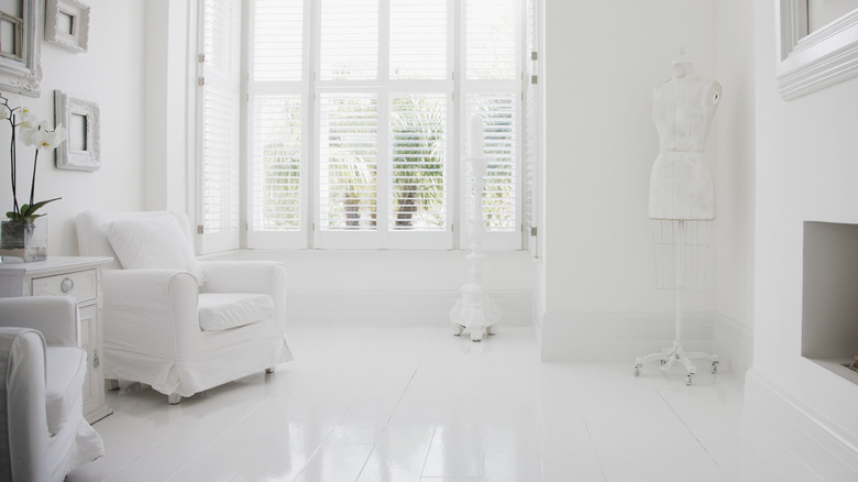
Martha doesn't stick with all white everything
Casual fans or viewers might think Martha is all about the muted look for decor, but her die-hard readers know that's not the case. If anything, Martha loves the way color can draw the eye and will add bold colors to places you might not expect. One of the best examples of how she's not afraid to get a little avant-garde with color would be the hot pink Christmas tree she showcased on her blog. During one of her holiday blog posts, she made a point to show off her tree with pride, saying, "I love to put it in a formal room, because it glistens so beautifully."
Maybe a hot pink Christmas tree isn't your thing; we get it. Regardless of the season or the reason, don't be afraid to experiment with adding a pop of color, especially when the rest of the color scheme is muted. Try a rich green, turquoise, or other jewel tone as an accent around a room and see if it livens the space a little. You can even mix and match patterns and colors if you want to go bold.
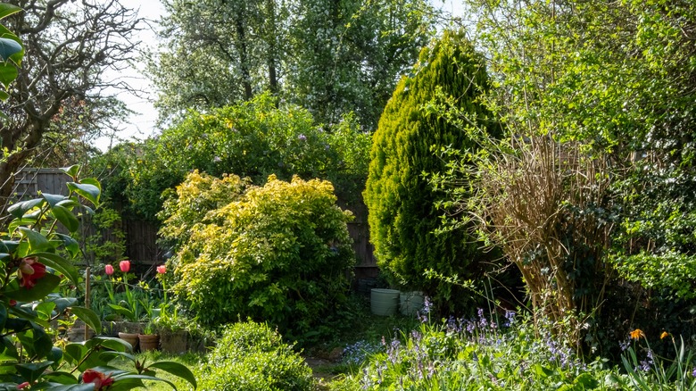
Unkempt landscapes aren't Martha's thing
While many outdoor decor enthusiasts love a bit of the back-to-nature look, Martha is definitely not one of them. Like her indoor spaces, she feels that outdoor spaces should be thoughtful and full of intention. That's why she'll often utilize landscape design techniques that showcase the beauty of the foliage without sacrificing the scenery.
Her personal blog is full of great ideas for gardening enthusiasts of all levels and includes techniques sourced from all over the world, such as the Japanese concept of cloud pruning, pruning trees and shrubs so that their leaves resemble clouds. In her "January at the Skylands" post, she explained that she applied this concept to her border foliage, saying, "This year, we did quite a bit of cloud pruning, so the tall trees did not obstruct the wonderful views of the water."
Don't worry; you don't need to study global landscaping techniques to keep up with Martha! Simply set aside a day every few weeks during the spring and summer months to go around your gardens and prune back any foliage that you feel is overpowering the space. Not only will you help give your gardens a neat and tidy aesthetic, but your plants and shrubs may even thank you for reducing their workload and come back with bigger, brighter blooms.
Rooms that prioritize form over function
Plastic on the furniture and rooms you're not allowed to go in? Not in Martha's home! It's nice to have pretty spaces, but even Martha understands that design concepts only work well when they're useful. If you want to have a Martha Stewart-approved home, then your decor must have both form and function. But there are times that even the Queen of All Things Decor admits to getting it wrong. She explained to her blog readers that the pandemic lockdowns showed her just how little she was truly enjoying living in her own home. "I realized my house was designed for entertaining, not for me... I had two dining rooms I couldn't really use. I didn't have a comfortable place to sit and have breakfast. So Kevin Sharkey [Martha's director of design for her merchandise business] and I started reimagining and changing stuff."
Instead of going on a shopping splurge, she and Kevin decided to use what she already had. Repurposing and putting well-loved antiques to use meant they were able to utilize beautiful pieces to be more than knickknacks, giving them a second life. Ever feel like your home is more a showcase than a living space? Take a note from Martha and use a different lens to look around your home. Are there spaces that could be redone with things you've got in the attic so that they're more functional? Not only will you get the chance to refresh your space with a little rearranging, but repurposing old items can save you some cash, too.
Bulky curtains and drapes
You might think rich window treatments are right in Martha's wheelhouse, but in truth, she's ambivalent about the concept, preferring a minimalist approach. As she told Veranda, "I really don't care about having a lot of draperies, curtains, or fancy window treatments."
While room-darkening drapes may create a moody feel that's great in a bedroom, there's nothing better than opening up a space by keeping the windows bare. However, it's not all sunshine and roses when you let the light in, especially if you have decor pieces with rich colors and designs that are prone to fading. Leave it to Martha to find a compromise that balances the need for protecting furnishings without sacrificing light: translucent roller window shades! She explained further, "I have shades on all my windows to protect the furniture, the fabrics on my bed, and my rugs from fading."


