Once-Trendy Design Trends To Avoid, According To Chip And Joanna Gaines
Chip and Joanna Gaines have something of a design empire on their hands. From their wildly successful HGTV show "Fixer Upper" and its many spinoffs to their highly publicized Waco, Texas flips (including a castle and hotel) to their Target home decor line, it's safe to say the couple knows a thing or two about design. While at first they might have been closely connected with the modern farmhouse style, the couple has evolved over the years and embraced all sorts of different looks, as trends changed and waned. Joanna might have started out creating white, black, and gray spaces, but she has since tackled mid-century modern flips, Victorian castle renovations, and Art Deco-inspired hotel spaces. She adapts to the design world's innovations, and because of that, she's able to comment on which trends are still in and which ones to avoid.
These following trends were all the rage, but have since oversaturated Instagram, Pinterest, and HGTV shows, making them feel overdone and a little boring. But that is the nature of fads — they're here for a while, and then something more innovative takes their place. According to the couple, these trends can run the gamut. They can be something as specific as maximalism that isn't curated or as controversial as all-white spaces. Take a look at what Joanna has since retired, hinting at designs that have met their expiration point.
Maximalist styles that aren't curated
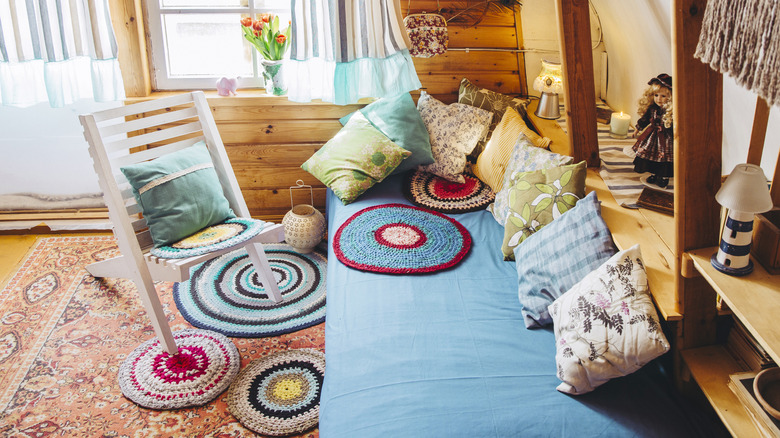
While Joanna might be the queen of farmhouse design, in recent years, she has made a slow pivot into more maximalist designs. For example, in "Fixer Upper: The Castle", she experimented with more elaborate styling, using darker paint colors like deep green and midnight blue, as well as busier patterns. These maximalist elements generated so much press that she released, via Magnolia Home, The Castle Collection paint line with Kilz, which included colors such as deep green, bronzey gold, and rich purple-brown. So, what's the deal with Joanna's view on maximalism? While Joanna isn't against maximalism, she thinks that eccentric styles that aren't well curated are what's out.
"For me, it's clutter. Sometimes people can't see what they need a space to be, because there's just so much stuff. It doesn't feel meaningful," she told Domino. If you're simply stuffing items on shelves or surfaces just to create interest, the room will feel more disordered than designed. Instead, the space is more impactful if you cut back the fluff and only display eye-grabbing, purposeful pieces. Other interior designers agree with Joanna's assessment. For example, interior designer Andra DelMonico told Insider, "Maximalism is about making a bold statement with a few key pieces, not overwhelming the senses with tons of stuff."
Painting exterior brick
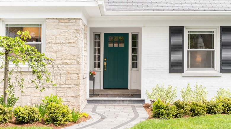
You have seen it countless times across many HGTV shows: Remodelers show up to a dated house that needs a facelift, and the fastest way they make the exterior appear more contemporary is to paint the brick. Slapping some white paint on a dowdy brown or red exterior makes it feel more farmhouse-coded, instantly boosting its curb appeal. But now that nearly every house flip is painted white, people are craving more variety, including the Gaines family. While they haven't retired the paintbrush entirely, they're now pickier with which exteriors to paint. Specifically, if the brick itself is interesting, they think it's better to find a way to modernize other parts of the exterior without changing the brick color.
"When you paint brick, it's a bit of a controversial thing," Chip said in Season 1, Episode 2 of "Fixer Upper." "This antique brick — like, people pay a lot of money to get this cool, old brick — it would be a disservice to this brick to paint it when it's this cool-looking." While the Gaineses believe you should think twice before modernizing unique vintage accents, you may want to completely reconsider painting your home's exterior brick, even if it's plain and builder-grade. Bricks are naturally porous, so they suck up water, whether from rainfall or humidity. But since paint isn't breathable, the water won't be able to evaporate and will therefore get trapped inside the brick. This will ruin its integrity, which can lead to costly repairs down the road.
Thick shiplap boards
Joanna singlehandedly made shiplap a mainstream design trend, so it's surprising to hear that she no longer embraces the look. However, it's true. "I've evolved," she told Good Morning America, explaining how her style hasn't stayed stagnant the 10 years since "Fixer Upper" aired. "I have a love for multiple styles. I don't want to be put in a box." You can see that's true when watching the Gaineses many "Fixer Upper" spinoffs. She embraced moody and historic designs in "Fixer Upper: The Castle," and tried Art Deco maximalist looks in "Fixer Upper: The Hotel." It's actually rare for shiplap to now make an appearance in her designs.
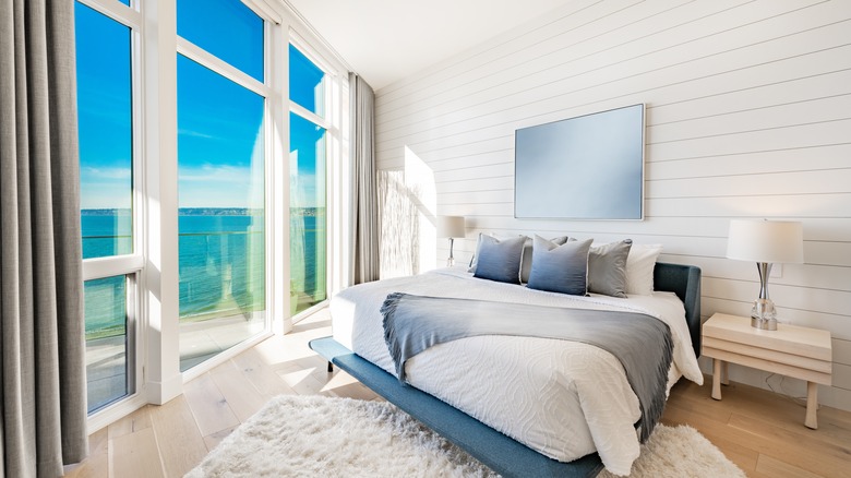
However, that doesn't mean it's completely retired. Instead, Joanna has found a shiplap alternative she adores. Dubbed "skinnylap," it's a thinner version of shiplap. Whereas shiplap planks usually clock in between 5 to 8 inches wide, skinnylap is around 1 inch wide. This creates a more streamlined and modern appearance. However, Joanna didn't come up with this idea all on her own. She got inspired by the wooden planks behind plaster, which are called lath. "'Lath' is a thin flat strip of wood where they use a series of pieces to form a foundation for the plaster of a wall. This wall was inspired by the idea of what you find behind plastered walls," she shared on Instagram. It's a fresher spin on her shiplap trend, allowing you to add texture without feeling dated.
Choosing only one design style for your home
It's no secret that Joanna singlehandedly helped kickstart the farmhouse modern trend, and she built her empire on the look by launching her Magnolia Home shop in Waco, Texas, and then expanding it nationwide with her Target line Hearth & Hand. While the look is now synonymous with Joanna, she no longer believes that your whole house has to follow one single theme. It's great if you lean towards a traditional or farmhouse aesthetic, but the design becomes more interesting if you weave other styles in between the bleached wood and black iron accents.
"Early on, when I started, I always thought we have one or two styles," Joanna told Domino. "As all of us are continually evolving, there are new things that we're loving; there are new things that we're telling our own story about. It's that mix that makes it feel more like home." The reason for that is people are layered. No one likes just one single thing, so you should feel free to explore all your interests within your home. "It makes it feel more like you if your home has three or four different styles," she explained.
Wood panel walls
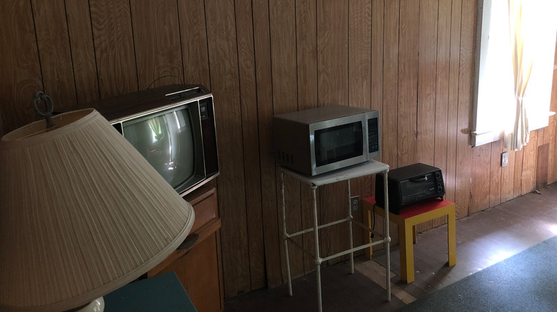
While Joanna fully embraces the skinnylap trend, she thinks wood panel walls are best painted over. While wooden accent walls can bring texture and richness to a space, old veneer ones from the '70s can feel dated. "Fixer Upper" fans saw this in action in the first episode of Joanna's spinoff show, "Mini Reni." In it, she and her Magnolia team flipped the nostalgic living room of a friend. The room in question had white tile floors, a textured ceiling, and wide veneer planks decorating the walls. Since she had only $5,000 to update the room, she decided the most impactful thing to do was to paint the walls.
"The biggest thing in the living room was its age," Gaines told Elle Decor. "The ceiling looked a little dingy, the wood paneling felt outdated, and the tile was bland." To cover it up, she painted it the same dark, mossy green color that she used in her castle restoration. The rich hue helped call attention to the texture in the space, but hid the dingy wood, making it seem more complex. "The color in the living room highlights the vertical lines in the paneling and the diamond pattern on the ceiling, and that play on texture is just beautiful," she explained. In the end, wood panels can really help boost a room's character — but only if they're painted over!
Drop ceiling tiles
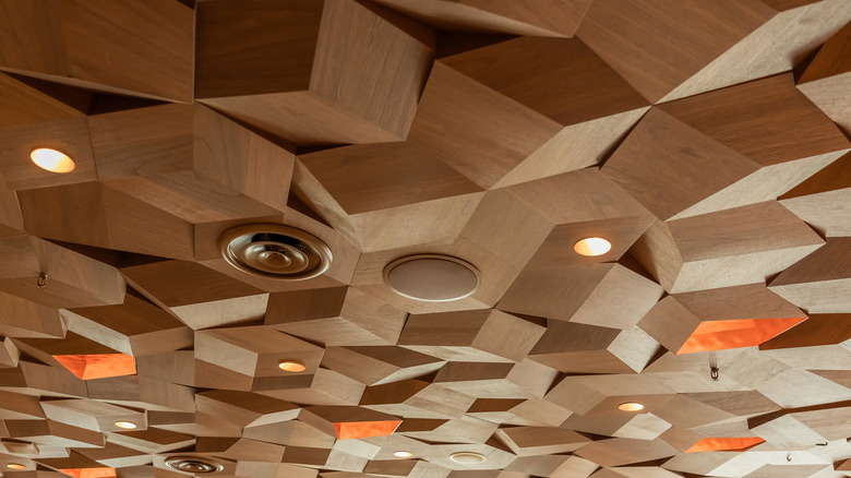
Amateur designers who love vintage aesthetics might reel at this one, but drop ceiling tiles are a temporary fix you're better off going without. Drop ceilings are faux ceilings installed a foot or so below the real one. They're usually installed to hide the room's infrastructure, such as HVAC vents or electrical work. The tiles are typically made from vinyl and can come in all sorts of decorative patterns. While they serve a purpose, Joanna thinks there could be a more elegant way to introduce texture to a ceiling. In the first episode of "Mini Reni," she tried to soften the appearance of drop ceiling tiles with the help of paint.
The living room she was flipping had diamond-patterned ceiling tiles, but they looked worse for wear. She decided to camouflage them by painting them the same dark green color as the rest of the room, helping them feel less dated. "This house was your typical fixer in the sense that it had not been updated in 20 years," Gaines told Elle Decor, referencing the various paneling in the room. While she's not a fan of drop ceilings, that doesn't mean she's against textured ceilings altogether. In the same renovation, she and her Magnolia team added a textured ceiling to the dining room, adding planks to create vertical lines (via TikTok). But this felt more contemporary and elevated than vinyl tiles.
The white-on-white-on-white trend
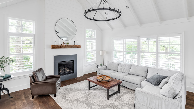
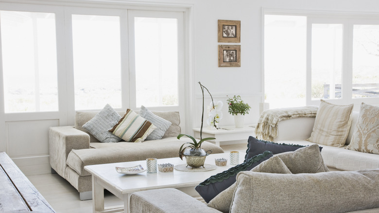
Earlier in her career and in the first few seasons of "Fixer Upper," Joanna really embraced white, neutral spaces. However, you will notice that she always adds a pop of color, whether that's gray, blue, or green. That's because the white-on-white-on-white trend can feel a little cold. "The challenge with an all-white room is making it feel warm and inviting," she shared on HGTV. Her remedy to that is incorporating lots of texture into white spaces using things like linen fabrics, thick rugs, or rough wooden accents.
However, as the years passed, Joanna left the all-white spaces behind and has since embraced moodier, more colorful designs. You can see that transformation in the dark rooms of "Fixer Upper: The Castle," and more eclectic spaces in "Mini Reni." "If you're intimidated by using color in your space, here's my take: When you find yourself drawn to bolder tones or colors — it could be time to just go for it in your home," she told Elle Decor. "If you're feeling a pull to go beyond grays and whites, go for it!"
Chip agrees with this sentiment, sharing that all-white or overly neutral interiors are better suited for houses you're trying to flip, rather than houses you're trying to turn into forever-homes. "I would argue, if you're going to be in a place for 1-2 years, (that's the way we worked back when we were flipping properties), you've got to be conservative because in two years you're selling this house," Chip told Country Living. "But if you're going to be in a property for 3-5 years, then that's a longer term commitment, so obviously you should personalize it and make it your own — don't worry about the resell part of it."

