Unsellable Houses Proves Upper & Lower Cabinets Don't Always Have To Match
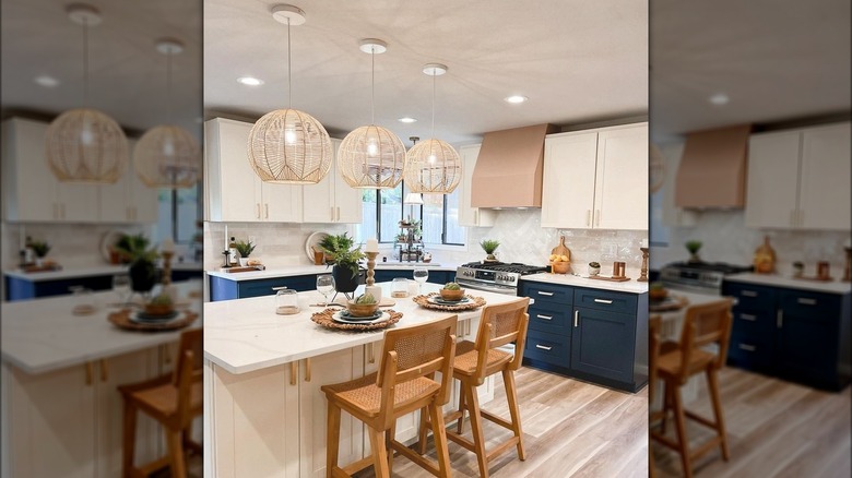
Cabinets are one of the major aesthetic choices for the kitchen, so it's no surprise homeowners can agonize over the choice of the best kitchen cabinet color. Comparing swatches between paint colors is common to find the perfect shade. But through their designs, Leslie Davis and Lyndsay Lamb from HGTV's "Unsellable Houses" show that two colors might actually be the right choice for the space. In Season 4, Episode 11 of the show, Davis and Lamb created a kitchen with blue lower wall cabinets and white upper wall cabinets. The two-toned space adds tons of visual interest by adding fun and unexpected details. Of course, it also adds a pop of color. While white kitchens are timeless, more homeowners are opting to add a little color to the space. Painting the base cabinets a different color from the wall cabinets makes a statement in an otherwise monochrome space.
Two-toned kitchens aren't a particularly new trend; it's one that designers both on and off HGTV have dabbled in. But it's not hard to see why this is one that many homeowners want to indulge in. Two-toned kitchens can help make a space feel larger when the darker of the two shades is placed on the bottom. The darker color on the lower cabinets helps ground the design, while the lighter color on top draws the eyes upwards and creates an open and airy effect. Mismatched cabinets prove to be a unique way to give your kitchen some character.
Pulling off two tones
It may be intimidating to purposely mismatch your upper and lower cabinets. However, choosing a focal point can make this design choice look more intentional. In most two-toned kitchens, the lower cabinets are typically where the contrasting color would go, making them the natural focal point. Lyndsay Lamb and Leslie Davis pull off the two-toned trend well on "Unsellable Houses" by adding a pop of color to a kitchen with stunning blue cabinets on the bottom contrasted with white cabinets on top. But if you have an island or a peninsula in the kitchen, you may opt to place the focal color there. A colored island with neutral cabinets around it will become a feature while keeping the design balanced.
The general rule of thumb for two-toned cabinets is that the darker shade is on the bottom with a white shade on top. However, this doesn't mean you have to pair a deep shade with a neutral. You can use any two colors, but it's important to ensure they have some contrast. For instance, Sherwin-Williams' Watery and Blithe Blue are both lighter shades of blue, but the latter is slightly darker, making it a better choice for the bottom cabinets. Opting for colors that are a few tones apart will ensure the colors don't blend together and make your two-toned look fall flat.
You can mismatch with texture too
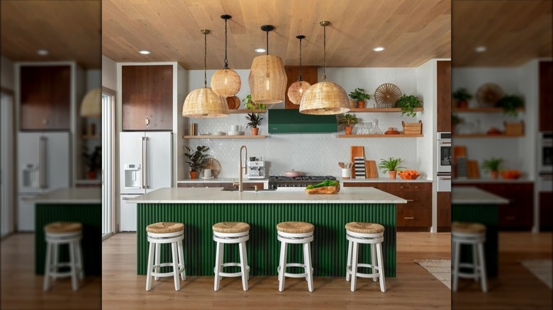
Lyndsay Lamb and Leslie Davis proved you don't have to settle on just one color for kitchen cabinets. However, color isn't the only way to indulge in the two-toned cabinet trend; you can also use texture to create contrasting cabinets. Davis and Lamb played with texture when creating the kitchen in the HGTV competition show "Rock the Block." The kitchen they designed featured dark-stained, flat-paneled wood cabinets contrasted with a fluted finish on the island painted a vibrant green.
The contrast between the smooth cabinets and the textured island creates a captivating visual effect, serving as a focal point. You can easily infuse texture in your current kitchen by adding fluted panels, like these from Home Depot, to an island or the fronts of cabinet doors. Plus, the wood graining in the kitchen Lamb and Davis designed also contrasts the painted flute detailing, which adds another layer of texture difference.
Opt for a more traditional method and consider two different kitchen cabinet styles for your space. For example, you can use the traditional shaker style on the bottom cabinets and glass front doors on the top. The glass adds a smooth and sleek element that contrasts with the raised panels of shaker-style doors. You can take it a step further and choose frosted or fluted glass for even more textured contrast. Get creative and combine different door styles with different paint colors or wood stains to create a customized two-tone design.


