Home Trends That Are Out, According To Fixer To Fabulous' Dave And Jenny Marrs
Dave and Jenny Marrs have made a name for themselves updating historic homes in their small town of Bentonville, Arkansas. While these homes have tons of inherent charm, they also need a skilled craftsman and designer to help bring them into the 21st century. Since their show "Fixer to Fabulous" aired, the couple has renovated over 300 houses, transforming them from dated listings with potential to irresistible family homes. With this track record, it's safe to say that the Marrses have experience with home trends. They have revamped enough properties to see which design styles are beginning to feel overused and played out and which trends homeowners are scrambling to erase.
Some of the tired trends they have an opinion on have to do with the architecture of the house, tapping into Dave's expertise. For example, Dave and Jenny Marrs have a controversial opinion about open floor plans, theorizing they're on their way out. They also have loads of views on which décor trends might be hitting their expiration date, such as gray losing its appeal due to oversaturation, appearing in just about every flipped house in the last several years. If you trust the HGTV couple's design savvy and expert opinion, then you'll want to read ahead. Here are the home trends they think are over and done with.
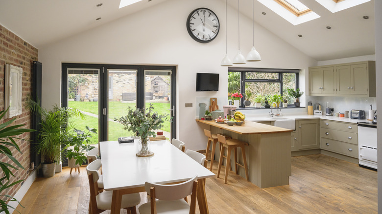
Jenny Marrs is over open floorplans
Open-concept homes have been climbing in popularity since the 1990s, and for a good reason. The kitchen has transformed from a utilitarian place where dinner was made to a family gathering spot where everyday life happens. As the kitchen became the heart of the home, it made sense to tear down walls. Rather than being tucked away in the back of the house, kitchens became a permanent part of the living and dining rooms, making these areas one communal space. This made it easier to host (the cook didn't have to be separated from their guests), stay connected with family (dad making dinner could still listen to the convo happening in the living room), and helped living spaces feel bigger and airier since they weren't closed in by dividing walls. But since we have enjoyed the trend for 30-something years, Jenny thinks it's starting to feel overplayed.
"This is very controversial, but I am over open floor plans. I'm going back to what we used to have 100 years ago, which were more cozy spaces that were defined better," she tells Realtor. "I've actually debated with a homeowner once. [I] said, 'No, [I won't] tear this wall down, I really like this wall!'" Jenny doesn't seem to be alone with this opinion. According to a 2023 survey by Rocket Homes, 48.8% of respondents prefer to have walls. Open-concept homes no longer have overwhelming approval.
Gray has been overdone
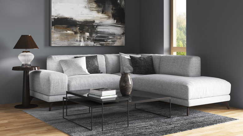
Another overdone trend is all-gray interiors. In Season 4, Episode 7 of "Fixer to Fabulous," the couple renovated a 2,200-square-foot Cape Cod-inspired house. When discussing color palettes, Dave and Jenny Marrs predict gray is beginning to wane in favor. "Grays are on their way out," Dave Marrs announced (per Realtor), looking to his wife for confirmation. She backed him by adding that warmer colors add more charm right now. While neutrals are timeless, oversaturating the house in this particular shade is beginning to feel passé. Dubbed "millennial gray," it was first used by millennials to create minimalist, practical spaces. Since many grew up in homes with Tuscan kitchens, rustic décor, and warm beige color palettes, they craved to create spaces that felt uncluttered and modern. However, since it has been mainstream since the early 2010s, gray feels less contemporary and slightly uninspired now.
Instead, people are gravitating towards warmer colors again, as Jenny noted. Instead of gray, designers and amateur decorators alike are now reaching for warmer neutrals like beige. "The decline in all-over gray color schemes reflects our ongoing desire to make our homes, in which we've all come to spend more time, feel special and layered," Anthony Barzilay Freund, 1stDibs' editorial director, told Homes & Gardens. "Comforting colors, particularly those that evoke nature and warmth, are visually interesting and also feel emotionally reassuring." People want their abodes to feel less like a modern showroom and more like a lived-in home. If you want to make the switch, paint is one of the easiest ways to update your home's color palette.
Tray ceilings can date your home
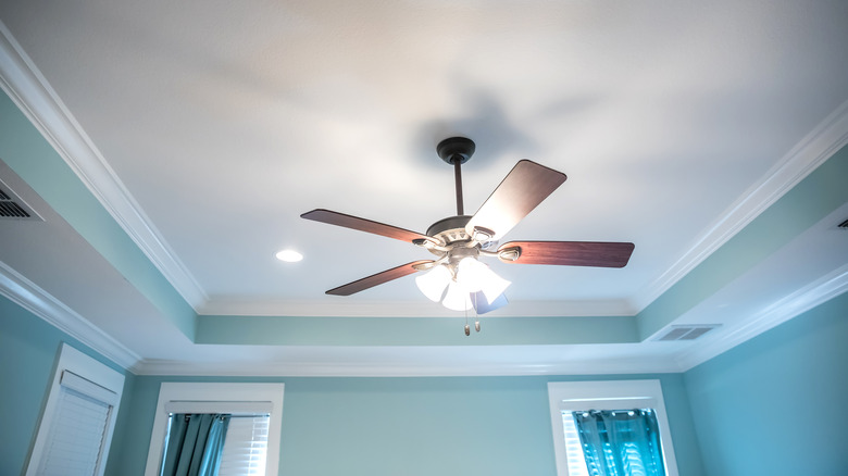
There is one outdated ceiling feature Jenny and Dave avoid at all costs, and that is the tray ceiling. It was a staple of the late '90s and early 2000s, so it looks decidedly dated today. In Season 4, Episode 15 of "Fixer to Fabulous," as the couple toured the house they were about to modernize, Jenny noticed the ceiling in the living room. "What about the ceiling? What do you think of this little tray situation here?" she asked the homeowner (via Realtor). They agreed it had to go, and the Marrses set out to level the ceiling by covering it in drywall. This dropped it by about a foot and made the room shorter, but the loss of height was worth it to make the room feel more contemporary. "The living room was large to begin with, but it felt so dark and outdated. We chose to close up the tray ceiling and add recessed lighting to modernize it," Jenny wrote on their blog.
If you have a tray ceiling but don't want to lose height by drywalling over it, there are some things you can do to soften the look. The first is to paint it a creamy white, so it blends into the room rather than standing out. You can also lessen the depth of the tray by creating an optical illusion with crown molding. Try installing molding along the cornice that only extends a couple of inches down the wall but is roughly 5 inches wide on the ceiling side. This can help make the walls feel taller and the tray shallower in comparison.
Cultured marble doesn't look as elegant as the real thing
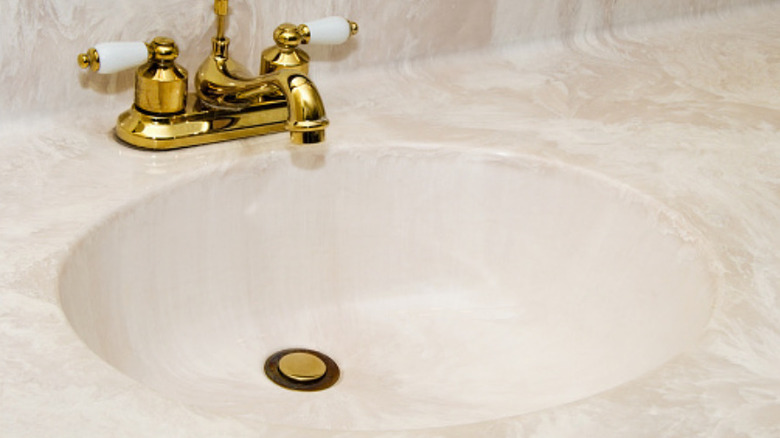
Everyone loves the look of marble, but not everyone has the budget to install it. Because of this, the market has produced clever alternatives that have the veining of natural stone but not the same hefty price tag. Enter cultured marble, a mix of natural marble dust and resins that allows you to mimic the luxury stone's appearance for a quarter of the price. However, not all cultured marble looks realistic, and if you get a more budget-friendly version, it can appear a bit like plastic. That's what Jenny thought when she saw the cultured marble bathroom countertops in Season 5, Episode 2. It had murky blue veining, making it look dirty. "Is this toothpaste, or is this the marble?" she questioned (per Realtor). They swapped out the cultured marble for black granite.
Interestingly, cultured marble is as delicate as real marble, even though it is mainly made of resin. It stains and scratches pretty quickly, making it a fussy material to work with. If you're in the middle of a bathroom reno and want the look of marble but don't want to deal with the maintenance, then consider getting quartz over cultured marble. Quartz can also mimic the veining of natural stone, but it's much more resistant to scratches, staining, and heat than both marble and cultured marble. It might cost more than the faux-marble alternative, but it will last much longer, be easier to maintain, and look more contemporary and up-to-date.
Dining rooms might be on their way out if they're not being utilized
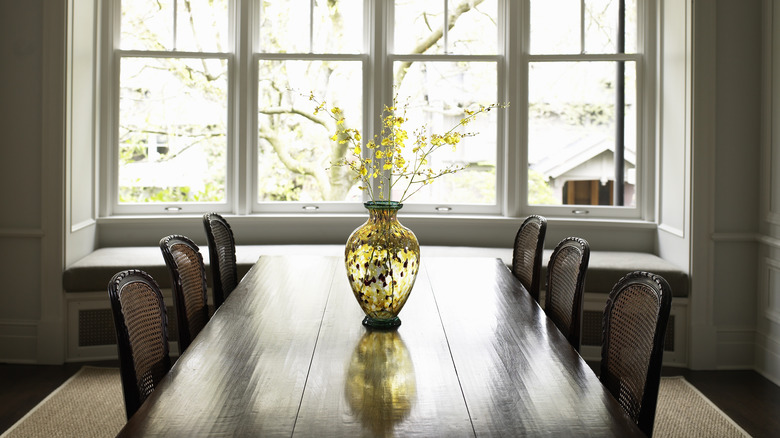
Formal dining rooms might be a thing of the past, but dining rooms in general are starting to wane in popularity as well. A lot of families gather around the island or kitchen table nowadays, with the dining room being reserved for the odd dinner party or holiday. In these households, the space may get used only a handful of times a year. And if you don't enjoy hosting to begin with, it becomes wasted space in the home. That's why the Marrses are all for breaking with convention and converting that square footage into something a little more useful. In an interview with Better Homes & Gardens, the "Fixer to Fabulous" couple reveals the perfect way to utilize an unused dining room. "If you only use your dining room as an office, and have your meals around a kitchen island, then maybe that room should be an office. Do what works for you," Dave explained.
More and more people want their rooms to perform multiple functions, especially when considering the rising costs of homes. As prices and interest rates skyrocket, homeowners become determined to make use of every square foot they own — and possibly cut expenses somewhere else to help balance bills. Realtor Tiffany Stevens tells U.S. News. that if an unused dining room "could be a home gym or office for someone, it could save a lot of money on gas, time, travel, and memberships alone."
Wrought iron accents feel old-fashioned
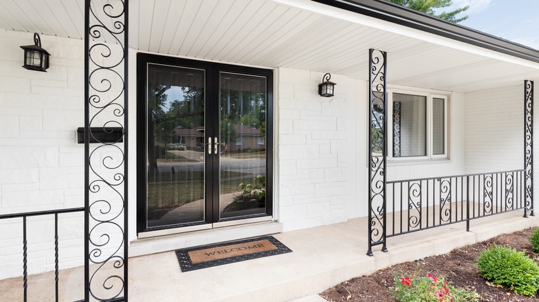
Wrought iron has been used in interior design since the Victorian era, and it has routinely waned in and out of popularity since then. It seems that wrought iron is currently trending downward as younger homeowners are snapping up properties and putting their own touches on them. Many are swapping outdated wrought iron accents for more contemporary designs. For example, ornate staircase spindles are often traded in for more minimalist wooden options since they feel less old-fashioned. The Marrses agree with that notion, but they don't think the swap needs to be limited to staircase rails. It can also be stretched to wrought iron details on the exterior of the home. In Season 4, Episode 14, Dave wants to modernize the ranch house's exterior by swapping the white wrought iron floral column on the front porch for a wooden pole. "This column — we've got to do something with it," he said (via Realtor). "I could build something to make it a really cool post."
While most outdoor designs now feel old-fashioned, you can still decorate with wrought iron in a modern way indoors. Rather than choosing ornate or gothic designs, zero in on more contemporary styles that are more minimalist in nature. Think simple iron spindles without any scrollwork. For a more farmhouse look, try black horizontal spindles, or for a more transitional feel, opt to pair black wrought iron with warm wood tones. This makes it feel more current.
Giant bedrooms can promote clutter
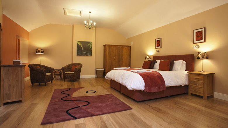
When it comes to square footage, one would think that bigger is better, especially in bedrooms. Who wouldn't want a sprawling master suite with enough room for seating, a fireplace, and a substantial vanity? Well, according to Jenny, the trend of massive primary bedrooms isn't one that she endorses. When Realtor asked the house flipper what bedroom feature people put on their wishlist but don't actually need, Jenny responded, "Lots of space. We live in an old farmhouse, so our bedroom is very small. But I found that I like a small space because otherwise it gets cluttered. We've had bedrooms before where we've had sitting spaces, and it just ends up being a spot to throw laundry."
Instead of dreaming of a room double the size of the one you already have, you can make the most of your space by choosing furniture wisely. To make it feel bigger, opt for a tall headboard that drags the eye upward, making the room feel more spacious than it is. Mount items to the wall where you can, like nightstands and lamps, which will free up floor area and make the space feel less cramped. You can also simplify the color palette to make the room feel less cluttered, focusing on three primary hues to create a sense of balance.
Black and white farmhouse exteriors are becoming cookie-cutter
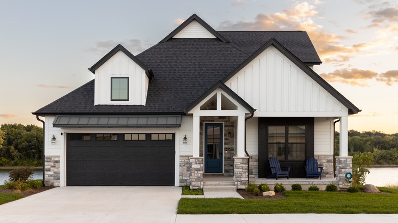
HGTV star Joanna Gaines put modern farmhouse design on the map, and because of that, there has been an explosion in black-and-white farmhouse-inspired exteriors in the last decade. People are embracing the look because it feels fresher and more exciting than the McMansions most developers offer. "Many young homeowners want the modern farmhouse look because they see it as a cool vibe that started with a historic pattern and gained an edge," Designer Marina Case of The Red Shutters told Realtor. While the trend isn't dipping in popularity, the Marrses think you can do better than using a black-and-white color palette.
In Season 3, Episode 5, the couple remodeled a black, white, and red brick house that lacked personality. "The exterior of Kimberly's house doesn't have any identity right now. Nothing is special about it. Nothing that makes you think, 'Oh my goodness, look at that adorable house!' It has no curb appeal," Jenny said (via Realtor). To transform the exterior, they gave it a complete farmhouse facelift, but rather than doing a black-and-white color palette, they painted the brick white and added cedar shakes across the porch wall and roofline. As it turns out, that's where the modern farmhouse trend might be headed. When asked why his contracting firm Welcome Homes was so popular, Executive Vice President Benjie Burford told Realtor, "What people like about our designs are the cool farmhouse shapes and volumes — still usually white with black windows, but often now with brown wood exteriors for the more transitional style."
Exterior beige homes feel very '90s
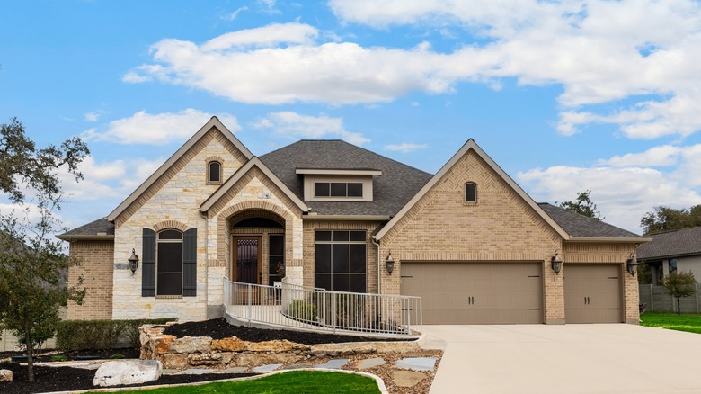
While beige might be trending in interior design right now, the Marrses don't think it belongs on exteriors. That's because it can make your house look like an outdated builder-grade home from the 2000s rather than a modern house with curb appeal. The color throws you back to a specific time period, so it's difficult for the home to feel contemporary and fresh. In Season 4, Episode 11, when the couple first saw the house they would be remodeling, Dave was unimpressed. "I think it was built in the early 2000s when we still thought brown was the thing," he observed (per Realtor). "It needs some help." The homeowner also wanted to change the exterior color. "I feel like we're living in the land of beige," she said.
As it turns out, brown houses tend to sell for less when compared to similar houses painted in other hues. According to Zillow's 2017 Paint Color Analysis, which looked at 32,000 sold homes, medium brown and tan houses tend to sell more poorly than other colors. In fact, they would fetch nearly $2,000 less than other homes. However, a warm "greige" color would fetch over $1,500 more than similar houses. This shows that beige isn't entirely out of fashion — you just have to choose a more contemporary shade.

