Color Rules The Stars Of HGTV's Home Town Swear By
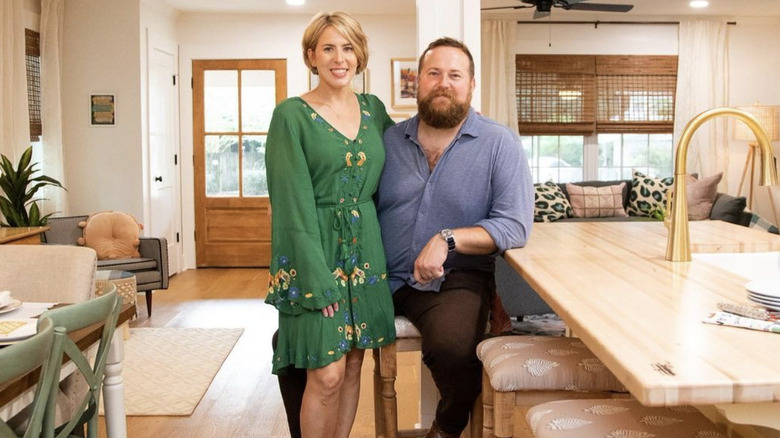
If you don't live in Laurel, Mississippi, it's unlikely your home will ever be featured in an episode of "Home Town." But if you love Erin and Ben Napier's design style, the couple never holds back about their favorite color rules. These design tips dig deep into their arsenal to help you create the home you want. It's almost as if you do get to be on an episode, after all. The Napiers are famous for sprinkling a touch of Southern Charm onto every home they touch. It's not an accident that the show is renewed season after season and the couple's product line is really taking off. They know their stuff and their designs show it.
While "Home Town" shines in its kitchen design ideas and fun exterior transformations, none of this would be possible without their great understanding of color. They know what works and what doesn't. The couple is also not shy about telling clients (and viewers!) when they should turn off HGTV and just do their own thing, anyway. So whether you are getting ready to remodel your house, or are just planning plans for your dream home, these are the color rules the stars of HGTV's Home Town swear by.
You can often draw color into a space using natural wood
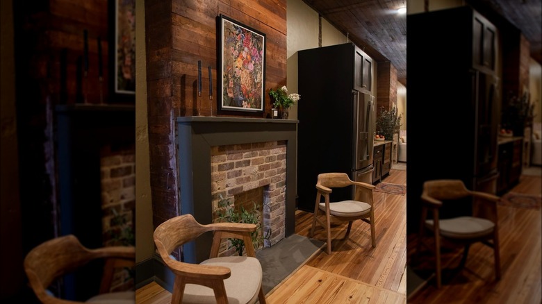
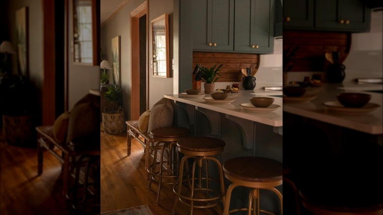
If you're not a fan of bold colors and don't want to have them in your space, you don't have to. In some episodes, the Napiers avoid pops of bright shine entirely. Instead, they work with more natural materials to bring color into the home they are working with. Way back in Season 1, Episode 2, of "Home Town" the couple stains existing cabinets a great dark color to enhance their natural grain. While they do paint the higher cabinets, this step is easily skippable for those who prefer it. The Napiers also use the natural earthy reds of the home's original terra-cotta tile.
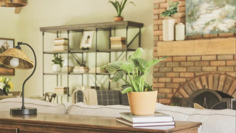
If you don't want a dull space, it doesn't mean you have to invest in over-the-top accessories to make it more liveable. You don't even need to paint anything. Instead, you can just rely on the ambiance that raw materials bring and enjoy their natural colors. You can achieve this through polished wooden floors and redbrick fireplaces, or even by adding a few potted plants to a space.
Red kitchens are bold, not tacky
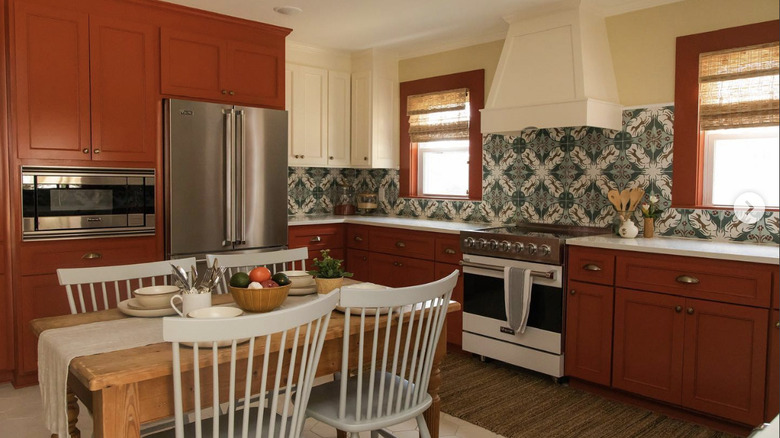
Color in the kitchen is kind of a controversial take, as the classic white kitchen has been around for years and always seems to reign supreme. However, the Napiers always like to keep viewers on their toes. In the "Home Town" episode "The Maui of Mississippi" the couple decided on a dark red color for all the cabinets. The paint is a creamy terracotta, and at first glance, it could easily be mistaken for more traditional wooden cabinets. Yet this color twist is what sets the Napers' eye for design apart. It's a great trick to pull off. "We ended this season of #HGTVHomeTown on a joyful note in an Americana color palette celebrating Jack's new US citizenship and Iris's love for patterns," Erin posted on Instagram about the makeover.
She has always been a staunch supporter of color in the kitchen, especially bolder ones. "Let's stop worrying about what other people think about our red kitchen or our green cabinets and just enjoy our spaces," she told Homes & Gardens. "Everything is tangible." So while many might argue that a kitchen isn't the place for a trendy color that could soon go out of style, Erin insists that be it red, or whatever other color you enjoy, go for it. If you like it, then it'll work perfectly fine.
Introduce color in small doses around the room
A color rule that Erin Napier stands by is micro-dosing pops of color in large spaces. Instead of overwhelming the eyes with color everywhere (on the walls, the furniture, all the textiles), she likes to keep things simple and expertly draw the eye to specific parts of the room instead. "People often compliment my use of bold color in homes, but in actuality—I keep it surprisingly neutral on the walls and sometimes introduce an unexpected bold color on the trim, or just in the furnishings we bring into the room," she wrote explaining the idea on her Laurel Mercantile blog.
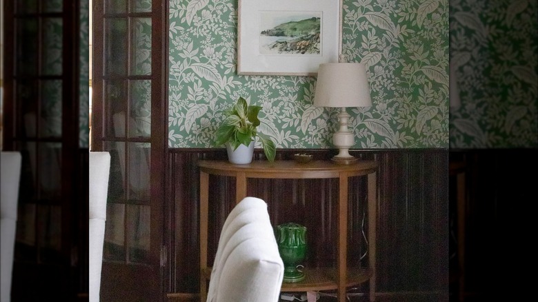
The idea behind this is that you paint the walls a shade that goes with everything, like cream, beige, or even shades of gray. This way you have a plain backdrop. From there, you can introduce fun accents of color to the space to infuse it with personality and make it feel more livable. Consider adding a funky wallpaper on the upper part of the wall above the wainscotting (the Napiers love wallpaper!), or a bright couch for lounging. Doing color this way makes a space feel nice and balanced, while having loud walls and neutral furniture can cause a home to feel a bit too lopsided.
Add a touch of lived-in to make colors fit any space
When selecting colors for your space, you might want to pick the brightest, nicest colors you can. Everything should look clean and new, right? Well, a color rule that Erin Napier follows actually calls out this practice as wrong. "The key to choosing colors that feel part of their surroundings, that feel aged and part of their environment rather than a brand new color that feels just a little day-glo, like a new pair of shoes that squeak a little when you step and are starting to rub a blister on your heel, the key is... Dinge," she wrote on her Laurel Mercantile blog. While houses do get this lived-in feel after years of living in them and loving them, if they start out too squeaky, things can feel sterile and uncanny, which is why Napier avoids it.
Instead, the best way to mix paint so that it looks cozy is to add just a touch of yellow. "Choose whatever color you like that has a bit of yellow in it to make the color feel integrated and truly part of its environment instead of too-new, too bright, not quite right, and out of place," Napier continued. "It is so subtle, but an important delineation between a house that's comfortable in its color vs. a house that's squeaky." Squeaky houses aren't the most comfortable, so aim for cozy instead with this tip.
Neutral colors might not be what you think
When someone tells you to think of a neutral, what colors come first to your mind? You likely imagine creams, soft browns, and grays. Yet Erin Napier wants to challenge this narrow idea of what a neutral can be and has a color rule to prove it. In her world, anything natural equals a neutral. "I mostly use neutral palettes of white and green and build on that with the furnishings, and I'll share my old standbys below," she wrote on her Laurel Mercantile blog. "You may think green is not neutral, but I say it certainly is. Look out your window and tell me what naturally occurring color you see the most of!"
The idea that the colors of the earth are all neutral opens up a whole new world of possibilities in home design. With this color rule in mind, you might reach for creamy blues to mimic the sky on a cloudless day, or a crisp pink that reminds you of the colors in your favorite sunset. Think about deep browns around the house to remind you of rich soil. And, of course — as Napier suggests, earthy greens to keep your home grounded in nature.
Introduce color in fun, albeit controversial ways
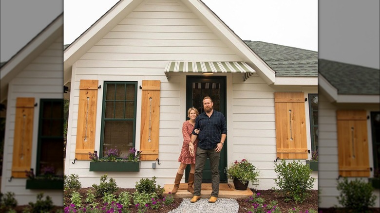
The Napiers are known for their downhome, classic design style on 'Home Town," but sometimes the couple goes out on a limb to try something new. Often, it works — but taking risks like this doesn't come without criticisms. "I know y'all were upset I asked for the striped awning vs. the arched porch: it was edited such that you didn't hear the part where we learned the cost to do that (about $3500) would have made it too expensive to have any woodwork and larger trim inside, Erin wrote on Instagram about a controversial porch redesign. Many fans thought the striped awning was ugly and the couple could have done something much better with the space.
"The juice wasn't worth that squeeze for us—millwork is the difference between new construction and historic homes when you're talking interiors .... I love the charming awning, and it seems like they did too," Napier explained. Putting up this awning is an example of one of the color rules that shows the feisty and fun side of Erin's personality. The stripes are a bold and unexpected way to introduce color to the space. Their darker green hue ties in nicely with the greenery of the yard and window boxes as well — something a stained wooden porch could not do.
Start small when you want to go with bold hues
If you are a little scared about introducing too much color to your space, you don't have to be. Erin understands that a newbiw might worry about not knowing where to stop and going overboard with adding color. You just meant to sprinkle in a little and then suddenly you have a bright pink couch with yellow pillows and purple walls — not to mention the funky wallpaper. Now, your living room looks more like a clown college dorm room than a space where people actually live. Instead, if you want to go all out, you just have to take baby steps to get there. "Start small: If you're new to bold colors, dip your toes in with accent pieces like throw pillows, rugs, or small decor items," wrote the Napiers on the Laurel Mercantile blog.
It's easier to switch out these smaller items if you decide you don't like a color after all than it would be to repaint an entire room or purchase a new couch. Then, you can paint the backdrop of your room neutral. The fun colors get the spotlight, but you don't have to feel cornered by them because most of the space is calm.
Pair bold cabinets with neutral countertops
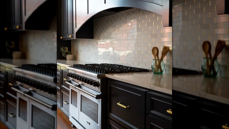
The bolder the cabinet color, the more neutral your countertops should be, according to Erin Napier. This dynamic color duo is the perfect combination to keep your kitchen light and fun without getting too visually overwhelming and making the space feel crowded. "We went with a classic white quartz that is going to look so crisp and pretty against the celery cabinets," Erin said in the Season 8 episode "Tickled Pink," per Realtor. "It's such a fresh, bright, and pretty kitchen that I think is going to make both of them happy." Luckily, there are plenty of great neutral countertop colors to choose from, so this tip is easy to put into action. You can do black cabinets with white countertops, and wooden finishes with pink cabinets; the sky is the limit. Neutral doesn't mean plain, either, as many materials come with swirls and splotches of great natural color already inside of them.
The thing you need to be careful of when selecting neutral countertops isn't as much the color, as gray or white stone and even brown butcher's block all tend to look great. What you need to watch out for is the quality of the material, instead. No matter how great it looks, a poor-quality countertop material will cost you so much money in the long run because it will damage easily.
Add cooler paint with warmer wooden elements
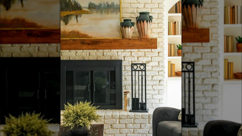
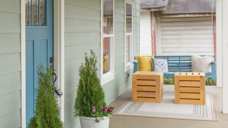
Wooden furnishings come with a great natural warmth to them, especially when they are polished and give off a nice shine. These gleaming browns, no matter their shade, can remind us of the earth and ground us. But a color design trick that Erin Napier loves playing with in her work is using this warmth to anchor other colors. "When you add in a natural wood element, it creates this great contrast that those cool colors need to play against," Erin explained in the Season 7 episode "Blue Heaven," per Realtor. "You've got to have warm colors for the blue to really feel special." Without the backdrop of the warm wood, the blue would look out of place and cool down the room too much.
To try this idea at home, consider the shade of the cool color you are working with and make sure your wood hue corresponds. For example, a beachy blue wouldn't look right set against a dark mahogany because the contrast is too strong and awkward. However, a hunter green might pair well, as they are both rich colors. If you have lighter chesnut colors, shallower shades of cool colors would work better.
Lighter colors can make you happy
The colors we have in our homes can actually impact our moods. If you want to feel happy, relaxed, or even productive — there is a color palette available for that. Erin Napier is well aware of this fact and uses this kind of color theory to her advantage to help her clients.
During Season 5, Episode 2 of "Home Town" Erin shared, "I did a lot of research in college about color psychology, and certain colors make you feel hungry or happy or sad or sleepy," per Southern Living. "In a color palette of sky blue, light-coral colors, lemon-meringue yellow, and then lots of neutrals and creams around those colors, together give you a feeling of happiness." If you are looking for a bit of pick-me-up around the house, you can reach for these colors to boost the mood. Science backs Napier up on this one, as studies indicate that certain colors are perceived differently by our brains, thus stimulating different parts of the organ. There is something about blues that can make us feel calmer if we are in a rage, and yellows make most people feel happy, as they remind us of the sun.
Choose your favorite colors; don't worry about trends
The number one color rule that Erin Napier stands by is simple: Do whatever you want in your own house based on what you like. "When it comes to using bolder colors in a room, you just have to not care about other people's opinions," she told Homes & Gardens. This is solid advice that the best designers always tend to share. It's your home and you have to live in it, so you really need to enjoy the color palette you choose. Base your decorating off what you like, not the latest trends.
Napier further addresses the issue with humor saying, "It's the same when you're trying to choose a baby's name before they're born, and you tell your mom, and she says, 'Oh really?', and that's never a good sign. Just don't tell her the baby's name, or in this case, just paint your room." Because there is a lot of advice out there for every color, both for and against. While it's great to gather advice to make the best choice you can, Napier insists that when it comes down to it about color rules, there really aren't any.
