12 Of The Best Kitchen Designs Fans Have Seen From HGTV's Christina Hall
Mom, author, business owner, and design and real estate veteran — Christina Hall has a myriad of titles to boast about. To most of us, however, her most memorable accomplishments are the home renovations from the various shows she hosted on HGTV. Time and time again, we have seen her orchestrate different elements to create impressive interiors while managing the often contradicting expectations of her clients.
In this article, we look back at the network star's most fan-favored makeovers. Though her projects often involved multiple areas of the house, our article will focus on her kitchen designs. We re-watched the episodes, read all the comments, and counted all thumbs-ups and hearts to narrow down the selection to the 10 best ones. Feel free to check the detailed ranking methodology provided at the end of the article. Do you have a personal favorite from Christina Hall's kitchen designs? Read on to see if it got onto our list!
Luxurious kitchen for her friend's flood-damaged home
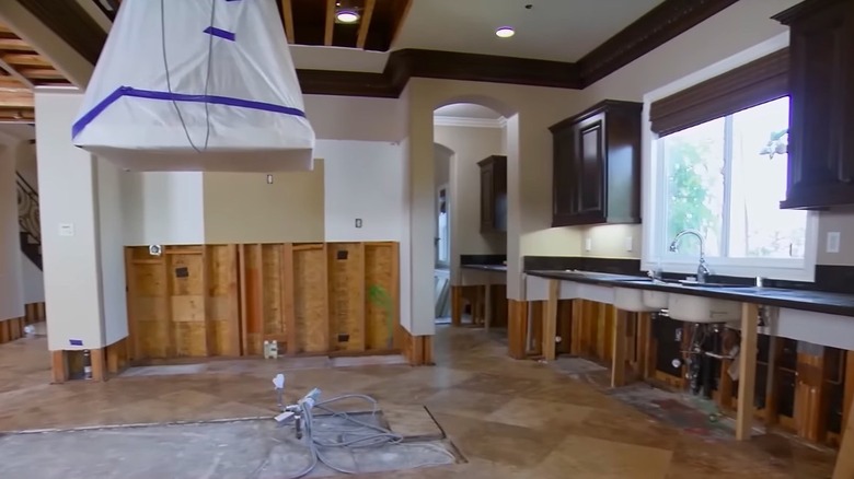
Our first kitchen is one raised from the ruins of a man-made catastrophe — or kid-made, to be more appropriate. After a seven-day trip, Christina Hall's old neighbors came home to discover their place was flooded — not by rain, but by a showerhead left running by their young boys. The damage to the house by the floodwaters was so severe that it had to go through a major overhaul. With most of the structural repairs done, the owners were ready to give their home a new look. And Christina Hall willingly accepted the job.
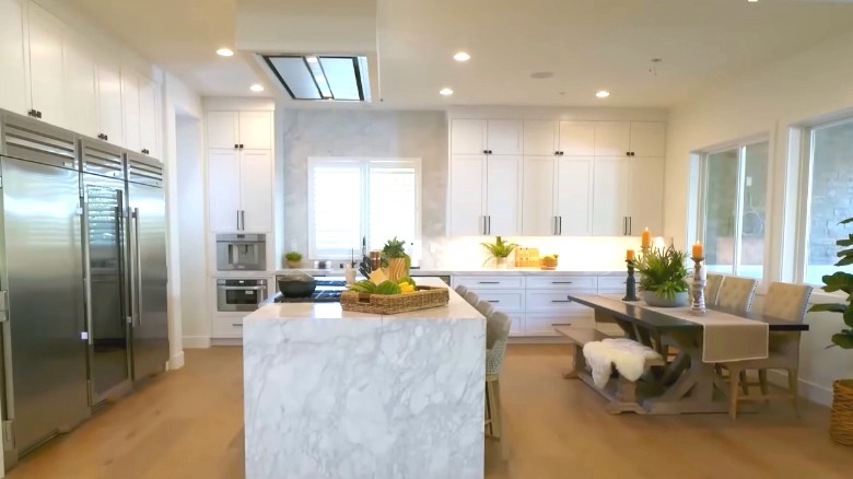
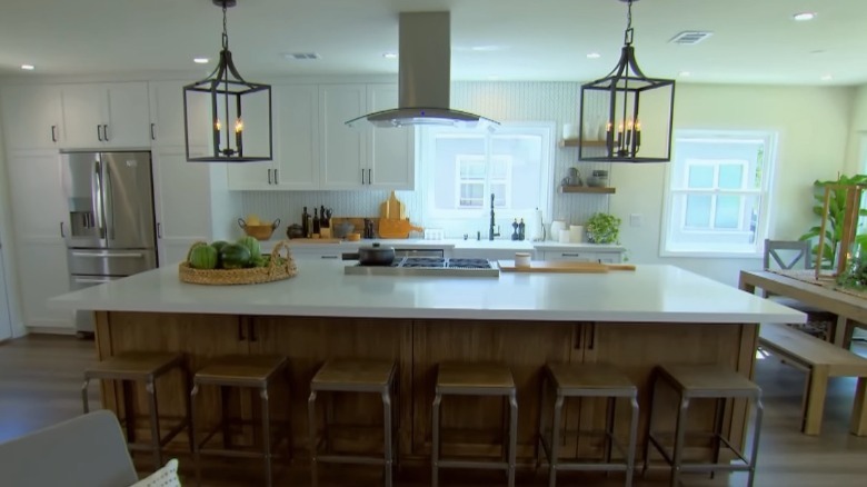
The silver lining was that they now had a clean slate. The clients wanted to update the previous Mediterranean style into something neutral and would stay in fashion for the long run. Hall suggested an all-white motif for the cabinetry along the walls. A massive island sat at the center of the room, covered by a white quartz waterfall countertop. In one section, they built a bar area with black lower cabinets and open shelving. The project involved multiple rooms, but the kitchen transformation stood out for many viewers, earning much praise on social media.
New kitchen for a firefighter and his wife
You might remember this kitchen makeover for an adorable couple, Travis and Jamie. As a local firefighter, Travis was used to making quick decisions. His wife Jamie, on the other hand, seemed to be a more ruminating type. Their characters were clearly apparent in their preferences for the kitchen redesign. Apart from being outdated, the room was also closed off from the living area, and the couple wanted to open up the space.
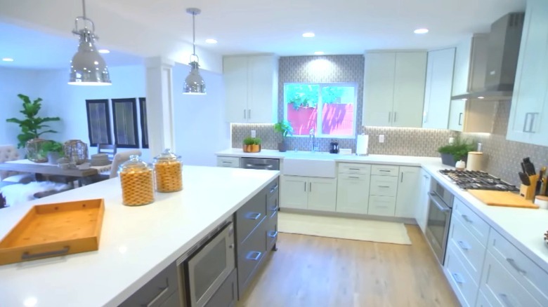
Hall and her team began by opening up the interior wall that enclosed the kitchen. They then replaced all the old features. Hall went for her signature white shaker-style cabinets and white countertops, while new appliances were also installed. After much deliberation, the clients agreed on a grey hexagonal tile design for the backsplash. Two wooden columns stood in the middle of the room, left behind by the demolished wall. A huge white island was built at their base. Above the island, they hung a pair of chrome-finished pendant lights that added the "functional firehouse" feel that Travis wanted. Jamie, who had her doubts midway through the project, was brought to tears upon seeing the new kitchen.
This gray L-shaped kitchen for Christina's delivery nurse
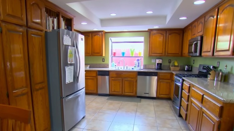
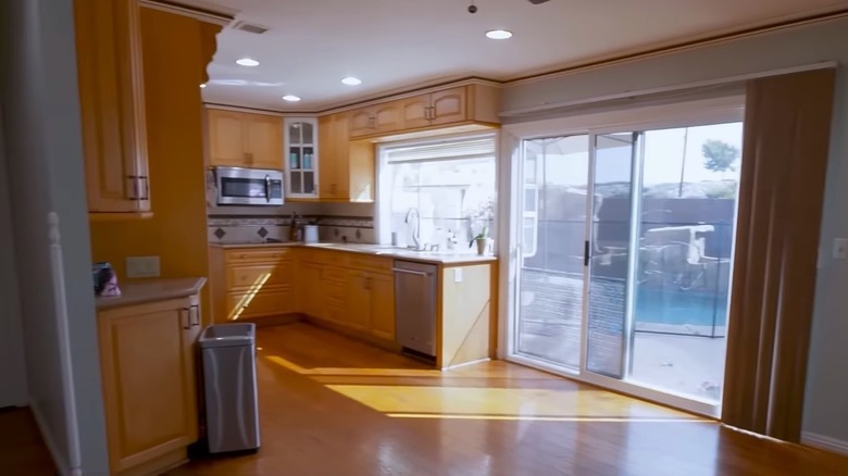
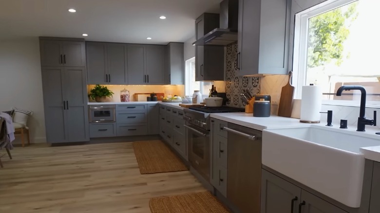
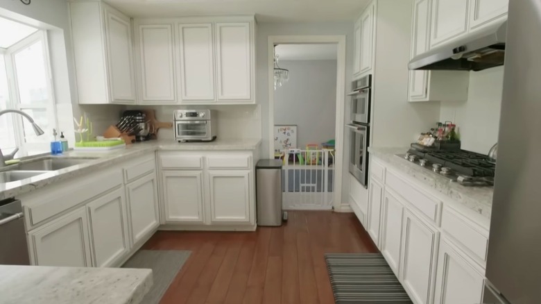
Christina Hall's delivery nurse and her husband recently bought a fixer-upper property in Huntington Beach. The designer came in to give a fresh new look to its interior, including its shy kitchen that hid its orange-toned wood cabinets behind a dividing wall. For their dream home, the couple envisioned a light farmhouse vibe. Hall did not hesitate to make sure she got the right materials for the desired outcome.
Removing the cross-sectional wall created an elongated space. To maximize it, they settled for an L-shape layout that also extended the kitchen adjacent to the living area. The owners selected a light grey tone for the cabinets and drawers, partnered with black handles. This time, Hall opted not to add an island. However, there were plenty of work surfaces courtesy of the white quartz countertops. While subway tiles were used for most of the backsplash, an eye-catching patterned tile set served as an accent behind the range hood.
From an empty, boring kitchen to a boho-modern fusion
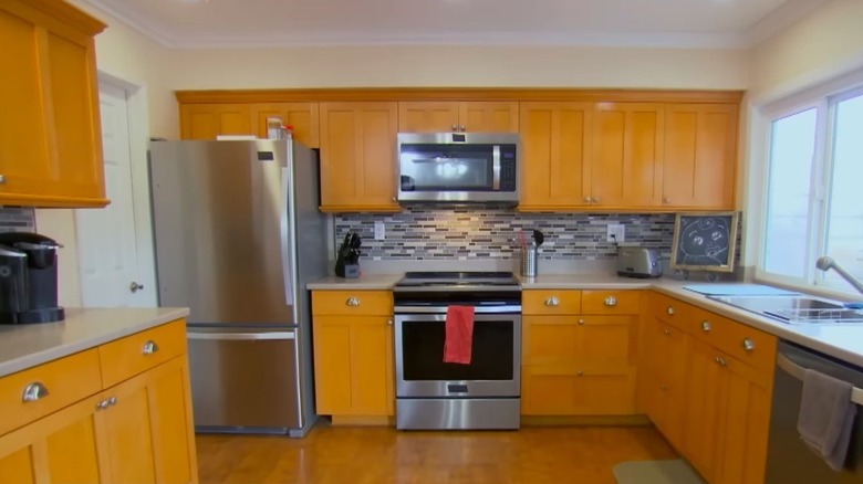
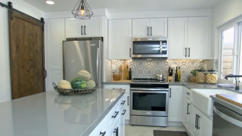
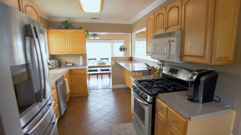
In this episode, Christina Hall tackled a kitchen remodel while going through the second trimester of her pregnancy. The pressure was on to finish the project before the baby arrived. If that wasn't challenging enough, she found herself caught in a design choice tug-of-war between her clients. While the husband wanted a sleek clean look, his wife looked forward to a boho-chic style. The existing kitchen was quite spacious. However, the unused space made it awkward. Its tangerine-toned wood cabinets were also outdated and felt monotonous.
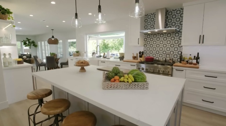
To mix apples and oranges, Hall had to be extra resourceful, using materials that best landed in the middle ground of her clients' varying tastes. For the backsplash, they settled with a white and grey tile design with a symmetrical pattern. She used grey countertops that matched the grey tile flooring. The cabinets were shaker-type coated in crisp white paint and fixed with black linear handles. A large island spread across the center, occupying the once empty space and providing additional work surface and storage. A pair of metal rod pendant lights hung above it to complete the look. The outcome made the owners happy and garnered multiple commendations from fans.
The blue and white kitchen of this San Diego beach house
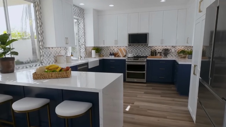
We have seen Christina Hall pull off some daring kitchen colors. However, this one from this San Diego beach house is possibly the most appreciated by fans. Though in relatively good condition, the previous kitchen did not appeal to its owners. Its overall look, including its caramel-toned cabinets and black stone countertop and backsplash, did not match their trendy style. The awkwardly small island also did not work for them.
After showing several options, the clients opted for a daring blue and white motif. The overhead cabinets and countertops were ivory white while they selected a deep blue for the lower cabinet doors and drawers. A fun criss-cross tile pattern decorated the backsplash, creating visual interest for the room. Instead of an island, Hall had a seated waterfall-edge peninsula which greatly improved the usage of space. One unique feature of the kitchen was a touch-screen monitor placed above the stove, giving it a cutting-edge feel.
Dark wood cabinets give way to modern farmhouse
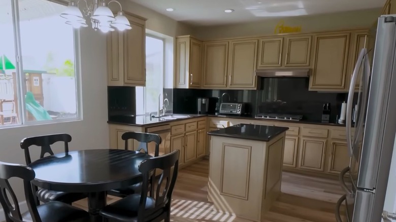
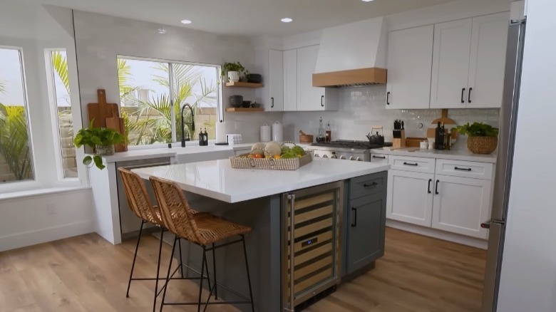
Anthony and Jenny's home had a pretty high-end kitchen — 10 years ago, that is. Their choice of dark wood cabinets and golden brown granite countertops were due for refreshing. The couple now wanted a brighter atmosphere with an inclination towards a modern farmhouse look with a subtle industrial touch. Apart from the appearance, the kitchen also had functionality issues, especially in terms of its cabinetry and appliance layout.
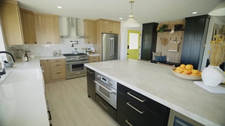
Our show host did a complete overhaul of the room. She replaced the cabinets with white shakers partnered with black hardware. Horizontal tiles were used for the backsplash and a charming apron sink was installed. Hall went on to add natural wood elements to the kitchen, as seen in the open shelvings and the beautiful wood lining for the custom range hood. A square island filled the central space, resting firmly on a handsome aqua smoke-colored bottom cabinet. Although the episode also showcased the transformation of other parts of the house, viewers were most impressed by Hall's work on the kitchen, placing it in a respectable spot on our list.
Beach house kitchen with pool view is a fan-favorite on IG
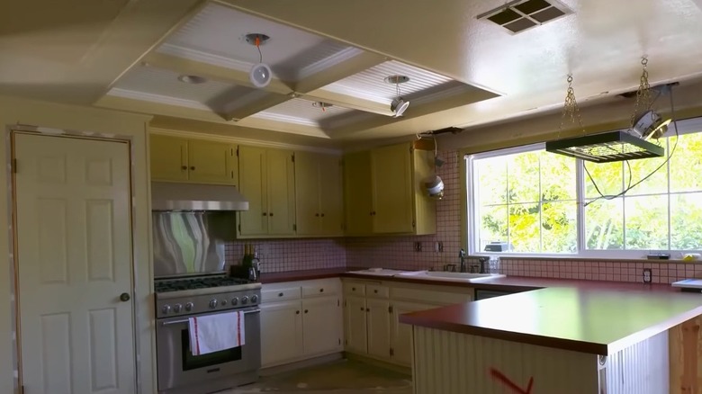
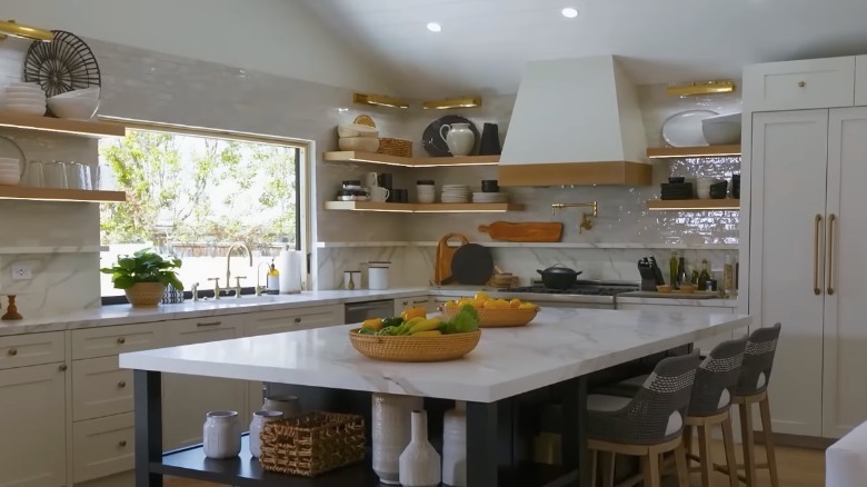
This was the episode where Christina Hall helped out her friend, George, a tile shop owner renovating his newly bought house. Our makeover star yet again found herself acting as a referee between the conflicting choices of her clients. George and his wife were struggling to agree on the design of their new home, leading the work to a standstill. Thanks to Hall's suggestions, the couple was able to meet halfway, finally giving clearer directions for their old, oddly decorated kitchen.
One of the biggest changes was reorienting the room to give it a view of the swimming pool in the backyard. A dramatic vaulted ceiling replaced the previous coffered type. From a rather bizarre red countertop, they switched to a modern marble style made of composite material. A combination of cabinets and open shelving hung from the walls while the rest was covered with special zellige tiles. An oversized island spread across the center. However, the most clever feature was the pool-view window that opened into a bar area built on the exterior wall. In an Instagram post, Hall asked her followers for their favorite among her kitchen designs, and this beauty was one with the most votes.
Mid-century modern kitchen for an empty-nester couple
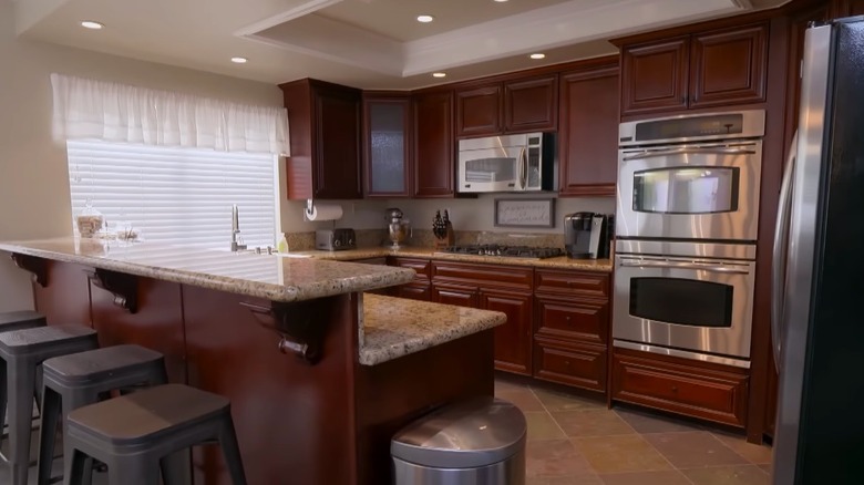
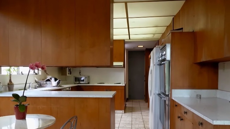
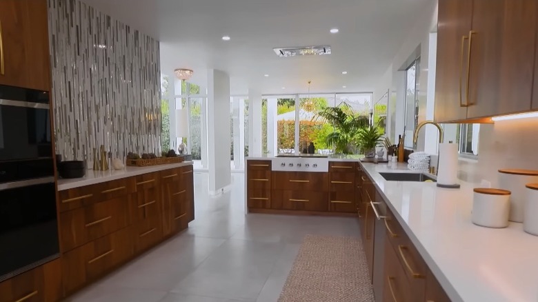
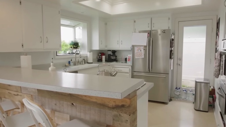
Next on our list is one of the most expensive kitchen renovations we have seen in the show. It belonged to an empty-nester couple who lived next door to Mike Rose, Christina Hall's contractor. The house was built in 1964 and still showcased its fascinating mid-century modern decor. While almost everything about the home was downright glamorous, its worn-out kitchen stuck out like a sore thumb. With the white appliances, laminate countertops, and illuminated drop ceiling panels, entering the room seemed like time traveling back to 50 years ago.
With an allocation of $100,000, Hall had big plans for the room to meet the clients' extravagant tastes. All elements were replaced. The cabinets were made of walnut wood while counters were quartz. Instead of an island, the designer decided on a large peninsula with a built-in range. A sparkly vertical tile backsplash served as an accent feature. Some audiences did complain that Hall went over budget in this project, costing the owners an additional $60,000. However, this was mainly due to unexpected yet necessary repairs. The final product still wowed a lot of viewers nonetheless and the episode received one of the highest number of positive comments on YouTube.
Boxed kitchen gets an open-concept makeover
A couple who saved up for the past 12 years asked Christina Hall to spearhead their much-awaited kitchen renovation. With a budget of $65,000, the experienced designer was eager to bring their dream space to life. Walls and columns separated the kitchen from the living area. These made it difficult for them to entertain guests while preparing meals. The two also had differing preferences in style — one leaning toward an all-white fashion and the other with a taste for the modern industrial look.
After replacing the structural blockages with steel beams and fixing an unexpected drainage issue, the client's budget was bleeding. Thankfully, Hall managed to source suitable materials without overspending further. These included new white shaker cabinets and quartz countertops. She also had an enormous six-seater island built in place of the old wall. Rustic steel frame stools ran along its length while romantic pendant lights illuminated it from above. One of the highlights was the one-of-a-kind leaf-shaped pattern backsplash that numerous fans have fallen in love with. The project is one of the most well-praised by viewers, with one YouTube comment calling it, "a dream kitchen that is worth waiting for."
Modern kitchen with a creative pop-up window
This kitchen was for another of Hall's friends, Berto and Ruby. While their house was in great shape, their kitchen was too small, especially when their relatives came over, something that happened on a weekly basis. The high-traffic areas often got congested and the storage and work surfaces no longer sufficed for the demand. The couple did have a wonderful outdoor space right next to the room where they usually entertained visitors.
This gave the designer the idea to create a food serving window that would connect the kitchen counter to the outdoor area. Moreover, she adjusted the layout to increase the room's floor area and make space for an island. New cabinets were installed together with black industrial-style handles. They went for an all-white look with the exception of the wall section behind the range hood which had a lovely tile pattern to serve as an accent. Several people cited this home as one of their favorites from Chrisitina's projects.
This beach-inspired kitchen that got fans raving
Christina Hall faced a kitchen scarred by wear and tear in this episode of "Christina on the Coast." You can tell from the rusting stove and peeled-off cabinet paint that the room had endured much. The lack of windows made it dim and limited the view of the property's stunning patio and the distant coastal waters. The homeowners also had issues with the size of the kitchen, stating that it was too small.
This project called for major updates on all sides. Hall and her team dismantled a wall section to expand the space. This gave way to a gigantic island that the clients personally requested to have. They raised the ceiling and covered it with new panels. The cabinetry, countertops, and appliances were replaced with more modern ones, while a beach-inspired stone backsplash was put in as well. After installing a farmhouse sink, they placed a large window above it that opened up to the outdoor space. "This has to be one of my all-time favorites," said one YouTube comment.
Dated tile countertop kitchen is given a high-end redesign
This episode is another kitchen-focused renovation that Christina Hall did for clients for Simon, a British ex-pat, and his wife Jetzabette. While they had done a splendid job updating most of their house, the couple had yet to tackle their decades-old kitchen with its old appliances and dirt-collecting tiled counters. The makeover expert moved ahead with a budget of $80,000, targeting the look of a modern craftsman-style home.
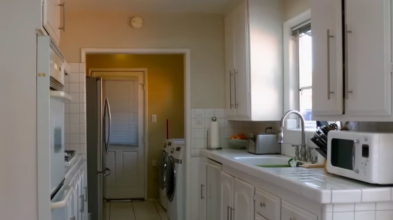
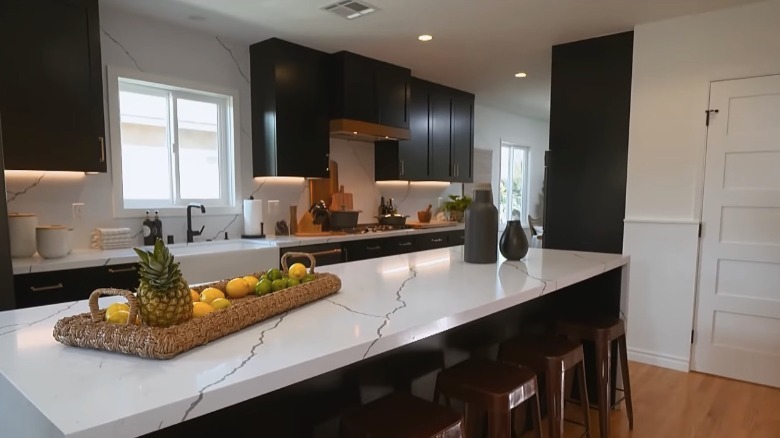
Since the clients already bought new appliances which were all matte black, they decided to go ahead and follow that motif for the cabinets. The crew removed two walls that previously enclosed the room. This made space for a massive waterfall island with a gorgeous marble-patterned quartz countertop. The same quartz material was used for both the wall-adjacent counters and the backsplash, creating a seamless look all the way to the ceiling. They also made changes to the layout. The laundry area that formerly conjoined the kitchen was replaced with a pantry. Even Hall's critics had to nod in respect after seeing the end result. "This is by far the best kitchen she's done," stated viewer Drew Conway.
Ranking methodology
We went through all episode recaps and selected the ones that involved redesigning the kitchen. Please note that we included episodes even if they did not focus on the kitchen alone. We read all comments, primarily on YouTube, and ranked them based on the number of positive comments specifically about the kitchen or features of the kitchen. However, we considered not only the number of commendations but the substantiality of each one too. We also assessed all the negative comments and weighed their validity. Additionally, we scanned through the Instagram account of Christina Hall and checked all posts about her kitchen designs.
