Married To Real Estate: 10 Best Kitchen Renovations According To Fans
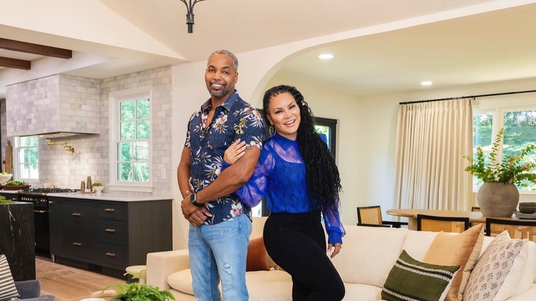
As real estate veterans, Egypt Sherrod and Mike Jackson know very well the importance of an impressive kitchen to a property sale. The celebrated hosts of HGTV's "Married to Real Estate" and reigning champs of "Rock the Block" have wowed us with their clever renovations that bring their clients' dream homes to life. "Kitchens sell houses" is a line we have heard Egypt say on numerous occasions and is surely reflected in all their projects.
Described by many as the network's best design duo, the Atlanta-based couple is now on the third season of their hit series. This is one of the ones we watch during the slow afternoons of our days off. (Yes. We write stuff about houses at work and we watch shows about houses when not at work. We cannot help it.) And we completely did not mind re-watching all its episodes to handpick the kitchen designs that won the hearts of audiences (ours included). Counting all views and reactions, and reading every single comment we can find, we bring you our list of "Married to Real Estate's" 10 most fan-favored kitchen makeovers.
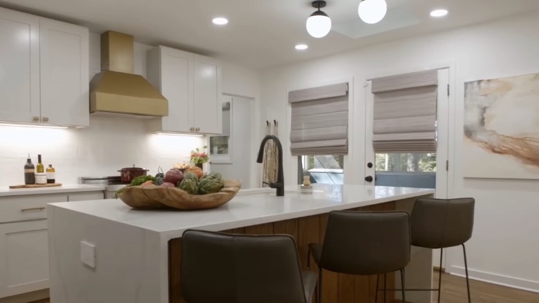
10. Outdated country home kitchen gets a swanky modern look
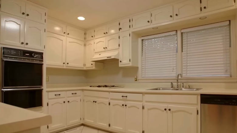
A young couple is ready to own their first property, but the house does not seem ready for them. Our makeover experts tackle a dated country home in this episode, including its all-white kitchen with old appliances. Aside from its monotonous appearance, the room was hidden behind a wall at the end of an elongated living and dining area.
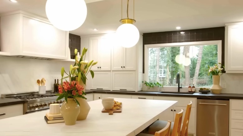
The wall was torn down, which created an unobstructed L-shaped layout and dramatically changed the atmosphere of the room. The crew added new cabinetries, pendant lights, and a dashing porcelain island that was much adored by its owners. Egypt played with a tuxedo look, with black stone countertops and upper backsplash contrasted by white cabinet doors. New stainless steel appliances were also installed. A breakfast table and a fancy dry bar were built on the other end of the room, adding more functionality to the space. "Ten out of ten," answered the couple when asked about their thoughts on their new kitchen.
9. Luxurious aqua smoke kitchen for a layout-troubled house
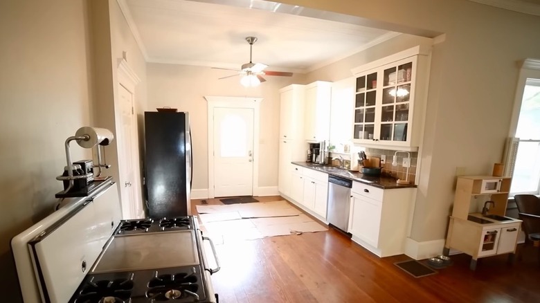
If you've been following the show, this problematic property is probably one that really stuck to your memory. In this episode, our duo had to solve a bungalow with a maze-like floor plan. Its kitchen, dining room, and living room were out of place at the back of the house and, even more bizarre, only accessible through the bedrooms. As if that wasn't horrible enough, its ugly metal stove was sitting awkwardly in the living area rather than in the kitchen.
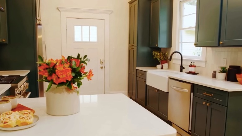
Not only did Egypt and Mike solve the space flow issue, but they also came up with an elegant kitchen design with a sophisticated aqua smoke hue, posh hardware, and yes, new and properly placed appliances. The final result left the owner at a loss for words. Clean white countertops contrasted the deep-colored cabinets while vertical tiles served as backsplash. It had more lighting, storage, and work surface, making it much more functional than before.
8. A half-done renovation turned into a dream ranch-style kitchen
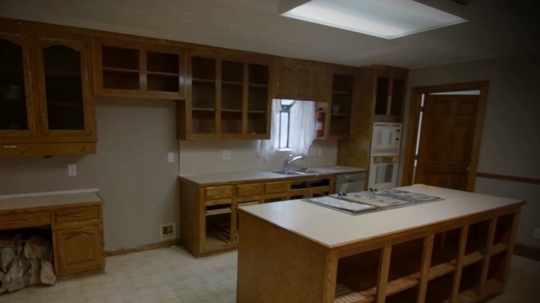
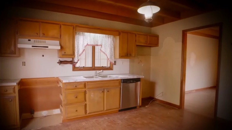
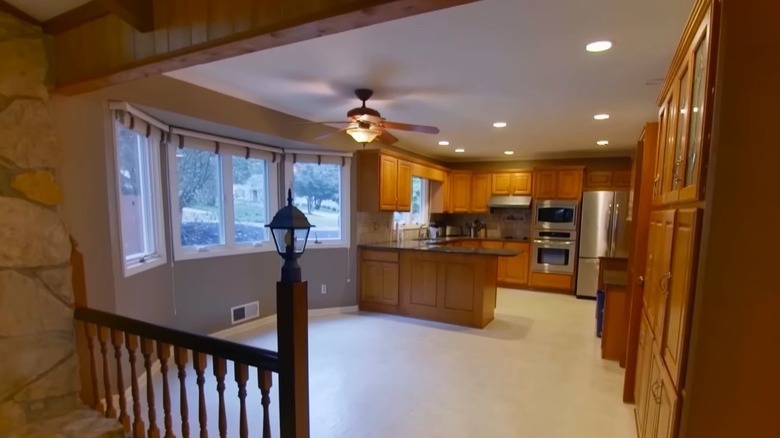
In this fan-praised episode, our real estate pros take on a renovation project for a couple who has been on the hunt for their very own ranch-style home. Egypt found a property that could be the answer to their dreams, but it just was not there yet. Its previous owner left it and its restaurant-sized kitchen in the middle of an unfinished renovation. Doorless cabinets covered one of the walls while old appliances and plumbing fixtures added to the room's unsightly state.
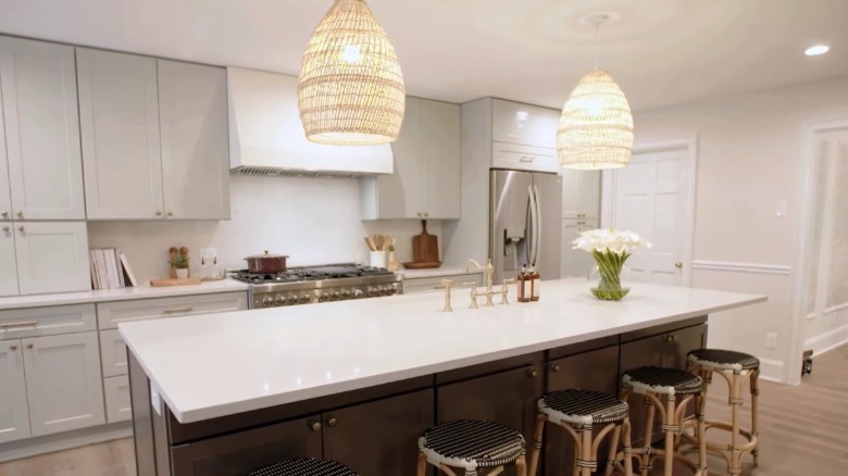
However, it was nothing that Mike and Egypt were not ready to handle. First, they broke down the long wall that separated the kitchen from the living and dining areas, dramatically opening up the space. Light-toned cabinets and hanging lamps gave the room a fresh and calming look. At Egypt's request, Mike had a charming breakfast nook built into what was previously an empty corner. A massive five-seater kitchen island with a bright white countertop was spread out at the center of the room. "This is unbelievable," gushed the ecstatic owners.
7. This kitchen with the unique coconut shell tile island
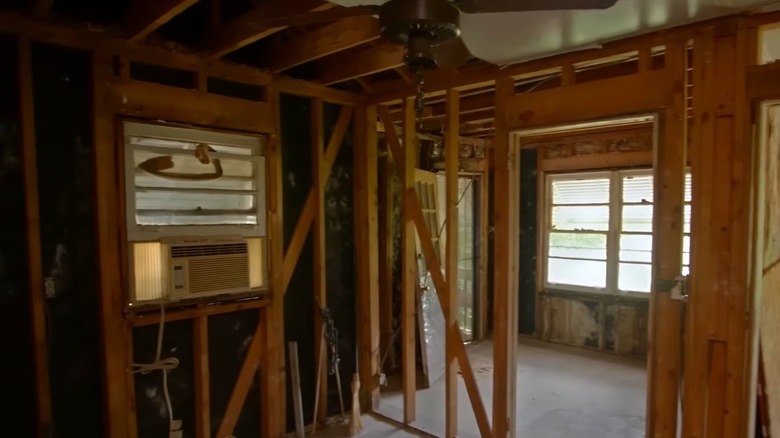
After his beloved father died from cancer several years ago, Gregory was left with his childhood house. He was planning to convert the property into a short-term rental business, but there was just one problem – it was nowhere near rentable condition. His dad intended to renovate the place and had already begun demolishing the interior. However, the project was cut short, leaving the rooms — including the kitchen — covered by a jungle of exposed wall studs and unaddressed structural issues.
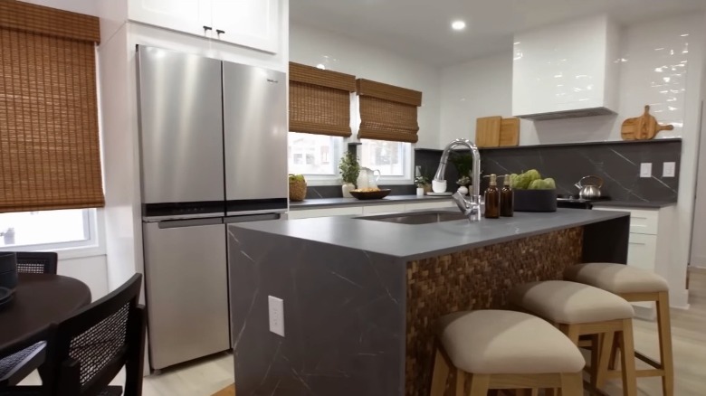
Egypt and Mike stepped in and not only finished the job but exceeded Gregory's expectations. The kitchen was a big highlight of the project with light wood floors, white cabinets, and gray stone counters. The most notable feature, however, is its waterfall island with a one-of-a-kind coconut shell tile siding that has the show's fans raving. "Very interesting!" said one comment on YouTube. Egypt installed them herself to add a touch of boho to the room. While it surely did that, the island also impressed the owners, admitting that it proved them wrong about not wanting an island in the first place.
6. A fireplace gives way to a stunning open-concept kitchen
Another young couple had their eyes set on a quaint cottage bungalow nestled right in their ideal location. Almost everything was ticking the boxes just fine — until they entered its spatially challenged kitchen. It was pretty tight with the fridge partially blocking the entryway, and the cabinets and counters were cramped into one corner while the other half of the room was left unused.
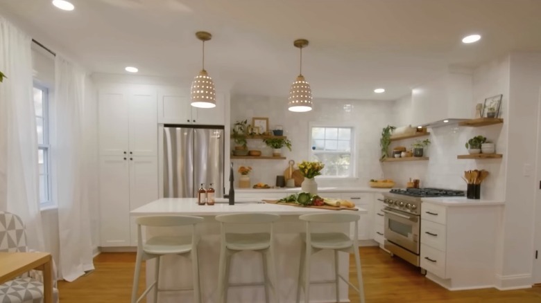
A wall with a gorgeous fireplace divided the living room and the kitchen, but the clients much preferred an open-concept layout. So our experienced renovators knew that they would have to take it down. While some viewers felt slightly disappointed to lose the fireplace, it did give way to a much more spacious interior. The team followed through by installing new floors and cabinets. Egypt went for a sumptuous all-white kitchen with open wood block shelves and stylish matte black hardware. It was arguably one of the biggest transformations done on the show and also drew one of the most joyous reactions from a client.
5. This picturesque farmhouse kitchen for an expecting couple
In this episode, Egypt and Mike help a young family intent on starting their own farm. The pair found a property for them with the acreage and environment that the clients were looking for. However, the house that came with the lot needed some serious refurbishment. The kitchen was a particular concern for the new owners, who stated that it felt way too small, and that it needed an island, more light, more storage.
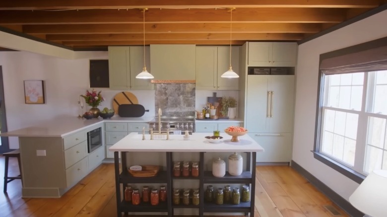
Rather than work with the existing space, Egypt had the brilliant suggestion of building a new kitchen in the enormous hall adjacent to it, switching its location with the dining area. The crew practically had to create the entire room from scratch, beginning with little more than bare walls. Mike laid new pine wood floors and new cabinets were painted with a warm green coat. A kitchen island with a quartz countertop and a brass faucet sink was also added. Above it, two pendant lights were suspended from the ceiling wood beams to brighten up the work surface.
4. A sunroom transformed into a daring green and white kitchen
Every avid follower of the show will likely remember this bold undertaking. A family is eager to finally transition from being renters to homeowners. Their chosen house had a lot to boast about, but it came short of meeting their room requirements. To accommodate the client's needs, Egypt had to make big adjustments to the floor plan, which included converting a sunroom into a new kitchen.
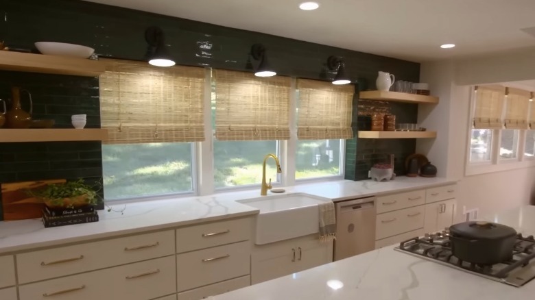
The project certainly called for daring measures including the removal of a stone fireplace and using a prominent green shade that the clients were reluctant about. Nonetheless, the two network stars pulled it off together with white stone countertops, white cabinet doors, polished golden hardware, and open wood laminate shelvings. Though some fans criticized the decision to go against the owner's preference, the episode is still the show's most viewed and most liked episode on YouTube, therefore earning it its lofty spot on our list.
3. Classy off-white kitchen for a young family with dogs
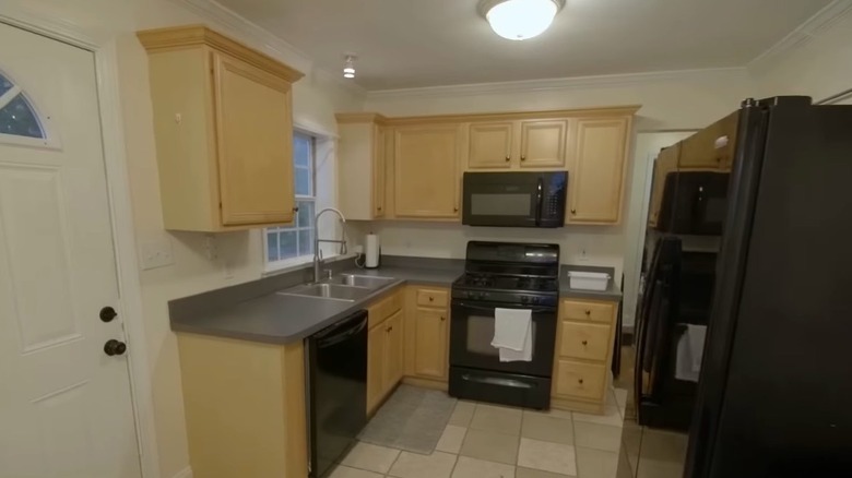
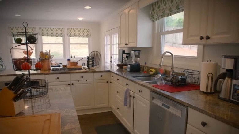
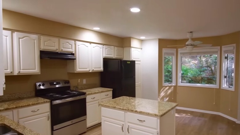
A husband and wife with their new baby and three dogs are moving back to Atlanta after devoting some time to their work in Kansas. Egypt found a lovely property that met most of their requirements on paper, although its style left a lot to be desired. The kitchen's tight layout and dark wood cabinets did not appeal to the young couple, while its signature '90s look with white laminate countertops and matching white appliances also needed updating.
Mike thought right away of moving a wall section that divided the kitchen and the dining room. This would expand the space to more than twice its previous size. However, it required installing an enormous steel beam to compensate for the lost vertical support. As if that wasn't difficult enough, his crew even managed to add a skylight for a burst of natural light. Instead of plain white, Egypt convinced the owners to go for an off-white Collingwood shade which they used for the new cabinets. She also orchestrated a mixed hardware look with brass cabinet handles and a black gooseneck faucet. Another pleasant surprise was a drinking and feeding station for their canine friends.
2. Mid-century kitchen is given a gorgeous makeover
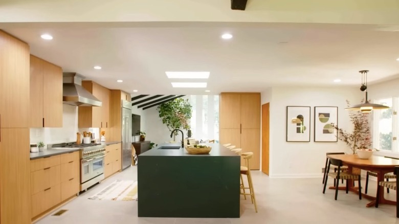
In this episode, our property specialists are challenged with a redesign project for another pair of first-time buyers with a taste for mid-century homes. The property that Egypt had for them possessed the specific architectural style they wanted, and it was also in excellent shape considering its age. However, the buyers longed for a more modern interior. "Almost everything in this kitchen has to go," said the couple upon taking a good look at the vintage-looking kitchen.
After closing the sale, the crew started right away with demolition. Since the fixtures were in great condition, Mike opted to donate the kitchen cabinets, a decision that was appreciated by many of the show's viewers. He then replaced them with a new set that was custom-built. In fact, all the kitchen elements were replaced — paint, backsplash, flooring, appliances, and lighting. A huge island with double-sided storage was also put in. While both the clients and fans were impressed by the project as a whole, this beauty gets credit for the positive comments pertaining directly to the kitchen.
1. Modern kitchen that shocked first-time buyers with high expectations
In this episode, our real estate duo works with a young couple who are looking to buy their first home, and they have pretty high expectations about it. Among their primary requirements is a modern, spacious kitchen. The house that the team found for them did have a good-sized kitchen, but it was not bright and modern enough for the client, describing her feeling as a bit claustrophobic.
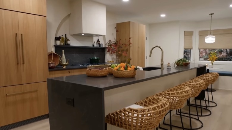
Mike and his builders took out a wall section to open the space further, which also created more room for a bigger island. They developed a symmetrical wall layout with wood-style cabinets, fluted wall panels, glassy gold hardware, and a range hood adorned by a recessed semi-circular wall arch. Gray stone countertops were used, including the new six-seater waterfall island. Egypt also had the idea of creating a bench for the existing bay window, which the owners liked very much. The jubilant clients had nothing but compliments about their new home. Multiple viewers also hailed this project as the best the show's hosts had ever done. "The kitchen is exquisite!!" exclaimed fan M Jones in her comment on YouTube, and the makeover got 30,761 likes after Egypt shared the kitchen photo on her Instagram account.
Ranking methodology
After going through the episodes, we came up with a preliminary list including only the ones which involved substantial changes to the kitchen. To fill the 10 slots and to determine the ranking, we assessed the candidates based on several considerations. Primarily, the top spots were given to episodes that earned the most positive reactions and comments on social media that pertained to the finished kitchen. These include mentions of specific features of the design and the manner of the execution. Both the volume and expressiveness of the comments were taken into account. Negative feedback was evaluated in the same way. HGTV's official YouTube channel served as a key resource. We also picked out Instagram posts shared by the show hosts which primarily featured the kitchens they remodeled.
