Rounding Up The Best Kitchen Makeovers We've Seen From HGTV's Hilary Farr
We may receive a commission on purchases made from links.
As the hub of the home and the room that will sell a house when you come to list your property, the kitchen is undeniably one of the most important areas in any dwelling. It makes sense, then, that this is where many families focus the bulk of their renovation budgets to get the cooking space of their dreams.
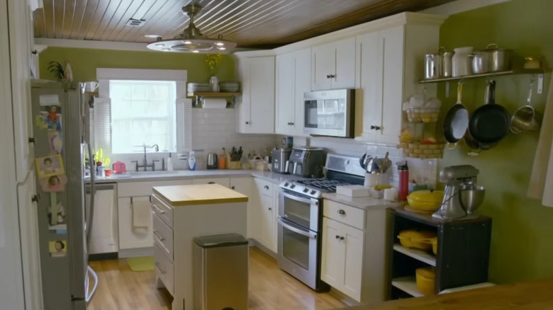
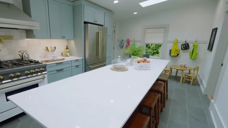
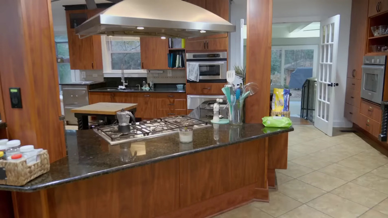
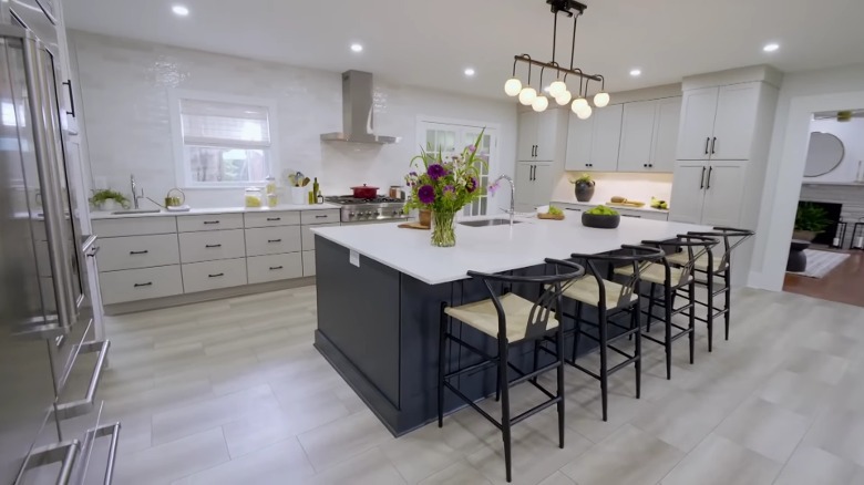
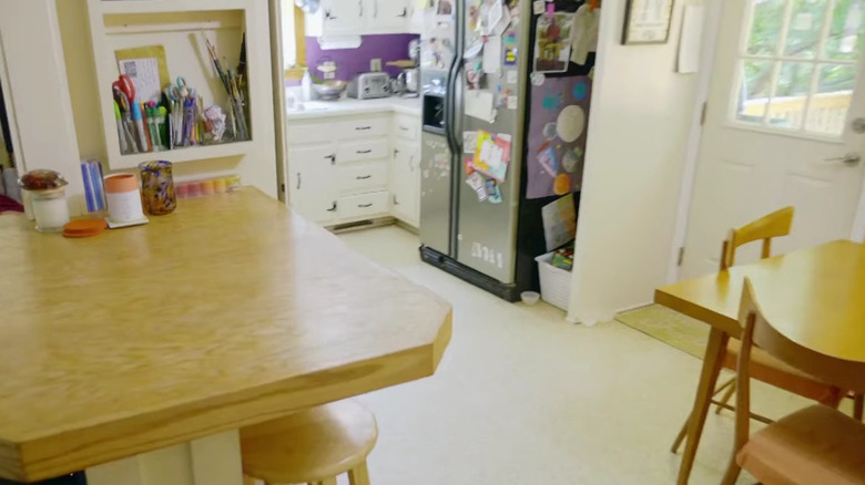
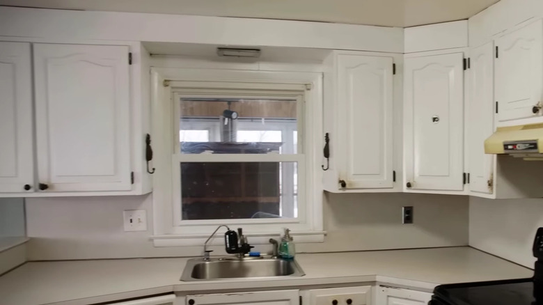
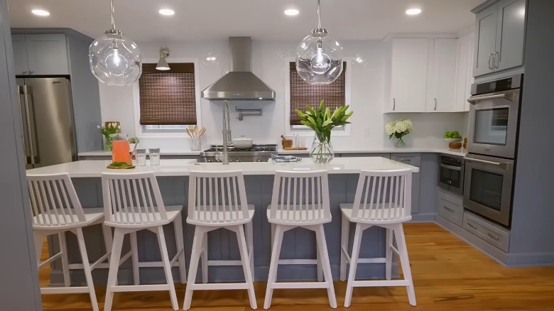
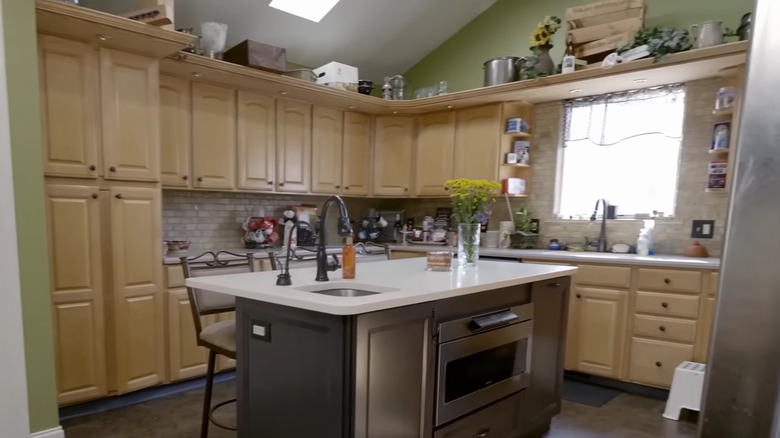
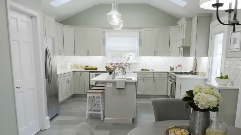
Seeking inspiration? We've got you covered with this roundup of the best kitchen makeovers designed by celebrity interiors expert Hilary Farr. The first image of each example is the "before," and the second shows how Farr transformed it into an "after." With a long list of show-stopping makeovers in her portfolio, it's not hard to find some phenomenal examples of kitchen renovations to stimulate those create juices. These are the best we've seen so far, using a methodology that includes fan comments, number of views, and number of likes on social media. Starting with "great" and working up to "even greater," these revamped cooking spaces will give the amateur home designer plenty to think about.
Ultimate family kitchen
The kitchen transformation Hilary Farr delivered in Season 2, Episode 5 of "Tough Love With Hilary Farr" shows us how a space that accommodates the needs of both the adults and young children in a family can be visually beautiful as well as perfectly functional. With almost 40,000 views on YouTube, this makeover — in particular the cabinet color – was popular with fans. Farr describes this space as a "chef's kitchen" because of the sheer amount of storage, preparation space, and high-end cooking appliances. This is at odds with the original kitchen which was cramped and seriously lacked storage. The new room works for children, with a special area where kids can sit at a small table to draw or craft while watching TV. There are also low-height hooks where children can hang their coats, and a bench for storing shoes to keep clutter at bay.
Despite the amount of features Farr has fitted into this kitchen, it still feels open and airy. She comments, "One of the reasons this kitchen feels so spacious is we haven't given you a lot of upper cabinets ... all the storage is beneath." If you want to fit a lot of elements into your kitchen and are worried about making the room feel cramped, you can follow Farr's lead and pass on wall cabinets. By doing this, the sightline can be extended further because it isn't interrupted by bulky wall units.
Enormous multi-functional island
Hilary Farr installed a titanic island in the family kitchen seen in Season 2, Episode 1 of "Tough Love With Hilary Farr," replacing an awkward layout that didn't make practical sense for the family. It fulfilled a multitude of needs, much to the delight of the 42,000 viewers on YouTube. With four bar stools, the room can accommodate the whole family at mealtimes, or it can be a place for children to hang out while parents are cooking. The island houses a wide range of under-counter units to maximize storage, and it also features a sink. Farr explains that the island is designed to increase family time. She says, "You and the family can be here, the kids can be here doing homework or whatever, chit-chatting while you're preparing meals. It's a way to bring everyone together." In terms of style, the previous design was dark and oppressive, so the designer brightened up the space with neutral décor and white countertops that bounce light around the room.
If you have a large space, it's an ideal opportunity for an island. This popular element can become the central feature of the room where the family can congregate at various points throughout the day. Encourage teens to spend more time with you in the kitchen by installing power sockets on the island where they can charge their phones or laptops. These sleek pop-up power stations from S-BOX provide functionality without compromising on style.
Striking backsplash
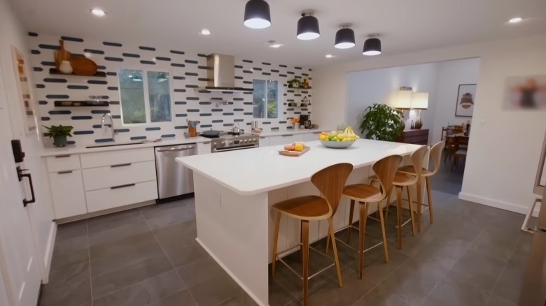
The "before" kitchen in this transformation was modern and spacious but lacked personality. From a design point of view, the color choices Hilary Farr made in Season 2, Episode 10 of "Tough Love With Hilary Farr" feel quite safe and almost bland since almost everything is white or gray. However, the addition of the bold teal-and-white patterned backsplash makes for a striking focal point and transforms an otherwise bland room into a stylish haven. Fans on Instagram were overwhelmingly impressed with the unusual choice of tile, declaring "Best episode so far," "Super love the teal tiles in the backsplash," and "That reno is outstanding ... love everything, especially the kitchen." One keen-eyed viewer commented, "Totally nailed the mid-century modern aesthetic of the home. I love the consistency of style and all the pops of color."
Take a leaf from Hilary Farr's book and opt for timeless colors when it comes to countertops and units; then get creative with your backsplash. Selecting neutral shades for the more expensive components of a kitchen can help to futureproof your home, while the more affordable parts like a backsplash could be swapped out to suit your changing tastes or trends. If creative backsplash ideas for your kitchen feel too risky, consider adding less permanent pops of color to your cooking area, like these quirky salt and pepper mills from Wayfair. This is a safer way of testing the waters if you want to experiment with different shades.
Two-tone cabinets
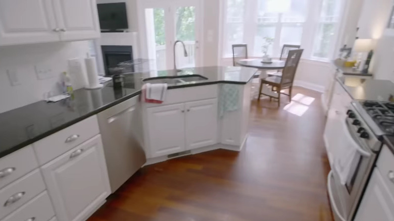
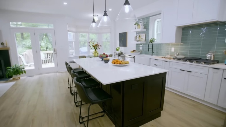
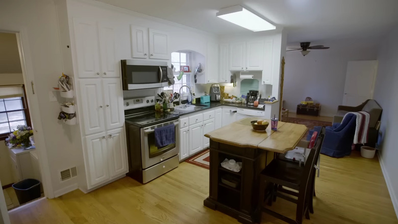
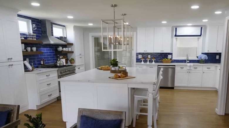
The kitchen Hilary Farr designed in Season 2, Episode 8 of "Tough Love With Hilary Farr" aimed to convert gray-obsessed homeowners to a more vibrant way of life. The old room had a bland white kitchen and an awkward layout that limited the way the homeowners could use the space. To improve this, Farr chose a huge black island set against a wall of white cabinetry. The sky-blue subway tiles used for the backsplash help to break up the two-tone look and add a pop of personality. Achieving over 50,000 views on YouTube, this kitchen makeover proved so shocking that fans could barely recognize the space. One fan commented, "This turned out absolutely stunning!! Once they got to the kitchen I couldn't believe it was the same house! I love the adorable window above the sink."
To prevent the hub of your home from feeling too monotone, you can implement contrasting elements. Like Farr, you could opt for two different colors of kitchen cabinets, or you could create contrast with a bold countertop or backsplash tile. You can find your perfect color palette using the color wheel. Do this by identifying a color you like for your kitchen, and then look to the opposite color on the wheel. This will be your contrasting shade.
Scandi style kitchen diner makeover
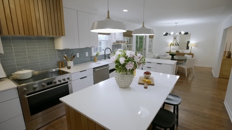
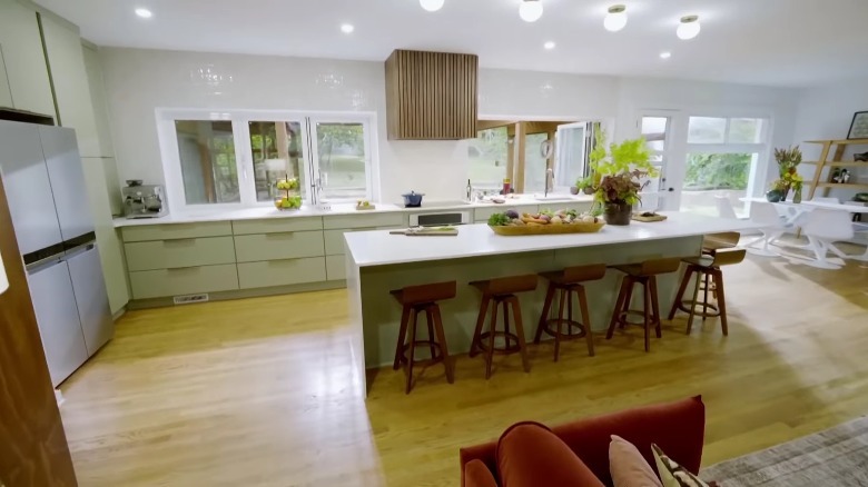
In Season 2, Episode 2 of "Tough Love With Hilary Farr," the designer demolished a laundry room, small kitchen, and separate dining room to create one expansive kitchen diner. Previously, the kitchen felt more like a corridor rather than a room in its own right, so Farr had to work to create a new downstairs layout that would flow more freely. She created a sleek and bright modern look that wasn't short on warmth thanks to wooden features like hardwood flooring, a wood-paneled kitchen island, and a wood-slat range hood. This makeover proved popular among fans, with over 56,000 views on YouTube.
The feel of this stunning transformation could be replicated in any kitchen by utilizing wooden accents alongside simple white countertops and cabinets. The standout feature of the kitchen Hilary Farr designed is the wood-slat range hood, which makes for a striking focal point while also tying together the whole neutral color scheme. For the perfect Scandinavian-style kitchen, you could invest in a wooden paneled hood such as one from the wood-hood range by Stanisci Designs. Alternatively, give your existing appliance a Scandi-style upgrade by gluing wooden slats to the outside of it.
Bold and colorful statement
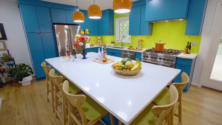
The original cooking area in this renovation was cramped and cluttered. It was tucked into an alcove to the side of a dining area and dominated by a refrigerator. Hilary Farr opened up the space to make it more usable and implemented a vivid color scheme that was very different from her usual palette. While it was a divisive design for many fans, plenty of Farr's Instagram followers went wild for the breath of fresh air it brought to their screens. Users commented, "Love the colors in this kitchen" and "My dream kitchen and colors!"
The color-loving homeowners in Season 2, Episode 9 of "Tough Love With Hilary Farr" select blue cabinets. Farr pairs this with lime walls and white countertops to ensure the bold colors don't become overwhelming. Referencing the green walls next to the bright cabinets, she explains, "This has created what we wanted, which is the statement when you walk into your house. This is what tells everybody who you are."
You don't always have to use neutral or earthy tones to create an impressive kitchen. If you want to make a statement with color, opt for a bold shade on your cabinets, or a vibrant backsplash. If bright green walls send you running for the hills but you're still interested in adding personality to your kitchen, you could accessorize with vibrant shades. This vivid orange vase from Wayfair would make a statement on any kitchen windowsill.
Stacks of storage
The homeowners in Season 1, Episode 6 of "Tough Love With Hilary Farr" have a problem with storage — or more accurately, the lack of it. The original cabinets occupy a small corner of the room, and they are narrow in size which makes putting away plates and food a challenge. They are also dated, worn, and in need of some serious attention. Farr solves this issue by installing a new range of different storage solutions in the kitchen, including an island with under-counter cabinets, wall cabinets, larder cabinets, and open shelving on the walls. The designer comments, "Storage, storage, everywhere you look there is storage."
If you have more dishes than you can count, upgrading your kitchen to include clever storage features can make your space feel more organized and less cluttered. Consider additions like a freestanding butcher's block with drawers or a wall-mounted shelving unit. Upgrading your space while saving money is also an option if you're handy with some basic tools. Consider the addition of some DIY shelving ideas that'll give your kitchen the extra storage space it needs.
Spacious family kitchen
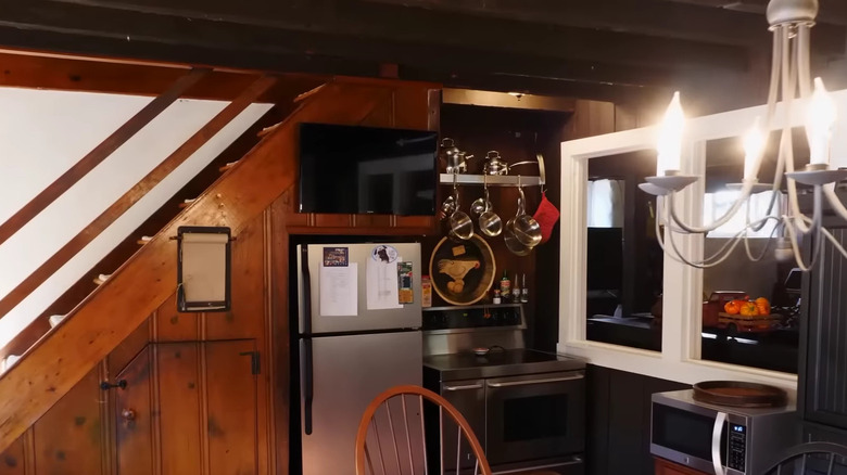
Hilary Farr addressed the concerns of the homeowners in Season 1, Episode 3 of "Tough Love With Hilary Farr," who had to take meals in shifts because there wasn't enough space for everyone to eat together. The original compact, dark wood kitchen was next door to the living room, so the designer knocked down the wall between these two rooms to open up the space. By installing a breakfast bar on the new island with space for four diners, an extra-long dining table with eight chairs, and three window seats, Farr created enough room for the extended family to enjoy mealtimes together. In terms of style, this generously proportioned kitchen was treated to a modern makeover with classic design features to pay homage to the origins of the century-old property. "What's striking is the amount of light that is coming into the house right now," the homeowner states.
Struggling to accommodate your whole family in your home at mealtimes? Knocking through two rooms to create one larger open plan can work wonders. While you won't be increasing the square footage of the space, it becomes a lot more usable and visually feels much larger because the sightlines are dramatically extended. For a similar style where tradition meets contemporary design, use Farr's tip of keeping everything simple and clean while making a feature of the backsplash with interesting tiles like this porcelain mosaic example from RONA.
Open-plan barn renovation
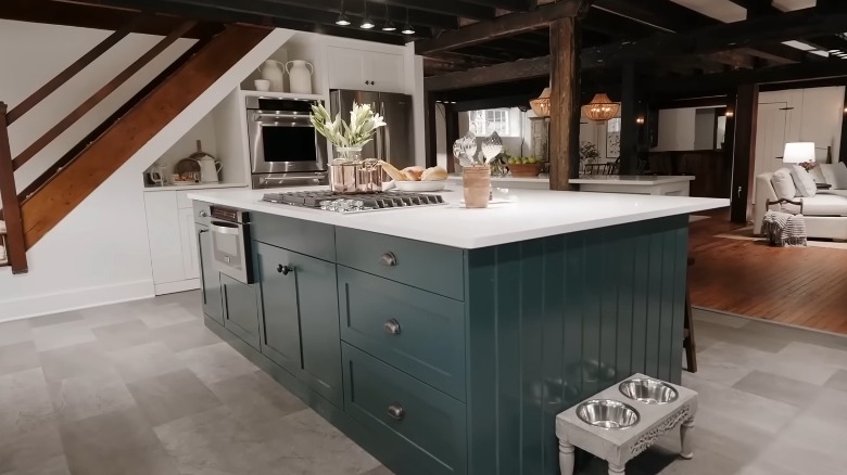
In Season 1, Episode 7 of "Tough Love With Hilary Farr," the designer tackles an old barn conversion that struggles with dark and gloomy rooms. She creates an entirely open ground floor space with a kitchen, dining room, and living area. The kitchen makeover, which has 68,000 views on YouTube, is truly spectacular. It features exposed beams on the ceiling to highlight the history of the property, and shaker-style cabinets teamed with a solid stone countertop for a modern twist on the traditional farmhouse style. Farr improved the oppressive kitchen by opening up the layout and replacing the dark wood units with a powder blue island.
It can be difficult to distinguish separate areas in a space that's open plan, but Farr pulls this off by using an island to physically separate the kitchen from the living room. She also opted to use different floor coverings in the kitchen compared with the rest of the ground floor, which highlights this as being a separate room despite the lack of walls. This is a great tip to follow in your own home if you want to set distinct areas in an open-plan living space. To ensure your dining area is identified as separate from your kitchen in such a space, set an area rug like this one from Target under your table.
Mid-century modern indoor-outdoor kitchen
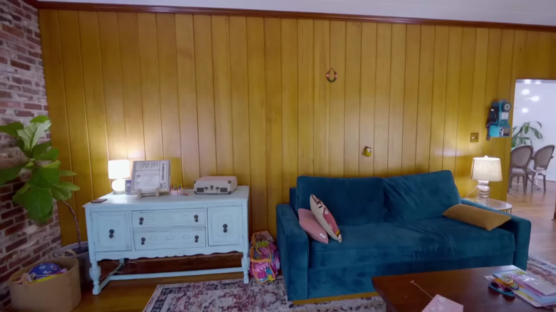
In Season 2, Episode 6 of "Tough Love With Hilary Farr," Farr worked on a 1950s-era home, transforming the dated and dingy living room into a bright, airy, and stylish cooking space. She opted for a mid-century modern-inspired design that was in keeping with the original style of the home, yet added plenty of contemporary touches to make the kitchen feel modern and functional. The homeowners wanted a patio space that felt connected to the interior of the house, so Farr created a pass-through via the kitchen window.
Use this genius solution to make your own indoor-outdoor kitchen adjoined with your patio. This can be accomplished with bi-fold windows such as these by Sierra Pacific Windows. If you're inspired by the interior design of this kitchen, along with the 80,000 people who viewed the makeover on YouTube, consider furniture ideas for a mid-century modern home that you could use in the kitchen, like these bar stools from Wayfair.
Open-concept kitchen and lounge
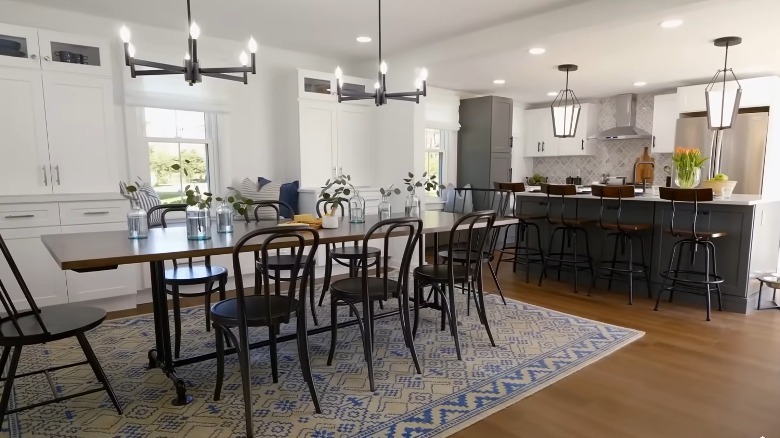
Hilary Farr demolished several walls for the homeowners in Season 1, Episode 5 of "Tough Love With Hilary Farr" to create an open-concept living space consisting of the kitchen, dining area, and lounge. She removed dated white cabinets from the original room and replaced them with blue-gray units and stylish white marble countertops. The result? A significantly more family-friendly functional space, where all the household could congregate together while enjoying their own activities in stunning surroundings. With over 84,000 views on YouTube and many overwhelmingly positive comments, fans received this renovation project very well.
If you want to spend more quality time with your family, opening up the layout of the living areas in a home is an ideal way to achieve this. Teens could be hanging out in the lounge while you prepare food in the kitchen. It's a floor plan that works especially well for families with young children because it means you can keep an eye on them without taking them with you each time you go to a different room. Knocking down the downstairs walls of your home can also be a sound investment if it increases the value of your home and makes it more appealing to prospective buyers. This tactic has been around for many years now, but it's not showing any signs of getting old. In fact, real estate agents say the open-concept kitchen trend won't be going away anytime soon.
Fan favorite gray kitchen transformation
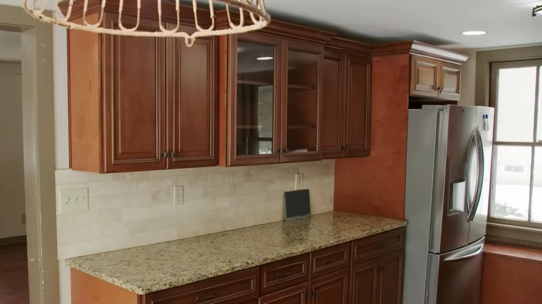
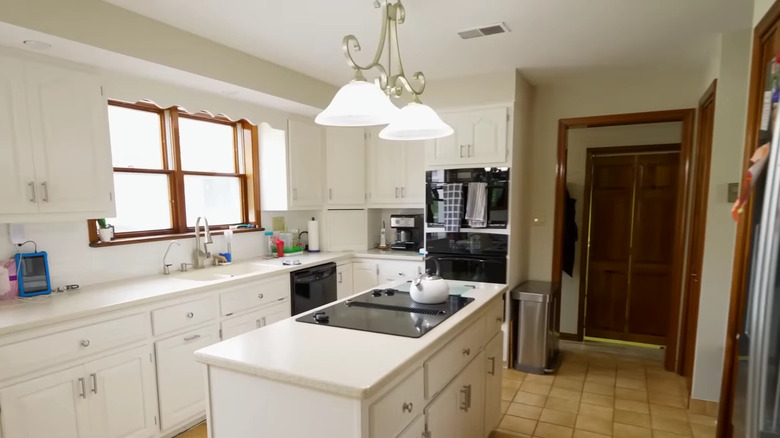
With a whopping 85,000 views on YouTube and a stream of likes and comments on Hilary Farr's Instagram, this remodel stands out as the ultimate fan favorite. The designer was working with a large kitchen in Season 1, Episode 4 of "Tough Love With Hilary Farr," but unfortunately, the wooden cabinets made the space feel old-fashioned and oppressive. By opting for cabinets, flooring, and backsplash tiles in a pale shade of gray, she transformed this unloved kitchen into a bright and elegant hub of the home.
Gray can be a dull color depending on the shade you select. To get the fresh yet welcoming vibe that Farr has achieved here, you should choose warm shades of gray with undertones of orange, red, or yellow. Avoid gray colors with blue or green undertones as these will read as cold. Versatile Gray by Sherwin Williams and Revere Pewter by Benjamin Moore are both warm shades of gray paint to use. The combination of warm and cool tones in these paints means they can be simultaneously crisp and comforting, making for a modern and warm kitchen.

