The Popular Kitchen Feature Jenn Todryk Demolished And Why You May Want To, Too
Kitchen layouts can be a huge factor in how well a home works stylishly and efficiently. Awkward placement of appliances, counters, and cabinetry can make a substantial difference in how we use and perceive the space. HGTV's Jenn Todryk is known for her low-impact transformations of spaces on her show "No Demo Reno," some of which involve small but significant tweaks in how the space works. As an alternative to shocking down walls and completely remodeling an L-shaped kitchen in a recent episode, Todryk instead opted to remove a large split-level boomerang-shaped island in the center that blocked off both traffic and sightlines between the kitchen and dining space, replacing it with a simple rectangular island in a uniform height. The results open up the kitchen significantly and deliver the entire kitchen into this decade.
Scaling the island down to one uniform level allows it to retain its original functional amenities like a sink, counter space, and seating, but in a way that does not block off the room as much. A well-placed rectangular island saves space both at floor level and higher, which can be a great solution if you are looking to open up the dimensions and flow in any kitchen. It also removes a rather dated configuration that was strangely shaped and really too high for the seating side to be of use to the family and their small children.
Pros and cons of split-level islands
Once very popular in late 20th and early 21st century new constructions and renovations, these sometimes strangely shaped dual-level islands and peninsulas were often a way to achieve an open-concept feel, but still allow some blockage of sightlines into the work area of the kitchen. The higher counter portion, usually bar height or higher, would not only separate the open-concept plan by its placement but offer seating at the higher end. It was frequently, like in the episode, used as a way to cordon off a corner or L-shaped kitchen from other living spaces like dining rooms and living rooms on the other side of the seating counter.
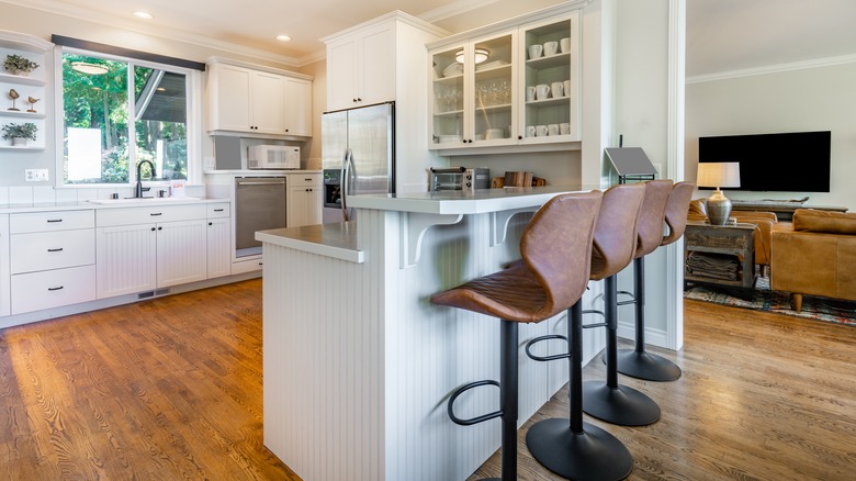
The results, however, as time wore on, proved to make these less practical. They were often quite large and cumbersome to look at and maneuver around. The higher counter was sometimes uncomfortable or difficult to sit at for long periods. The different levels made it more difficult to use that extra space since you had to walk around the island to access it. Because they were so high, they often blocked light flow and negated the open-concept feeling they were meant to embrace. While they are still incorporated into kitchen island designs today as seen in the photo above, they are usually less hulking and more subtle in their height variations.
Alternatives to split-level islands
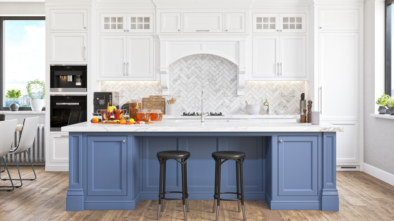
Jenn Todryk's alternative kitchen island in a streamlined single height is a great swap for large bi-level islands of old, giving the same functionality, but in a fresher and more carefully appointed way in line with today's kitchen trends. It's an approach she has taken before, in another series remodel that removed a split-level peninsula with great results, replacing the dual-height counter with a slender single-height surface that separates the kitchen from adjacent spaces.
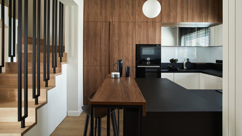
If you still like the benefits or look of a split-level island or peninsula without the drawbacks, consider scaling down the overall size with a more subtle differentiation between levels of the counter, which makes both spaces more usable and eliminates the uncomfortable high seating problem. A slenderer version in the center of the kitchen is much easier to reach across for both the chef and those seated without having to get up and walk around.


