Our Interior Design Expert Weighs In On Jenny Marrs' Anti-Paint Powder Room Design Choice
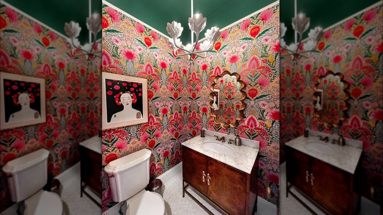
Since powder rooms tend to be smaller spaces, many homeowners overlook them. Jenny Marrs proved in an Instagram post that the small bathroom can handle a bold design. Though a powder room is a small room in the grand scheme of your home's design, that doesn't mean it has to be an afterthought. House Digest garnered insight on this design choice from Carissa Henderson, interior designer and design coach at A Bold New Hue, LLC in an exclusive interview. "A powder room is absolutely one of the perfect places to go bold with your color and wallpaper!" Henderson said. In small spaces, bold design choices can often be more impactful and unexpected, creating a fun and hidden standout feature.
Plus, there are some perks to designing a smaller room. "For starters, there is less surface area to cover, which means it is cheaper to wallpaper than other rooms," Henderson explained. "This is your place to splurge on that wallpaper or patterned tile that you have been loving, but it's just right out of range. If you only place it in pops such as over the sink or even on the ceiling, it can make such a statement and still be generally cost-effective." Half bathrooms tend to be between 11 and 20 square feet, depending on the home. These sizes of rooms would usually only require one or two rolls of wallpaper, which means you can opt for something a little more expensive without expanding a budget as you would in a larger space.
Mix and match for a bold bathroom
However, cost isn't the only reason why wallpaper is a good option for a powder room. It also allows you to be a little bolder with the design. "Another reason is, since there is less furniture and accessories in a bathroom, it makes it easier to go a little bolder without overwhelming yourself as a beginner to the pattern mixing world," Carissa Henderson exclusively told House Digest. "The less furniture and accessory items you have to mix and match with, the easier it will be." Powder rooms tend to only have a toilet and sink as fixtures. Fewer elements to work around is a benefit in this case, especially since these fixtures tend to come in neutrals that would work with a variety of patterns.
Mixing patterns doesn't have to be intimidating. Henderson has an approach that is almost scientific. "All you have to think about is balance in the space, spreading colors evenly throughout the room, and making sure you are contrasting appropriately," she explained. "For patterns, mix soft lines with straight lines, small-scale prints with large-scale prints, and light backgrounds with dark backgrounds." Contrasting elements and balancing those details throughout the room helps create a cohesive design. Henderson gave an example of pairing small-scale geometric tile with a wallpaper that has a large-scale abstract print in the same color scheme. The similar colors help the elements relate to each other, and the scales of the prints balance each other while still being a statement.
Creating a color scheme
Creating a cohesive color palette has a similar approach to mixing and matching patterns. And, you can often use elements that would naturally be in a powder room to help pull the look together. "[T]he easiest starting point is to have a dark shade, a lighter shade of that same color, a neutral color, and if you are feeling extra frisky, a bold color pop," Carissa Henderson explained in her exclusive interview with House Digest. Insert any colors into this basic guide and you'll get not only a color scheme that works together but one that has balance.
Henderson also explained that these colors can be spread around through different elements in the room. "For example, you can have a dark blue ceiling, light pink walls (that light pink acts as your neutral), light blue towels, and maybe a color pop of coral," the designer said. "Then just balance out colors around the space." Spreading the colors out helps to pull different details of a powder room together, making for a more cohesive design.
With powder rooms, sometimes standard design rooms can go out the window. "Just because it is a small room doesn't mean that you have to do light and soft colors," Henderson said. "A dark and moody space can be really powerful and peaceful as well." Ultimately, powder rooms can be their own moment. They don't have to follow the rest of your home's design scheme or color palette. The small square footage presents big opportunities.

