11 Outdated Design Trends That HGTV's Hilary Farr Is Over Seeing In Homes
Hilary Farr knows a thing or two about bad design trends. The star of HGTV's "Love It or List It" and "Tough Love" has spent decades gracing our screens and fixing up homes. In that time, she's come across some real design faux pas — yet at some point, most of these missteps were the hottest trends. When designing and decorating your home, it can be hard to keep up with what's in and what's out, but Farr has never been one to not keep it real. This list is the no-nonsense round-up of all the outdated design trends she is so over seeing in homes.
You might take offense at Farr's thoughts, as you actually love your bright kitchen walls (thank you very much). Or, you might also agree with her, because the wood paneling in your '70s living room makes you squirm every single time you accidentally look at it. Either way, deep down — you know that she has a point.
1. Curtain rods mounted on window trim instead of the wall
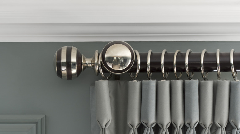
If there is one trend that Hilary Farr is happy seems to be well in the past, it's curtain rods installed in places they shouldn't be. One example that drives her particularly crazy is seeing curtains hanging off of window trim, instead of being firmly attached to the wall where they belong. "That's bad for aesthetics and practical function," she wrote in an article for HGTV Magazine and later shared on her blog.
This is because you won't be able to see much out the window. After all, a part of the curtain will always be in the way of your view. You also run the risk of the curtains falling and harming someone because they are too heavy. If you secure the curtain rod to the studs on either side of the window, it's unlikely this will occur, as they provide plenty of support, no matter the thickness or weight of the curtain.
2. Hardware as the main feature in your kitchen
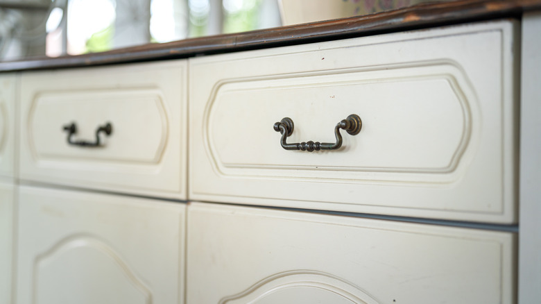
Kitchen hardware includes things like cabinet pulls, light switches, and the knobs on your stove. While some might think it is en vogue to make these fun and bold — whether it be through color, shape, or finish — Hilary Farr thinks this trend is best left in the past, because it can easily overwhelm the space. "I rarely want to make kitchen hardware a feature, especially if it's open concept, because it becomes distracting," she told Apartment Therapy, cementing the idea that it's best to avoid putting too much hardware in your kitchen.
However, there are ways around this. To avoid a misstep, be sure to pick out "lean and very linear hardware that will blend in with the cabinetry." This way, the drawer pulls are not the first thing a guest or potential homebuyer will see when they walk into your kitchen. Instead, they will notice the larger things at play, like the cabinetry and major appliances.
3. Stained wood cabinets in kitchens
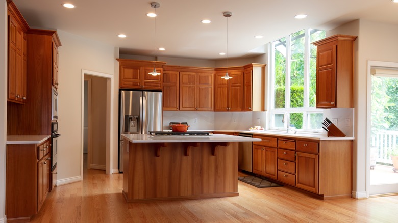
Stained wood has been a classic look for kitchen cabinets for ages. Although, in the 2010s we saw a lot more painted cabinets, this trend of classic wood is finding its footing once again in recent times — something Hilary Farr is wary of. The only exception that she thinks actually looks good in modern kitchens is a "super cool walnut that is repeated and reflected somewhere else," she told Apartment Therapy. Farr thinks any other type of grain is off-trend and takes too much away from the rest of the kitchen.
A non-exhaustive list of the types of wood stains Farr thinks are past their prime would be things like white, silver, amber, gray, black, red, and even mahogany. Although Farr didn't clarify in the interview her precise meaning behind "repeated and reflected," we assume that she meant walnut stain only stays in style if it's mirrored back in other elements of the kitchen. This could be on the table in your breakfast nook or the stools placed along your island countertop.
4. Too much color in the kitchen
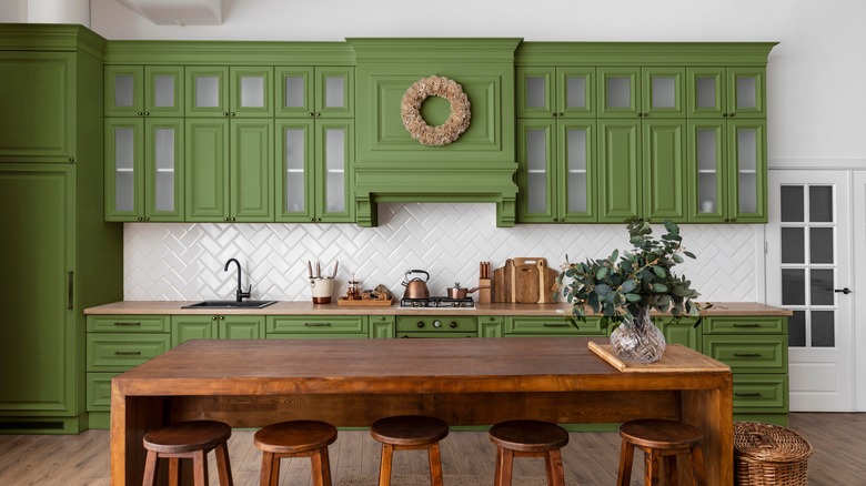
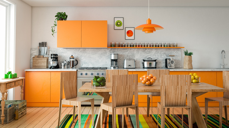
Colorful kitchen cabinets have been one of the biggest recent trends. We've seen everything from green cabinets to bright pink subway tile as a backsplash. However, Hilary Farr is wary of this trend and would like to see it on its way out. This is because, she believes, it is often not done properly. "I like bringing color in, but too much of it is going to disrupt the main design of the concept," she told Apartment Therapy. You should opt for colors that give a boost to your kitchen design, rather than distract from it.
Too many colors draw your eye away from the main points of your kitchen and this clashing look should stay in the past. In addition, you run into the issue of picking a trending color and then having it date your home. Instead, try following Farr's advice of using color as a means to support your overall look, instead of being the look in and of itself. This could be having neutral cabinets and hardware, but investing in an interesting drawer pull to give the space character. You can also add personality through the upholstery on your dining chairs and the color of your tabletop appliances. A bright pink Kitchen Aid mixer, anyone?
5. Walled-off, cramped kitchens
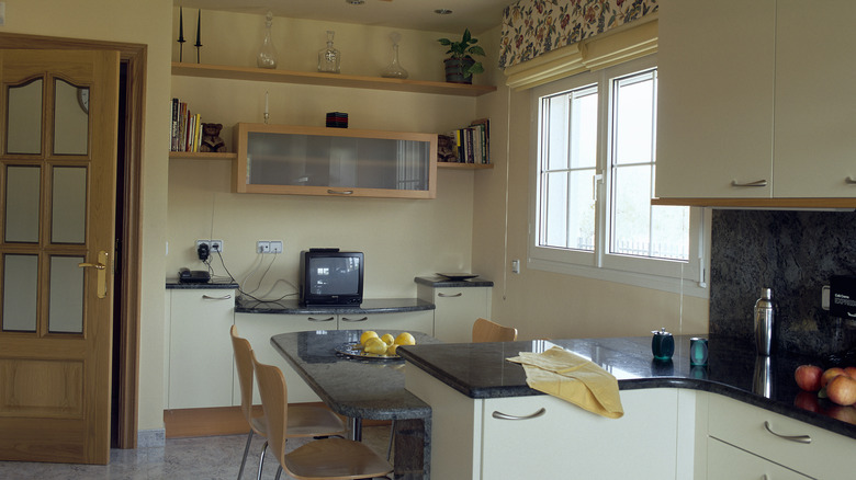
Ranch houses became popular in the '50s, which introduced Americans to the idea of the open-concept home. From there, homes became more and more open throughout the '70s. If you have a home built before this trend, you might have a smaller kitchen. This is also true of homes abroad — the kitchens tend to be closed off by a door or narrow hallway. Hilary Farr believes open-concept, airy kitchens are the future of design, and this trend of keeping things smaller or closed should be left in the past.
In Season 1 Episode 7 of "Tough Love," Farr mentions that "It's the smallest things sometimes that can make the difference," when speaking of opening up the kitchen. Although you cannot change the flow of your existing kitchen without a major renovation, this design point is worth considering if you are looking for a new home. Whether you are building or buying, pay close attention to the layout of the kitchen. It will save you plenty of renovation money in the long run — and increase the overall flow and livability of your house.
6. Un-upholstered vintage furniture
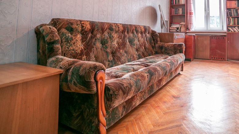
There is nothing greater than finding an amazing vintage piece of furniture on Facebook Marketplace. However, you should tread carefully when choosing to engage with the trend of the circular economy. Using older, pre-loved chairs, couches, and the like is definitely in — but keeping them "as is" has been out of style for a while. In short, Hilary Farr believes that old furniture is often tacky without throwing a little bit of TLC in the mix. "It's like putting fresh paint on a wall," she said in Season 1 Episode 8 of "Tough Love," per YouTube.
Luckily, updating furniture is an easy DIY project that even those of us with the worst crafting skills should be able to manage successfully. Yet, if you feel like swapping out the fabrics is too tall of an order, it's possible to purchase furniture covers on low-cost websites like Amazon. These fabric covers are easy to put on, washable, and can change the appearance of an ugly or out-of-date piece of vintage furniture in an instant — with no skill required.
7. Old school parquet floors
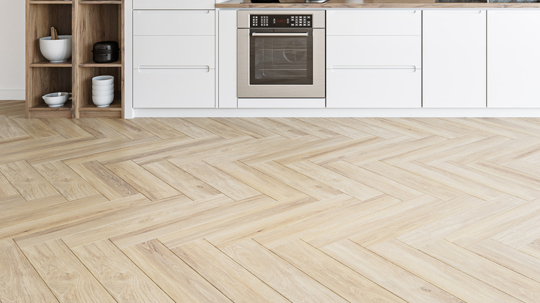
Wooden floors are one of the most popular features that home buyers look for. It's been this way for years and there are no signs of it slowing down. However, Hilary Farr believes the old way of installing this flooring is a trend best left in the past. Instead, there is a new, modern way to do wood: reclaimed flooring. "Reclaimed woods that look beautiful with any design choice from, sleek modern to traditional to hard-core country!" Farr told The Huffington Post. "The designs are available in a variety of old world layouts such as herringbone."
Yet, there is a big difference between older wooden floors and the new style that Farr champions. "Notice the scale has been notched up," she exclaims. "Not your granny's parquet! Play with this in small spaces or use it for drama in large open spaces. LEED approved is as important as how they look." LEED is the Leadership in Energy and Environmental Design, the agency that sets the standard for green elements in construction and decor. Farr insists that we must move away from the old trends in wooden flooring and towards reclaimed options for the betterment of the planet (and the sake of a stylish living room).
8. Larger-than-life furniture that takes over the room
Bulky furniture has already had its heyday. According to Hilary Farr, it's time to be more realistic. In the past, you might have chosen to attempt to make your comfort a priority by purchasing a king-size bed or lounging couch when you didn't have the space in your home for it. The same could be said of large heirloom furniture, like wooden dining room tables or china hutches. Farr believes the trend of keeping the same furniture for every new home you live in or holding onto something for the sake of it, should be over.
In the Season 1 episode "Coming Back to America," Farr counsels a couple who is struggling to adjust their overseas design preferences to their new space. "The house isn't the problem," she said, per HGTV. "The house, filled with all sorts of incongruent, oversized pieces of furniture; that's the problem." Instead, she counsels the client to be realistic about what can fit. If you find yourself struggling with the same issue, it might be time to let go of a few things. In the '90s, it seemed like every American living room had a large La-Z-Boy recliner. As times and trends change, Farr advises that it's best to let things go to save space.
9. Itchy, uncomfortable, or showy fabrics
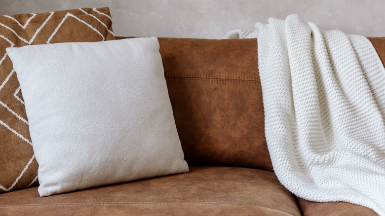
Gone are the days of textiles that are just for show. Hilary Farr believes that if you are going to have fabric in your home, it should be of use to you. When asked about ways to make a living space more comfortable, she told The Huffington Post, "Fabrics that speak to a desire to be closer to a more user-friendly, traditional and simpler way of life," are the best ones to keep around. In the past, design moguls might have encouraged you to use plenty of patterns in your home or spruce up your space with itchy, uncomfortable, or showy fabrics — through couch pillows, throw blankets, or curtains. However, Farr thinks this trend is over, and instead, we should take a step back and thoughtfully consider each element of our homes.
"The colors are muted, the fabrics tactile and understated to work with any decor," she said. "Pattern on pattern. Down-to-earth material such as linen and wool embellished with simple designs or more intricate embroidery." By doing this, you can enjoy a warm, comfortable home that invites a feeling of being "lived in" instead of a sterile space that is better suited to a showroom than a family.
10. Wood-paneled walls belong in the past
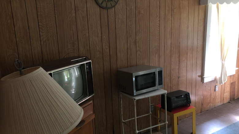
Hilary Farr can't make things more clear: Stay away from wood-paneled walls. You mainly see this feature in homes built from the '50s to '70s. Wood was inexpensive during this era and the panels were quite easy to install, so it popped up everywhere. Yet, because of its popularity so many years ago, homes with wood paneling are basically singing the siren song of "I'm old and out of date." In the Season 2 episode of "Tough Love" called "Brick by Brick," the guests own a home built in 1957 and are excited about keeping the wood. "We are on the fence about whether or not to stay with this wood paneling," the homeowner mentioned, per Realtor. "But for right now, we're leaning into it." Farr replied, "I think right now you might want to lean back out again," not making any effort to hide the disgust on her face.
No matter how mid-century modern or cabin-in-the-woodsy you want your home to be, it's still not a good excuse to use or keep wood panels, according to Farr. Instead, you can mimic the transformation of this episode by choosing simple painted walls over dated wood panels.
11. Bright, brash wall colors that overwhelm your eyes
Bold colors found their footing in our homes in the 2010s, however, Hilary Farr thinks this moment is well and truly over. In the Season 2 episode of "Tough Love" called "Color Clash," homeowner Jennifer is quick to justify the large amounts of orange on display in her home. "My favorite color is orange," she said, per Realtor. "We gravitate toward stronger, brighter colors, and we'd like our home to reflect that." In 2024, "Peach Fuzz" was the Pantone color of the year, yet Farr isn't so sure about including the hue. "I have to say I am a fan of lots of color," she said. "I am a fan of orange. I'm not a fan of too much color or too much orange. This falls into the latter."
This home was a difficult project for Farr, as the homeowners were hesitant to remove all the colors from their home. While this doesn't mean you have to go boring beige all over, Farr does point out that finding the right balance between the current trending bold colors and a peaceful home. For example, the color of the year is just that — lean into it too hard, and in 10 years your home will be the poster child for a bygone era. "We have just enough quirky," Farr remarked about the finished renovations. It's all about balance.
