7 Outdated Design Trends To Avoid, According To The Stars Of Unsellable Houses
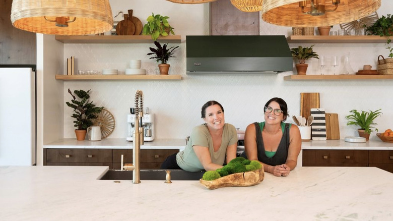
Home design trends come and go so often that keeping one around for too long after its prime can quickly date your property. Lyndsay Lamb and Leslie Davis, the dynamic duo behind HGTV's "Unsellable Houses," know this all too well. In the hundreds of homes the pair has fixed up, they've noticed plenty of trends of, well ... trends that you need to avoid.
If you are trying to sell, or are tired of looking at ugly elements around your house, you'll want to update these missteps ASAP. If you are in the process of redesigning, some home trends are well past their sell-by date. While a few of these design elements are glaringly obvious (hello lighting fixture that is too old for even your grandma's entry hall) others are a bit more covert. You might think your home is on-trend by keeping your massive soaking tub in the master suite — but depending on its size and location, it could hurt your resale value. Not only that, some outdated trends can affect the overall livability of your house, too. To keep things fresh and functional, these are the seven outdated design trends to avoid, according to the stars of "Unsellable Houses."
1. Old lighting fixtures bring down the vibe
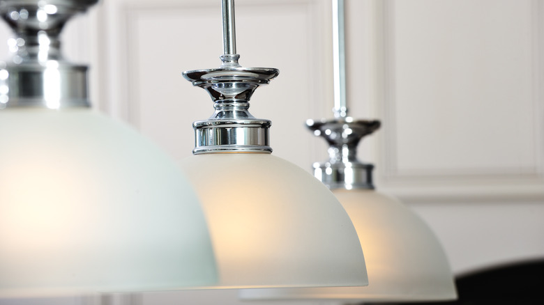
Out-of-date lighting fixtures can significantly impact a space, but luckily, they are relatively easy to swap out. In the Season Four episode "Color Confusion to Oasis," Davis and Lamb were quick to notice the old and cliché lights in the home. "I have to point out these lights," Davis said, per Realtor. "You have the same one in the entryway. This is so 1980s, 1990s." Lamb quickly agreed, confirming that the lights looked out of place. "It just automatically dates the house," she said.
Art Deco lights have never seemed to go out of style, and lights with midcentury modern elements are having a bit of a renaissance. However, if your home still has the original dingey lighting elements, it's not worth it to wait and see if they ever pop back into style. Instead, consider updating them with a fixture that's a bit more classic. Before you do, it's important to pause and not just jump on a new lighting trend that will be another flash in the pan. Instead, you can do what Davis and Lamb did in this house. Select something bright and simple, as trendy statement pieces are often the first to fall out of style.
2. Too many colors can easily overwhelm
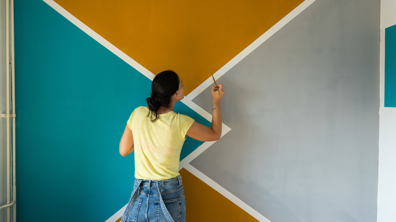
Fans of maximalism decor and all things bright and exciting might be disappointed to know that the trend of too many colors in one space is well and truly over, according to Lamb and Davis. Also in the Season 4 episode "Color Confusion to Oasis," the pair could not hide their shock at the amount of colors present in the home. "I truly do not know how many colors of paint are in this home," said Davis, per Realtor. "Probably just around eight," replied Lamb. "Fifteen?" Davis quipped. All in all, that was way too many for both modern trends and a more classic look. "I really want to simplify it with one beautiful, neutral color," said Lamb. To keep things simple, she chooses a fresh white called White Tail. "That would give us that brilliant white throughout the entire home," she explained.
Of course, if you are not a fan of a neutral home, this doesn't mean you have to repaint your entire house like a hospital to stay on trend. However, what is important is sticking to the 60-30-10 approach. The theory works out just how it sounds: choose 60% of one color, 30% of another, and 10% of a final color to combine in a space. Typically, the least used color is the boldest.
3. Aerobic's class mirrors are not artistic, they're just old
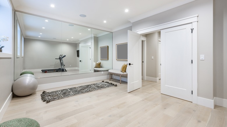
When you're at the gym, it's an upside to be able to see your entire body in the mirror — to correct your form or maybe admire your physique. However, floor-to-ceiling and wall-to-wall mirrors have had their moment in homes ... and it's time to move on from them. "In your ... living room, we'll get rid of the aerobics class mirrors and give the buyers back some wall space. We want the focal point of that room to be the spectacular view," Lamb told one homeowner, per HGTV.
In this instance, the mirror might distract the eye from the better vistas available just outside the window. Plus, this type of mirror was very popular in the 1960s when the condo was built. In modern homes, you don't see them as much anymore, so their presence immediately dates the home back to that time. While having mirrors in living spaces can help reflect light and make things look larger, it's better to have smaller accent mirrors — as Lamb and Davis decided to do in this episode. If you still feel like a larger one, floor-to-ceiling mirrors can still work, as long as they are a single panel and framed. Attaching them to the wall still gives the outdated, aerobics class vibe.
4. Tubs can be great, but not in awkward shapes or too big
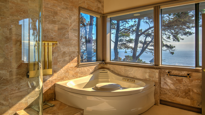
Bathtubs can be a make-or-break option, as some buyers won't even consider a house that doesn't have one. However, an outdated tub in your master suite is almost as bad as not having one at all. In the Season 2 episode "Two Bedroom Dilemma," Davis was quick to point out the awkward shape of the tub. "Even though there was that huge soaking tub, it was really not usable," she said, per HGTV. It was bent around a corner, so an adult would not be able to stretch out and relax in the space. These corner tubs were popular in homes built in the latter half of the 20th century, yet they seem to be more for appearance than functionality.
In the show, the team ends up replacing the large tub. "This was probably the biggest transformation in this house," Davis said. "Even though there was that huge soaking tub, it was really not usable. What we wanted to give this main bathroom is a really high-end custom shower so that they felt like this wasn't a letdown of a bathroom." It might be expensive for you to nix your statement tub, but if you don't have one yet, you can heed the design duo's advice to skip one.
5. All-over carpet belongs in the '70s
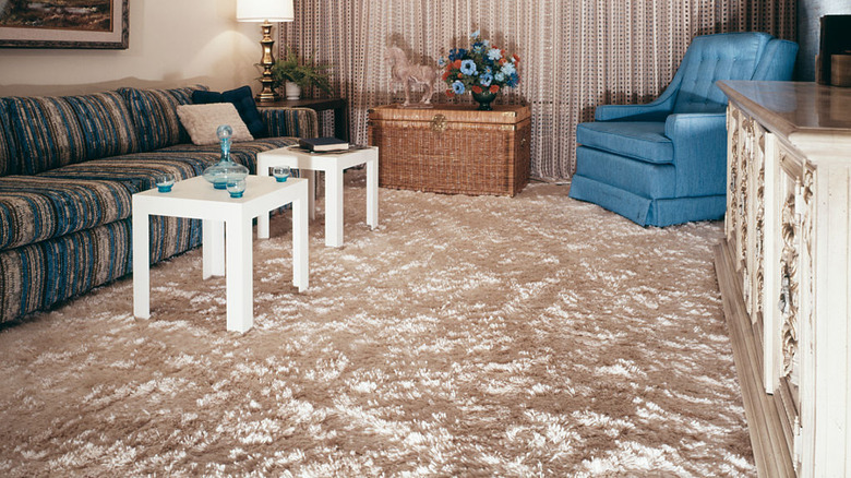
Nothing dates a home like an all-over carpet situation. The trend was oh-so-popular in the 1970s, but is a thing best left in the past. "I have seen carpet on all walls, including the ceiling," Davis said in the interview with House Beautiful. She went on to explain the design disaster that will always stick with her. "We actually had a lady carpet her ceiling just last week. I said, 'Why?' And she goes, 'Oh, because it was showing the old beam from when it was built (because it was in a basement), and I just thought that this would be more aesthetically pleasing.' It was a rainbow carpet, and she thought somebody could use it as a kids' room."
Not only is rainbow carpet an aesthetic nightmare, but having carpet on the ceiling makes any potential buyers (and guests in your home) think they've walked into Elvis' shag carpet den and not a comfortable place to live. Luckily, carpet is relatively easy to remove, even if you aren't the best at DIY. If it's on the walls and ceilings, you won't even need to worry about putting down replacement flooring — although your spackling and repainting skills might be put to the test.
6. Open-concept kitchens that are too open
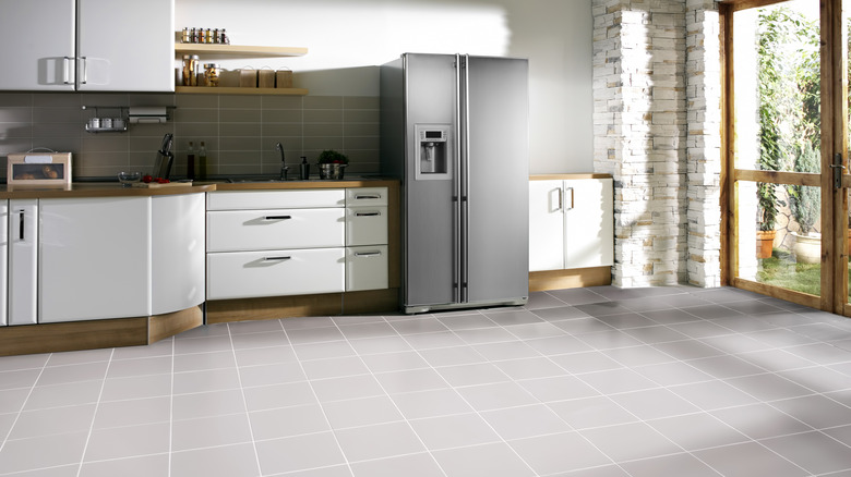
Americans love an open-concept kitchen, while counterparts in Europe tend to have doors on theirs for fire safety reasons, especially in older homes. However, one trend that is out of style is taking the open-concept design a bit too far. You want to make sure there is still a bit of contrast between where the kitchen ends and the rest of the home begins. "This is nice and open," Davis said of a client's kitchen in the Season 2 episode "Two-Bedroom Dilemma," per Realtor. "But to be honest, I opened this front door and I immediately was, like ... fridge." By swapping things around and adding shelving between the countertops and hallway, the duo brings the kitchen into the modern age.
"The overall design for the kitchen is really to go with something that is universal," Lamb said. "Any buyer could walk in and feel like, 'Wow, this is something I can relate to, something that I can connect with.'" So while open-concept homes will never actually go out of style in American homes, it's important to tread carefully when incorporating this trend and blending too many spaces. Instead, try to create distance with shelving and rugs to stay on trend.
7. Original hardware sets your home back in time
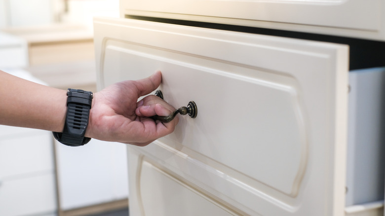
The thing about trends is they are so often cyclical. Things that were popular in the 1920s eventually gave way to modern ideas, yet as more time passes — they are once again considered chic and en vogue. The same can be said for things from the 1950s ... yet most homes built in the 1980s and 90s have yet to experience this sort of renaissance. They likely won't for some time still. So, while the drawer pulls, lightswitch covers, and doorknobs in your midcentury modern bungalow are on trend and could look fantastic with a little polishing, the very same elements can look awkward and out of date if you live in a home built in 1994.
In an exclusive interview with HouseDigest, Lamb shared this gem of advice for those in this situation. "[One of the ] easiest, least expensive, and fastest ways to make a change to your home is by changing out the hardware if it's dated. Fixtures ... make a huge difference in making the house feel fresh and move-in ready." The great part about this is it's an easy DIY as all you need is a screwdriver — no knocking down walls or exact measurements required. Swapping out old-fashioned hardware doesn't break the bank, either. This makes it perfect for a weekend (or just an afternoon if you're quick!) project.
