14 Design Mistakes To Avoid At All Costs, According To HGTV's Ben And Erin Napier
Decorating a new space (or sprucing up an old one) can be a golden opportunity to create a home that makes you happy every time you walk in the door. But interior design can also be costly and complicated. Not only do you want to make things look good, but you also have to balance costs and ensure your space functions well. There are tons of choices to make, ranging from what wood tones will match to whether your favorite tiles are timeless –- or likely to look dated in less than a decade.
Before you invest time, money, and energy into designing your home, take a few tips from two of HGTV's most seasoned pros, Ben and Erin Napier. This wholesome husband and wife duo have renovated over a hundred houses in their hometown of Laurel, Mississippi. Over the years, the personable pair haven't just breathed new life into old homes, they have also shared many valuable insights with viewers and fans. If you want to profit from their experience, read on for some golden nuggets of design wisdom from the Napiers.
Trying to imitate other homes
Thanks to social media, there's no shortage of interior design inspiration to help you come up with ideas for your home. However, online inspo photos can be a double-edged sword. It can be very tempting to pin a bunch of pics, purchase similar items, and recreate the aesthetic in your own space. While there's no harm in getting inspired by a beautiful room or an arresting color palette, this copy-and-paste approach could leave you with a space that lacks personality and charm. Erin Napier addressed this in Alyssa Rosenheck's book, "The New Southern Style: The Interiors of a Lifestyle and Design Movement" (via House Beautiful), saying: "I wish people wouldn't worry so much about how other people are styling their homes. It removes the individualism, which is what makes home so comforting."
So how do you know if you're unconsciously keeping up with the Joneses versus getting inspired by things that truly speak to you? On her website, Laurel Mercantile Co., Napier said one of the ways to identify your unique style is to reflect on your favorite things: "Think about the clothes you wear, the car you drive. The things that make your heart beat fast. How can that be applied to your home?"
If you're feeling stuck in a design rut, it can also help to take a step back and look for sources of inspiration outside of interiors. Instead of scrolling through Instagram and being confronted with endless images of immaculate homes, take a trip to a museum. Pop into an art gallery and just absorb what you see. Next time you spot a gorgeous color palette out in nature, snap a picture.
Worrying what people will think of your color choices
Nobody wants to feel like they have an ugly, tasteless, or tacky home, but be careful of decorating to impress others, especially when it comes to color. Do you want to go bold, but feel afraid to stick your head out? Erin Napier has some sage advice. In an interview with Homes & Gardens, the HGTV star said, "When it comes to using bolder colors in a room, you just have to not care about other people's opinions." A lot of things in interior design are subjective, including color. A red kitchen might be completely out of the question for one person and unquestionably beautiful for another. In Erin Napier's words, "Let's stop worrying about what other people think about our red kitchen or our green cabinets and just enjoy our spaces." She also said homeowners shouldn't get too caught up in whether or not their tastes will change. "It's our right as people to change what we love. If you love red now, then, oh baby, paint your kitchen red and enjoy every moment."
If you're feeling scared of a bold color choice, rather than write it off as too risky, channel your inner designer. Create a home design vision board so you can see how the color will look with other elements in the space, like hardware and flooring. If it's a daring paint color you're considering, brush a large test patch on the wall to see how it looks in different lights. You can also use an app like ColorSmart by BEHR® to visualize how different wall colors will look. If you're tempted to buy a big yellow sofa, test drive your desire with a buttercup-colored blanket thrown over your existing settee.
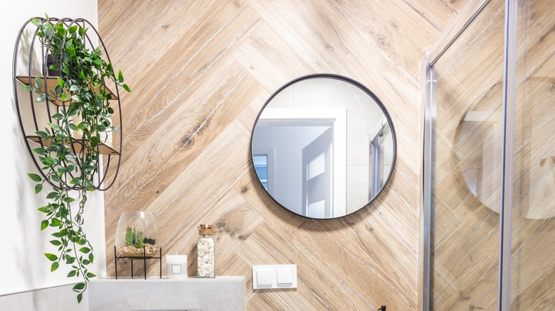
Trying to match wood flooring
Replacing a section of floor? If you already have existing hardwood planks in place, you'll need to think carefully about where the new and old flooring meets up. Having two different wood tones butting against each other isn't a good look. During Season 5, Episode 11, of "Home Town," the Napiers were faced with this exact problem when they realized that the home's original hardwood didn't extend underneath the old kitchen tile. Instead of trying to match up wood tones, Erin Napier went with a gray slate vinyl, saying (via Realtor.com), "You have to choose something completely different from what it's touching."
When picking out new flooring for an area, you'll also want to think about the thickness. Ideally, you want the new and old flooring to be perfectly level with each other. If you don't have much room to play with, vinyl tiles can be a great choice, as you can get durable options that are just 4–6 mm thick. Most ceramic tiles measure between 9.5-10 mm.
To keep things cohesive, also be careful of installing too many different types of flooring across your home. There's nothing wrong with mixing hardwood and tile. However, having multiple wood tones and three of four different types of floor tile could create a chaotic look that gives off patchy renovation vibes. Creating a cohesive color palette for your home's finishes can also help tie in different types of flooring and make your selections feel intentional.
Not taking risks in small rooms
Small rooms can be tricky to decorate, but they're also the perfect place to test-drive attention-drawing designs. Erin and Ben Napier said (via Reader's Digest), "If you're revamping a tight space like a bathroom or entryway, it's easy (and safe) to stick to one color palette and keep the design simple." But if you want to transform a pint-sized room, look for ways you can incorporate some interest and personality that will help make the space pop. This can turn the area into a feature rather than an afterthought.
For instance, you can go with a daring or moody wall color, funky floor tiles, or even install some wallpaper. If this is too bold for your tastes, you can also inject pizzazz with smaller details. "When looking for subtle ways to add color in bathrooms, installing a patterned tile backsplash or even unique and unexpected fixtures can bring life to a bland space," said the couple.
Ditching original details
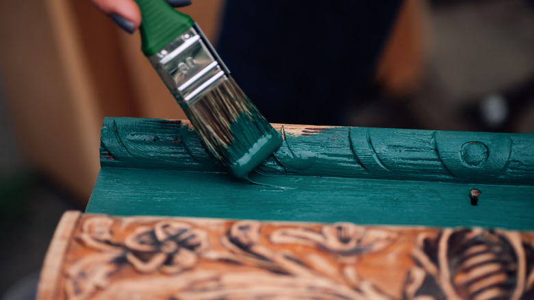
If you're remodeling an old home, it can be very tempting to feel like you have to update everything to achieve a fresh look. But be careful not to recklessly renovate original details which could be a valuable source of historical charm. In Season 7, Episode 3 of "Home Town" (via AOL), Erin Napier warned against painting over original features, observing: "Most people want to paint their historic trim. I think it's a huge mistake 90% of the time." Ben Napier shared his wife's take, warning, "Once you paint it, you can't go back!"
Retaining the original wood trim can help give your home a timeless feel and sense of history. But there are times when painting might make sense. For instance, if the wood is in poor shape, full of dents, wormholes, or water stains, you may be better off filling and repairing these imperfections and then painting over them. Also, not all wood in historic homes is exposed. Painted trim was often featured in Victorian and even colonial houses, especially if the wood underneath was deemed undesirable, such as knotty pine.
Depending on the layout of your home, you might even want to consider going for a mix of painted and unpainted trim. For instance, if you have far-from-perfect pine paneling in the bedroom, you could paint this while keeping any original stain-grade trim in the living areas. Go with what works for your home and will be the most timeless choice.
Not choosing timeless materials
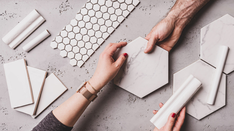
One of the biggest pitfalls to avoid when renovating is choosing overly trendy finishes. The latest tile craze might look fresh for a hot minute, but it could also seriously date your home. So how do we avoid getting caught up in trends, and instead choose timeless materials that will never truly go out of style? During an episode of "Erin'spired," Erin Napier shared an actionable tip, saying, "Find that shape, or that color, or that finish that you've seen in every decade, and use that."
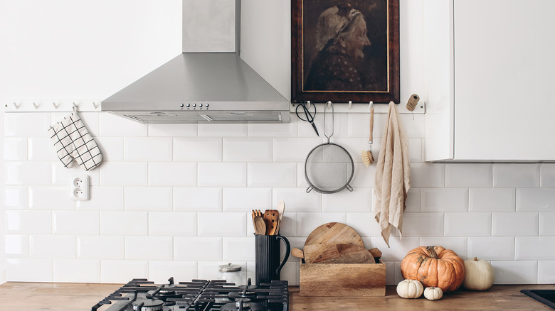
Finishes that were widely popular in a single time period may be more likely to date. For instance, hardwood flooring has been around for hundreds of years, but there are some trendy takes on this time-tested flooring that you may want to avoid, such as gray-wash planks. This finish is a by-product of the 2010s obsession with gray and is steadily going out of style. Installing gray-toned hardwood or faux wood vinyl is almost sure to time-stamp your home. Another thing to think about is how you install a finish. For example, subway tile has to be one of the most classic tile choices. It hasn't been the rage through every decade, but it's always been in the background. During the 2010s, subway tile took off in a big way, appearing in just about every blogger's backsplash, picked out with very dark grout. If you love the retro look and want to install subway tile in your home, simply choosing a lighter or more unusual grout color can make it look more historic and less 2012. You can also look at interesting layouts and take inspiration from Erin Napier's unique spin on subway backsplash tile with vertical stacking.
Never spending money on nice things
Home improvements can get expensive fast, and picking the best of everything is a recipe for going over budget. But this doesn't mean you should never spend money on nice things, or always avoid finishes and furniture that's a little more upmarket. The secret to getting what you want, without triggering extravagant spending, is planning. According to Erin and Ben Napier (via Reader's Digest), homeowners should "make a prioritized list and feel confident spending a little extra on those items you really, really want."
If you've always yearned for a 6-burner range but your budget is limited, see if there are other areas you can economize on. Don't use a ton of ice? Skip the refrigerator with the built-in ice maker and divert the savings to your range. You can apply this same principle to décor and furniture. If you want an amazing rug, mark this down as a priority and see if you can save some cash by thrifting a sideboard, dining table, etc.
Thinking family photos or children's art is tacky
Some designers consider family photo displays a faux pas, especially in main living areas. Fortunately, Erin Napier is here to tell us that we don't have to choose between a stylish home and pictures of our loved ones. She feels that both family photos and children's art can make for great décor. During an interview with Homes & Gardens, the down-to-earth designer said, "My favorite tip, which I learned from my mother, is to include photos of our ancestors around our home." During Season 8, Episode 6 of "Home Town," Erin Napier also said, "I never want a house to feel so elegant that it's not livable." She explained that "children's art has a way of bringing it back down to a human level."
Keen to hang up a few family photos or kids' paintings? Here are some ways you can make it feel elevated. To keep things cohesive and give images a historic, chic feel, go for a monochromatic look with black and white photos. Grid gallery wall layouts are a great way to create more of an art installation effect and less of a higgledy-piggledy approach. But if you like an eclectic look, feel free to create a charmingly chaotic display that channels the feel of your family. For a curated, collected feel, mix in other mediums, such as sketches, posters, or those pieces of kids' art. To make both family snaps and children's paintings feel special, pay attention to the frames and matting. Not being intentional with matting is one of the most common mistakes people make when hanging family photos.
Putting too much emphasis on design
In keeping with her grassroots, people-centric approach to decorating, one of Erin Napier's tips is to not focus too hard on design. In an interview with Country Living, the HGTV star said: "I never think about 'interior design.' I think about creating a home that tells that family's story, where they can be themselves and feel welcomed by the things, places, and people they love." Design trends come and go, but the story of your family is here to stay.
Telling that story through your home is a surefire recipe for a unique space. Family photos are just one way to visually relate your tale. You can display books that you love or showcase collectibles. Maybe you have some items that remind you of special places you've visited or lived in. Handed-down household goods like old furniture and crockery can bring a sense of your family's history, trigger memories, and be interesting talking points.
Playing things too safe
By now, you've probably gathered that Erin Napier is a fan of the personalized, history-steeped, and even eclectic. Her designs on "Home Town" are full of charm, subtle color, and coziness. But what if you're someone who prefers to play it safe and doesn't naturally embrace quirky details? Napier has an actionable tip. To create a unique feel in your space, the "Home Town" host advised (via Homes & Gardens): "If you make one conventional choice, let the next one be something deeply personal, something weird, even if it's something that someone else might think is ugly, that's okay. It's this balance that makes a room interesting."
Not only can this formula keep your space fresh, but it can also inject some fun into the design process. A really unusual piece can break the mold of how you thought a room should look and take your design in a new direction. A strange architectural detail could make you rethink a layout. But you also don't have to own a collection of kooky décor or a historic home to implement this tip. If you're buying home items, apply it to your shopping process. For instance, if you purchase a "safe" conventional sofa from a big box store, balance it out with an unusual thrift store find or a piece of art that's a little "out there." If an entire room is feeling a bit too staid, see if you can offset this with an interesting wall color or an unexpected rug pattern.
Not planning for change
Fun fact: you might not like the same wallpaper or paint colors in ten years. Tastes and needs can change over time, and factoring this in can help you leave room for flexibility. As Erin Napier told Homes & Gardens, "Our houses are not stagnant –- they're going to change so much over the years, so don't be afraid to let that change happen."
How do you design for change? If you're renovating, stick to classic materials and color palettes. If you want to introduce a bold hue or hop on a fun trend, try to incorporate this through things you can easily switch out. For instance, a colorful accent wall will be much cheaper to paint over than redoing a bright backsplash. For wallpaper, look into removable options, especially if you think you may want to change up the design at some point in the future. If you're buying furniture, prioritize longevity and versatility. A small antique desk could easily transition from a child's drawing station into a piece for your home office one day.
Planning for change is especially important in kids' rooms. Before you know it, that "Bluey and Bingo" wallpaper might not be age-appropriate anymore. An easy way to get more mileage out of kids' room décor is to opt for less age-specific motifs. For instance, a forest-inspired wallpaper can liven up a nursery but also won't look out of place when your little one outgrows Duplo and diapers.
Covering up all imperfections
We all want to have a well-kept home, but Erin Napier warned against getting too obsessive over small imperfections. The Napier philosophy of how a home should look is all about celebrating the history of houses and their occupants. During Season 7, Episode 3 of "Home Town," the HGTV host said, "Imperfection is a sign of the growth and evolution of a house in history, not something that we should cover up and be ashamed of." Ben Napier agreed, saying, "You would ruin it by trying to make it perfect, so why make it perfect?"
Sometimes, small imperfections, like a fingerprint left in paint that hadn't quite dried, can remind us of special moments. The same holds true for furniture. Not every item in our homes has to be immaculate. Cracked leather, aged brass, or a well-loved wood piece can stand testament to time spent and good memories.
So how do you know when to intentionally embrace an imperfection, whether that's in your home's architecture or a piece of furniture? First off, ask yourself if there's a story behind it. If it's a furniture item, evaluate the materials. Good quality materials tend to look even better as they age and can often be gently restored. This is often the case with low-grade materials like cheap pleather and particle board.
Injecting too much formality into dining spaces
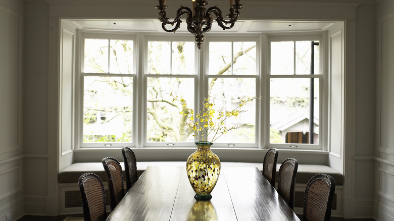
If you like entertaining, it might feel like you should create a statement with your dining room and make it feel fancy. But too much formality in a dining space can be a buzzkill. In Season 7, Episode 3 of "Home Town," (via House Beautiful) Erin Napier said, "Anywhere you eat should feel intimate, where you can have great conversation."
In this renovation, the dynamic duo created a beautiful built-in breakfast nook with banquette seating and a round table. If you have an unused corner, this could be an ideal opportunity to do something similar. But custom benches aren't the only way to achieve a cozy, casual vibe. For a regular dining space, start by choosing chairs that have a non-formal feel, such as ones with scooped seats. Free-standing benches, cantilever seats, and wishbone chairs all tend to have an informal feel. Natural materials like cane and rattan can also lend a laid-back attitude, and a simple area rug can help add softness. Circular dining tables tend to feel less formal than long, rectangular ones. If you have an open-plan living area, this will automatically create a more casual atmosphere. Choosing chairs with similar fabrics and finishes to your living room furniture can increase this feeling and create a sense of cohesion.
Painting wood furniture
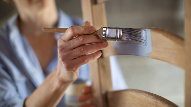
Seeing as the Napiers are all about preserving historical details, it should come as no surprise that the pair aren't on board with painting wooded furniture. Not only does Erin Napier say you should buy antique instead of new furniture, but she also feels that wood is the way to go. The southern design star told PopSugar: "I hope we'll finally see people stepping away more from painted furniture and toward the warmth of natural and stained wood. The organic movement in wood grain is art!"
Wooded furniture has become expensive, so if you have a solid oak nightstand on your hands, it makes good sense not to cover it with a layer of paint. But there are times when painting wood furniture mightn't be a cardinal sin. If you're dealing with a cheap piece made of inexpensive wood, such as pine, paint could be the perfect transformation. Or maybe the finish is so bad that it would take days to strip and restore it. If the piece has damaged areas that need to be fixed and filled, this is another instance when it makes sense to paint.
Things get a little trickier with antiques. For true antiques, paint could drop their value. However, if you aren't interested in resale -– and painting is the difference between keeping and disposing of an item –- it is a free country. However, if you don't want to take a brush to vintage wood, you can breathe fresh life into it simply by updating the pulls. In Season 7, Episode 7 of "Home Town" (via Realtor.com), Ben Napier showed how hardware is a small upgrade with a big impact, saying, "A piece of hardware, a drawer pull, can change a piece of furniture."


