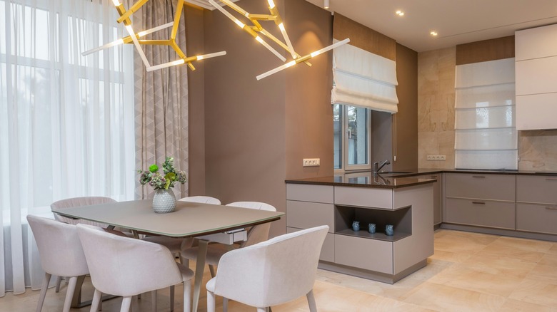
12 Creative Ways To Bring Midcentury Modern Design Into Your Kitchen
The clean lines and minimalist aesthetic associated with Midcentury modern design often appeal to homeowners striving for a timeless, yet contemporary, look. Dating back to the mid-20th century, this style took root after World War II during a time of prosperity, when a sense of simplicity was embraced, rather than elaborate designs and style. Frequently used components were floor-to-ceiling windows and flat rooflines. Midcentury modern homes often featured exposed ceilings and beams, open floor plans, and earthy tones that blended indoor-outdoor living naturally.
In the kitchen, incorporating Midcentury modern design can elevate the heart of your home to a stylish and functional space. Focusing on straight lines, geometric shapes, and neutral and natural tones is the easiest way to seamlessly incorporate this style. From sleek cabinetry to iconic lighting fixtures, there are numerous creative ways to infuse your kitchen with the spirit of Midcentury modern design, so you can pay homage to the iconic era.
Incorporate warm wood tones
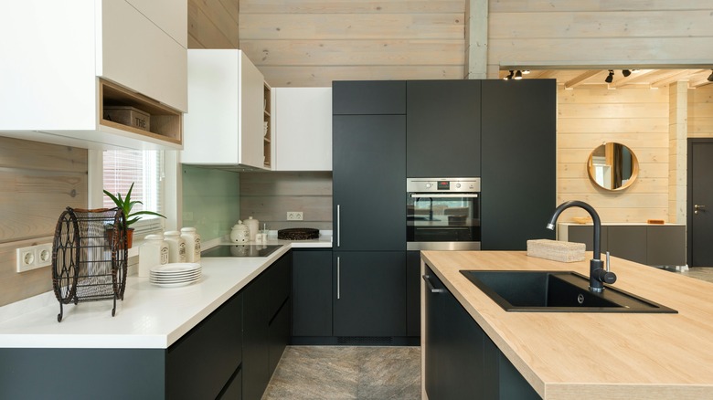
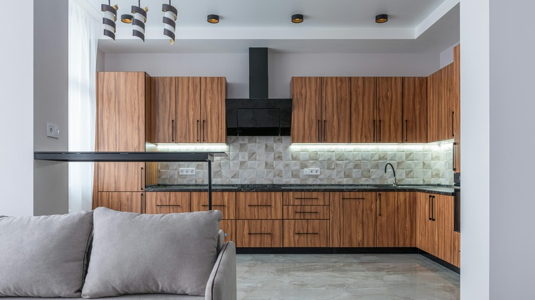
Warm wood tones are considered to be a Midcentury modern element because they have an organic, natural appeal, bringing the outside world into your home. The shift away from overly decorative to more simple styles is when the use of natural wood began growing in popularity. Natural materials that aren't overcomplicated and have a neutral hue — such as teak, walnut, and oak — emphasize a simplicity that can totally work in your kitchen. The combination of various shades and types of wood is a way to mimic nature and create a relaxed, cozy space.
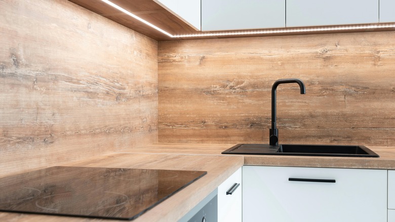
In your kitchen, there are several ways to get creative with warm wood tones. If you're up for a big renovation, you can change out your cabinets or floors for maple wood. This soft, light, tan color can create a neutral, relaxed look in your kitchen. However, if you're looking for smaller, easier projects, consider creating a backsplash with peel-and-stick wallpaper or tiles that are designed to look like maple.
If you're lucky, your cabinets might be made of natural wood, and with a little sanding and stripping, you can reveal what's hidden under layers of paint and varnish. Small additions of wood can also go a long way when creating a Midcentury modern kitchen. Try replacing your metal stools with ash wood or solid beech wood. Or, swap your glass and metal light fixtures with brands like Peared Creation and Tom Raffield, who integrate wood with other finishes and materials.
Emphasize clean lines and angles
The essence of this design style lies in clean lines, angles, and geometric shapes — particularly in the kitchen. To achieve this aesthetic, consider swapping out curved edges on countertops, arched doorways, and embellishments for right angles and structures that feel crisp, sharp, and modern. Big upgrades, such as replacing countertops and installing new appliances, are obvious ways to change the appearance of your kitchen. However, smaller elements throughout the space can also work together to truly transform its look and feel.
You can opt for sleek, flat-front minimalist cabinets, or for an easier project, you can simply trade out your hardware and finishes. Round or curved knobs and handles can be replaced with more updated, metal hardware with right angles, such as these cabinet pull handles from Amazon Basics. Straight lines across multiple surfaces can be emphasized, such as lines in your tile and grout. Also, you can choose modern lighting fixtures, like the Modern Ceiling Light from Umeiluce on Amazon. Striped rugs are another great option. By focusing on or highlighting straight lines and sharp angles, you can effortlessly bring Midcentury modern design into your kitchen.
Turn your focus to the ceiling
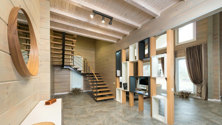
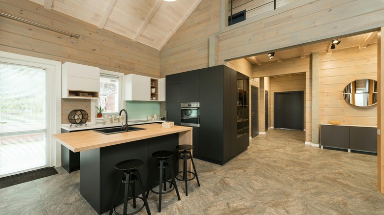
Another aspect of Midcentury modern design is open space. Extra room to move around and uncluttered areas are a nice contrast to previous styles. This concept often includes high ceilings and skylights that allow for lots of natural light and leaves kitchens and other rooms feeling wide open. Exposed beams were often found in Midcentury modern homes because they added a unique design element and highlighted those high ceilings. Adding higher ceilings is next to impossible unless you're rebuilding, but there are a few tips and tricks for making your room feel bigger and more open.
It's commonly known that light colors make a space feel bigger, which is why ceilings are often painted white. However, you can go beyond this simple trick. Try utilizing high gloss paint that reduces the flat, boxy feel of the room. Add vertical lines to your design, but avoid thick horizontal ones. You can also paint the lower half of your walls a dark color with a lighter one on top, which will help draw the eye upward.
Other tricks include installing recess lighting or semi-flush fixtures that don't hang too low, which can make it feel like the ceiling is closer than it actually is. Installing long window curtains can also make a room feel taller. Another bigger project would be to install faux beams to create an illusion of higher ceilings. Just a few of these tips can make your ceilings appear higher, and thus your space bigger overall.
Add earthy tones
Indoor-outdoor living largely influenced Midcentury modern designs, which is why natural, muted, and earthy tones are usually found throughout this aesthetic. After World War II, designers and architects migrated around the world, and the style of German Bauhaus design and architecture spread as well. Various shades of green, warm browns, and other colors found in nature were frequently used to create more welcoming, relaxed spaces. This combination of colors and natural materials, such as wood and stone, brought the outside world into kitchens and more.
Most kitchens already have some elements of Midcentury modern design, which means that a few small changes can really establish the style. A wooden countertop can shine if you surround it with neutral, muted tones, so that the natural component takes center stage. Adding just a few elements from nature will also stand out against modern, simple surfaces. Consider placing a large snake plant in a dark corner. They don't need much light or water, and it will create an earthy vibe. You can also try implementing florals into your backsplash, tile, tea towels, or even as a large focal painting. These natural shades will play nicely with a dark forest green or a slate gray that feels clean and modern. Another trick to make your earthy tones shine is to replace your white fluorescent bulbs with a softer yellow shade, which resembles natural light and creates a cozier space.
Forego upper cabinets
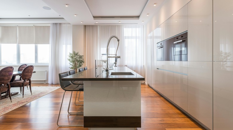
In your quest to create open, airy kitchen spaces that are reminiscent of Midcentury modern design, forgoing upper cabinets has become an unexpected way to embrace the style. The absence of upper cabinets not only reduces visual clutter but also creates an illusion of spaciousness, which helps capture the essence of this era. By eliminating cabinets at eye level, the room opens up, inviting natural light to shine freely and enhance the overall ambiance. No cabinets on your wall will make the room feel bigger.
Contrary to what you might think, removing upper cabinets does not always mean sacrificing good storage space. Homeowners can optimize lower cabinets with the addition of drawers and shelves. Making the most of storage near the floor might take a bit more planning when it comes to the placement of your appliances, but the difference could be worth it. Detached storage units — such as coffee bars, bar carts, and free-standing pantries — can help as well. For example, this Mufico Console Table has doors that can provide extra hidden storage space. In addition, integrating sleek wall units can provide innovative alternatives that remain functional but still stick to the minimalist aesthetic. Slimmer cabinets without hardware that extend from the floor to the ceiling can offer storage without impacting the feel of the room.
Contrast wooden hues with metal finishes
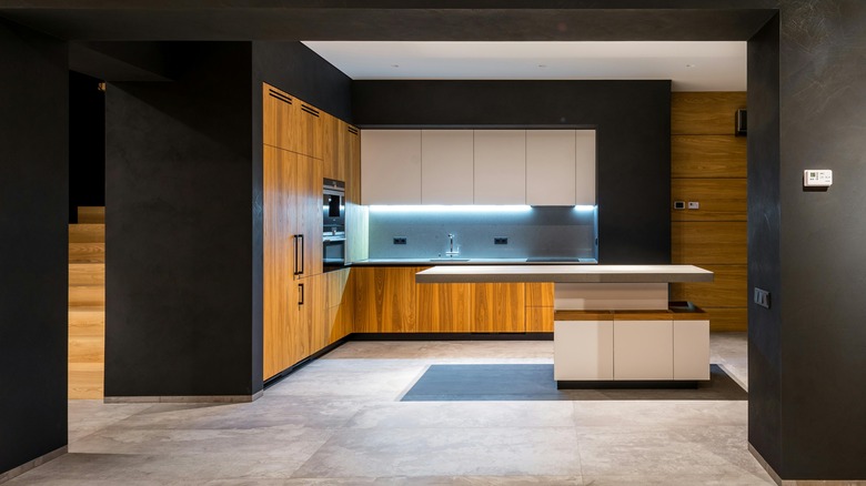
A simple way to achieve a Midcentury modern look in your kitchen is by integrating metal finishes to contrast warm wood tones. Gold, copper, and silver finishes can add an elegant modern touch to any kitchen, but they especially shine against varieties of wood — whether it's in flooring, cabinets, countertops, or furniture. By incorporating these metal finishes in strategic locations, homeowners can transform the entire look and feel of their kitchen, without the need for extensive renovations. The beauty of these small touches lies in their versatility; unlike cabinets and countertops, which are more permanent fixtures, metallic accents can be easily swapped out to keep up with changing design trends.
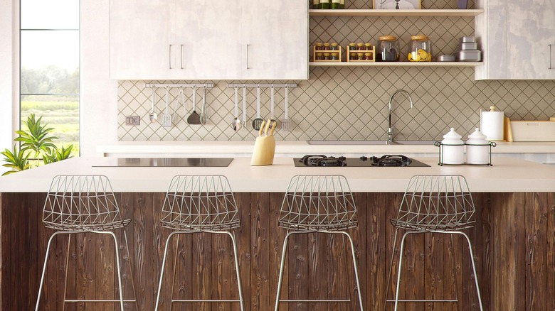
For those looking to infuse a sense of timeless sophistication into their space, consider choosing a gleaming copper faucet or sink that will pair nicely with light shades of brown. Copper finishes go perfectly with warm wooden floors and sleek white cabinets and countertops. The natural orange tones in the wood will be highlighted by the copper. Another way to bring metal into your kitchen is to invest in some industrial-look stools that will pop against wood floors — for example, these Oro Polished Bar Stools by Azeeza. Finish off the look of the room with a metal light fixture that has edges and angles to play up multiple elements of Midcentury modern design.
Embrace a fresh take on paneling
Wood paneling might conjure up outdated looks from the '60s and '70s; however, there are tons of ways to include this element in your modern home, while still paying homage to earlier designs. Not to mention this design addition has been around for centuries, once serving as a type of insulation and now offering an opportunity to add detail and personality to your space. If done correctly, paneling introduces a subtle, yet impactful, bit of texture, adding depth and character to a room. This can help add the lines that make up the Midcentury modern style, while also offering versatility in elevating your kitchen and infusing it with the classic charm.
To embrace paneling, consider sleek, clean lines and minimalist designs. Opt for natural wood finishes or painted panels in muted tones to create a harmonious look that complements your existing decor. There's no reason to get extra fancy with details or carvings — just simple lines can add a lot to a room. Avoid overwhelming the space with excessive paneling; instead, strategically place panels on key focal points, such as island fronts or accent walls, for a chic and timeless appeal. Another tip is to be thoughtful with the direction. Vertical lines can make a room feel taller, but horizontal lines are a great choice only if there's already plenty of light and space in your kitchen.
Opt for smaller tiles to create more lines
Incorporating small tiles into your kitchen design can be a game-changer when going for the Midcentury modern look. This iconic style is characterized by clean lines and geometric shapes, key features of small tiles. By introducing these tiles into your kitchen, you are adding a touch of nostalgia and sophistication.
One way to leverage small tiles is by creating an accent wall that serves as a focal point in the space. The grout lines between each tile naturally form linear patterns that draw the eye and enhance the overall appearance of the kitchen. These accent walls not only add visual interest, but also elevate the aesthetic appeal of the room. For an artistic twist, consider using peel-and-stick tiles for your creative backsplash, around the base of your cabinets, or even the sides of your cabinets. This unexpected element adds a fun surprise to the kitchen, infusing it with personality and charm. The small tiles will create a cohesive look that ties the design elements together seamlessly.
Large windows can transform a room
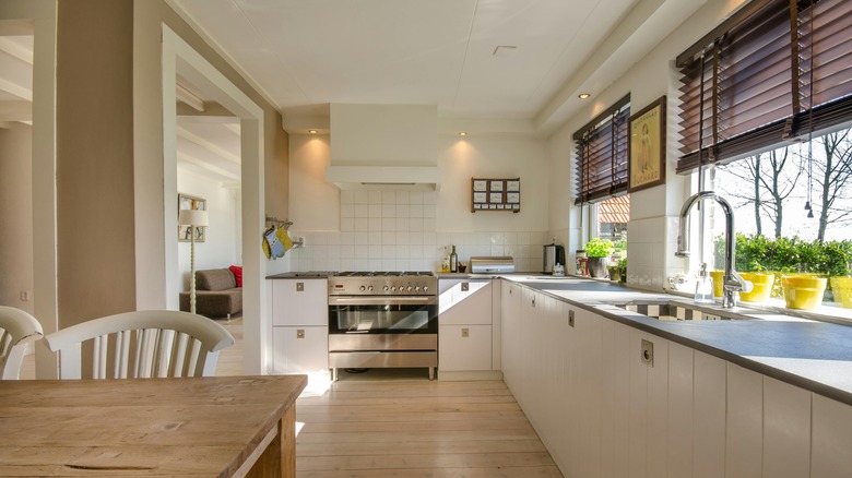
The decision to enhance your kitchen with large windows goes beyond mere aesthetics; it is a transformative investment that can elevate the entire atmosphere of the room. While the initial cost of an upgrade like this may be daunting, the benefits can truly be worth it. Natural light flooding through expansive windows has the ability to create an illusion of more space, while also showcasing the natural world outside. The seamless integration of indoor and outdoor spaces was a hallmark of Midcentury modern architecture. The lush greenery, changing seasons, and natural colors are all brought into your living space, replacing the need for excessive art, decor, and clutter.
If you're not looking to fully replace your windows at this time, you can do small things to make your existing windows feel larger. Consider ditching frilly curtains that bunch up and block your view even when they're open, and check out static cling window tints. They protect your privacy and still allow natural light in, and they create a less cluttered, sleeker appearance. Roman shades are also a great option when striving for a minimalist look. Choose a neutral shade without patterns and minimal fabric to make the most of the windows you have.
Geometric shapes are easy to incorporate
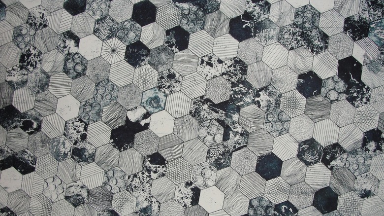
Geometric shapes bring a sense of order and sophistication to interior design, particularly in the context of a Midcentury modern kitchen. By adding these shapes to your decor, you can evoke a timeless aesthetic that is both stylish and interesting. Large pieces of art featuring geometric patterns serve as focal points, drawing the eye and adding visual interest to the space. Or you can opt for bold, graphic prints that complement the clean lines of Midcentury modern design.
In addition to statement artwork, consider adding smaller details, such as tea towels, curtains, rugs, backsplashes, and refrigerator magnets that feature geometric shapes. Accent walls are another simple way to add some flair without committing to a huge project or an expensive renovation. The Peel & Stick Geometric Roll by York Wallcoverings on Wayfair is a perfect example of a fun design that still incorporates other Midcentury modern elements, like earthy tones. These subtle touches help tie the room together and create a cohesive look.
Add some spherical lighting
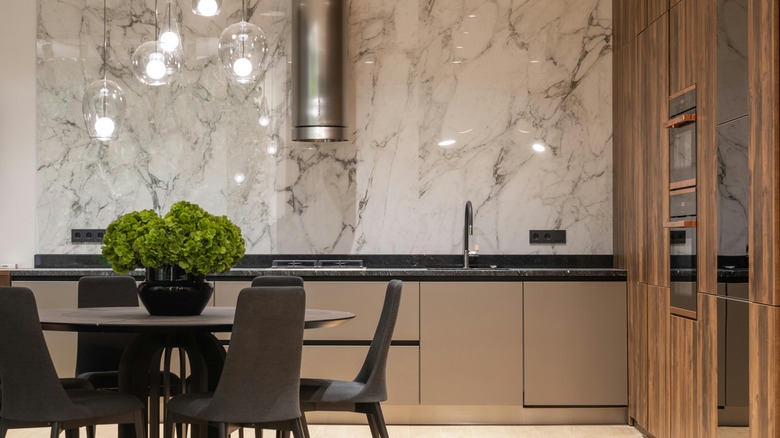
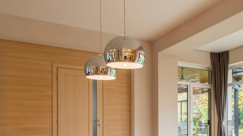
It might sound contradictory, but the addition of spherical lighting fixtures can greatly enhance the Midcentury modern aesthetic of your kitchen. While prominent lines and angles are main features of this style, introducing curved elements can provide a striking contrast that adds interest and depth to the space. Pendant lights and rounded lamps with subtle curves and a soft glow can also serve as focal points in the room, while still complementing the overall design scheme. Placing them strategically above key areas, like the kitchen island or dining table, can create visual interest and draw the eye toward specific features.
Whether placed on countertops, shelves, or side tables, these fixtures can soften the sharp edges of cabinetry and countertops, creating a balance between straight lines and organic shapes. To combine a few design elements in one feature, you can look for pendant lights that are made of natural wood with warm tones. Lighting fixtures are also often made with metal finishes that can tie other aspects of the room together. If you're feeling extra creative, you can consider an option such as the Euclid Faceted Glass Pendant by Vaxcel Lighting, which is a combination of round and geometric. These opportunities to get creative are where your unique style will shine through.
Take a minimalist approach
Characterized by straight lines, organic forms, and a focus on functionality, this design style embodies several characteristics already associated with minimalism. Embracing the principles of simplicity and uncluttered spaces, a minimalist approach to your kitchen can transform it into a sleek and stylish Midcentury modern paradise. This aesthetic will not only stand the test of time, but also provide you with a serene environment to cook, entertain, and gather with loved ones.
When making improvements to your kitchen that adhere to minimalism and Midcentury modern design, start with a neutral color palette. Opt for shades like white, beige, or light gray to create a clean and timeless backdrop. You can add natural materials, such as wood or stone, for countertops and accents to create warmth and texture to the space. When it comes to furniture and decor, choose pieces with simple shapes and silhouettes. Open shelving can be a great way to display your favorite dishes or cookware, while maintaining a sense of openness in the room. Avoid cluttering your kitchen with unnecessary gadgets or decorations — instead, focus on essential items that serve both a functional and aesthetic purpose.
