Unsellable Houses Stars Unveil A Questionable Design Choice You May Want To Avoid
On HGTV's "Unsellable Houses," twins Lyndsay Lamb and Leslie Davis take underwhelming properties and transform them into welcoming homes that sell for top dollar. The sisters renovate, upgrade, enhance, and walk away with as much as $210,000 after selling their investments. And what's the secret for the duo? According to the Lambs, it's nothing less than stellar design. The Lamb sisters look at an unsavory property and see a diamond in the rough. They then work together to draw out its full potential and make it a home that buyers will love.
While both sisters are expert brokers, Lyndsay is the design guru. On "Unsellable Houses," she does more than just stage — she creates spaces where people want to live. And buyers love that she's not afraid to go bold. Mixing textures, prints, and tones, Lamb's design choices pay off, with formally unsellable houses getting swept up for top dollar. Since Lyndsay Lamb usually gravitates to a look that's timeless overall, her latest bold and playful move has fans divided.
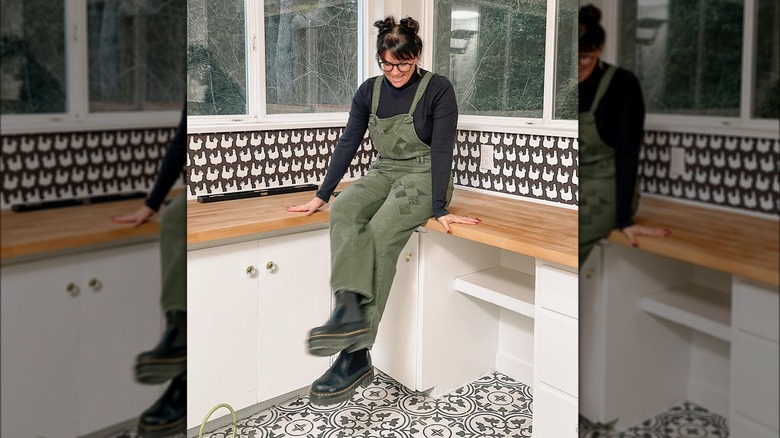
On season 4, episode 12 of "Unsellable Houses," the Lambs unveiled a renovated farmhouse mudroom with black and white patterned tile and wallpaper featuring an unexpected design choice — chickens. Even for a farmhouse, the poultry-inspired wallpaper and double dark patterning were bold choices to pair. Although the house renovation turned out handsomely, with the sisters walking away with $182,500 pocketed, we're diving into why doubling down on striking patterns after installing bold wallpaper may still be a big design mistake.
Think twice before pairing patterns
Though the "Unsellable Houses" stars proved that their season 4 finale home was far from unsellable, their bold mudroom may have still been a design mistake. The two strong, monochromatic patterns on the floor tile and wallpaper shared on Instagram clash more than complement each other. The choice created a busy look that didn't resonate with fans. Apart from being an eccentric design choice, a closer look at the wallpaper reveals one of two problems: uneven wallpaper application or unleveled cabinets. Both are renovation faux pas you'd want to avoid. Whatever the case, the renovators could have solved the issue by using plain neutral-colored wallpaper or paint instead. Designers view neutrals as the foundation for a space, keeping it grounded and harmonious. Swapping the wallpaper for a neutral would have created a more balanced space. Especially when contrasted with the simple, natural colors and tones used throughout the rest of the home, this double design in the mudroom seems like a mistake.
Although there is a way to perfectly mix home decor patterns, you'll want to avoid pairing two bold patterns that utilize the exact same color scheme. Especially if your eclectic design choice involves something as unique as monochrome chickens, your pairing can still be bold, but opt for a variance in color. There are many examples of maximalist rooms that balance the space perfectly, but the Lambs' redesigned mudroom was missing a key element — the use of complementary and contrasting colors for cohesion.
Bold wallpaper dos and don'ts
If you're a fan of big, bold wallpapers, don't ditch your dreams just yet. Some principles can help you personalize your space with patterns and avoid people's most common mistakes made following design trends. When it comes to wallpaper, you'll want to opt for a peel-and-stick option that will make it easier to remove if you make a mistake or eventually want to switch things up. This is what the Lambs do for their HGTV designs, with even the mudroom chickens being peel-and-stick. "Wallpapers right now are so easy to install," said Lyndsay Lamb, showing off peel-and-stick wallpaper in an interview with K5 Mornings. "You wanna change them? It's easy to do. So you get a new mood, you decide you've got a new style in a year — easy."
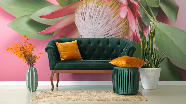
If you're going to use a bold pattern, aim to maintain visual cohesion and ensure that your selection harmoniously blends with the house. Balancing one bold pattern with solid neutral colors like gray and beige is a good option. If you're set on doubling patterns up, make sure the designs are complementary and create visual interest without being overwhelming. Utilizing solids and neutrals is a must, as it ensures that the eye has a steady place to land. Another way to avoid a design mistake if you want to pair bold patterns is to use scale. Instead of pairing two large patterned items like wallpaper and flooring, pair bold wallpaper with intriguing decorative items instead.


