Bathroom Color Schemes Your Favorite HGTV Stars Swear By
Whether you're renovating an entire property or your bathroom only, deciding on the look of a space can be tricky. From fixtures to shower styles, there's heaps of things to think about, and with the average remodel in 2022 costing $9,000, you want to make sure it's right. One of the most important factors to consider is the color scheme of a bathroom. You may have plenty of ideas, or feel stuck on where to even start. Fortunately, the designers of HGTV have got you more than covered. From a space inspired by a vintage ice cream parlor to modern and timeless styles, there really is a pick below for everyone to love.
Take inspiration from none other than Jenn Todryk of "No Demo Reno," Christina Hall of "Christina on the Coast," Erin Napier of "Home Town," Joanna Gaines of "Fixer Upper" fame, Hilary Farr from "Love It or List It," and the Property Brothers. All of these design experts have shared their favorite color schemes for a bathroom, and what they love is sure to get you in the mood to design your own perfect space.
Jenn Todryk - White and gray
Jenn Todryk of "No Demo Reno" believes that one color scheme doesn't work in a bathroom, and that's brown. However, Todryk does like white and gray. In Season 2, Episode 9 of "No Demo Reno," titled "New Space for Newlyweds," the design expert made over a couple's brown bathroom as part of an entire home renovation. Todryk transformed the previously dated room into a modern oasis, complete with white cabinets, white and gray geometric tiled floor, and greige paint on the walls. The final result was a calm and sophisticated space perfect for relaxing in.
White and gray is a classic color combination that will suit a contemporary bathroom perfectly. Though neutrals are timeless, gray is a neutral that can read on the trendier side. If you're worried about it going out of style, we recommend using white as your main color and introducing gray via things that can be changed out like a bath mat or towels. Using a greige color for the walls will also introduce gray in a warmer way if you don't like the look of cool gray tones.
Christina Hall - White and champagne
Neutrals never go out of style, and it seems that Christina Hall agrees. In Season 4, Episode 9 of "Christina on the Coast," Hall helped a couple redesign their old-fashioned brown and cream bathroom as part of a wider coastal renovation. Choosing white and champagne for its stylish yet timeless feel, Hall opted for glossy white cabinets with silver hardware and white and champagne wall tiles for the vanity wall. The couple also opted for contrasting ashy wooden flooring on one half of the bathroom and tiling on the other.
Champagne is a color that evokes opulence and sophistication without being visually overwhelming. As it's a subtle shade, you can use the hue either on your walls or to accessorize with. We recommend incorporating it via tiling either on your vanity wall or in your shower for a chic look. If you're worried about your bathroom looking too dull, add in color elsewhere — champagne and white would look stunning with brighter shades like purple.
Joanna Gaines - White, navy, and gray
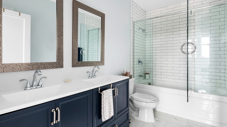
Joanna Gaines has chosen hundreds of color schemes over the years on "Fixer Upper," but the design expert thinks that navy, gray, and white make up the perfect bathroom color scheme. Choosing these colors because they will stay in style without looking aged no matter how much time passes, Gaines has long heralded the use of gray in a bathroom. Speaking to Country Living in 2017, she shared, "In a bathroom, I like the idea of using something fresh and clean, like one of my favorite grays, 'Wedding Band."
Of these three colors, navy is the boldest. Because of this, we recommend accenting with it. For example, if you paint the walls gray, navy cabinets would look great and bring in a pop of color without making a space appear too dark. You can then add in white with fittings such as the shower and sink. Alternatively, if you prefer to go all out with navy walls, we recommend choosing white over gray for fixtures. You can then incorporate gray via accessories like towels.
Erin Napier - Gold, brown, and cream
Everyone loves ice cream, but Erin Napier's ice cream-kissed bathroom takes this love to the next level. Napier wrote via Instagram, "I couldn't decide what would be the most appropriate surfaces for our 1930 Tudor, and I kept returning to the design of the Wakulla Springs Lodge and its marble slab ice cream bar and baths from that same era." The ice cream bar in question has a pink, brown, and white color scheme that Napier clearly took inspiration from. Her bath and shower are tiled with marble slabs, and the brown and cream flooring also evokes a vintage feel that's fitting for a 1930s home.
Though an unusual color combination, the brown, cream, and champagne-gold color scheme Napier chose for her bathroom is perfect for creating an early 20th-century look. If you like the color scheme but don't necessarily want the vintage vibes, we recommend opting for cream and gold marbled tiles to capture the main essence and then accessorize with pops of brown. It doesn't have to be a deep, dark brown. There are plenty of tawny brown shades that would work with cream and gold while giving your bathroom more of a contemporary look.
Hilary Farr - Black and white
She has designed heaps of bathrooms on "Love It or List It," and Hilary Farr's love for bold designs is clear to see. The designer often utilizes colors that are on the opposite side of the spectrum — black and white. Farr's love for the color combination can be seen both in this Facebook post showcasing a geode-inspired powder room and this Instagram post sharing a chic geometric bathroom. She uses the colors to create larger-than-life designs even in the smallest of spaces.
Due to black being a strong color, it will make a striking impression if used for your walls. However, if your bathroom doesn't get much natural light, black walls might make it appear enclosed and gloomy. In this case, we recommend opting for either black and white wallpaper on just one wall or for black cabinets in an otherwise white bathroom. While Farr loves to use bold wallpaper in small spaces, the look isn't to everyone's taste. If pure black isn't your thing, choosing a washed black or darker gray shade can also achieve a sophisticated look without being as intense.
The Property Brothers - Green, black, and white
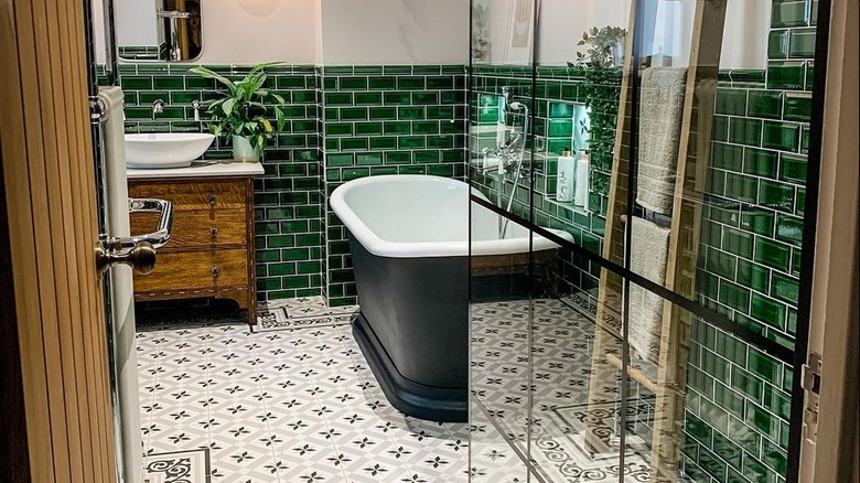
The Property Brothers aren't afraid to branch out color-wise, as evidenced by the design they have chosen for their homes. In their stunning Los Angeles home, Drew Scott and his wife Linda opted for a stunning green, black, and white color scheme in their guest bathroom. The effect is bold yet still peaceful enough for guests to feel relaxed and welcomed, and we love how the black adds extra dimension to what could have been a bland space.
Make like Drew and Linda and contrast darker colors with bright white countertops. This is especially important if your bathroom has small windows, as the white will work to lighten up a space. Green can give a bathroom a retro vibe, which Drew and Linda emphasized by opting for subway tile on the walls. This is a great way to introduce texture into a small space and give it that little something extra. When used for accessories, green can fade into the background, so we recommend using it for walls or cabinets so it gets its rightful spotlight.
