Jasmine Roth's Two-Tone Wood Cabinets Are Revolutionary. Here's How She Did It
It's a testament to Jasmine Roth's design sensibilities that at first you probably don't notice what's so unusual about the kitchen she designed for Katt and Vinny, a couple recovering from a catastrophic plumbing failure and featured on "Help! I Wrecked My House." Even when you see the feature described as "two-tone wood cabinets," you might not see it at first. When you finally do see it, you probably can't imagine it any other way. Did she really drop natural white oak all-wood drawer pulls and accents adrift in a sea of walnut cabinets?
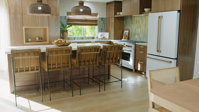
She did, and the effect isn't striking or dramatic or any of those things you eventually get bored with. It's simply right, just as she meant it. "It's not every day that we mix wood tones, but if you are going to mix wood tones you have to do it intentionally," Roth said in the episode. "You can see the white oak is very light. The walnut's very dark. Obviously, you're doing this intentionally because you have two very different colors." The walnut is carried through every room of the home, sometimes as an accent and sometimes accented in ways that integrate it into the individual rooms. The kitchen cabinets themselves are tall affairs with undecorated doors and drawer fronts. Like a number of elements in the room, which Roth describes as midcentury boho, the design flirts with a dated vibe but veers into timelessness in the way all the details cohere.
Cabinets: sameness and contrast
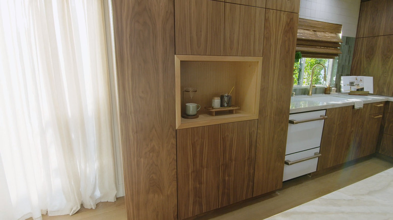
Roth says in her blog, "I don't say this very often, but this might be my most favorite kitchen I've ever done!" It's not hard to see why, but it's not something you can see all at once. The cabinet fronts, for example, are bookmatched top to bottom so that a stack of three drawers whose fronts are all sawn from a single piece of wood with continuous grain. "[T]he fact that they connect makes it feel like just one solid piece of wood," Roth said in the episode. In some places, the cabinets are floor-to-ceiling, and in others are interrupted only by a slice of countertop or a splash of tile ... and by the contrasting white oak details.
It could have all looked a bit homogeneous except for those interruptions and the fact that they are themselves intentionally varied — three types of tile, two countertop materials, white appliances, and the second wood tone. She could have easily gone too far with the white oak, but the cabinet doors don't have handles, so the solid wood pulls only appear on the drawers. The other prominent location is an inset coffee bar in the middle of a monolith of cabinetry. It's just enough, in just the right place, to lighten and refine what could have felt heavy, dark, and dated.
Half a century might be dated, but midcentury is forever
HGTV has been promoting two-tone kitchen cabinets for a while, but almost always with one or more of the elements painted. Using two natural wood tones is less common. It was far more common in the '70s when a room might have wood floors, wood-paneled walls, wood cabinetry, and three different kinds of wood furniture. And Roth's solid wood drawer pulls are reminiscent of that period. But one of the first things homeowner Katt, a fan of midcentury design, said when seeing the kitchen was, "Look at the handles. I love the wood on wood." She might have been seeing the midcentury and not the '70s because while the home ended up with enough boho eclecticism to escape the full midcentury modern label, there's certainly enough midcentury to make the wood-on-wood aesthetic feel perfectly at home there.
For every touch that pulls the design away from the wood, like the glass tile and the countertops, there's an element that reinforces the multiple wood tones. The half-iron, half-oak frames of the counter stools, for example, marries the white oak and the walnut perfectly. As do the cane and reed elements like the dining chair backs, kitchen window blind, and the pendant light shades. It all works together to make the two-tone wood treatment gel within the midcentury vocabulary.

