HGTV's Erin Napier's Unique Spin On Kitchen Backsplash Brings All The Charm
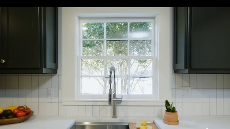
A backsplash is the perfect place to infuse some personality and uniqueness into a kitchen. While there are plenty of shape and color options, nothing stands the test of time like a simple white subway tile. That's why Erin Napier wanted to use it in the historic farmhouse cottage she and her husband renovated for clients on HGTV's "Home Town." In Season 6, Episode 8 of the show, it was important for Napier to retain the charm of the original farmhouse, so she used classic subway tiles that wouldn't take away from the other details. "I wanted to do something just sort of minimalist with the tile for the backsplash," Napier explains to her clients. However, to make the tiles more modern, she stacks them vertically.
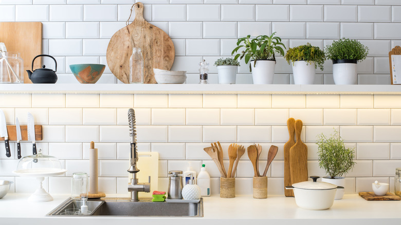
Subway tile is traditionally stacked horizontally and with an offset, meaning the edge of one tile sits in the middle of the tile below and above it. There are ½ and ⅓ offsets where the edge of the tile sits halfways and a third, respectively, across the tile below it. However, placing the tile vertically and with a straight stacked pattern creates an unexpected and unique design that allows the other charming details of the kitchen to shine.
Vertical tiles add emphasis
Erin Napier had white subway tiles installed vertically instead of horizontally to add a minimalist charm to the farmhouse. However, the added charm isn't the only reason why vertically stacked tiles are a good option for a kitchen backsplash. The vertical lines the tile creates can emphasize the height of the room by drawing the eyes upward. If your home has large ceilings, stacking tiles vertically will highlight that detail. However, for homes with lower ceilings, vertically stacked tiles can still be a benefit. Those long lines can also make a ceiling appear higher, making the room feel larger.
Napier used these tiles as a backsplash that stopped at the base of the wall cabinets. However, these tiles would make a stunning feature running from the countertop to the ceiling. In areas with no wall cabinets, such as above a range or where there is open shelving, run the vertically stacked tile all the way to the ceiling to create a minimalistic statement in the kitchen.
As for the tiles, 3 inches by 6 inches is the size of subway tile you'll see the most often. While they're a versatile option, they lean more traditional, which makes them a great option for a farmhouse aesthetic. However, if you want a more modern subway tile, opt for something skinnier, like a 2-inch by 4-inch or a 2-inch by 6-inch tile. The sleek look has a timeless but more contemporary feel.
Taking risks with tile
Stacking subway tiles vertically isn't the only way that Erin Napier takes risks with her designs. Napier has played with the shape of subway tiles and opted for squares rather than the traditional rectangular. The designer has used square tiles in a grid pattern as well as a half-offset, both of which provide their own kind of charm. The grid pattern has more of a retro look, calling back to designs from the 1940s. The half-offset feels a little more contemporary. Square subway tiles have the benefit of being unique as they're not used as often as their rectangular counterpart. However, their minimalistic design allows them to be timeless.
Look for square tiles that are 4 inches by 4 inches. Tiles smaller than this size can look too busy when installed, and larger tiles tend to work better on the floor. For a retro look, glazed white tiles work best and can add some charm to a home that has a more traditional or antique style. For homes with a more modern aesthetic, materials like marble and stone can add that contemporary touch. Square tiles with classic marble veining can add an elegant touch. Or, for a bit of texture, consider handmade zellige tiles, which have naturally uneven edges and divots. As Napier has proven, taking risks and altering traditional elements can create the subtle statement a room needs.

