Take A Tour Inside HGTV Star Alison Victoria's Chic Warehouse Home
We may receive a commission on purchases made from links.
What does an interior design star do when they decide to create their dream home? In the case of Alison Victoria, they go big, they go high-budget, and they go bold. After a tumultuous series of legal battles, the HGTV star was on the verge of picking up sticks, leaving her home city of Chicago, and almost quitting the business entirely. Until she had the daring idea to renovate her warehouse office space into the home of her wildest imaginings. Alison Victoria was in the process of selling the property when she was put onto the fact that she could rezone the space to be residential. She promptly pulled the listing and started laying plans to turn it into a show-stopping residence that she could both work and live from. And boy did she have plans. In an episode of "Windy City Rehab: Alison's Dream Home," the HGTV host boldly stated, "I'm going to design the biggest, the baddest, the sexiest live-work dream home I could ever imagine. When I'm done with this space, there will be nothing like it in Chicago."
Months and millions later, did she manage to pull this off? Alison Victoria recently opened up her new home to Entertainment Tonight's cameras during a house tour, where she shared how the renovation turned out. Although this home is built on a hefty $1.2 million remodel budget, the seasoned renovator has implemented more than a couple of clever design tricks that anyone can apply in their own home. Dive in to peel back the layers on this luxurious warehouse conversion.
The incredible courtyard
Victoria's home tour kicks off in the courtyard, and for good reason. Chicago is notorious for its chilly, blustery conditions, and the Windy City host was determined to create a protected oasis where she could shelter from the elements and "never have to worry about the weather ever again," she shared during the home tour. "Never have to do anything except feel like I am in an Italian garden 24/7, 365 days a year." To achieve this, she went all out, designing a gigantic indoor courtyard in the center of the home. The original 80-foot skylight that illuminated and ventilated the building back when it was a factory now acts to bring the outdoors in, channeling light and allowing a view of the stars at night. To enhance the atrium effect even further, Victoria added six smaller pyramid skylights. The black and white marble checkerboard tile floor is heated underfoot to ensure the space is always toasty. To one side is the "spool," an indoor spa pool that doubles as a massive water feature. Faux olive trees in green planters draw attention to a generous dining table flanked by antique chairs that once graced a Parisian restaurant.
The vast majority of us don't have such an abundance of space to play with. But this doesn't mean we can't take inspiration from Victoria's daring (and smart) decision to create an enclosed courtyard. If you're a fellow Chicagoan or live anywhere else that experiences inclement weather, take a hard look at your home. Is there a space you could enclose, protect, or potentially add skylights to so you can get year-round use out of it? Enclosed courtyards, patios, and decks aren't just fancy; they're also practical. Instead of having to haul cushions and soft furnishings in and out of storage with the seasons, you can leave them in situ.
The dramatic dining room
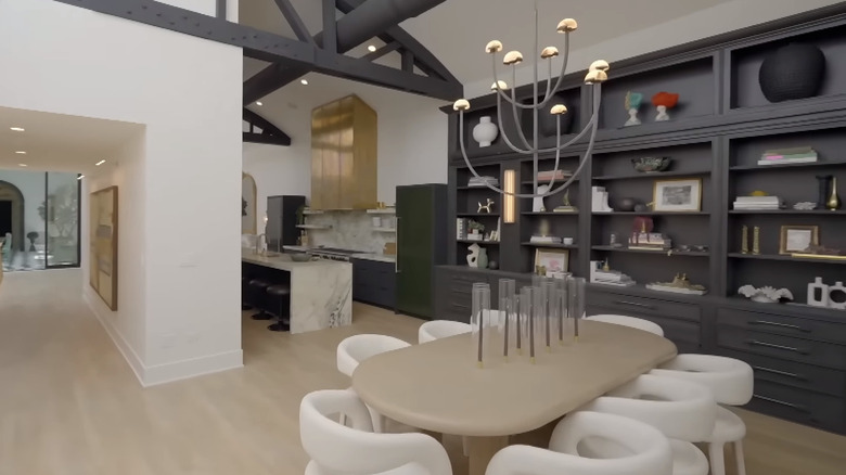
Victoria's dining area has an informal feel, thanks to the open-plan layout. And while it's simple, it definitely has drama. The moody onyx, ceiling-height bank of built-in cabinetry extends from the kitchen into the dining space, lending it that old-school, luxurious feel while still coming off as fresh and current with its black-and-white color palette. To balance the intricacy of the cabinetry, Victoria went with a set of curvaceous postmodern-style dining chairs that manage to look comfy, quirky, and chic all at once. The thick oval dining table echoes the softness of the chairs and offsets the angularity of the bookcase.
Victoria's walls are breathtakingly tall, which gives the area an ultra-grand feel. However, she utilized a design hack that anyone can implement. Instead of stopping the built-ins at a standard height, she carried them up to the base of the overhead beams and installed a library ladder to access the uppermost shelves. Ceiling-high bookcases require a bigger budget, but they can draw the eye upward and accentuate visual height. What's more, you don't have to go the built-in route to get a big bookcase. You can achieve the same look by using Ikea Billy bookcases to create floor-to-ceiling shelves on a budget. The collection also has extender shelves for sale for $30 each to add even more height.
The sumptuous, high-contrast kitchen
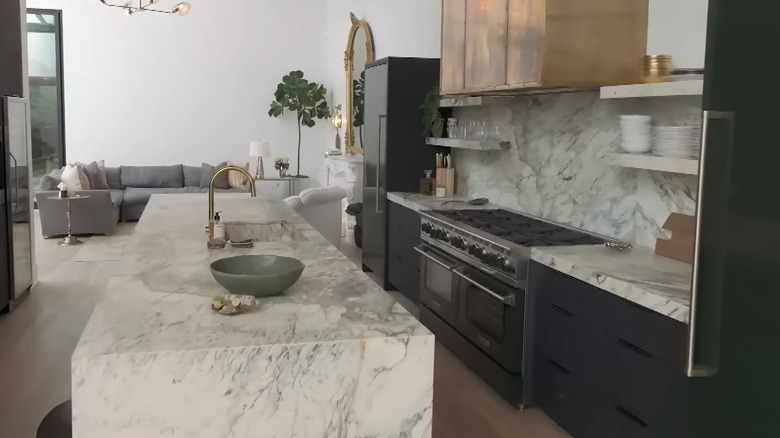
With its exquisite, graphically veined marble, Victoria's kitchen practically screams sophisticated luxury. The moody cabinets flow seamlessly into the space, creating lots of visual contrast between the waterfall island counter (complete with a marble sink) and the marble-lined cabinet niche. A vast brass hood flows upward from a double range, matching the brass faucet and hardware. The final color in the space is an ultra-dark olive green on the doors of the built-in freezer and fridge, which punctuate the ends of the counter.
Double-thick marble on everything and towering brass range hoods definitely don't fit into most homeowners' budgets, but there are still lots of ideas one can steal from this upscale space. For one, the slab-lined cabinet niche is a brilliant way to break up a bank of cupboards, creating depth and visual interest. If you want to channel this look in your own space, see if there are ways to create wiggle room in your budget. For instance, by opting for quartz instead of natural stone, you might be able to save some money. You can also use remnant marble pieces to create the niche for cheaper, like home content creator Drew Michael Scott did when creating his coffee bar niche. Rather than buying a whole slab, you buy remnant pieces and piece them together to create the backdrop. Or you can downgrade from a niche and instead utilize marble open shelving to incur less cost.
The full-size bar
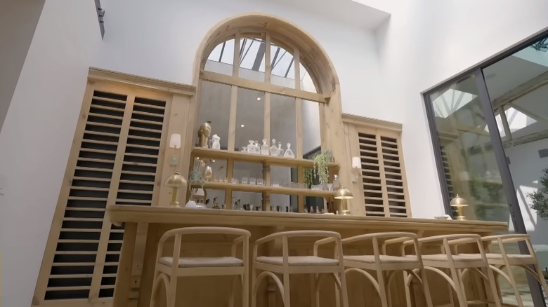
Alison Victoria and her long-time carpenter on "Windy City Rehab," Ari Smejkal, recently parted ways after he retired, but not before he left her with a final, stunning installation. The full-sized bar that he crafted sits right off the atrium and features a restored arched recess originally from a library in Chicago, fitted with honey-toned wood shelves and lined with mirrors. This eye-catching feature adds oodles of dimension, commands attention, and perfectly compliments the louver wood cabinet doors that flank it. The bar counter itself is beautifully made, featuring intricate detailing that whispers of old-world entertaining and easy opulence.
Unless you, too, have over 6,000 square feet of home to work with, creating a bar on this scale could be off the cards. Fortunately, bars don't have to be big, and the perfect place could be hiding right under your nose. A wall unit whose sole role is holding knick-knacks can easily become a sizable drinks station. A small section of bare wall could be the ideal spot to place a chic drinks trolley or a closed bar cabinet. Do you have a butler's pantry that doesn't see much action? This could be your opportunity to convert it into a fully-kitted wet bar. If you've got a built-in that's just boosting your ability to hoard junk, you could use this area instead to install a bar counter. If space is super tight, look into home bar ideas like creating a vertical cocktail station made with floating shelves or utilizing wall-mounted wine storage.
The easy-going living room
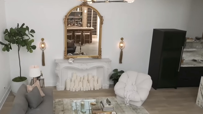
Between the atrium and the kitchen nestles the living room, which is a surprisingly easy-going space. Yes, it has a big, arched, gilt-framed mirror above Victoria's undeniably opulent Parisian mantel — filled with candles — which she brought along from her previous house. And yes, the furniture is stylish, but the L-shaped sofa looks comfortable and cozy. A gray Persian rug defines the space and anchors the glass coffee table, while a petal-shaped accent chair adds interest.
If you want to snag some ideas from this approachable area, here are a few tips: First, notice how the plush accent chair echoes the curves in the mantel. Repeating similar shapes adds visual rhythm, a key design concept. The coffee table's square top with its rounded corners mimics the angles of the sofa, and the base is slightly reminiscent of the tiered arrangement of candles. If you leverage complementary shapes in this way, your mantel doesn't have to be imported from Paris to look hot. Another little trick to take away from this space is Victoria's decision to go with a glass coffee table. Glass-topped tables are a favorite of hers, and the HGTV host uses them intentionally to keep rooms visually open and increase reflection. Given the sky-high ceilings and acres of floorspace, this isn't super critical in her new living room, but it does help to cool down the corner and give the eye a break from the warm, textured feel of the soft furnishings. If you're decorating a small living room that lacks light, glass can be a good way to keep more of the floor visible and bounce a bit of brightness around.
The tastefully sexy bedroom
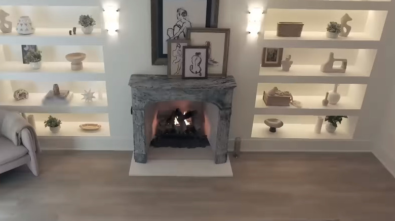
Opposite the living room is the door to Victoria's boudoir. Here, the renovation veteran has dreamt up a simple yet uber-sexy space that oozes understated glam. The stone fireplace makes for an instant focal point, and the built-in recesses on either side complete the elegant vibe. A set of stained glass doors lead onto the courtyard and give off Riviera-vacation-villa vibes. The color scheme is light and soft, primarily a mixture of whites and beiges with some gold accents thrown in.
If you're burning with envy at the idea of a fireplace in the bedroom, here's some exciting news. Installing one might not be as expensive as you think, especially if you opt for an electric fireplace and look for affordable (i.e., not from Paris) surrounds. For example, electric fireplaces can retail for under $300 on Amazon, and the surrounds vary from $300 to $1,000 on Etsy. If you don't get one that simply plugs in, installation costs can vary widely, so that may become the main affordability factor. Already blessed with a bedroom hearth? Haphazard fireplace styling can steal some of your mantel's glory. Instead, go minimal and mimic Victoria's fireplace by stacking some simple framed artwork.
If a fireplace won't warm your heart or fit in your budget, you can still take inspiration from Victoria's shelves, which have just as big a design impact as her hearth. Carving out recessed shelves can cost a pretty penny and be a dusty, disruptive business. To avoid the chaos and cost, here's a hot Ikea hack that interior enthusiasts are using to create dreamily curved built-ins. All you have to do is grab a few sheets of plywood, paint, some Billy Bookcases, bust out your jigsaw, and mark out some arched fronts. You can find in-depth tutorials all over the internet, such as this tutorial from design enthusiast Tamara Smith.
The massive main bathroom that is straight from Mykonos
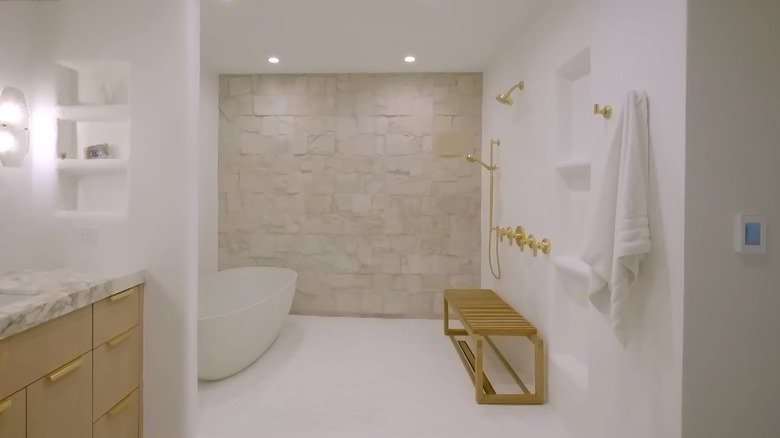
Passing on from the bedroom comes a serious dose of dreamy bathroom design. The primary bath is expansive, featuring a spacious wet room with a natural stone accent wall, waterproof plaster, and heated floors. The inspiration? The Windy City TV star wanted her bathroom to feel like you're in Mykonos, and the white walls, herringbone tile, and textured stone certainly achieve this. A simple wood-fronted vanity with a thick marble top and under-mount sink brings a touch of the contemporary, laced with luxury finishes and warm metal accents.
Having a roomy WC definitely makes it easier to incorporate big design statements like a wet room or a his-and-her vanity. But smaller bathrooms can have just as much impact. Less space means lower material costs. So if you want to go with a mildew-resistant plaster option like polished Venetian stucco or Tadelakt — or a pricy tile choice — fewer square feet could work in your favor. If you're trying to curb costs and make a statement, you can take a cue from Victoria's bathroom and create an accent wall. Investing in one focal feature can allow you to save in other areas and will ground the space. From here, all you need is some great lighting and good finishes on your vanity, and you can have a space that feels inspired and upmarket. Another way you can channel the soothing ambiance of the HGTV host's primary bath is by taking inspiration from her color palette. Maximalist design is definitely on the rise, but if you're chasing serenity in the shower, more may not be more. Instead, a simple color selection of white, soft gray stone, blond wood, and a bit of texture might be the move.
The cozily chic theater
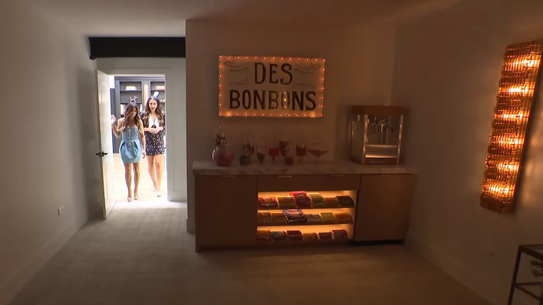
What do you do if you're turning a warehouse into a home? Install your own movie theatre, of course. To make the space cocooning, Victoria dropped the ceiling and installed super cushy carpeting underfoot. Home cinemas are often heavy on black leather, moody walls, and dark carpet, but the "Windy City Rehab" star went in the other direction. Instead of a dark, masculine space, she went with an almost all-white color palette. But at the entrance is an enchanting pop of color in the form of a snacks counter, equipped with a popcorn machine, a glass-fronted display area for sweet treats, and glass storage jars full of candy. Above this is a retro-style, light-up sign that reads "Des Bonbons," which is French for "the sweets." Speaking of lights, the wall-mounted TV screen is framed by two vintage Murano glass lights that Victoria picked up at a flea market in France.
Want to recreate the vibe in your own home? You don't have to be a Francophile, but you will need some spare space to convert into a movie theatre. If you already have a dedicated TV room, this could be the perfect place. Setting up a snack station with a cute sign and attractively displayed candies could quickly turn the area into a certified cinema situation. Finished basements can also make for great home theaters, thanks to their lack of windows and enclosed feel.

