The Stars Of Unsellable Houses Swear By This Brilliant High Ceiling Design Tip
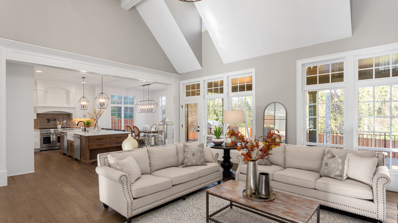
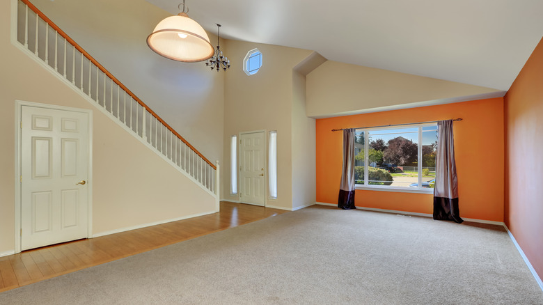
Spaces with high ceilings can be as challenging to deal with as they are beautiful to behold. Often, vaulted ceilings will create a lot of unusable space near the top of a room that homeowners never quite know what to do with. HGTV's "Unsellable Houses" hosts Lyndsay Lamb and Leslie Davis showed off their solution to adding a bit more character to high-ceilinged spaces. By painting them a different color than the lower parts of the wall, they immediately give greater interest and dimension to the room, drawing attention to those gloriously soaring ceilings.
It's an easy fix to a usually awkward space that isn't always accessible to augment with art or decor. Painting this space a separate color gives it its own definition and allows the room to maximize its dimensions in a much more noticeable way. Even better, it's very budget-friendly and completely DIY-friendly, requiring only paint and some time.
Using paint to draw the eye up
In one episode of "Unsellable Houses," a client's house features a large back room that extends off the kitchen with a much higher ceiling than the rest of the home. While the skylights make the space expansive and bright, they do nothing to highlight the architecture. By simply painting the wall above the kitchen's lower dropped ceiling a rich periwinkle blue, Leslie Davis and Lyndsay Lamb draw attention to the height of the adjacent room. In the episode, Davis says, "It makes your eyes go up, and that's one of our big selling points for this house. This back room with these vaulted ceilings and the skylights," per Realtor.
The blue defines the space above the kitchen and ties into one of its walls, painted the same shade of blue for a unified effect near the fridge. The color calls attention to the height difference but still makes both rooms feel more cohesive and put together.
Creating architectural interest
Leslie Davis and Lyndsay Lamb's trick with color is one you can implement in your own home in similar spaces, using color to draw the eye upward. This works beautifully in modern homes that often have lofted and soaring ceilings. Choose a color that complements both your lower wall color and other decorative touchpoints throughout the room. For a bolder look, pair something saturated or matte black with white paint below. If you gravitate toward neutrals, try a soft white below with a rich gray or brown on the higher section. You can also create a stunning monotone look using two shades of the same color.
Other options for treating these kinds of wall spaces include wallpaper, paneling, murals, timbers, or molding, as seen in this drop ceiling remodel on the show, to create visual interest that varies from the walls below, all of which can draw the eye more subtly. The approach is also great for spaces that have smaller height variations like stairwells and rooms with raised or lowered floors to create definition.


