Design The Perfect Modern Bathroom With Tips And Tricks From Popular HGTV Stars
We may receive a commission on purchases made from links.
Have you been dealing with an old, dated, dingy bathroom and are on the verge of renovating? Maybe you're planning a bathroom addition or need to pick out the finishes for a new build. Designing a bathroom is a super exciting project, but it can also be fairly challenging. Pretty much every element is fixed, and all decisions are final. In a living room or bedroom, you can play around with furniture placement, swap out pieces you don't like, and mix up the space whenever you want. In a bathroom, there's a lot less room for experimentation. Once the tiles are up on the wall and the features are installed, there's not much you can do to change things until the next reno.
If you're feeling daunted by the sheer permanency of it all, don't be disheartened. With the right tips and tricks, you can ditch the indecision and start designing with confidence. And who better to take design advice from than HGTV's bevy of hands-on hosts and interior experts? From gutting out bathrooms to solving design dilemmas sans any demo, HGTV's most popular stars have seen it all. They know what to avoid, where to save, and where to invest, and they have more than a couple of clever hacks up their sleeves. Get inspired, and keep reading to discover some unmissable tips for creating the perfect modern bathroom.
Jasmine Roth: Carve out a niche
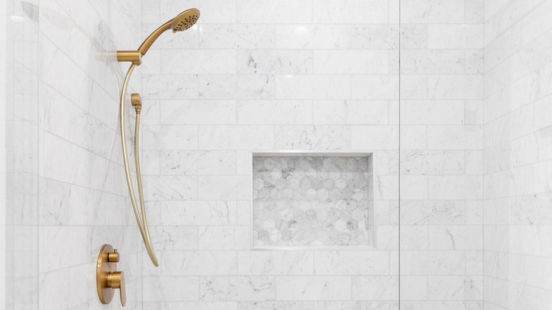
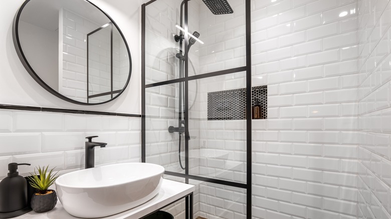
If you're demoing your shower cubicle or installing one from scratch, you have the golden opportunity to get fancy with a shower niche. Goodbye flimsy-chrome-hanging-shower-caddy and hello beautifully sleek, seamless, inset ledge. With one small recess, you can transform your shower from cluttered with a bottle-stuffed basket into an Insta-worthy space that oozes modern vibes. Installing a shower recess isn't a massive undertaking, but it's not an upgrade that can happen without proper forethought. During an interview with Realtor.com, Jasmin Roth said, "A shower niche is one of those things you have to plan for in advance, because otherwise it won't stay fully waterproof, and it could compromise the framing, the actual structure, of the wall."
To avoid this potential disaster, speak with your contractor about your plans. If you're doing the job yourself, you'll need to start by lining out the inside of the niche with a waterproof backerboard and modified thinset, followed by a layer of waterproofing membrane. After this, you can tile out the inset. If you don't trust your DIY skills for the task, you can also look into installing a ready-made shower niche that you can tile over. Another alternative is to install a prefabricated niche that doesn't require tiling. This will cut down on tile cutting, but it might not look as custom and high-end.
Emily Henderson: Avoid accent tile in your shower niche
If you do decide to build out a shower storage niche in your new bathroom, be mindful of how this will break up the space. Adding accent tiles into shower niches was a big trend up until very recently, but going this route could do more harm than good. Emily Henderson, host of HGTV's "Secrets From a Stylist," revealed on her blog that shower niches in contrasting tiles can look dated and disrupt the flow. "As a loose rule, I'd say to stay away from alternative tiles or 'accent' tiles. Yes, this can totally be done well, but like a wet pair of jeans, it's just harder to pull off," she shared. "Instead, I recommend going for a shower niche that is almost invisible to the eye. Built with the exact same tile as the rest of the shower surround, so it almost disappears when empty. Or keep the background of the shelf super neutral. I get it, having a shelf right in the shower is almost a necessity, but it doesn't have to announce itself."
If you want to get really fresh, you can implement her personal favorite, a bathroom ledge. Henderson says that "the ledge is a serious contender in my design playbook and something we've been seeing a lot in magazines and in high-end hotels." Rather than creating a recessed box in the wall, you have a simple ledge running across the length of the shower wall.
Leanne Ford: Hide the throne
If your bathroom is getting a serious makeover, why not hide one of its least aesthetically pleasing features? The potty might be one of the most important parts of a bathroom, but it doesn't need to be a focal point. In fact, Leanne Ford feels that it should be as far out of sight as possible. When asked about her biggest pet peeve in an interview with The Expert, Ford said it's "when the toilet is the first thing you see in a bathroom. I don't understand why we design that way. If you are in the blueprint phase, hide the toilet. Sinks are gorgeous, tubs are gorgeous, and showers are gorgeous. Toilets are not. Hide it."
If you're designing a new bathroom from scratch, look at layouts that place the toilet discreetly adjacent to the door. This way, it won't be the initial feature you lay eyes on. You can also try to partially conceal your throne on the far side of the vanity or behind a built-in pony wall if you have the space.
Jenn Todryk: Make your shower look bigger with more grout lines
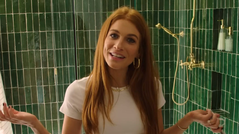
Nothing makes a bathroom look quite as luxe as having a super-sized shower. But not all of us have the square footage for a generous wet-room-style zone. Fortunately, you can create the optical illusion of more shower space by simply increasing the number of tiles you use. Jenn Todryk demonstrated this superbly in her teen bathroom remodel during a Season 3 episode of her HGTV show "No Demo Reno." To maximize the visual space, Todryk chose a narrow tile design that ramped up the number of grout lines. During the episode, the HGTV star said, "The more lines you get in a shower that's really small, it looks a little bigger." Not only do the skinny tiles create depth, but they also pull one's eyes upward, emphasizing the vertical height of the shower.
Thin tiles aren't the only way you can make your shower seem larger. Mosaic, penny tile, herringbone, and chevron tiles can all add dimension and introduce patterns. If you want to increase the visual impact of your tiles, you can also consider using a contrasting grout color to play up the design.
Leslie Davis: A wet room is worth it
Speaking of wet rooms, if you do have the space for one, Leslie Davis believes this feature is a must-have. During Season 3 of "Unsellable Homes," Davis and her twin sister Lyndsay Lamb tackled a five-bedroom home that (shocker) didn't have a tub. The dynamic duo felt this could be an issue for potential buyers and created a wet room area that featured both a shower and a tub. On her Instagram, Davis shared, "Since we worked on this project, we have become obsessed with wet rooms ... Even though it was a risk, and the most expensive 'Unsellable' bathroom reno to date, it definitely paid off in the end!"
As the "Unsellable Homes" host hinted, opting for a wet room can ratchet up the price of your reno. Not only do you have to buy more tile, but you also have to ensure that the entire space is properly sealed and waterproofed. Very tiny bathrooms might not be suited to a wet room layout. Having a toilet constantly covered in water isn't a good time, by any stretch of the imagination. But if you have enough space, a wet room has a bunch of benefits. Along with looking luxurious, they are also more accessible. They don't have any lips or steps to trip over, and they're usually easier to clean. As Lamb and Davis demonstrated, they can also be a great way to squeeze in both a tub and a shower while still achieving a spacious feel.
Breegan Jane: Get more floor traction with grout
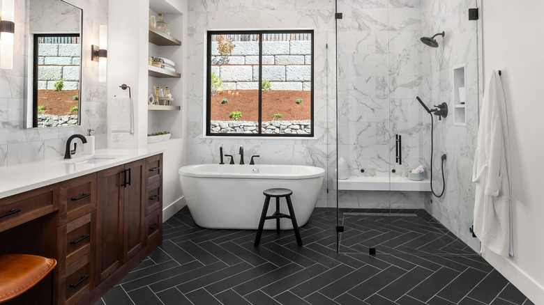
Traction is a top priority in bathrooms, particularly if you're going to install a wet room. To start, try to only select tiles with a coefficient of friction (COF) rating of 0.42 or above. This is the minimum recommended for level floors that are likely to get wet, as per the American National Standards Institute. To increase the safety of your bathroom floor even further, grout lines are your friend. Along with a bevy of other bathroom flooring tips, Breegan Jane shared on her blog that "one of the best ways to give your bathroom flooring a bit of necessary grip is to take advantage of grout." Besides sealing and setting the floor, she says that grout "provides a bit of traction, and that's precisely what we're after in a space that is often wet and slippery. You can also take advantage of patterns with tile in order to gain a little grip on your bathroom flooring. I laid subway tiles in a herringbone pattern to do this, and it gave the floor a little more personality."
If you have your eye on a tile choice that isn't super grippy and are worried about safety, speak to your installer about ways to lay the tiles that will up their anti-skid factor. If you're doing the job yourself, make sure you adhere to the minimum grout line width specifications for the tiles. To know for sure, check the manufacturer's directions on the packaging.
To make your grout do double duty, you can use even wider tile spacers, such as 3/16 inch or 1/4 inch. Sanded grout is typically recommended for wider grout lines, as it shrinks less and has a lower risk of cracking. Because it's abrasive, sanded grout can add even more traction to your floor.
David Bromstad: Pick your paint color last
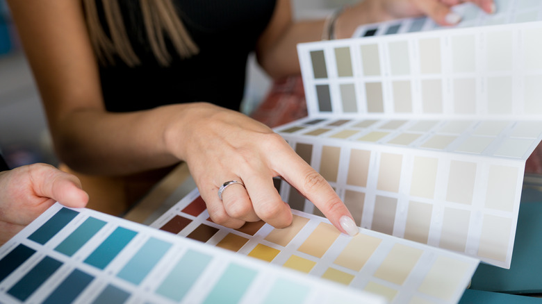
What's one of the first things you start thinking about when designing a space? Probably paint color. While it can be wise to pick out your paint shade in the early stages of a remodel, sometimes saving this decision until last could make sense. Longtime HGTV host David Bromstad revealed in an interview with US Weekly, "I always chose my paint colors last ... When you're buying your bath towels, bath mats, rugs, shower curtains, and all your accessories, those are all going to cost more than a gallon of paint, which is your cheapest accessory. Figure out your color scheme first, then look like a bag lady and bring your accessories to the paint store to match."
This is a great approach to take if you're undecided on your final color palette and want some wiggle room. Professional designers have these details worked out way ahead of time, but for the average homeowner, choosing all your elements without seeing any of them in the space can be overwhelming. Paint is not only the cheapest, but also the least permanent feature in a bathroom. First, see what color your tiles and bath features will be, then fill in the holes with your accessories. Once you have it all pulled together, choose your paint color.
Desta Ostapyk: Make a statement with a wall mural
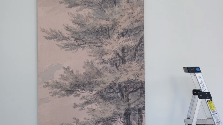
If you're itching to do something unexpected and break the mold in your bathroom, interior designer and Canadian HGTV personality Desta Ostapyk could have the perfect tip. In an Instagram post, the "Love It or List It" star said, "Murals are a fun way to add interest to any space, like this basement bathroom we did!" The before and after photos feature a plain-looking bathroom turned into an ultra-inviting space, with one wall decked out in a floor-to-ceiling wallpaper mural. The grayscale design perfectly suits the color palette and adds an elegant touch.
To copy and, ahem, paste this idea into your bathroom, start by measuring the wall and analyze how your chosen design will fit onto it. You will probably have to trim off excess. Make sure this won't cut off key elements of the mural. Prep and clean your wall thoroughly, filling any holes and sanding down rough patches. Using a level, mark a line down your wall to use as a starting point. Most walls aren't perfectly plumb, and any discrepancies will only get worse the more panels you apply.
Not totally sure whether a mural will look good in your space? If you're scared to commit, you can always test out the idea with a renter-friendly removable product, such as this Piedmont mural from Wall Blush. This will save you some elbow grease should you decide to take the mural down in the future.
The Property Brothers: Add lots of lighting
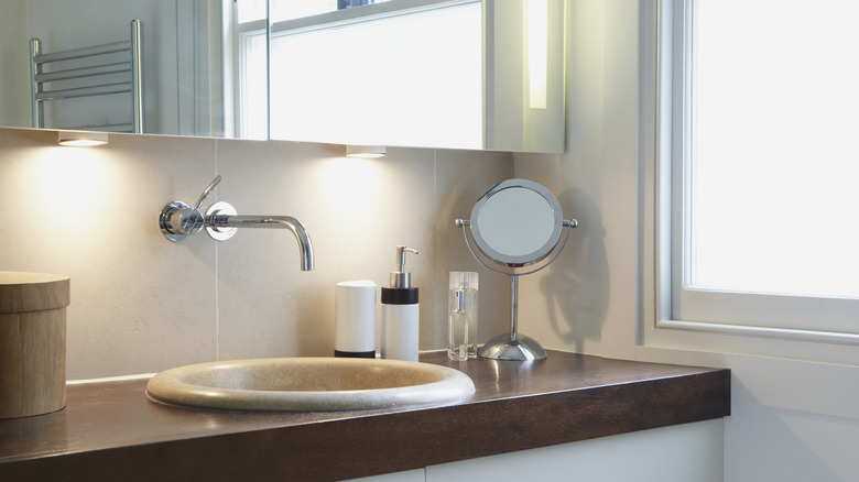
After spending all your mental energy sorting through tile, tub, and toilet options, it can be tempting to treat lighting as an afterthought. But lighting is the final layer that will allow your new bathroom to really shine. Not only can it be a visual wow factor, but it's also an essential functional element. If you've ever tried to shave or do your makeup in a dimly lit bathroom, let's just say the results aren't always great. In an interview with MyDomaine, Jonathan Scott shared, "Lighting is key, especially in smaller spaces like bathrooms." He then goes on to suggest different kinds of options to include for optimal results. "I always include recessed lights in a bathroom, even if there is a chandelier," he said. "For your mirror wall, sconces don't typically do the trick. Anyone trying to use a mirror or apply makeup knows that most sconces do not give you the best light. Nowadays, there are many mirrors that have built-in light fixtures. It gives you the perfect glow when applying makeup or taking a selfie."
Scott's selfie game is pretty strong, so keep his advice in mind when talking to your contractor about lighting options for your new bathroom. While you're at it, see if it makes sense to add any other extra lighting, like heated recessed lights in the shower or downward-pointing lights under the mirror for nighttime use.
Galey Alix: Mix metals for a modern look
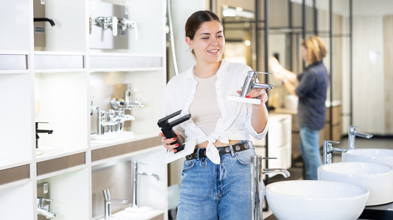
In the past, it was pretty common to stick to one metal tone in the bathroom, but times have changed. Going all in on one finish can create cohesion, but it can also make your space feel basic. Galey Alix encouraged fans to get bold in a social media post, saying, "Don't be afraid to mix metals! If you don't want a staged builder-grade feel, then you need to do things differently. Mixing metals is a great place to start. Here I took an all-chrome bathroom to a mixed matte black and aged brass. The key is to have at least two of each metal. I call them 'sister pieces.'"
Besides mixing the right proportion of different metals, you should also think about their overall tone and how they pair together. Not all metals will look like soulmates, and you need to make sure they speak to each other and tell the same story. For instance, gold cabinet handles may not pair well with patinaed brass faucets. That's because the two yellow hues are a little too similar to each other, making it feel like you tried to match them but failed. Instead, go with total opposites. But gold and chrome can be complimentary, as well as brass and polished nickel. Black fittings are considered a neutral and can go with just about any finish.
The Property Brothers: Save some serious cash with pre-fab cabinets
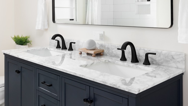
A decent-sized vanity can gobble up a good chunk of your bathroom budget. But if you're smart, you can use this area to save. The Property Brothers know a thing or two about working with budgetary confines, and they shared a hot tip during their interview with MyDomaine. Drew Scott said, "A common mistake when designing a bathroom is to forget about storage or the fact that two people may be using it at one time. To stretch a dollar, use prefab cabinets, which are higher quality than they used to be and are less expensive than custom. At big-box stores, you can typically find preassembled units, including sinks and fixtures, countertops, and vanities."
If you're worried that a pre-fab vanity is going to look boring and basic, there are a bunch of ways to customize these standard cabinets. You can paint the exterior to match your color scheme, swap out the hardware, ditch the taps, or even replace the countertop. If the vanity comes with small, loose pieces of backsplash that are meant to be adhered to the wall, skip these. They scream "pre-fab," so toss them and instead tile a generous backsplash for a bespoke feel.
Nate Berkus: Keep your bathroom current by approaching trends with care
If your bathroom was clearly built a couple of decades ago, you're probably itching for the day when you can rip out those dated features and create a current, fresh space. But this doesn't mean you should hop on the trendiest tiles and finishes. Yes, channeling trends will make your bathroom look modern right now, but what about in five years' time when some of those fads are old news? It's hard to imagine the likes of Nate Berkus having design regrets, but per an interview with Domino, he said, "I made one mistake, years ago, in my own bathroom, where I put in this tile from Mexico in my shower; they were black and white triangles. It was the first thing I didn't like a year later ... I try to keep bathrooms as timeless as possible, especially when choosing materials and more permanent fixtures."
If you do want to try out some trends in your new bathroom, see if there are any less permanent things you can play with, such as the color of your walls or vanity. Repainting is a whole lot easier than ripping out tile. Vanity hardware is also very easy to swap out, so feel free to go bold. Plus, mirrors, lights, and small fittings like towel rails are other areas where you can take some risks.
