The Dated Tile Trend You May Want To Avoid In Your Shower
Tiles are a fun element to plan around when designing an interior space. There's always so much to keep up with in terms of trends, and they come in various styles and layout possibilities. There are also many practical things to consider when choosing tiles. You need to think about where they will be installed, what their purpose will be, and how well they can support the goals of a space. Accent tiles, for example, used to be very popular in shower design, but you may want to avoid them because they tend to detract from the visual landscape.
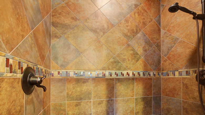
Accent tiles come in different forms now, but the classic style that used to be all the rage in the 90s and 2000s is the cluster of a few horizontal lines of tiles that cut across the space. The tiles are typically different in terms of color, size, and layout so the horizontal band can create a sharp contrast with the rest of the tiles and add some visual interest. Phoenix Grey, the principal interior designer of Orion Studios, advises against accent tiles for this exact reason.
Accent tiles
In a recent TikTok post, Phoenix Grey explains "Adding in these super busy accent mosaic tiles really do not add the personality and flair that you thought they did." The main appeal of these tiles is that they add something different to the shower space. Instead of maintaining a uniform look all over, they offer a clear focal point that the eye can immediately land on in the space. While they do achieve this, it isn't a positive for the shower space.
Picking the right size tile, along with layout, shape, and pattern are important elements because they affect the visual experience of a space. For example, big tiles can create the illusion of more space but so do tiny, continuous patterns because it all depends on the execution and how you combine the different elements. Accent tiles in a thick horizontal band achieve a negative effect because they disrupt the visual flow. "Doing this visually stunts the height of the room," says Phoenix Grey (via TikTok). "You're adding this extra horizontal line that visually breaks up the space and adds more clutter." If your bathroom is already small, it feels even more cramped, and if your bathroom is spacious, it detracts from that.
Alternatives to consider
Instead of the classic horizontal lines, it's now common to see accent lines used in different forms. One way is with any recessed sections of the shower wall. A fun accent tile in those spaces can add interest to the space without affecting it too much because they're typically smaller, allowing them to truly deliver as accents. Another option is to still create a band, but vertically so it draws the eye upward and visually extends the walls. This still breaks up the space but it will feel much less harsher than the horizontal band.
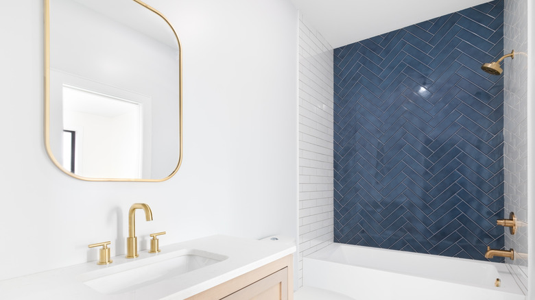
Another alternative is to create a full accent wall. This is a great way to make a statement in the bathroom space and it doesn't even have to be too different from the rest of the tiles. You can choose color, pattern, layout, or a combination of any two of these elements, as the distinguishing factor for your accent wall. You can also ditch the accent concept completely and create visual interest with all the shower tiles. A current trend is dimensional tiles that add texture like stone tiles or handmade ceramic tiles.


