Lyndsay From Unsellable Houses Says This Kitchen Upgrade Will Make Your Space Feel Homier Than Ever
A modern kitchen has a lot of conveniences, but aesthetically, it runs the risk of feeling a little cold. After all, it should be a warm, welcoming centerpiece of your home — and with a few simple upgrades, it can be. For one creative idea that will make your kitchen feel homier, consider some advice from Lyndsay Lamb. The host of HGTV's "Unsellable Houses" says that shiplap can be the secret ingredient. According to the designer, the finish is a great way to infuse a kitchen with the right amount of character and depth to create that cozy vibe. On her Lamb & Co. blog, she writes, "It's hard to resist a good shiplap surface. It provides texture and interest in a space without getting too loud."
Traditionally, shiplap is a layered wood panel style, where the bottom of one panel overlaps with the next, creating a shallow ridged texture. Today, shiplap is often used as a generic term for midsized or wide wood paneling, particularly when it's used for special accent walls. Although wood paneling can be overdone in a home, Lamb shows that with a light touch, shiplap is the ideal accent texture for turning your kitchen into a welcoming space.
Shiplap ceiling for the kitchen
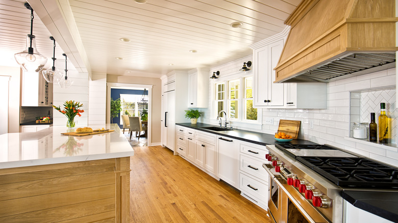
On her blog, Lyndsay Lamb shares a specific example from a renovation project, where she used wood paneling. She writes, "In this house, we decided the kitchen needed a little extra splash of homey-ness, so we decided to add shiplap to the ceiling." Lamb goes on to explain how they coordinated the shiplap with the rest of the space, saying, "It fit well with the classic white cabinets and really added definition to the space."
As demonstrated in Lamb's kitchen renovation, the shiplap helps to warm up a modern kitchen and give it a slightly more traditional aesthetic. The streamlined modern cabinetry and stainless steel appliances suddenly feel much less sterile when housed under the wood-paneled ceiling. Color also plays a big role in Lamb's design method. The white ceiling matches the cabinets, keeping the kitchen light and airy. Meanwhile, the dark lines that naturally form between the wood panels create organic depth.
Shiplap styling ideas
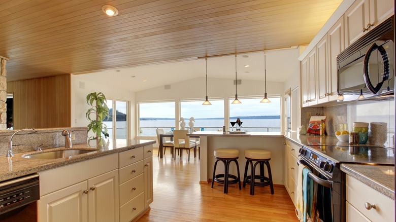
In the case of Lyndsay Lamb's project, she puts the shiplap on the ceiling only. This provides texture without overwhelming the space. When you're planning your design, install the wood panels so that they align with the length of the room, rather than the width. This will help elongate the space and keep the kitchen from being cramped. You can also copy Lamb's style and give them a white finish for a clean, crisp look, or you can stain them for a soft, natural aesthetic.
Alternatively, skip the ceiling and use the finish on an accent wall or for the backsplash. A breakfast nook is the perfect home for a shiplap wall, especially if you use the traditional layered shiplap style with horizontal panels. The boards can be painted any color from a pretty pastel for a beachy look or a deep charcoal for a dramatic vibe. Add a few hooks to hang decorative kitchenware and some family mementos, and you'll have a magical, homey kitchen vignette.


