Mina Starsiak Hawk's Stunning Design Ideas You'll Want To Bring Into Your Own Home
HGTV's "Good Bones" star Mina Starsiak Hawk is one of the network's most innovative talents. Using her keen eye, she evaluates the distinct characteristics and features of a property. Then, she embraces their uniqueness and visualizes stunning design ideas.
Throughout the show's run, the home remodeling guru has taken on each project with a holistic approach. Sometimes she draws inspiration from the property's history. Other times, she makes design decisions that pay homage to the neighborhood. But in many projects, she reimagines the home's footprint or amenities to transform it into a perfect space for her clients.
This all leads to an exciting mix of finished homes. However, there are some tried and true techniques she's used multiple times to wow both her clients and local real estate experts. And, you can borrow Starsiak Hawk's design ideas to upgrade your own space and thoughtfully transform your home.
Millwork oozes character and detail
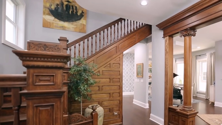
Because of the typical age of Mina Starsiak Hawk's project properties, ornate crown molding and detailed paneling are typical finds. Not commonly seen in modern homes, this millwork hasn't always been cared for properly and can look neglected. To rejuvenate it, the designer uses a few methods. Many times, she brings out the beauty of the wood by simply refinishing it. Other times, to fit with more modern aesthetics, she paints it to create subtle detail. Either way, she often opts to integrate this feature into the new space instead of ditching it.
If you have existing millwork in your home, you can give it a fresh new look. First, apply a liquid stripper to remove any old finishes. This can get into any grooves or detailed nooks better than sandpaper. Then, clean the surface with mineral spirits and allow it to dry. For a natural wood look, stain it using an interior product designed to seal the surface. If you'd like a solid color, use a durable trim paint like Emerald Urethane Trim Enamel.
Maybe your existing home doesn't feature millwork, but you're still craving that character. Adding a bit of crown molding or a chair rail can make a big impact in a dining room or half bath. Or, create a living room accent wall with paneling like board and batten or wainscoting. These simple projects inject a finished vibe and can make builder-grade homes feel custom and timeless.
Colored cabinetry creates a pop
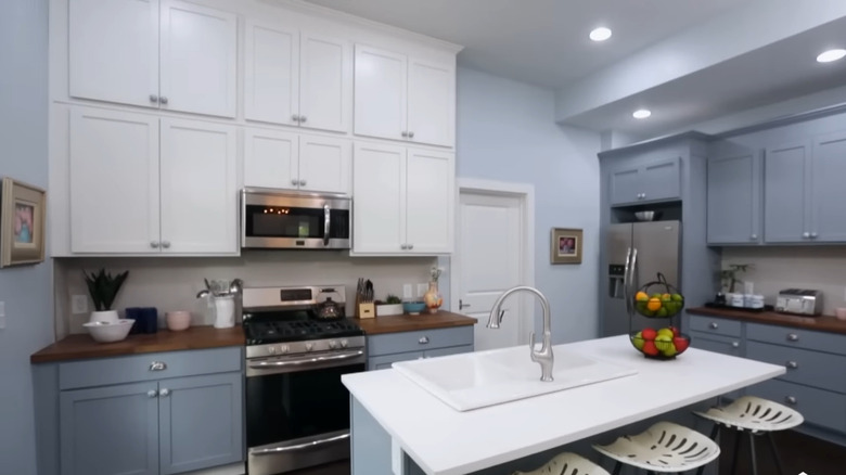
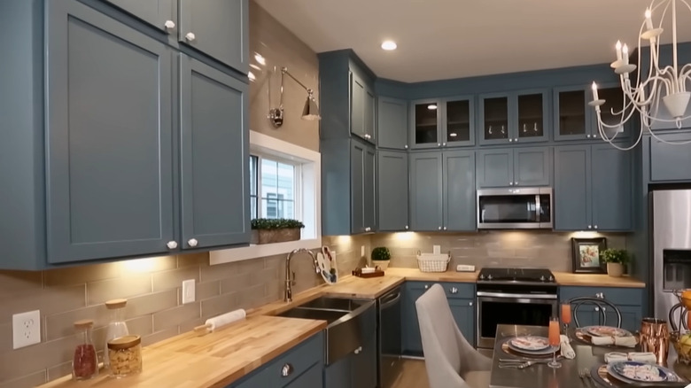
Like many designers, Mina Starsiak Hawk tends to lean on a palette of neutrals with strategic bursts of color. One place she loves to use a subtle hue is kitchen cabinetry, often choosing muted blues and deep greens. The key is creating balance and using the right amount of color for the intended look. For some projects, Starsiak Hawk simply paints the island for a little pop. However, when striving for a bolder look, she's transformed the space with vivid color on all of the cabinetry.
If you want to add a bit of budget-friendly color to your neutral kitchen, first consider the impact you're striving for. Do you have an island that can be used as an accent, or do you want to make a bigger statement by transforming the bottom row? Maybe you're ready for a design adventure and want to revamp all of your cabinetry.
Either way, carefully select the color, especially if the rest of your surfaces will remain the same. Pick up a wide range of chips in the color family you're considering. Then, see how they look against your counters, walls, and backsplash. Once you've decided, have a high-quality paint like Insl-X Cabinet Coat tinted to your desired hue. Carefully follow the instructions on the can for the most durable finish.
Greige blends warmth and neutrality
When creating her signature looks of stylish accessibility, Mina Starsiak Hawk relies on cozy neutrals. Greige paint appears on the walls in many of her finished projects, providing spaces with both an airy feel and comforting warmth. In one episode, she even extended the hue to the ceiling to up the room's coziness factor. And, when asked by Philly Home and Garden about her favorite paint color, the HGTV star responded, "Rhinestone or Sea Salt — They are very soft and go with almost all color palettes."
So with so many greige paints on the market, how do you choose the right one for your space? Both of Starsiak Hawk's favorites are from Sherwin Williams. Sea Salt is infused with a soft, green coolness that works well in coastal and traditional designs. Her other go-to, Rhinestone, leans more gray and can provide a neutral backdrop for modern spaces. If you're looking for something more on the beige side, Agreeable Gray is a popular hue that oozes warmth and versatility. Or, for a warm, creamy look, Edgecomb Gray by Benjamin Moore is a timeless choice that can work well with lots of palettes.
The key to selecting the best greige is to carefully evaluate your space. Because these shades are a compromise between gray and beige, their appearance can alter drastically in various lighting conditions. Narrow your paint options down to three to five. Then, purchase samples or peel-and-stick swatches of each and apply one to every different directionally-facing wall in your space. Check them out at various times of the day, with window treatments opened and closed, and illuminated by the room's light fixtures. The one that looks great on each surface with various lighting will give you the best overall result.
Curate a signature look by mixing design styles
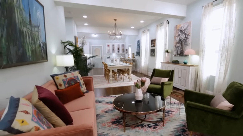
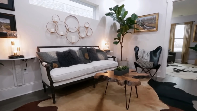
There are a few HGTV stars that have pretty consistent styles. But to mix things up, Mina Starsiak Hawk breaks the design rule of sticking to just one, even in a singular space. One way she creates unique looks is by blending different aesthetics. First, she creates a versatile base of neutral walls, floors, and major furniture pieces. Then, she uses accents like rugs and throw pillows to inject various vibes. The result is an eclectic look that's not overwhelming to the eye.
If you haven't yet discovered your personal style, take a few online quizzes to help you pinpoint one. If you end up getting varied results, blending a few can help you curate a signature look. Farmhouse and coastal styles play well off each other with cohesive wood elements and airier paint tones. However, contrasting styles can also pack an interesting punch. If you want a more rustic vibe, industrial or glam inclusions can add modern juxtapositions. The key to blending multiple aesthetics is sprinkling them throughout the space. Integrate them within multiple elements like furniture sets, shelf décor, and wall art to create a cohesive look.
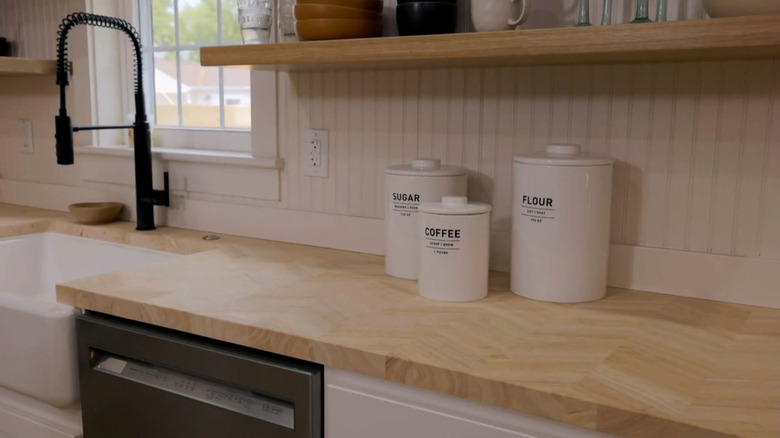
Wood countertops warm up kitchens
When it comes to kitchen design, Mina Starsiak Hawk tends to keep it crisp and modern. However, she also uses elements of warmth to make the room welcoming. The "Good Bones" star creates these cozy kitchen vibes with butcher block countertops that infuse character as well as functionality. Many times, these play perfectly off her choice of cool blue cabinetry or an otherwise crisp, white color scheme.
When borrowing this trick, decide if you want to overhaul all of your countertops or create an accent. Starsiak Hawk has used butcher block for a whole kitchen as well as just a portion of the work surfaces. This is a great way to add even more contrast to an accent-colored island or to designate a coffee or drink bar.
The awesome thing about wood countertops is that they're versatile and can be used well beyond country-leaning décor. Butcher block with a cool-toned stain and matte finish can soften a modern kitchen without interrupting the aesthetic. In more traditional or minimalist spaces, iconic maple can inject tons of interest and character.
Exterior color oozes charm and curb appeal
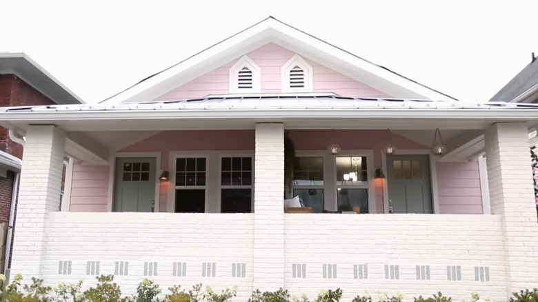
One way that Mina Starsiak Hawk signals that one of her properties has been refreshed is a fresh coat of exterior paint. Many times, she uses unique colors to stand out from neighboring homes on the street. The design star has opted for shades like sunshine yellow, deep teal, and powdery pink to create that wow factor.
If you want to revamp your own home, take a nod from your community feel and any historical context that exists. If your home features nostalgic Victorian architecture, a mid-tone blue or a vivid berry tone can be a colorful nod to the past. Or, maybe you have a mid-century modern or traditionally styled home that you prefer to keep neutral. You can still add character by accenting your front door or trim with pops of color.
One thing to keep in mind when embarking on an exterior painting project is any HOA or historical regulations that impact your neighborhood. There may be restrictions that limit the shades you're able to use on your home's façade. Plus, there may be an approval or application process you need to complete before finalizing a color.
Layered textures add dimension
When decorating with a neutral color scheme, it can be easy to fall into a bland look. However, Mina Starsiak Hawk mixes textures to breathe life and visual interest into these spaces. She loves to layer rugs, throw pillows, and decorative accents in an assortment of materials to create her trademark welcoming style.
Textural elements are some of the simplest ways to make an impact and create contrast. For example, a plush area rug can play perfectly off the sleekness of a leather couch. Or, for throw pillows, lean on a monochromatic color scheme, but mix materials like fur, velvet, and woven fabrics. And, don't forget about vertical opportunities. Curtains are largely functional, but materials like linen and velvet also add dimension.
Keep in mind that texture reaches beyond textiles. When arranging decorative accents, layer various finishes like raw stone, smooth metal, and sleek glass for a captivating mix. Filling an empty wall with macramé, wicker, and carved wooden wall hangings can all be stunning alternatives to paintings or photographs.
Biophilic touches enliven interior spaces
One touch that seems to be consistent across Mina Starsiak Hawk's reveals is the presence of plants, as they appear everywhere from kitchens and bathrooms to bedrooms. Plus, you don't need to have a green thumb or keep up with a maintenance schedule to enjoy these biophilic design elements. As the star revealed to The Buffalo Home Show, "My entire house is fake plants!"
The key to using faux foliage is purchasing quality, realistic-looking options. Ones with variations in color and imperfect leaf shapes better imitate the real deal. Look closely at the stems for details and avoid those that look too plasticky. The base of a faux plant should also match the variety's natural growing medium, whether it be soil, moss, or pebbles.
The beauty of fake greenery is that there are no sunlight requirements. This means a succulent can bring a touch of nature to a windowless powder room, or a tree can make that dark office corner more cheerful. Place tall, slim options to add height on a mantel or arrange short ones down the center of your dining table for a simple centerpiece. Starsiak Hawk even boosts curb appeal by extending this strategy to the exterior. Options like IKEA's FEJKA Monstera plant are designed for indoor and outdoor use. So, just pop it in your favorite planter, set it on your front porch, and eliminate watering from your to-do list.
Stylish functionality in simple, budget-friendly backsplashes
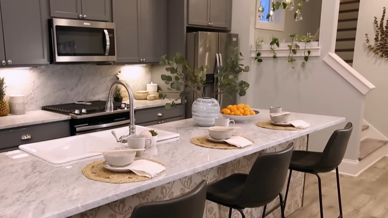
When designing a kitchen, backsplashes are ideal for both style and functionality. In her own home, Mina Starsiak Hawk's quartz counters extend as a backsplash up to her cabinets. However, she explains on the "Rachel Ray Show" that this design is "not super cost-effective for a lot of people." But, the designer has used some budget-friendly ideas to get that custom backsplash look for less.
One is peel-and-stick tile. Not only is this one of the cheapest ways to create a backsplash, but it's also a super simple DIY project. Plus, it can be implemented in nearly every kitchen, no matter the style. With the Carrera White Smart Tiles on Amazon, you can emulate the look of the designer's kitchen. Or, for a little more detail, you can install sheets of white mosaic tiles from Wayfair.
Starsiak Hawk used a different backsplash material in another cost-effective project — wooden beadboard. This is simple to cut and can be painted any color to complement a kitchen. Cream or white look stunning in country kitchens, while intense hues like charcoal or navy can add drama to contemporary ones. Just make sure to use cabinet paint and seal it with a food-grade polyurethane before affixing it to the wall with adhesive.
Lofts and attics can extend entertaining space
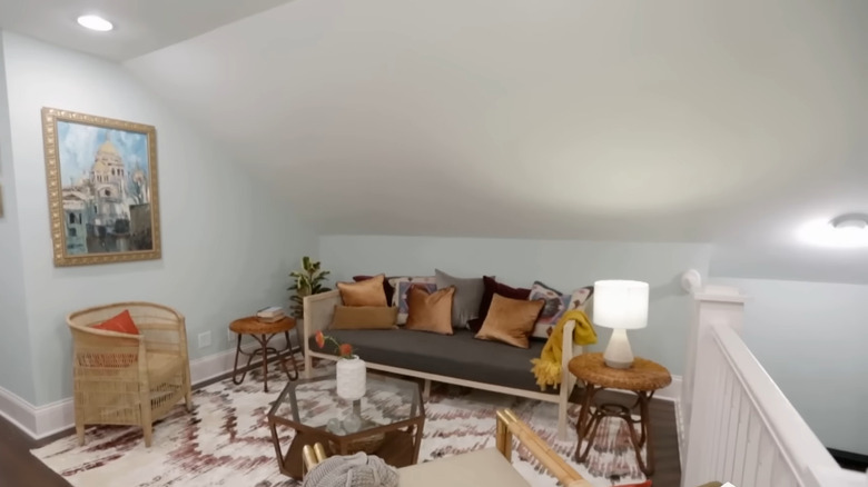
Another strategy Mina Starsiak Hawk is known for is taking advantage of unused spaces. She's overhauled lofts and attics, and transformed them into playrooms, living spaces, and even a poker room. The key here is rethinking the space and carefully curating furniture and storage options.
The biggest obstacle is often low or vaulted ceilings. Working within these constraints, select lower furniture to make the most of the footprint. Starsiak Hawk often tucks a long-slung couch or chair along an attic wall to allow clearance for comfy seating. These spaces are also typically compact in floor space. So look for scaled-down furniture like slim armchairs and small round tables to add function without taking up too much room.
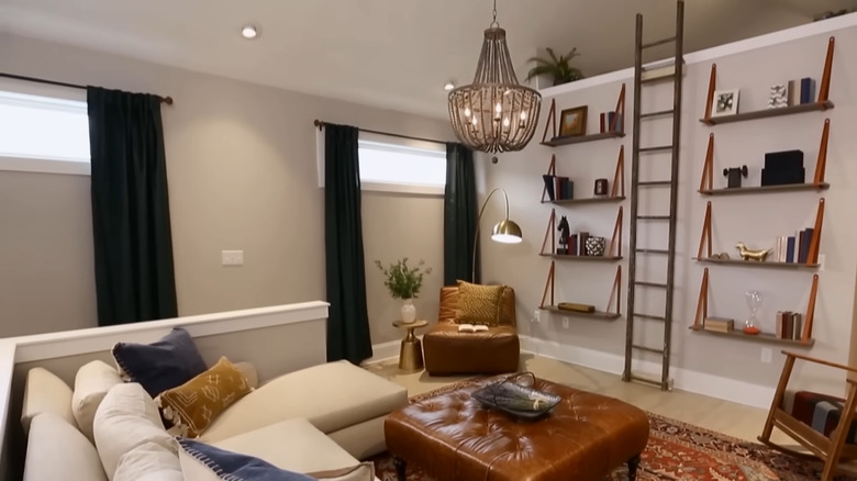
When it comes to storage in an attic or loft living space, creativity is key. Look for options that double as furniture, like a storage trunk coffee table or couches with compartments under the cushions. Then, mount vertical options like floating shelves high on the tallest walls to create out-of-the-way spots for stashing books and board games.

