Here's Why The Lighting In Your Dining Room Looks So Wrong
Creating the perfect dining room or area is a careful science. Not only do you need to decide on a shape and size of the table that works in the space, but other considerations like rugs, chairs, additional furniture, and window coverings must be considered in the overall picture. Lighting is often an overlooked element, with many opting for the same older or builder-grade fixtures their home came with. Dining room light fixtures, however, can have a huge impact, both when the light is on and when it is off. By considering the shape, size, and light throw of your dining room fixtures, you can fine-tune this very important element for a perfect look every time.
By carefully considering the lighting in your dining room, you can avoid it feeling too dark or shadowy when in use, or overwhelming/underwhelming the room in the daylight. Whatever the size and shape of the dining space, whether it's a large formal room or a tiny breakfast nook, keeping certain things in mind can help the room feel balanced and cohesive.
What to avoid
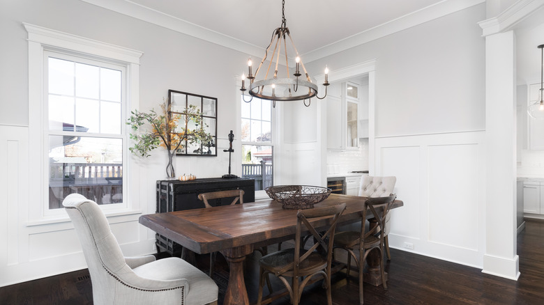
One of the chief pitfalls of lighting design for dining rooms is size and scale, which depends as much on the room itself as it does the table below. While many homes sport conventional round-oriented chandeliers, these can not only feel dated but out of line with the room's full design. These round lights in a room with strong rectangular lines can often appear too small and out of place, particularly if your table is also rectangular. In a squarish dining room space, a circular or square light fixture can look much more cohesive than an elongated one. However, because these tables are often smaller in dimension, a larger light fixture can make the room look unbalanced and top-heavy. If you have a table with a heavier, more solid look, a lightweight primarily glass or airy fixture can feel out of place.
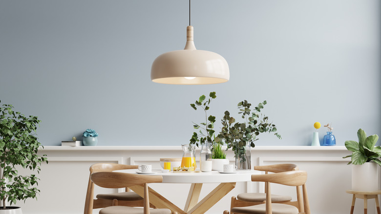
While these factors impact a light fixture whether it's on or off, another danger in using the wrong light can be dark pockets and corners on your table when illuminated. A small fixture will often only light the very center, leaving everyone else in shadow. While track lighting and carefully placed pocket lights give a greater ability to focus light throughout the room, many homeowners prefer the look of a traditional center overhead fixture.
What to do instead
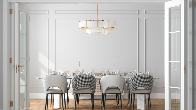
Problems of scale and balance can be solved in a number of ways. For a large rectangular table in a rectangular room, opt for a more linear fixture that is large enough to light the whole table sufficiently. Be sure to balance the weight of your fixture with the visual weight of your table. This also includes considering any tablecloths or possible centerpieces that will impact the overall look. If you prefer larger centerpieces, choose a light fixture with adequate clearance. Experts recommend that a picture be half to three-quarters the length of the table and allow 30 to 36 inches of space between the bottom of the fixture and the table.
Another great option for a longer table is to use pendant lights, which can be hung side by side or in a grouping scaled to the table and the room. If you are stuck with an existing fixture or a favorite one you do not want to get rid of, there are other ways to amp up the lighting in the room to eliminate pockets of darkness or shadow. Try adding recessed lights to the ceiling, floor lamps in the corner, wall sconces, or picture lights above artwork.


