Should Your Backsplash Be The Same Color As Your Countertops For A More Cohesive Look?
Backsplashes can be one of the most distinctive ways to set the tone in any kitchen, as well as one of the most contentious topics when it comes to designer discussions on what backsplash to use in any given space. While many experts and celebrity designers are opting for abolishing the conventional backsplash altogether in favor of running the counter material up the wall, others maintain that backsplashes can be a beautiful way to form the aesthetic of the room and add an extra layer of texture and visual interest. One great way to marry these two ideas is to use color as a unifying factor to make the transition feel more modern and seamless.
In previous decades, backsplashes were often used to draw in additional patterns and colors, a look that can still work in a larger kitchen but can often be too overwhelming in a small space. These sharp horizontal lines can make a room feel more visually cluttered or cut off the desired vertical lines that make a space feel larger.
Uniformity of material

Todays' designers, like HGTV's Christina Hall, often make use of beautiful countertop materials like marble and quartz to continue that backsplash up the wall, sometimes even going as far as the ceiling for a fully cohesive look. Not only does this extend visual lines and offer a seamless transition, but it is often easier to clean than other backsplash materials – like tile — that involve grout. In addition, there are fewer crevices where the wall and backsplash meet to harbor crumbs, moisture, or bacteria. The downside, however, is that this approach can be more expensive compared to tiled backsplashes. While the material costs may be equal or less, this sort of installation usually needs to be done by professionals, which can prevent saving money by taking a DIY approach.
Other designers and homeowners criticize it for uniformity reasons, citing it as a passing trend. While a minimalistic kitchen may revel in that uniformity, many designers miss the variation that tiled backsplashes provide, particularly if you are going for a more traditional or rustic look, where the abundance of marble surfaces may seem overly cold and austere.
Uniformity of color
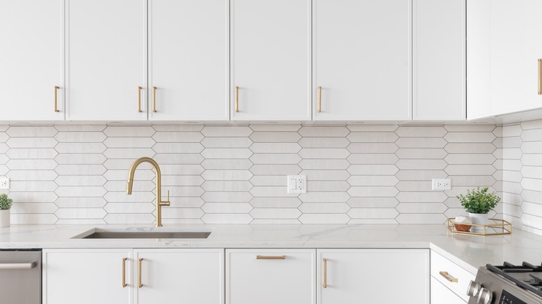
If fully extending the counter materials as the backsplash is not feasible or feels too boringly uniform to you, there is another way to meet in the middle by using other elements like color to help the counter and backsplash feel more uniform. Colors in a similar shade to the counters create an illusion that it is a cohesive whole. Basic white subway tiles can complement white quartz or marble, continuing the bright shade up the wall, an effect that can be increased by using white cabinetry for a bright and airy feel.
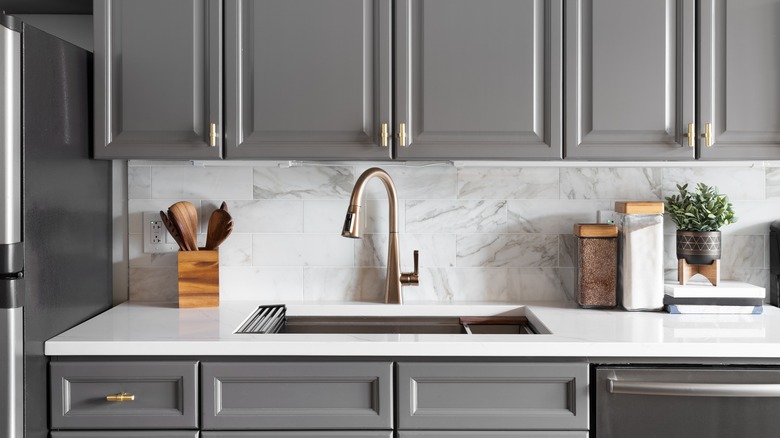
Darker counters can be augmented with tile backsplashes in similar shades. Black granite counters look stunning topped with black, shiny penny tiles. A gray concrete countertop can be extended by choosing similarly shaded stone tiles carried up the wall. Another great way to create an illusion of continuity is to use mirrored or reflective tiles that reflect the surrounding surfaces while increasing the sense of open space. You can also use tiles in a similar material to the counters, like veined marble or iridescent quartz.