How To Create A Tasteful Blend Of Old And New Furniture, According To Our Interior Design Experts
If you're tired of following trends to a tee or want to avoid copy-paste design styles, mixing old and new furniture pieces is a surefire way to add interest to your home. It's a designer-approved strategy that can take your space from generic to curated, from predictable to one-of-a-kind. Blending vintage decor with modern items is one of the best blueprints for creating designs that pop with personality.
But achieving a harmonious mix of new and older pieces is often harder than it looks. It's the interior version of the perfect "I woke up like this" hairstyle. Professionally designed spaces that masterfully mix the contemporary with the classic often look enviably effortless. But there's usually a lot of thought that goes on behind the scenes.
Tossing together a selection of trendy and classic pieces at random can easily look chaotic and disjointed. If you want to avoid the mishmash look, you've got to combine pieces with intention. Like most elements of great design, mixing pieces from different eras can take some trial and error. But there are also actionable tips you can follow that will make the process a whole lot easier. To help you mix eras like a veritable expert, House Digest picked the brains of two seasoned designers. Whether you're aiming for a transitional style in your home, want to create something ultra-fresh and funky, or simply get grandma's dresser to speak to your new sectional, their insights will give you a game plan so you can design with confidence.
Use colors to create cohesion
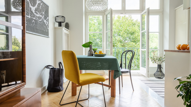
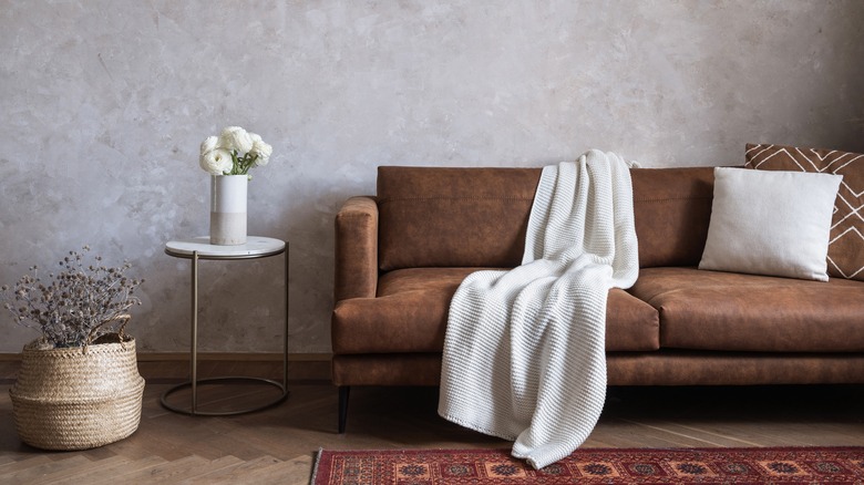
Achieving an integrated feeling is often the biggest challenge you'll encounter when mixing furniture from different decades or styles. One of the easiest, designer-approved ways to get a cohesive look going is through color. Creating a comprehensive color palette across the space can help tie all the items together and make your design feel harmonious and consistent. During an exclusive interview with House Digest, interior designer and founder of Meble Furniture Raf Michalowski advises, "Create a theme or color palette for the room. This makes it easier to select old and new furniture that will work well together." For example, if you have a vintage wooden dining table, you can pair it with a modern, brown leather couch in the same color tone.
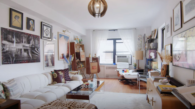
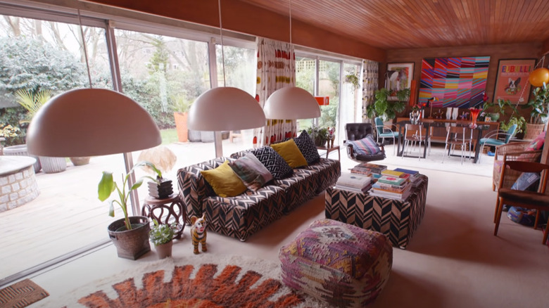
If you can't match colors from the individual furniture pieces, you can also work your color palette into the room through decor items like throw pillows, art, rugs, wall hangings, and books. For instance, if you have a vintage chair upholstered in red fabric, you can carry this color over to your coffee table by channeling it through items like bowls, candles, or coffee table books. Art and rugs can also be good starting points. Also, don't forget to look for complimentary undertones in your neutrals. This means if your color palette is red and orange, your neutrals should be warm-toned rather than cold.
Pick your key players
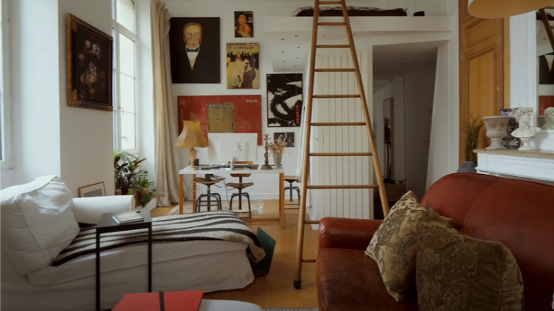
Decorating and furnishing a room is often similar to building a great outfit. You don't want to throw on all your favorite clothing items in one ensemble. Even though you love each piece individually, lumping them all together probably won't look good. To keep things simple, start by deciding which pieces are the key players. Once you've zeroed in on these backbone elements, you can look for supporting players that will make them work together in the space. During an exclusive interview, Artem Kropovinsky, designer and founder of interior design studio Arsight in New York, told House Digest that when it comes to mixing old and new, the "key is focusing on a few standout items in every room. Place these components on a setting that comprises simpler points, and it will all turn out well together." Michalowski echoed this by saying, "Try to avoid overcrowding a room with too many furniture pieces, as this can make the space look cluttered and uncoordinated."
In other words, once you've found the star pieces for the space, keep the rest simple. This doesn't mean you can't include bold artwork, saturated colors, or any other statement pieces. But it does mean that you should minimize visual clutter. Mixing vintage and contemporary items is already a design moment. If there's too much happening in the room, it could start to feel like a decor storage pod instead of an intentionally designed space.
Create visual pathways
Have you ever encountered a picture of an interior that you could hardly stop looking at? One of the secrets to creating a captivating room is by placing items in such a way that they pull your attention from one point of interest to another. This technique is also key for blending vintage and contemporary items so they play together. Kropovinsky explained this, saying, "It's quite practical to create visual pathways that guide the eye around the room. When blending old and new furniture, you can use this technique to lead the viewer's gaze from one piece to another in a seamless manner. This creates a sense of cohesiveness and flow in the room, making it look intentional rather than haphazard."
If you're not sure where to begin, start with the physical pathways of the room. Establishing a meandering pathway between zones and objects can help to create a visual journey. On the opposite side of the spectrum, straight pathways and long, distinct lines (such as a rectangular coffee table placed perpendicularly to a fireplace) can firmly guide attention to their endpoint for dramatic impact. Spacing out the vintage items is another way to keep the eye moving, since it will naturally clock where these unusual pieces are in the room. Instead of grouping items from the same period or design style together, try to spread them out and pair them up in complementary ways. For instance, placing a vintage bentwood dining chair next to a sleek, minimalistic sideboard can act as a visual palette cleanser that looks masterful and meant-to-be.
Balance proportions and scale
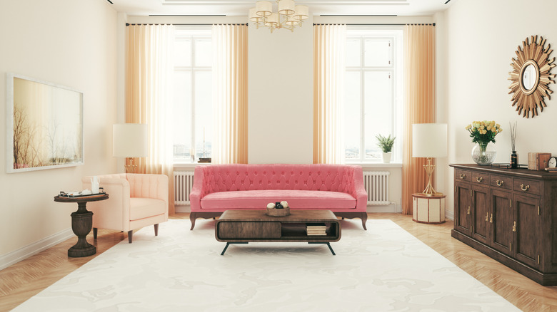
Proportions and scale are two other elements you can work with to harmoniously mix and match furniture from different decades. By tinkering with how the dimensions and sizes of different items look paired together, you can create a design that's not only seamless but also unique. Michalowski told House Digest, "A large vintage sofa paired with a modern petite coffee table can create an interesting contrast, while still looking balanced. By balancing the sizes of each piece in a room, you can avoid making one stand out more than the other, creating a harmonious blend. You can also experiment with mixing different textures and material finishes to add depth and dimension."
Along with evaluating how different-sized pieces combine together, look at their size in relation to the room. A super-overstuffed vintage sofa is probably not going to look good in a tight living space and stick out like a sore thumb. But a dainty antique loveseat? Different story. And if you want all of your pieces to feel like soulmates that span centuries, pay special attention to height. If the seats of your sofas and chairs are all roughly the same height, this can convey a subtle but powerful sense of cohesion that will marry all of your pieces together.
Create continuity with similar shapes and silhouettes
Just because your pieces come from different time periods doesn't mean they can't match. How do you spy when items are meant to live together? "I would say, look for similarities in shapes and silhouettes across old and new pieces. Whether it's the curvature of a chair leg or the lines of a sofa, selecting items with similar shapes creates visual continuity," Michalowski says. "This helps the furniture pieces relate to each other and establishes a cohesive design language. It also makes the transition between pieces less jarring to the eye."
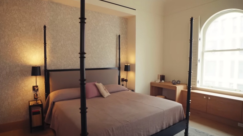
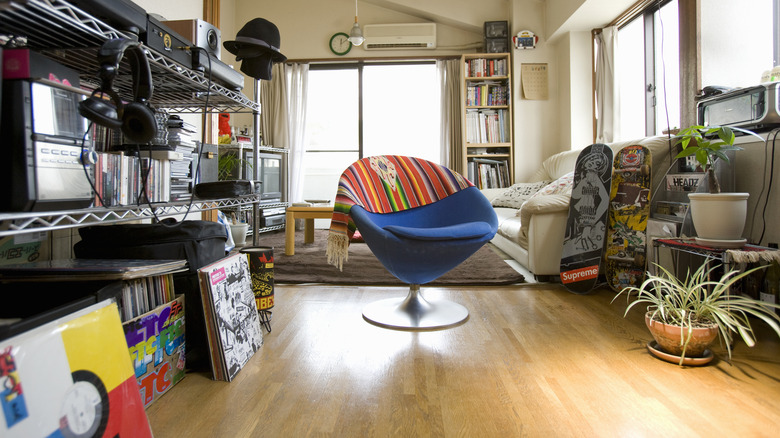
A Togo sofa might look entirely different from an Art Deco tub chair, but if they both feature channel tufting, this will create a visual kinship. To further make your pieces feel like they belong, you can echo this visual effect with a striped rug, thickly pleated curtains, or a trendy credenza decked out with fluted sides. Or maybe you're attracted to organic, curvy lines in your furniture? A cloud-shaped coffee table that's uber-current could pair perfectly with a more retro-style item, such as a Garouste & Bonetti sofa or a bulbous Bellini Camaleonda-style couch. Alternatively, perhaps you like a more formal feel to your furniture, and straight, restrained lines light you up. Look for items that feature this, such as a modern tuxedo sofa or a simple sectional, and pair them with unfussy vintage items like sleek retro side tables or a plinth coffee table.
Intentionally add interest with unexpected combinations of shapes and styles
Echoing shapes and silhouettes around a room can help tie in pieces that otherwise might have looked random or out of place. But sometimes, it can pay to go in the opposite direction and look for opportunities to bring together unexpected combinations of shapes or design styles. Kropovinsky explains that "the addition of different sizes and shapes in the same area enhances playfulness in a harmonized manner ... it all adds up and puts everything visually together, forming one style." Having all of your main pieces roughly the same size and featuring similar silhouettes can create a clean, simple look that's almost guaranteed to be cohesive, but for some, it can feel boring. That's when it pays to go in this direction.
To harness the power of the unexpected, start experimenting with your existing pieces. Are there new ways you can pair them together that will give off a fresh, avant-garde aura? For instance, if you have a tall floor lamp, instead of placing it next to a high sideboard, teaming it up with a small stool could create an invigorating vignette. Playing around with different pairings can help you get an eye for what works together and give you an idea of what additional items you may need to complete the space. When evaluating the shapes of your furniture pieces, keep a close eye on the legs. Too many legs crowded together in a space can feel chaotic and choppy, so try to pair elevated items on legs with low-to-ground, more solid pieces.
Mix materials
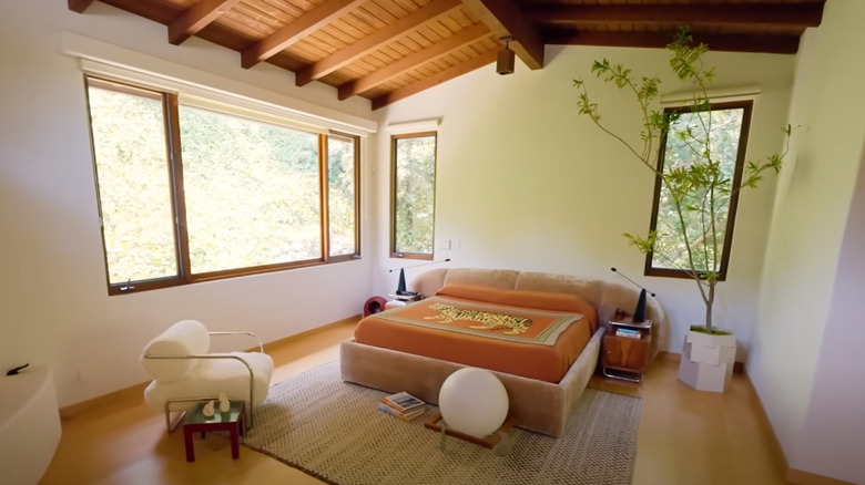
Achieving a mix of materials is almost always a good idea if you want to create a dynamic design that feels nuanced and exciting. It's also one of the key tenants for tastefully combining new and vintage furniture pieces. For example, if you have too many wood items in a space, all from different eras, this could start to feel like you're running a furniture store and make the area look flat. Kropovinsky elaborated, "The best way to add depth is by mixing materials. For example, styling a slim metallic table with an elegant vintage couch will achieve this eclectic feeling of juxtaposing old and fresh."
The secret to this strategy lies in contrast. What items will contrast with each other when paired together? The soft silhouette and texture of a boucle chair could be the perfect way to balance out and highlight the cool sharpness of a glass coffee table or the cold weight of a stone plinth. A classic blueprint for these kinds of pairings is leather and softer upholstery fabrics. An all-leather set of sofas and chairs can be overwhelming. But a leather accent chair with a wool blend sofa? Design perfection! If you're already in possession of the pieces you're mixing together, and they're of similar materials, you can also offset them with other decor, like floor lamps. For instance, if your space is feeling very soft and matte with a lot of upholstery and wood, you could add a cool metallic touch with a chrome floor lamp.
Let smaller details tie your design together
Besides being thoughtful with how you pair bigger pieces, don't forget to harness supporting items to pull the whole look together. "You can keep the mash-up looking consistent by paying attention to small details. For instance, you can add a few decorative elements, like cushions or rugs, that help tie the old and new pieces together," Michalowski suggests.
Scatter cushions are one of the simplest ways to weave a common thread between disparate pieces of living room furniture. You can also use them to pull colors from different pieces or introduce different textures. Rugs can be trickier as colors are usually more limited, and they're a bigger investment. If you're struggling with choosing a rug that incorporates all of the colors in your palette, don't worry. A neutral rug in the right tone and texture can still help to unite your pieces together. Finally, don't forget about the power of art. Besides using pieces to enhance your color palette, you can also use art to manipulate the overall style of your space. For instance, if you feel like the overarching tone is leaning too vintage, a large contemporary piece of art can bring back balance.
Experiment and trust your instincts
There are lots of rules, guidelines, and tricks you can employ to curate a space that gels, flows, and gives you all of the right design feels. But the roadmap to success usually involves some uncharted exploration. As Michalowski points out, "Trust your instincts and have fun experimenting with different combinations to find what works best for your unique style and space."
The best designs aren't just born of a blueprint; they're also a creative process of discovery. If you're feeling daunted, not sure where to begin, and don't want to waste your budget, start small. Move things around, even if it's just shifting some side tables. Watch how different placements change the feeling of the space, swap things between rooms, and introduce small moments of color to see how it can help coordinate larger pieces. Pretty soon, you'll train your eye to spot why something works. The more you experiment with the items you already own, the easier it will be to know where to invest in fresh pieces to flesh out your floor plan.
