Unsellable Houses' Lyndsay Lamb Says This Is The Secret To Mixing Tile Patterns Like A Pro
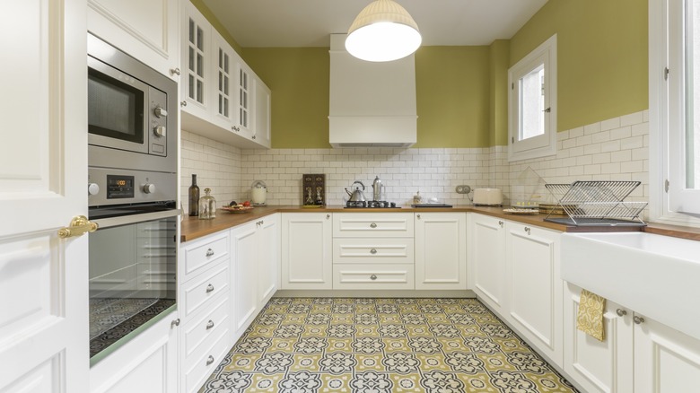
Tile patterns are a design classic that can look beautiful in all kinds of spaces. However, as soon as you bring a pattern into your interior design vision, your project inevitably becomes more challenging, requiring you to balance complex color schemes and factor in elements like texture or shape. And, with eclectic design aesthetics rising in popularity, you may be trying to tackle several stylish tile patterns at once. If you're feeling nervous about combining tile patterns, or other types of prints like wallpaper, know that there's no need to be intimidated by clashing patterns. Lyndsay Lamb, real estate expert, designer, and co-host of HGTV's "Unsellable Houses," has an easy tip for mixing tile patterns without overwhelming a space. According to Lamb, you can use several patterns in one room as long as you sort the patterns by eyeline.
On her Lamb & Co. blog, Lamb shares her work from an episode of "Unsellable Houses" saying, "One of the questions I get a lot is how to mix design tiles without it feeling like too much, and what I like to do is have one main pattern at every eyeline. For example, I pick a bold print for the flooring but keep it a complimentary solid in the shower surround." In other words, the eye can be drawn to different focal points at different levels, such as the floor, walls, and ceiling. With this method, you can combine all kinds of patterns.
Divide by eyeline
Lyndsay Lamb's tile method is all about splitting the room up based on eyelines, also known as the different visual levels of the room. To adhere to Lamb's eyeline rule, you'll need to mentally divide the space into sections. Most rooms will have three eyeline levels: the bottom, middle, and top tiers. When a viewer takes in a room, you can think of it as looking at three images stacked on top of each other. If that's tricky to visualize, you can also take a photo of the room and draw lines over it to make three horizontal sections.
Per Lamb's advice, each eyeline section can feature its own tile pattern. For instance, in the ranch house Lamb blogs about, the bathroom has a floral geometric tile pattern on the floor (the lower eyeline) and a different blue tile along the shower wall (the middle eyeline). These tile patterns are strikingly different, but when located in separate visual zones of the room, this unique bathroom tile design feels quite natural. The blue adds depth to the shower wall and the playful floor lightens the overall mood of the bathroom.
Lamb uses the same method for the kitchen, where an intricate black and white floor gets paired with an orange backsplash. The floor in the kitchen is really fun and elevates the space, while the orange backsplash brings warmth and a softened texture. By keeping the patterns separated, they can each contribute to the space without clashing.
Pairing tile patterns
When you pair tile patterns together, sorting them into different eyelines is just one aspect of making the space feel cohesive. Whether the tiles are a solid color or come with a special print, they need to have some kind of relationship that ties them together. This can be simple, such as a shared color like Lyndsay Lamb's choice to put solid blue shower tiles with a blue and beige floor tile. It can also be more complex, such as a complementary color pairing (blue and orange) or a common motif (two tile patterns that both feature flowers).
Lamb also emphasizes (via Lamb & Co.) that tile combinations don't need to be monochromatic. She says that "this doesn't need to be white or gray; it can be a fun color!" If you aren't sure how to pick the right color scheme, you can always refer back to basic color theory for inspiration.
Another principle to keep in mind is scale. Small-scale patterns and large-scale patterns should be balanced so the room doesn't look cluttered or disconnected. For example, you could do a small-scale tile pattern, like marble mosaic tile from Home Depot, for the floor and a larger-scale pattern, such as Carrara polished porcelain stone look tile also from Home Depot, for a wall. This way, the patterns are distinct and don't visually blur together. Finally, use small details in the room, like throw pillows or wall art, to bring everything together and create a maximalist room that balances the space perfectly.

