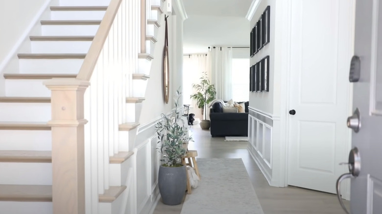
Make A Small Entryway Feel Bigger With These Brilliant Solutions
We may receive a commission on purchases made from links.
Entryways can easily become a decorating afterthought, but they have a phenomenal psychological impact in design. Your entrance area is the first zone you experience once you step inside your front door. It's the space that greets you and your guests — the one that welcomes or repels. It's also a hardworking spot that has to house the things you need to grab before you head out the door.
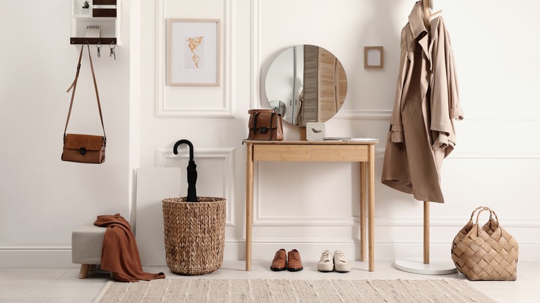
But what if you only have a tiny space to work with? A gloomy, cramped-feeling entryway can give off claustrophobic, suffocating vibes, which is the last thing you want to feel when you cross the threshold. It can also easily turn into a non-functional space that's overflowing with scattered shoes, mounds of coats, and messy piles of bags. Fortunately, there are a bunch of clever tricks you can employ to make even the most pint-sized entryway feel bigger and more inviting.
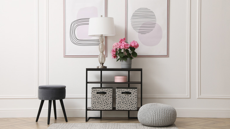
Having a small entryway does not have to cramp your decor style. With the right solutions, you can free up visual space, trick the eye, and tickle the senses while also incorporating key storage elements. If you're down in the design dumps over limited entrance space, keep reading to find out the best decorating and storage solutions to make it feel bigger.
Get creative with shoe cabinets
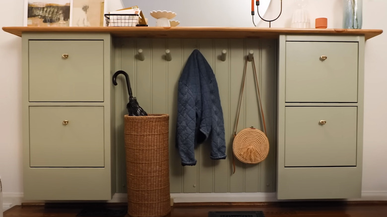
Piles of discarded shoes are the nemesis of any neat, chic entryway. But they're especially problematic if you're working with a small space. Stray shoes lying around don't just look untidy; they can also become a tripping hazard, eat up valuable floor space, and render the area even more cramped and hard to maneuver in. If you want to make your petite foyer look more spacious, the first order of business is figuring out how to get any errant shoes up off the floor and into a storage solution. Closed shoe cabinets are an ideal option because they can double as a credenza. Flip drawer units like the ones sold by Ikea tend to have slim profiles, which is perfect if floor space is at a premium. Depending on how much wall area you have, feel free to get creative. Alexandra Gater, queen of small space makeovers on YouTube, positioned two HEMNES shoe cabinets apart, installed coat pegs in the middle, made the top into one long surface, and painted the installation in one color for a seamless result.
If you don't have the bandwidth for a project this big, there are other ways you can customize standard shoe storage solutions. Besides painting them to match your space, you can also swap out the factory hardware for custom drawer pulls to add a unique element. If you're after some pattern, you can even jazz up plain shoe cabinets with wallpaper, peel-and-stick tiles, or decoupage.
Create a fun (and functional) bench and basket moment
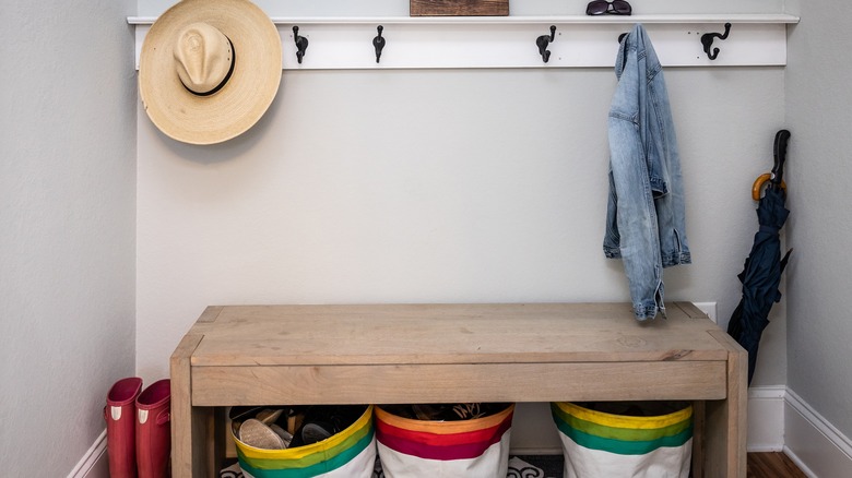
A bench and basket combo is another great solution for getting shoes out of sight while also giving you a place to perch while you slip them on and off. Having somewhere to sit can make your entryway feel more inviting, furnished, and even spacious. Choking up a tight space with too much furniture will make it feel even smaller, but one intentionally chosen item can make a small entryway feel like a zone of its own rather than a pass-through.
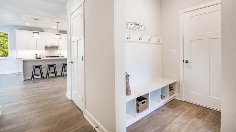
This is one of the simplest mudroom ideas to achieve. It's attractive, functional, and easy to adapt. You don't need to screw anything down (or up). All you have to do is find a bench that fits your space. Start by measuring the wall you want it to go against, decide how wide it should be, and look for something that fits your design style, whether that's rustic, glam, minimal, or grandmillenial. Once you have the perfect decorative storage bench, simply pair it with baskets that can easily slide underneath while being tall enough so the contents aren't on display at all times. If you're like most households, these baskets are going to contain all the nitty-gritty and possibly grungy things you need when you head out, like shoes, boots, bats, backpacks, balls, or pet items. If you want to go a step further, you can even add a few hooks above the bench for hanging coats and bags.
Got stairs? DIY an open shoe rack
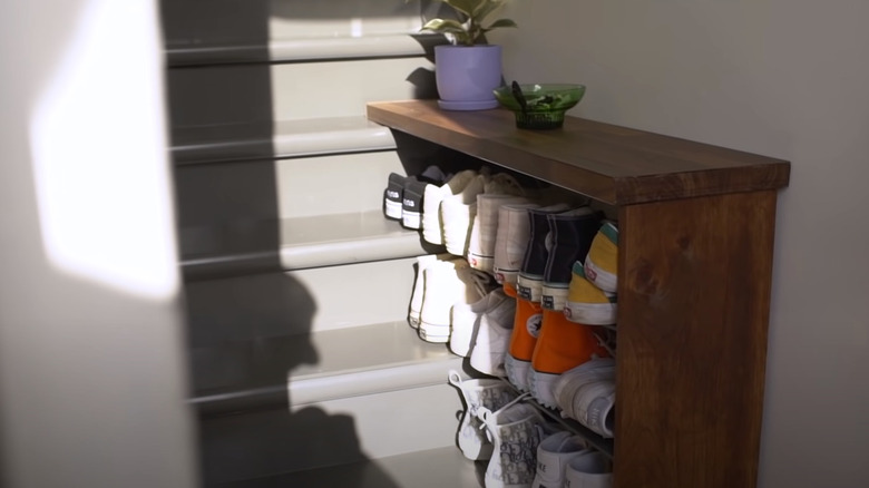
Tiny entryways at the bottom of a flight of stairs are common in older tenements and can feel almost impossible to decorate. They give you a very limited amount of space to work with, and shoe storage can be a real issue. The floor area is often too tight to squeeze even the skinniest floating shoe cabinet. If you're after a cheap, quick, and space-saving solution, you might want to consider DIYing a compact shoe shelf, like the one above from Rachael over at The Sorry Girls. Creating a DIY shoe shelf that butts onto the stairs can add a highly functional and stylish touch and even give you a modest surface to store things like keys and sunglasses.
Decide where you want the shelf to end and measure from the base of each stair to determine the length of the shelves. If you have a miter or hand saw, you can saw planks up to length yourself, or you can ask your local hardware store if they'll cut them for you. You'll also need a pack of screws and a few small strips of wood to act as supports for each shelf where it meets the side. Attach the supports to the end of the shelf, and slide your shelves into place so one set of ends is supported on the stairs. If the shelf wants to fall away from the wall, you can attach it with some heavy-duty double-sided foam tape.
Float a credenza
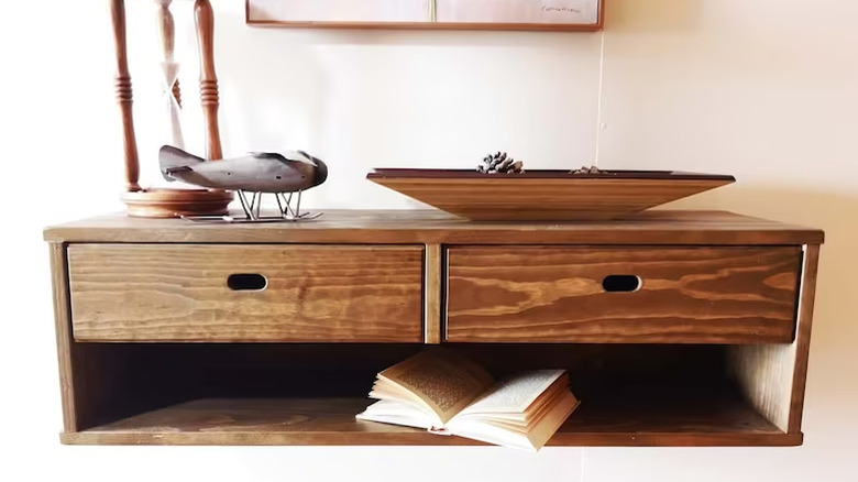
Having some kind of surface in your foyer helps to define and ground the space. It can also be functional, giving you a place to store keys, sunglasses, and other loose objects. But the problem in small entryways is that just about any kind of credenza is going to rob you of valuable floor space. Floor space doesn't just give you more area to move around in; it also impacts the visual size of your entryway. The more the floor is covered by furniture, the tighter the space is going to feel. Enter the floating credenza. Not only does it reveal more floor area for your eyes to enjoy, it can also let extra light in. A chunky sideboard can block light and create shadows, while floating options allow light to pass underneath them.
To implement this idea, measure the wall space and find a floating credenza that will fit. Most units will come with all the hardware you need to mount them to the wall. Just be sure you use a stud finder to identify solid anchor points for your screws and steer clear of any electrical and plumbing in the walls.
Go bold with statement hooks
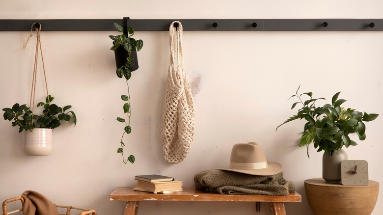
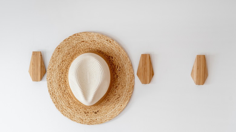
Anytime you're dealing with a small space that needs to pack a powerful storage punch without feeling crowded, look to the walls. How can you maximize the vertical space? If a built-in mudroom locker is going to make your mini entrance hall even more minute, consider statement hooks. Hooks can provide the perfect place to hang up your bag and coat, rather than dumping them on a seat or surface. They can also help to draw the eye upward, emphasizing the height of the room rather than its small footprint.
There are two secrets to making this solution work. The first is to look for eye-catching hooks that act as a design statement and will play well with your aesthetic. The second is placement. If you position your hooks correctly, everything you hang on them will look both organized and artistic.
If you're not hooked on this idea (pardon the pun), there are lots of other ways you can make the most of the vertical surfaces in your entrance. From installing shelves and rods for hanging umbrellas to wall-mounted bins and baskets, the options are almost endless. If you don't have space for full-on shoe cabinets, look into wall-mounted pockets, such as these from Ylisse. By opting for a combination of shelves, pegs, rails, and baskets, you can really max out your wall space and create a vertical landing strip that's equipped to handle everything from outerwear to incoming mail. This could be ideal if you're a highly visual person.
Demarcate the area with a rug
A lot of modern homes and apartments don't have separate entryways. Instead, your front door might open almost directly into your main living area. If this is the case, you might be struggling to create the feeling of an entryway at all! Area rugs offer an easy way to solve this problem. Rugs can help define a space, clearly demarcating where it begins and ends.
The trick to leveraging area rugs in entryways is to choose the correct size. If you want to establish visual boundaries for the area, choose one that covers most of the space between the door and any other entryway elements, such as a bench, hat stand, or console. Do not use a dinky 18-by-30-inch mat if this won't fill up the area. You don't want it to feel like your rug is floating around in a sea of floor. It might seem counterintuitive to use a larger rug for a small entry, but going up a size can make a closed entrance appear more spacious. If you have a small mat, this will just emphasize the tightness of the floor and make visitors feel like they're teetering on the mat. A big rug automatically feels more generous and restful, and can even do a better job at catching dirt from the outside before it makes its way farther into your home. If you have a long, narrow entranceway, definitely consider a runner.
Don't let art be an afterthought
Art isn't just for filling up big blankets of bare walls. You can also leverage it to make small zones feel a little more expansive. There are a few visual tricks you can employ, starting with oversized art. It's easy to assume that little rooms need little prints and paintings, but this couldn't be farther from the truth. Large art pieces can help to ground the space and keep it from feeling busy. Depending on the piece, it can also create an illusion of added depth. For instance, an A2 art print of a landscape that extends into the distance, a winding river or road, or any other vista can give the subconscious feeling that the room carries on. Our conscious minds know this isn't true, but this doesn't take away from the visceral effect.
Another way you can deceive the eye is through large mirrors. Big mirrors are an age-old hack for making confined spaces feel roomier and bouncing light around. They're also an entryway decor staple, perfect for quick hair checks as you walk out the door.
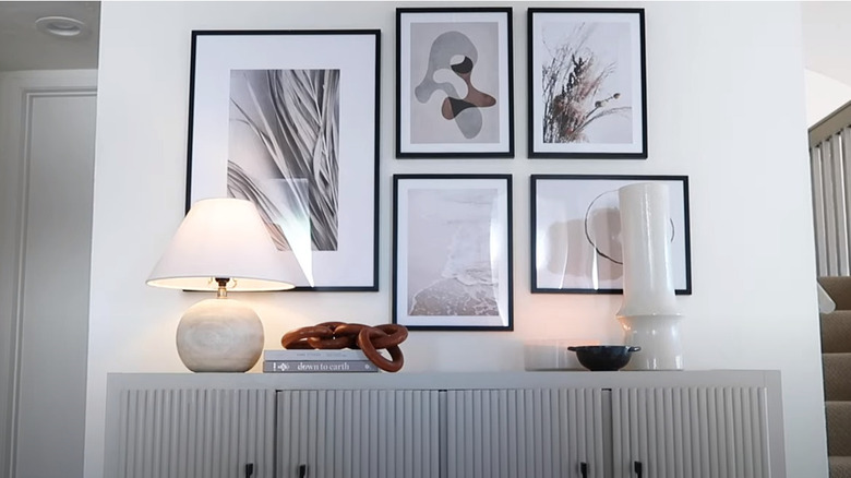
If you do want to add multiple pieces of smaller art to a tight entrance area, try to cluster them so they fan out from large to small. To emphasize the height of the room, create a taller, narrower gallery wall. If you want to maintain a calm, minimalist feel, go for matching frames.
Make a flourish with your floors
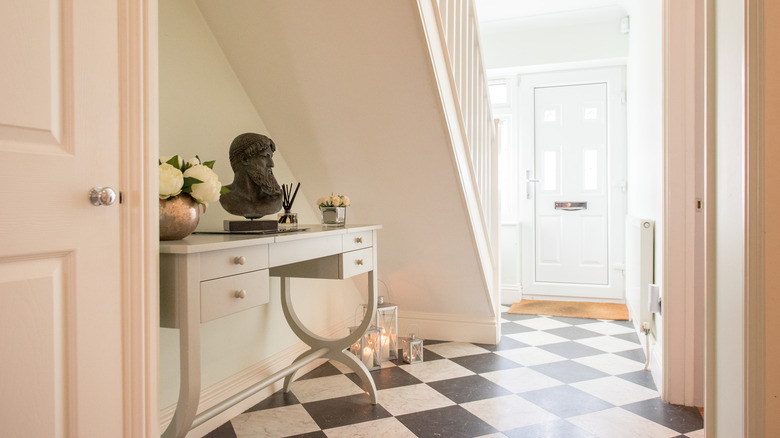
What's the first thing you do when entering your home? Probably take off your shoes, which means that the floor is one of the initial elements your eyes land on. Besides creating a first impression, flooring can also influence how big the space feels. Large tiles with grout that matches their exact color can cut down on busyness. But if your entry space needs some visual interest, patterned tiles can add a touch of vibrancy and energy. Irregular designs, like terrazzo flooring, can help the eye focus on the pattern rather than the dimensions of the room.
Laying square tiles diagonally can artificially increase how big the floor looks by creating longer lines. If you're installing hardwood planks, try to line them up with the longest wall, and go with wider planks over skinnier options. Another thing to think about is whether to install new flooring in just the entryway or carry it through into the connecting rooms. Continuing the flooring material creates a more seamless look that expands the space. On the other hand, having a contrasting area of flooring in the entranceway can help to define the zone and differentiate it from the rest of the home. If you're on the fence, you can always play around with less permanent peel-and-stick options.
Get even more storage with a built-in bench
Storage and seating. These are two of the most critical foyer features. Built-in benches can add oodles of extra storage while also giving you a perfect place to sit while putting on shoes. By storing all your hallway must-haves inside the bench, you can keep the rest of the area clean and minimal, which can help to visually open up the space. Because benches are low, they might be the only item of furniture you can fit into a small entrance. They block less light than boxy credenzas and cupboards, and they don't have to be ultra-deep. Speaking of depth, is your entryway too narrow to fit a bench, but you happen to have a hallway cupboard? By taking off the doors and adding cushions, you could get both seating and storage from the space.
If you have the budget, you can get a custom bench built. On the other hand, if you're keen on Ikea hacks, you can even take something like a KALLAX unit, turn it on its side, and fit it out with a couple of cushions on top. For the front, you could install doors or pick up a few bins or baskets. Finally, if you don't have the space, budget, or time for this project, you can still make your entryway seating do double duty by using things like storage ottomans instead of regular chairs or stools.
Let your walls do the talking
Bite-sized entryways do not, we repeat, do not have to equate to boring design. In fact, small spaces can present the perfect opportunity to flex your creative muscles and try out bolder ideas. Daring designs in tight spaces are often easier to pull off and less apt to become overwhelming. Even more importantly, they can help divert attention away from the room's lack of size. Who has time to judge a room's dimensions when they're immersed in its design?
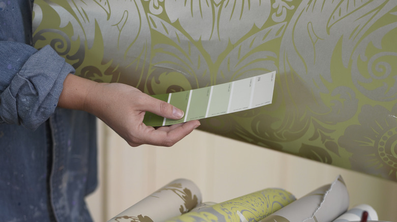
So if you're feeling like your entranceway is too tiny to decorate properly, cast your eyes on the walls. What could you do to them that would make the space pop? A brave paint color choice could be the thing that takes your mini mudroom from bland to breathtaking. Using wallpaper is another great way to add interest, depth, and tasteful design daredevilry. If you want to hype up the height of the room, look for wallpaper with vertical patterns, like stripes. If you're dealing with a dark entryway, high-gloss paint can help bounce light around and create reflections, similar to mirrored surfaces. Whether you're going with paint or wallpaper, consider wrapping the area in it instead of doing an accent wall. This will blur the corners, creating the illusion of more space. Accent walls can visually chop off the space and draw your attention to the corners.
Show your entryway off in the best light
Lighting is a very important (and often overlooked) element for any entryway. But it's especially critical in small entrances that can easily feel dark and dingy. The less light there is, the smaller the space is going to look. A layered lighting plan will help you and your guests see clearly, emphasize attractive elements, draw your eye around the space, make it more dynamic, and set the mood.
Entryway lighting during the day should be bright enough so your eyes don't have to make a sharp adjustment from the sun outside into a dim interior. At night, you can amp up the cozy factor with table lamps, wall sconces, etc. Look for unique lighting features, like beautiful or artistic chandeliers, that draw your eye upwards, helping to emphasize visual height. Picture lights can highlight art, add a touch of sophistication, and double as mood lighting. If you're renovating your entrance, ask your contractor to run power to multiple places so you can carry out your layered lighting plan. If you're just redecorating and don't want to call in an electrician, you can also look into things like plug-in wall sconces and battery-powered puck lights.
Borrow space from other areas
If you've got an undersized entryway, another trick you can try is to borrow space from other areas, either visually or functionally. A truly tiny entry probably won't be able to house a bunch of coats, jackets, shoes, and bags. Instead of trying to cram everything in — which will clutter up the space and make it feel smaller — see if you can steal some storage from an adjacent room. For instance, you can create more entryway-type storage in the living room with a dedicated coat closet instead of a bookcase. Or put a seating bench in the adjoining hallway and not just the foyer.
If it's visual space that's in short supply, give your eye more room to roam into adjoining spaces. One way you can do this is by taking down any unnecessary interconnecting doors that are stealing floor area and light. As mentioned above, extending the same flooring into other spaces can help blur the lines between areas. If your entryway is being tiled, you might even be able to continue the tiles out onto your front step or veranda.
