The Best Paint Colors For Your Home Based On Your Myers-Briggs Personality Type
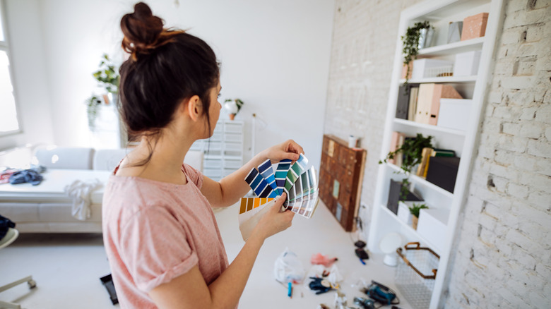
Move over star signs — Myers-Briggs types are the new personality match in town, and they can even help you find your new favorite paint color. If you have never heard of Myers-Briggs, or MBTI, it's a personality type indicator that is split up into 16 different types. There are two different main categories, introvert and extrovert, and six different sub-categories: sensing, intuition, thinking, feeling, judging, and perceiving.
The quiz was designed by Katherine Briggs and Isabel Myers, a mother-daughter duo who were inspired by Carl Jung's personality theories. On the surface, decor and MBTI types don't have much in common. However, much like how different colors can influence the mood and the feel of a room rather than just its look, some paint colors suit certain MBTI types better than others. If you have ever wondered which paint color fits your personality completely, we've got all the inspiration you need, from vibrant chartreuse green to calming beige.
ISTJ - Dove gray
Those who fall under the ISTJ umbrella are logical, organized, and responsible. Always reliable, they act as a grounding force in both relationships and friendships and are determined to maintain order in any situation. Dove gray is the perfect color for ISTJs. It's neutral and won't be overpowered by other, brighter colors. Calm and steady, it meshes well with the reliable nature of ISTJ.
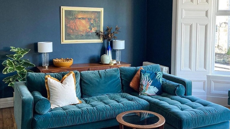
As dove gray works well in harmony with other colors, it can be used for a whole room or as an accent color on one wall. In keeping with the calm nature of this MBTI, a study or reading room is ideal to feature dove gray paint. If you're worried about a fully gray room appearing too somber, paint your trims and door frames white. A paint option that captures the steady yet light nature of dove gray is "Pavillion Gray" (pictured above) paired with "Blackened" for the trims, both from Farrow & Ball.
ISTP - Tangerine orange
ISTPs are always heading for a goal. Driven and unafraid to take on a challenge, this Myers-Briggs type is also an adrenaline junkie and will choose to take risks both in their career and in day-to-day life. Aside from the above traits, ISTPs are incredibly creative and love to make things. All of these traits make tangerine orange a great fit. In general, orange is a vivacious color, fitting the creative and risk-taking aspect of those who identify as ISTP.
However, as this MBTI type is prone to remaining calm and tends to be easygoing, tangerine should only be used as an accent wall color. While orange looks great with other bolder colors, it's best to balance it out with a neutral to appeal to the level-headed aspect of ISTPs. Bright white will look better than cream to preserve the vivid energy of tangerine orange. Some of our favorite orange shades that exude ISTP energy are "Electric Orange" from Benjamin Moore and Valspar's "Orange Fruit."
ISFJ - Off-white
ISFJs are easy to trust, organized, and empathetic. They tend to be focused on work and overall aim to create harmony. However, those who identify as ISFJ are not wholly open and can actually be a bit unforthcoming, which is why off-white is such a solid color match. It may seem like a dull option at first, but the versatility of off-white is what makes it shine. Not only will it never go out of style, but it also brings harmony to a room due to its warm undertones and ability to take a backseat to other, less neutral colors.
Additionally, off-white meshes well with almost any other paint color. The subtlety of off-white shades means you can use them as the only color in a room. Lean into the compassionate nature of the ISFJ MBTI by surrounding yourself with warmth and painting your bedroom or bathroom in this color. Off-white paints that hit the above criteria include "Timeless" from Clare Paint and "Aged White" from Sherwin-Williams.
ISFP - Forest green
ISFPs are quiet, calm, diligent, and nurturing. While they are practical, they are also extremely aware of their surroundings, so it's only fitting that their color match is one that helps the eye focus on details. In keeping with the sometimes reserved nature of ISFPs, forest green has all the tranquility required and would look stunning in a hallway.
As Patrick O'Donnell, brand ambassador and color consultant at Farrow & Ball, told House & Garden, "Once intimidating and mildly controversial, these last few years have seen a huge embrace to bolder, darker colors." Paint your ceiling white to contrast. While ISFPs are steady, they also have a creative, playful side. To tap into that, pair your forest green walls with touches of pink — think lampshades or picture frames. Benjamin Moore's "Black Forest Green" is dark and moody yet soothing at the same time, whereas "Forest Symphony" from Valspar is a more matte, muted take on the color that's perfect for rooms that receive a lot of light.
INFJ - Periwinkle
INFJs are idealists who will be there for others when needed. Always willing to help, they are organized and decisive. Despite their soft nature, those who identify as INFJ are not easy to bulldoze, which is where the strong blue and purple undertones of periwinkle come in. Periwinkle is additionally a unique color, which matches up well with the fact INFJ is one of the rarest MBTI types. Plus, the mix of both soft purple and blue hues showcases both the logical and emotional side of an INFJ.
Periwinkle would fit a bedroom space ideally. It will carry you off to dreamland without being too dull in the daylight. "Periwinkle Dream" by Valspar embodies the stronger side of INFJS. As it's a brighter paint color, it's best to accent one wall (for example, the one your bed sits against) instead of using it for a whole room. If you do want to cover your room in dreamy periwinkle, "Wink" from Clare Paint captures the charming, sometimes delicate essence of the INFJ MBTI (it's also the color the Brownstone Boys chose for their bathroom).
INFP - Lilac
Much like INFJs, INFPs are thoughtful by nature. However, while INFPs are quick to solve an issue that pops up, they do so with creativity rather than logic. If asked what their goal would be, this MBTI type would place a very firm emphasis on continually improving themselves and are drawn to those who feel the same. Their caring yet imaginative personality is what makes whimsical lilac the ideal fit.
Lilac comes in many shades: light, dark, rich, or delicate, representing the depth of INFPs. The kitchen is a place where both creativity and imagination are often used, and so we recommend using lilac paint throughout your kitchen. "Calluna" by Farrow & Ball is a light, cool-toned shade that will illuminate any room. If you're an INFJ who prefers to showcase their imagination with a less cool tone, "Purple 06" from Lick Paint features hints of pale pink to bring extra warmth to your space.
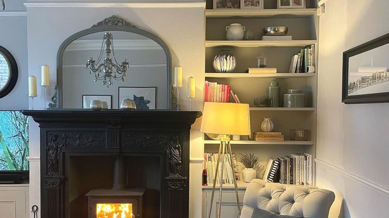
INTJ - Deep blue
One of the main traits of an INTJ is determination, and they will use this trait to get where they need to be, even when things get tough. Aside from determination, INTJs will look to the future with wide, big plans, which is why the vast ocean of deep blue fits so well. This MBTI type features a willingness to face whatever is ahead and learn new things along the way. Just like the depths of dark blue, INTJs never stop learning, even as they age.
Dark blue can appear moody if put in the wrong room. Like INTJs, it needs to be in the right space to be seen in the right light. (These personality types can sometimes come off as being superior thanks to their analytical minds and big-picture focus.) Because of this, we recommend it for a room that gets plenty of sunlight. Not quite navy but darker than mid-blue, this shade needs to feel never-ending. It would look gorgeous on window frames in a living room or on a wall near a window. Farrow & Ball's "Hague Blue" (pictured above) and "Benjamin Moore's "Adriatic Sea" both have the unique essence INTJs carry so well.
INTP - Beige
Always considerate no matter the situation they're in, INTPs approach things with intense focus. They can sometimes seem detached, but this MBTI is thoughtful, despite the fact this thoughtfulness can be hidden behind a veneer of appearing too busy or disassociating. Because of this, INTPs can seem impersonal. However, similarly to beige paint, they make a great foil when paired with other colors/MBTI types.
Beige has a reputation for being dull, but this doesn't have to be the case at all. As Homes & Gardens' editor-in-chief Lucy Searle stated, "You can achieve a much warmer, softer finish by layering creams, warm whites, and light beige shades which can move into natural pale straw colors too." This warmth and softness are ideal for matching the underlayer of INTPs, which is being thoughtful and helpful. Due to beige being neutral, it will look good anywhere, but we recommend it for a living room to create an ultra-cozy vibe. A couple of the best beige paint shades are Clare Paint's "Turbinado," which oozes honey-like warmth, and "Playa Arenosa" from Sherwin-Williams, a slightly deeper, warm-toned beige shade.
ESTJ - Mulberry
Reliable, practical, and dependable, ESTJs make extremely strong leaders due to their no-nonsense approach. The self-confidence of an ESTJ is one of their defining traits, but they are also traditional. The deep, dark hue of mulberry has the same assuredness as an ISTJ but is additionally a time-old color, making it an ideal choice. Mulberries can vary in color from white to lavender, but most associate mulberry with being a reddish-purple shade.
Benjamin Moore's choice, aptly titled "Mulberry," has all the richness of a mulberry in full bloom. It would be perfect for making a splash in your downstairs bathroom or your living room for a slightly playful look. If you're after something a bit deeper and darker, "Epoch" from Graham & Brown carries the same richness but with a moodier vibe. It would look stunning in a study, a place where ESTJs feel naturally at home thanks to their practical, problem-solving personality.
ESTP - Chartreuse
ESTPs may be logical and like to use common sense, but they're not averse to taking risks and love to come up with new ways of looking at things. Clever and resourceful, they march to the beat of their own drum and hate being told what to do. Sitting in between green and yellow, chartreuse is an ideal fit for these natural high-flyers. It may not be a traditional yellow hue, but chartreuse will still bring tons of life to a room.
As Natasha Bradley, Color Psychologist at Lick Paint, shared with Homes & Gardens, "Yellow affects our emotions and is a great choice for kitchens, particularly if there is a lack of natural light. It's bright and cheerful and brings positivity to the heart of the home." They say to take risks in the kitchen, and you certainly will be with a lick of chartreuse paint — just make sure to keep the rest of the kitchen relatively low-key to tie in with the logical side of ESTPs. Our picks are "Chartreuse" from Valspar and "Citrine" from Little Greene for a slightly less bold take on the hue.
ESFP - Hot pink
Never one to be anything but optimistic, ESFPs are the best people to have on your side if you feel like having fun. This MBTI type loves nothing more than hanging out with new people and getting to know them, fully embracing their extroverted nature. ESFPs are spontaneous and cheerful, and what better way to express this than with hot pink? Though you may think it's a little much to use as a paint color, hot pink is a great way to incorporate some personality into your home.
Plus, it plays into the Barbiecore trend that has been sweeping the interior design world. To add a splash of color in an unexpected space, painting a wall in your bathroom hot pink will do the trick. If you want to lean fully into the spontaneous, fun side of ESFPs, opt for pink tiles on your shower or bath wall. "Lille Pink" from Graham & Brown is a gorgeously bold pink shade, as is "Hot Lips" from Benjamin Moore, a fun, in-your-face color that will let people know the kind of person you are instantly.
ESFJ - Brick red
ESFJs are loyal, lifelong friends who will always be there for others and value good communication. Although ESFJs have extremely strong moral principles, they prefer to keep the peace where possible. This aligns with the numerous undertones of brick red — fiery red to represent the righteousness of ESFJs, and calming terracotta to represent their love for connection and loyalty.
Brick red is an excellent paint color for a living room to create a cozy atmosphere. This MBTI type loves hanging out with friends, and the living room is usually where this happens. Warm and welcoming, go for a shade with a bit more red in it to make an impact, or a laid-back shade with more terracotta tones if you prefer neutrals. Valspar's "Laird Of The Isle" is a browner take on brick red, and "Bronze Red" from Little Greene is a true deep brick red if you want to bring richness to a room.
ENFP - Turquoise
ENFPs are natural leaders thanks to their charismatic and eager personalities. They care greatly about others and can be highly empathetic at times. Like the ocean, ENFPs are open to change and spontaneous thanks to their flexibility. They hate doing the same day-in-day-out and prefer instead to daydream about what could happen in the future. The magical, ever-changing hue of turquoise fits their shifting personality perfectly.
Most people associate blue and green tones, particularly turquoise, with bathrooms, but this paint color can create a fun energy elsewhere. A turquoise accent wall in your kitchen will lead the rest of the room like ENFPs naturally lead a crowd. Balance it out with white for a refreshing feel or cream for a calmer one. "Surfin" by Sherwin-Williams is a rich, vibrant turquoise ideal for re-creating a beach vibe, or opt for "Turquoise Blue" from Little Greene if you want a classic blue-green shade that conjures up images of the ocean.
ENFJ - Navy blue
If anyone is born to be a leader, it's those who fit into the ENFJ category. Extremely driven and willing to solve a problem no matter the cost, they can be intensely thoughtful toward others. Despite their desire to lead, ENFJs have a positive outlook and are open to listening to others. Above all, this MBTI type is reliable and works well with others, and navy blue is a reflection of this.
Sometimes overlooked for being "dull," navy blue can actually bring a great deal of warmth and depth to a space, similar to how INFJs can command a room. It's a particularly good choice for a hallway, turning what is usually viewed as an in-between area into a chic and sophisticated one. Navy blue works well with wall detailing like paneling due to its timeless feel. Two of the best INFJ-adjacent navy blue shades are "Stiffkey Blue" from Farrow & Ball and "New York State of Mind" from Benjamin Moore, both classic navy blue hues that will mix well with neutrals and brighter colors.
ENTP - Black with gold accents
Conversationalists first and foremost, ENTPs are happy to meet new people and enjoy lively chats. Always curious, they love planning things for the future and often skip over the details of things if they don't find them interesting. Nevertheless, in spite of their lively nature, ENTPs have a tendency to hold back when making decisions and can actually be quite reserved in some situations.
Just like this MBTI type, black can seem like an intimidating paint color on the surface but, in fact, will bring richness to a room. As it is bolder than typical paint colors, it's best to use black paint on only one wall. In addition to black, gold accents fit with the curious, debate-loving part of ENTPs (since it can be quite bold and controversial) and will additionally balance out the moodier look of black paint. "Off-Black" from Farrow & Ball for the wall and "Rich Gold" from Mylands to accentuate the window frames and baseboards are a match made in heaven.
ENTJ - Fire engine red
With their commanding personality, ENTJs naturally draw attention when they enter a room. Another extremely rare MBTI type, they won't back down or feel shaky under pressure once their decision is made. Efficient and tactical, they are full of energy and aren't afraid to work long hours to get to where they need to be. Aside from their good leadership skills, ENTJs are generally charismatic thanks to their boundless energy and strong will.
Fire engine red is a fearless color that suits the never-back-down nature of this MBTI type to a T. It would work well to accent a study or an office, a place where ENTJs naturally spend a lot of time. But it will also look wonderful used as an accent wall in a bathroom or dining room. "Heartthrob" by Sherwin-Williams is a warm-toned red full of drama, whereas "High Voltage" from Valspar features slightly more orange tones for a dramatic punch of color.