HGTV's David Bromstad's Best Tips For Creating Your Own Dream Home
HGTV's David Bromstad has designed more spaces than we can count during his long tenure as a reality TV star host. Not only has he transformed a riot of rooms from drab to fab, but he's also helped hundreds of lottery winners find their new abodes in "My Lottery Dream Home." These properties are often spacious and high-end, but Bromstad is not above showing homes that need a little love. He's also a mine for design tips. His time on "Color Splash" has made him a seasoned pro at creating bold yet cohesive color palettes and transforming a room with a couple of strategic tweaks.
From faux beams to avoiding the faux pas of a full-on beach theme, this HGTV star has a whole host of decorating secrets up his sleeve. Over the years, Bromstad has shared many valuable design hacks that just about anyone can implement and that won't break the bank. Here are some of Bromstad's best tips for making your space look like a million bucks — even if you haven't won the lottery.
Leverage (you guessed it) color
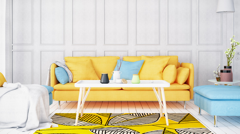
Not mentioning color in conjunction with David Bromstad would be a major oversight. Thanks to his time on "Color Splash," he is a veteran expert on how colors can coordinate (or clash) in a space. One of Bromstad's color tips is to let your feelings be your guide. This is sound advice, given that colors can have a powerful impact on emotions. For example, blue can bring a sense of calm, yellow can inspire joy, and white can inspire relief. If you like the way a certain color makes you feel, see how you can incorporate it into your space so you can enjoy its mood-altering properties every day.
If you don't like loud walls, big prints, or anything remotely maximalist, don't stress. Incorporating color into your space doesn't mean you have to wash your walls in it. While creative, bold use of color is synonymous with Bromstad's personal brand and design style, he doesn't advocate that everybody paint their interiors with rainbow hues. In an interview with the Los Angeles Times, the HGTV star said, "You don't need color on the walls to have color in your space." Instead, look for ways you can add pops of saturation through things like art and books. Interchangeable accessories that you can easily swap out are great because they're low-commitment and allow you to change your mind.
Avoid accent walls in small rooms
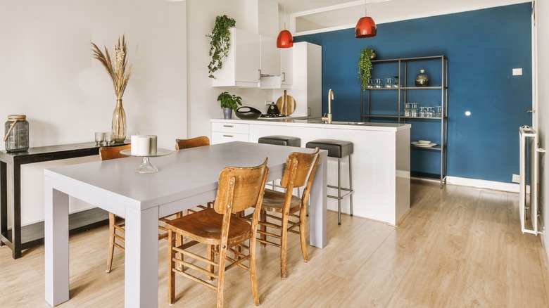
Over the last couple of decades, accent walls have dominated design. They're an easy, cheap way to add interest and inject color into spaces. While a good accent wall can do all that and more, Bromstead warns that they can have a negative effect on small spaces. In a "Color Splash" episode on HGTV, he says, "A feature wall is great because it can give a big, bold punch, but what it does to smaller rooms is that it chops it off a little bit. Makes it look disjointed and a little bit smaller. You notice all the corners."
If you're itching to imbue a small space with color or mood, it may be better to go all in and paint the space in a solid hue. You might want to also include the ceiling. This can create an immersive, cocooning feeling that imparts more impact than an accent wall could.
Pair dark wood with light walls
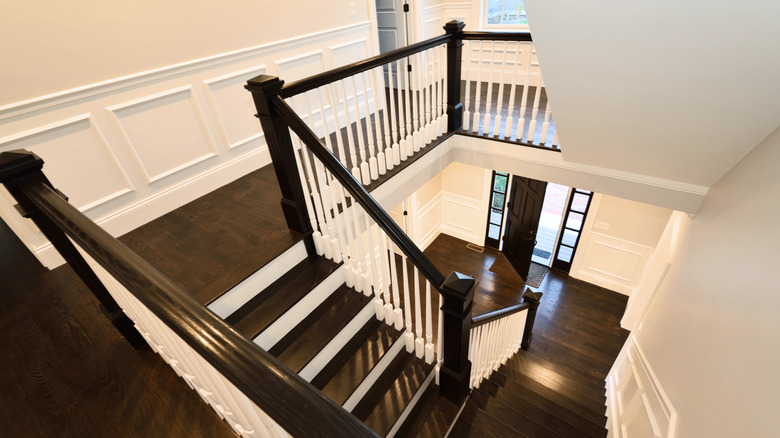
Does your house have dark wood that's original to the home, which you don't want to paint, but you also can't seem to hit on a complimentary wall color? One fan was faced with this exact issue, so she reached out to Bromstad and HGTV Magazine. Bromstad gave her some solid advice, stating, "Dark woodwork can be incredible, but only if the wall color majorly contrasts with it; otherwise, it'll look like a haunted house. That's why I would go with white. (Yes, Mr. Color Splash loves white walls. Shh!) The lighter the walls, the more high-end the trim appears."
Pale walls might make dark wood seriously pop, but what if you really want to add some color? Color with dark trim isn't totally off-limits; all you have to do is lower the saturation. Bromstad advises that you "choose a pale shade, like a gray-blue or muted green, which will freshen up the dark wood."
Pick your paint color last
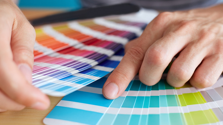
Deciding on a paint color can be a daunting task, especially if you aren't a design professional. The shade on your walls can have a massive impact on your space. It's able to change the entire feeling of a room and help tie in multiple elements for a cohesive look. But the wrong hue could hurt your home's design and clash with your favorite furnishings.
Because of this, picking out a paint color can be a bit of a chicken and egg scenario. Should you start with the color of your walls and decorate from there, or map out your design and then select a complementary color? There isn't a one-size-fits-all rule for choosing paint, but Bromstad says that it can be easier to match your wall color to your decor, rather than the other way around. In an interview with ABC15 Arizona, he shared, "I pick my color last. Because you have to find the furniture that's within your budget, you have to find all the accessories that you really, really love. Paint is the most inexpensive thing that you can buy to transform a space."
Don't be boxed in by design rules
Bromstad is a firm believer that everyone should feel free to express themselves in their own home, and nobody has the right to tell you what to do. True, there are guidelines and tricks you can follow, but nobody's opinion matters more than your own when it comes to your space. Are you planning to mix two seemingly incompatible styles together — like Memphis Style and Victorian Gothic — and are worried about breaking a design rule? In an interview with Barron Designs, the HGTV star said, "Let your freak flag fly in your own home. Do whatever you want; listen to nobody. If you want your walls all different colors, then you paint your walls all different colors."
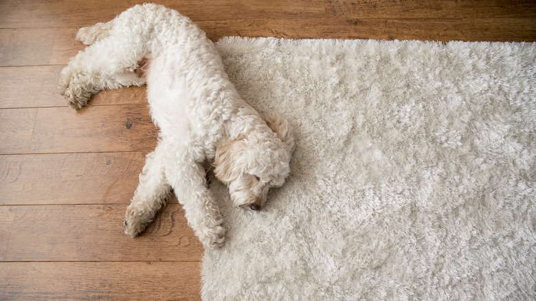
Or maybe you're a hardcore minimalist who loves low-contrast neutrals. All you really want is a wholly white-on-white space — but you've got pets, and everyone says you're crazy. Well, in Bromstad's book, you're not. "If you want everything white, you go for it. If you want dogs and you want all white, you go for it. You're just going to be cleaning a lot. There's no rules when it comes to design." In an age awash with content on interior decorating "rules," this reminder is very freeing. We all want a cheat code for great design, but decorating guidelines shouldn't box us in and prevent expression and experimentation.
Know where you want to start
Do you want to begin redoing your home, but you just don't know where to start? If you're new to interior design, aren't sure of your style, or are nervous about making mistakes, it can be very easy to develop decision paralysis. If you're doing everything yourself, it might also feel slow-going.
Bromstad shared two valuable tips for this scenario in his interview with Barron Designs. If you've got a good budget, or just want to get going with affordable upgrades like repainting, he says, "Start with the areas you use the most. So your kitchen, your living space, your main suite." By beginning with the spaces you spend the majority of your time in, you can cut to the chase, enjoy the fruits of your labors, and feel like you're making progress on your house as a whole.
But if you are feeling anxious and unsure — and aren't sure what design direction to go in — take the opposite approach with this tip from Bromstad, "If you're nervous, start with a guest bedroom and see how you do. Use that as a jumping-off point." Beginning in a low-pressure zone where you don't have to make a massive monetary outlay is a great way to cut your teeth, experiment, and gain confidence to start designing the rest of your space.
Tape rugs together to make them bigger
Big rugs help to properly define living spaces and prevent them from looking like your furniture is teetering around the edge of a postage stamp. If you're unable to find a rug design you like that's large enough, David has a smart tip. During an interview with Today, Bromstad shared a great hack for making your money go further by joining smaller rugs together. He said, "If you can't find one rug, why not two or three, or four, and tape 'em together with carpet tape?" Duck tape will also work in a pinch.
Solid-colored rugs are the easiest to join for a seamless look, but you can also go with certain patterned rugs. Checks, stripes, chevron, trellis, and geometric motifs are some examples of patterns that you might be able to match up on the edges, provided the rug doesn't have a border. Certain abstract patterns can also work. Shaggy rugs with thicker piles are ideal for disguising the joins.
And don't think you're not allowed to leverage rugs if your home is fitted with wall-to-wall carpet. You can still use large rugs to demarcate different areas and add pattern and texture. Just make sure that they're big enough for at least the front legs of your furniture to fit onto.
Affordably adding art
Adding art to a space can instantly give it a designed feel. Bromstad started his career as an artist and illustrator for Disney, so it's safe to say he knows a thing or two about art. But when it comes to interiors, he's not above using affordable, accessible pieces or encouraging homeowners to try their hand at DIY wall decorations.
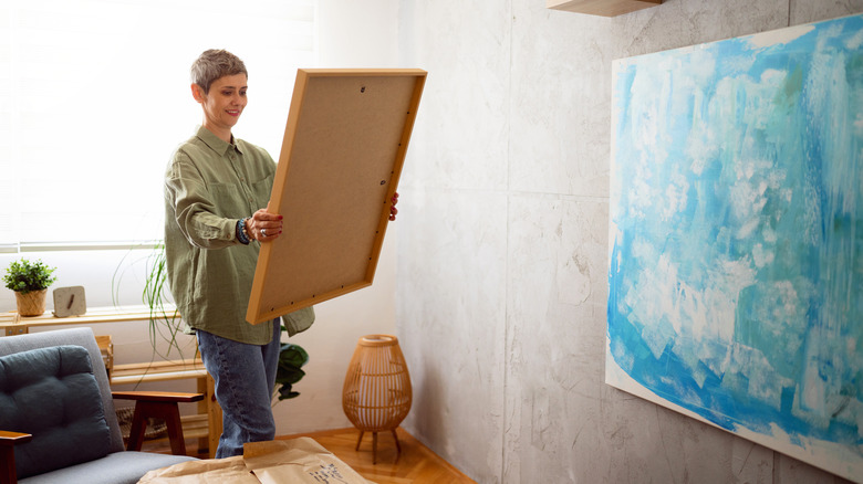
In his interview on Today, Bromstad demonstrated how viewers can create impactful art by finding affordable prints online and framing them. For an ultra-custom, designer-level effect, you can take one large, high-resolution print, slice it up in thirds, and frame it as a triptych in three panels. You can also experiment with making your own abstract art with paint and a canvas. If you're stuck for ideas, David Bromstad even has a DIY tutorial you can follow.
Also, don't feel like you have to confine yourself to canvases and frames. During an interview with Cleveland.com, Bromstad shared how he loves to use unexpected things on the wall. For example, create "an art installation of faux animal heads. Chic and unexpected! Hang your bike over your couch like you would a painting. Don't hide it, showcase it! Art comes in many forms. You just have to own it!"
Amp up your crown molding with extra trim
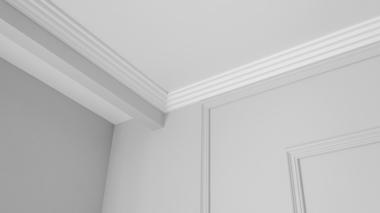
Crown molding is a small detail, but it can take a room from bland and basic to expensive and luxurious. If you already have crown molding installed, you can easily amplify it even further. All you have to do is add an extra strip and apply some paint. In the interview with Today, Bromstad demonstrated how simple this is to do: "You take molding, and you take another small piece of molding, and you paint the drywall in between, and it looks very expensive."
If you want to implement this hack to make your home feel more lux, start by selecting wide trim. Wider molding may cost a few dollars more, but it will yield big returns on your wall. Chunky trim automatically looks more generous and high-end. Also, consider what color you want to paint in between the strips of molding. You can either match it to your walls or paint the trim and the gap between with an accent color. This can work especially well for wainscoting and chair rail trim.
Install beams for extra architectural detail
If you're looking to design your space without spending a lot, you're probably not thinking about making any major structural changes. But what if there was a reasonably simple, affordable way you could add architectural interest? Enter faux beams.
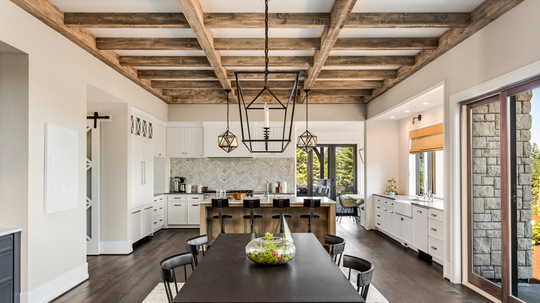
As per the interview with Barron Designs, Bromstad says that if you want to ramp up the architectural appeal of your space, "the easiest way to do it is through beams, because beams are easy. They're beautiful, they're cost-effective, they create an impact — you can lay them out in so many different ways. You can lay them close together, you can lay them in a crisscross fashion, which gives it a more formal feel. There's so many things you can do with it to create that architecture without taking up any space on the walls or on the floor." You can buy them anywhere from big box stores like Home Depot or specialty stores like AZ Faux Beams. You just have to search online for the style you like best. Besides increasing architectural interest, faux beams can also highlight and draw attention to high ceilings, a feature that Bromstad says almost every homebuyer is looking for.
Create a beautiful bed by layering linen tones
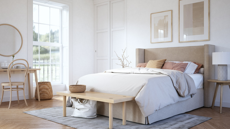
Bromstad might be the king of combining colors, but he also likes to keep things classy between the sheets with neutral tones. On an episode of "Color Splash," the HGTV host told viewers, "The key to making a beautiful bed in neutral colors is layers. What I like to do is start with a very light-colored bedspread and work my way up in color." Gradually increasing the saturation of neutrals is a great way to add depth and dimension to your bed styling, giving it a designer touch. If you like to feel like you're in a luxury hotel, start with stark white for your fitted sheet and bottom pillows, and then build up into tan or gray throw pillows, a medium-toned comforter, and a darker throw blanket layered on top.
Having a luxurious home isn't just about how it looks. Luxury is as much a sensory as a visual experience, and the bedroom is the perfect place to treat your senses. One way you can ramp up the dreaminess of your space is by investing in quality linen. An Egyptian cotton comforter might cost a little more, but you'll feel ultra luxurious every night when you slide between the sheets. If you want to give your boudoir the ultimate Bromstad touch, you can even look into creating a canopy bed.
Avoid obviously themed decor
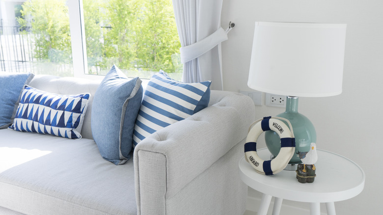
Very themed decor (like shell motifs all over a beach house) can feel stagey and tacky, but this doesn't mean you can't take inspiration from nature. Bromstad said it best in an interview with HGTV: "Beach style and design is timeless, it just must be updated like our wardrobes. Having seashells everywhere, fish netting, and every sheet and blanket covered in shells or some type of sea life is old news."
His advice for channeling nature without getting theme-y is to make more mature references through fewer and bigger decor items. In his ABC15 Arizona interview, Bromstad says, "If you're going to do a prop, do it big, do it bold. It's going to update that very typical beach theme and make it very cool." He also said that when it comes to using natural elements, like driftwood or shells, it's important to "keep it simple. If you find something gorgeous in nature, grab it, but don't grab too many. Don't clutter your space with it. Make it like a sculpture. Make it a feature of the room."

