The Controversial Fall Trend HGTV's Jeremiah Brent Wouldn't Want To See In Your Home
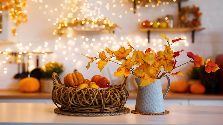
If you are decorating for fall, you must have seen enough pumpkins, gourds, and crunchy leaves by now. Fall décor involves many core elements that have become common, but not everything is to everyone's taste, and it's okay to decorate based on what you want to see. HGTV's Jeremiah Brent recently shared some trends that he personally chooses to avoid during this season, and the no-nos included flannel sheets, pumpkin scents, and — the most controversial thing on the list — the color orange.
"Another fall thing that I try to avoid is orange. I like terracotta, something with a little more brown in it tone-wise, but like actual orange, the color, no bueno," he says via TikTok. When thinking about fall, orange is one of the colors that immediately comes to mind because it is associated with pumpkins and fall foliage. Technically speaking, the common orange fruit shade is a bit too bright to match the colors of your fall leaf wreath or centerpiece, and more natural shades may feel more fall-y.
Alternatives to fall décor involving bright orange
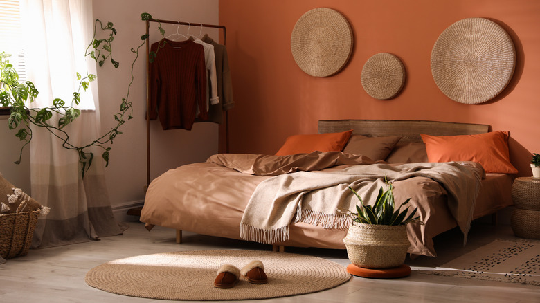
To design a realistic and natural fall atmosphere inside your home, go for the colors you typically see in nature at this time, like pale yellows, deep, dark reds, and brown oranges. Some rich, brown, orange shades you can opt for instead of bright orange are terracotta, which Jeremiah Brent mentions, rust, and even something called 'Halloween orange,' which is just the right balance between fun and calm. These colors will definitely improve the connection between your interior and the outdoors. Next, choose complementary colors and shades that best fit the vibe you're trying to create.
A space that leans towards modern or elegant will need more beige, blue, gray, dark brown, or black, while a more quirky space can benefit from earthy greens and reds. Think outside the box by introducing unexpected colors like dark blue or a classic black-and-white combination. This can look like using beige for the larger elements of a room like the couch and then accessorizing with terracotta and stone blue throws for a stylish living room or pairing black and white art pieces with a strong, earthy shade of green for the duvet so a bedroom feels playful even without bright colors. You don't have to say goodbye to pumpkins either, as you can always get them in more muted neutral colors or paint them into the exact shade you want.