HGTV's Christina Hall's Design Trick Makes Your Kitchen Look So Much Bigger
Larger backsplashes are a trend that is here to stay. While the mid-to-late 20th century often extended this kitchen element only a few inches above the countertop, today's backsplashes, be they tile, marble, or other materials, usually go higher, typically extending to the undersides of upper cabinetry for a seamless look that de-emphasizes the horizontal lines that can sometimes make a room look clunkier and smaller. HGTV's Christina Hall takes this one step further in a recent remodel on "Christina on the Coast," extending the backsplash all the way to the ceiling around the windows. The overall effect draws the eye upward, emphasizing the high ceiling in the space and making the kitchen feel both larger and unified.
The herringbone tile in shades of gray lends a sense of modernity and fun to the white cabinetry with its dynamic pattern, and the vertical lines also work to expand the eye upward. Brass trim used at the corners ties in well with the brass hardware and fixtures throughout the kitchen for a cohesive look. This bit of pattern feels less sterile than painted walls and frames out the windows without blocking them or diminishing the light.
Extending the backsplash
Extending the backsplash upward is a great way to make the room feel tied together and give it a sense of expansiveness. It's an approach that Christina Hall uses often in her designs, whether they incorporate traditional tile in the backsplash or extend the counter material up the wall as an alternative to tile. It works particularly well to create pattern and texture in a kitchen without cluttering the lines of the room with too many horizontal lines and bottom-heavy accents.
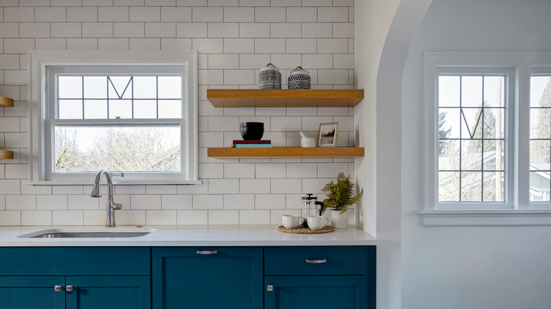
To get this look in your kitchen, consider extending the material of your backsplash vertically wherever you can, including around windows and above your stove. Both tile and marble are also a great backdrop for open shelving that is easier to clean and maintain than a painted wall. While Hall's choice is a patterned tile, this approach also works well with more streamlined varieties of tile like basic white subway tile, which can be a classic and affordable option for a similar look.
