11 Design Mistakes The Property Brothers Want You To Avoid
The "Property Brothers" Drew and Jonathan Scott know a thing or two about home design. These charismatic siblings have captured the hearts of millions, transforming properties on their hit TV show and inspiring homeowners worldwide since its 2011 premiere. The Scotts have redesigned hundreds of homes and witnessed thousands of disastrous design choices across the shows in their franchise. Luckily, the pair is also very open about design mistakes everyone should avoid in their homes.
From following over-the-top trends instead of your own taste to ignoring your budget and forgetting to consider the environment when updating appliances — Drew and Jonathan Scott truly have seen it all. The valuable insights they share will not only save you from potential design disasters but also empower you to create the home of your dreams. Here are the top trends, choices, and ideas to stay away from if you want your home to be HGTV-ready.
1. Forgoing a room's function to make a fashion statement
When designing your house, there is a fine line between a space that is gorgeous and can still be lived in and one that is just for show. The Property Brothers warn that way too many people end up crossing this line. "Most people, when they try to renovate, think about pretty and forget about function," Drew told NativeTrails. "They forget about how a family is going to function in a space. It doesn't matter if you replace the fixtures or the cabinets if you keep a really bad flow. So that's the big thing — we always try to give function along with style to homeowners."
To avoid this when designing a space, make sure to think about the practical aspects of how you and your family tend to use rooms. For example, while the floating shelves in your bathroom might look great aesthetically, do you want your antacid pills and toilet bowl cleaner on display for everyone to see? In this case, a closed shelf of the same color will give you the look you want along with the privacy you need. The right kind of storage is so often forgotten when designing homes, so make sure you don't make this mistake.
2. Making things too white can work against you
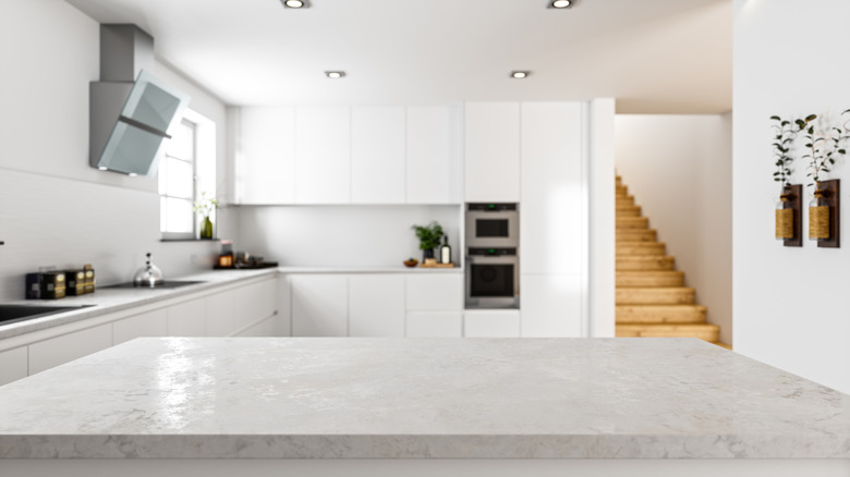
White is a classic color that doesn't seem to go out of style, but if not used correctly it can cause rooms to feel cold and sterile. When designing your home, the Property Brothers warn that too much white can go wrong quickly. "If people are going modern, they think of white everywhere, but maybe some contrast is good," Drew Scott told The Kitchn. This is especially true in high-use areas, like the bathroom and kitchen, which can start to feel like a hospital, not a home if you aren't careful. "Too much of a good thing is not a good thing," adds Jonathan Scott. "White is classic and nice as long as you don't go too ultra-white on the cabinet."
Instead, try adding a few pops of color throughout the space. In a bathroom, this might be through textiles, as a bright bathmat and towel set can lift the room. In a kitchen, try bold draw pulls, stained wood shelving, or even white countertops with colored cabinets. Remember trending cabinet colors can change, so settle on a color you personally like and won't get tired of.
3. Sticking with fully mirrored walls
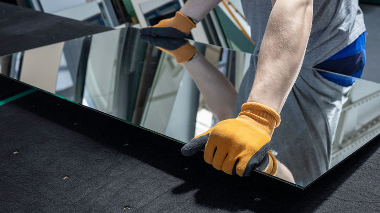
Fans of "Property Brothers: Forever Home" will recall Jonathan suggested the removal of mirrored walls during "The Next Multigeneration" episode of the show. "Fully mirrored walls came and went," he says while helping a homeowner dismantle one, per Realtor.com. Unfortunately, having an entire wall of mirrors in your home instantly places it in the 80s and 90s, much like a sunken living room screams 1970. You need to visually break up the mirrors to bring your home into the 21st century.
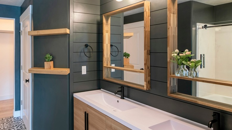
This doesn't mean you must do away with mirrors entirely, as they can make small spaces look way bigger and brighter. This is especially true if you have a small room without much natural light. The mirror will catch the few rays that are available and amplify them. Or, having one larger mirror taking up a sliver of the wall gives you floor-to-ceiling views without the retro vibes. You can also place more, smaller mirrors along the wall to expand the space and capture the light without being stuck in the past.
4. Going over budget on luxury cabinets
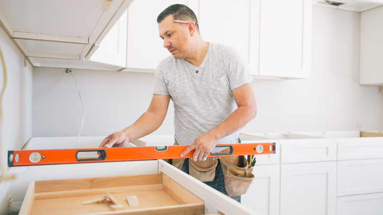
It can cost anywhere from $15,000 to $40,000 to fully remodel a kitchen, yet the price can continue to soar if you choose fully custom cabinets and joinery. While bespoke woodwork might seem nice, it is a mistake to eat up your entire budget to make it happen. The Property Brothers choose pre-fabricated options when available to stay within the financial restraints on projects. "The quality of pre-fabricated cabinets is way better than it ever was in the past," Jonathan Scott told NBC News. "And if somebody doesn't have the budget to do a custom kitchen, we actually will do prefab and finish it with details like molding to make it look custom."
Prefab cabinets tend to be well-made and durable, so you don't need to worry that your new kitchen will fall apart after just a few years, either. They also tend to be significantly less expensive, sometimes even half the price which saves you plenty of money to use elsewhere on the renovation. The best part is with a little handiwork and some design magic, no one will ever know the difference.
5. Failing to draw from your travels
It can be easy to only mimic current design trends when designing our homes, but the Property Brothers warn that not leaning into your life experience when decorating your home is a mistake. The Scotts like taking ideas from the world around them, particularly when they are traveling. "Whether we're at a hotel or a resort or a restaurant, we're always looking at things and thinking, 'That could make an interesting application in a residential situation,' and also learning new technologies that are coming along," Jonathan told NativeTrails.
So if you are staying in a nice resort on your next vacation, check the branding of the pillows you love so much, so you can pick them up later. You might even be able to purchase bedding directly from the hotel, like with the Four Seasons. Or, if you see dishes or an accent piece that you love, note the brand so you can order it later. It's the same for paint colors, furniture arrangements, and the like. Take pics of new finds for design inspiration and bring your vacation home with you, instead of just dreaming about it.
6. Forgetting storage solutions can leave you overwhelmed
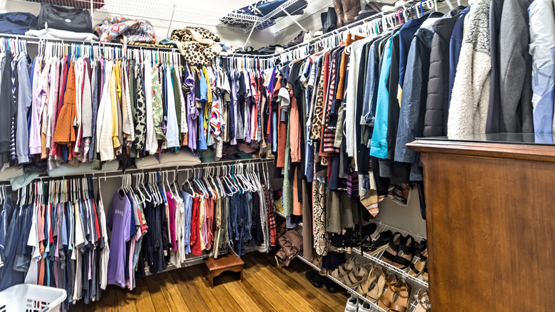
Most people have that one closet at home they don't dare go near. As soon as they open the door, all the junk they've shoved in there over the years comes pouring out. Yes, forgetting storage solutions can leave you overwhelmed, but the Property Brothers have a great workaround for this mistake. "Storage is everything," Jonathan told Architectural Digest. "And one thing that so many people forget about...is how attractive it is to have closet organization systems in your home."
Having an organized closet immediately makes your home more livable. The best part is that it doesn't take long to install and begin enjoying it, either. "If you add some open shelves, drawers, and double racks for storage, you wouldn't believe how much you can get into one small, standard closet," he continued. "The systems look clean, and they're also modernizing your closets." If you are not a DIY person, many home improvement stores like IKEA, the Container Store, and The Home Depot offer pre-built closet systems. You can install them or pay a little extra for someone to come and do it for you.
7. Not going green when redesigning
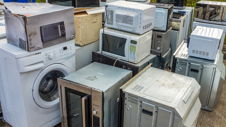
Redesigning your home is an excellent time to swap out your appliances for newer, better ones if the ones that came with your house are on their last leg. While new ones can increase the overall price tag for the renovation, Drew Scott is quick to point out that green appliances will save you more money in the long run. "If you're going to be upgrading anyway, why not get the latest tech and something that will lower your bills?" he told Architectural Digest.
Most energy-efficient HVAC systems, dishwashers, and refrigerators use less power (and water!) meaning your monthly bills are lower. The government also has incentive programs to encourage people to use green appliances, through the Inflation Reduction Act. This means that you might even get some money back up front for your new purchase. If you aren't in the market for a large appliance, you can still make small changes around your home. "There are smart devices as easy to install as screwing in a light bulb — allowing you to remotely control and schedule the power in your home to reduce electricity consumption," Jonathan told Future of Business and Tech.
8. Leaving the microwave on the counter
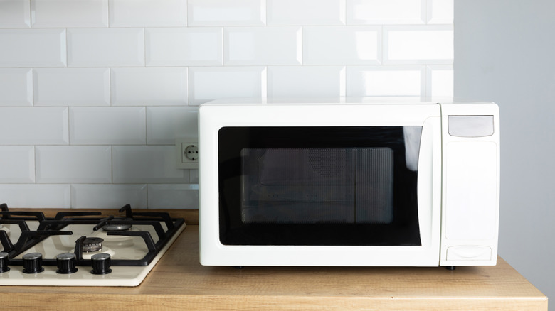
Space comes at a premium on most kitchen countertops. And, there never seems to be enough of it. However, one design mistake that the Property Brothers often see is clogging up the counters with appliances, when you could easily put them somewhere else. The main offender is the microwave, but the solution is luckily an easy one. You don't have to store the microwave in a cabinet and lug it out every time you need it. Instead, you just build it a custom nook, which won't take more than an afternoon.
Installation can be DIY for more savvy homeowners, but could easily be a one-off job for a contractor as well. Jonathan told Architectural Digest you will need to sacrifice a bit of storage space under the counter to make room for the appliance. But if you have a bottom drawer that is mostly empty, it's a fair trade. You just need to make sure the electricity from the power point connects to the new slot and then "the units are pretty plug and play."
9. Choosing furniture that is the wrong size for your space
Furniture that is the wrong size for your space can be awkward. You're either left with a piece that swallows the room whole, or something so small sounds seem to echo around it. "Size is so important. You will get someone who sees something beautiful and says, 'Oh my gosh, I want it,' and they get it home and they realize, 'Well, now you have to turn sideways to shimmy past it to get into the next room.'" Jonathan told Realtor.com.
Luckily, there is a way around this. "Make sure you measure everything out. Every iPhone has a measuring app built into it. Make sure size is being thoughtfully considered," he continued. Of course, most people will remember to measure when they go out for furniture shopping — but what happens if you just so happen across the most wonderful thing unplanned? An easy tip to help prevent this is to pre-measure your spaces as soon as you are in the market for a new item. Is the bedframe too squeaky? Are the couch cushions wearing out? Measure your bedroom and living room now and keep the dimensions handy in your phone's notes.
10. Forgetting that designs are made to change over the years
When discussing their new furniture line with Realtor.com, the brothers emphasized that styles come and go. Having something a little outdated doesn't make it a mistake. "The important thing to remember is that trends change, styles change, but there are some elements that are just timeless. They just extend, and they live on, and they look beautiful," Jonathan said. So just because you have things around your home that were popular ten years ago, but aren't so much now — it doesn't mean you have to get rid of them if you're still enjoying them.
Instead, when updating designs around your home, do so when life makes it necessary. For example, when you have a new baby in the home, the chic, sharp furniture might need to be replaced with something a bit more practical. "One of the big struggles that people have is to figure out what comes first, style or safety. That's why a lot of our pieces have rounded corners, where you have that safety for children" Drew said.
He even suggests safety comes before style and sentimentality. "In my living room, I actually have some chairs I love. They're a beautiful midcentury modern look. But they have super sharp corners. I actually broke a toe on one of those chairs. And so we have those and our coffee table that we're swapping out for some of our pieces that have rounded corners."
11. Adding laminate countertops in your kitchen
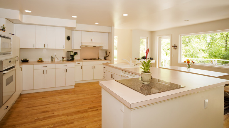
Laminate countertops tend to be less expensive and still mimic more expensive materials in appearance, but the Property Brothers cannot make themselves more clear: Stay away! "Yes, laminate is cheaper, but in many cases, you can actually take value away from a house by installing it," Jonathan told HGTV. His brother could not agree more, telling the outlet, "It frustrates me to no end when people spend their budget on a product, like laminate, that automatically seems dated — it's like throwing money away!"
If you are on a tight budget and have no other options, Drew continued, "If you have no other choice, at least get a laminate that's printed to look like stone. But make it a last resort." So what should you use instead? The real thing, when possible. "We love materials like quartz and Neolith for durability and no maintenance, but other products add beauty and value too, like marble and granite — they just need more maintenance," the brothers told The Boston Globe. They also recommended steering away from easily scratched materials to guarantee long-term durability.

