The Flooring Design HGTV's Nate Berkus Says He'll Never Get Tired Of

Home décor and floor tile enthusiasts, you're on deck, so here's a pop quiz. What simple yet powerful flooring design was in use in ancient Rome, adorned medieval cathedrals, perfectly suited the geometry of both the Art Deco and Mid-Century Modern movements, made a detour as the iconic flooring of 1950s diners ... and is still beloved today? Well, if HGTV's Nate Berkus had his way, he'd be festooning houses all across the land with this flooring design — the iconic black and white checkerboard.
For as long as human beings have been designing, we've returned to the most basic geometric shapes again and again. The checkerboard pattern is timeless in part because a square is such a reliably strong, grounded shape. And as ancient as the pattern is, a checkerboard can absolutely work in a contemporary home. But, as with any design element, the key is in creating harmonious relationships with all the other decor and choosing where to place it. And while it's a luxurious, upscale look, it doesn't need to be expensive. Make sure to shop around to find out who has the best floor tile deals.
How to make a checkerboard floor work for you
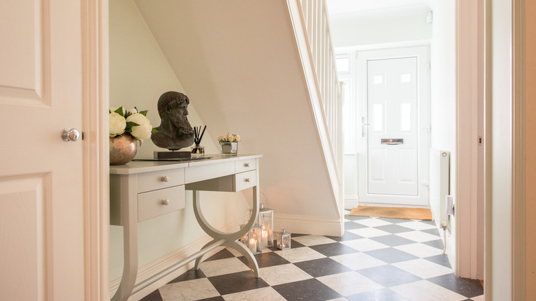
On his Instagram, Berkus said, "Checkered flooring is something I don't think I will ever grow tired of." The classic version of this design is black and white, and you can install it in one of two configurations. It can appear as a series of squares, though it's often installed on the diagonal, creating diamond shapes.
Because black and white makes such a high-contrast dramatic statement, it's the perfect flooring for smaller or transitional spaces. It's well-suited for a memorable foyer or home entranceway and adds visual interest to a narrow hallway. It shows up in mudrooms and can elevate a laundry room, too. What pairs especially well with black and white tiles is warm-looking wood furniture, art, mirrors, and wall colors in neutrals and one significant splash of color. Staying more minimalist will keep it elegant because too many colors will quickly become tiring.
Or you could take the reverse approach and go for neutral tiles, like white and cream or beige and gray, using paler colors with less contrast. This more calm but still visually intriguing floor would allow you to use color freely everywhere else. It also makes it more comfortable to cover a larger space, like a living or dining room. Just keep in mind, generally speaking, tile flooring doesn't belong in the bedroom. Another benefit of graphic flooring in soothing colors is that it makes for an easier sale should you decide to move.