Spruce Up Your Basic Bathroom With Nate Berkus' Simple Design Tip
Nate Berkus is known for layered designs that create intrigue. Even though the designer tends to keep his color palettes limited to neutrals and muted shades, there's plenty to look at throughout the room. That's because Berkus doesn't overlook the smallest details and how they can upgrade a space. When it comes to a bathroom, there's one item the designer believes can take the room's design to the next level: the towels. Most people opt for solid-colored towels, and oftentimes, they're white to make a bathroom feel like a spa. However, that can sometimes lead to the design being boring and basic.
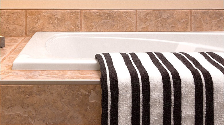
Instead, Berkus suggests swapping out the solid white towels with patterned ones. "If you have your favorite white towel, but your bathroom looks a little bit boring, add a little bit of pattern with [towels]," Berkus explains in a video posted to Instagram. Berkus gives the example of a jacquard towel from his home line that comes in a simple checkered pattern in dark gray and white and blue-gray and white colorways. The towels have a versatile but graphic pattern that will add a unique detail when paired with solid or other patterned towels.
Level up your bathroom with patterned towels
Paying attention to the small details will make any room look more thought-out, but these are often overlooked as people focus on the larger elements. This sometimes leads to looking around a space like the bathroom and finding that it looks boring. To combat this, interior designer Nate Berkus suggests mixing and matching your towels. Instead of choosing solid white towels, mix in a little color and pattern to create a more interesting look.
Mixing and matching your towels can create more visually interesting details, but it can also be tricky to do well. One of the easiest ways to do this, though, is to use a restricted color scheme of similar colors. Berkus, for example, keeps his color scheme neutral and uses gray and white patterned towels to add some intrigue. These colors should coordinate with the overall design of the rest of the room, too, to maintain a cohesive design.
You should also play with the pattern scale. Use both large- and small-scale patterns that balance each other out when layered together. Patterns with lots of negative space will provide a good backdrop to smaller, busier prints. Consider these when displaying your hand towels and bath towels throughout the room.

