Sherwin-Williams 2024 Color Of The Year Will Bring An Ethereal Element To Your Home - Exclusive Interview
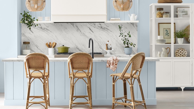
Choosing the right paint color can make all the difference in a room — it can have an effect on your mood and help you create a space that feels relaxing, engaging, or inspiring. However, with so many colors and different depths of shades, choosing the right paint for a room can be a difficult decision. A home that leads to a calm environment and your ultimate relaxation was Sherwin-Williams' goal when choosing its Color of the Year for 2024. Upward (SW 6239), a calming shade of light blue, "evokes the ever-present sense of peace found when slowing down, taking a breath and allowing the mind to clear."
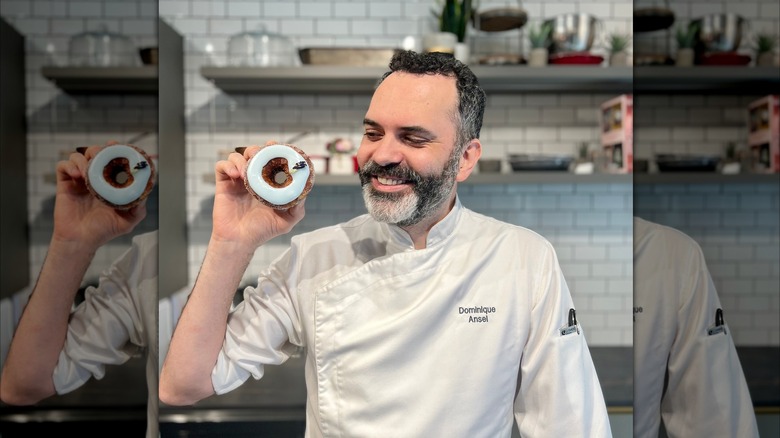
Sue Wadden, the director of color marketing at Sherwin-Williams, says the color "represents the gentle forward momentum in all of our lives," according to the press release. This Color of the Year is also special because it comes with a unique pairing: The paint company partnered with award-winning French pastry chef Dominque Ansel to create a dessert based on this tranquil color. He created his first vegan cronut, which features a coconut riz au lait filling and a hand-glazed fondant topping. This special release cronut is only available for a limited time at the Dominique Ansel Bakery in New York City. To learn more about the Color of the Year and the accompanying pastry, House Digest spoke to Sue Wadden for an exclusive interview.
Ethereal feelings
What was the process like for selecting the 2024 Color of the Year?
I lead the process alongside the Sherwin-Williams global color and design team, and we always start by researching and identifying key trends that influence the way we interact with color. From those findings, we turn emerging trends into our annual Colormix® Forecast, which features trending palettes for the year to come.
We, as a team, then choose our Color of the Year from the Colormix® Forecast. In this decade, nature has been a big trend, and we definitely highlighted that in our Colormix® Forecast 2024, Palette No.1: Blues and Greens. However, we're now seeing a shift from the power of greens and earthy tones to ethereal blues. We knew from the start we wanted to pick a Color of the Year that showed this — and Upward SW 6239 was the perfect choice!
Sherwin-Williams is partnered with award-winning French pastry chef Dominique Ansel. Can you tell me about the partnership and how it ties in with the Color of the Year?
I am so excited to see this partnership come to life! We aimed to create something unexpected that represents how color can be impactful in all markets, not just home and design. We also thought of it as a challenge since blue is not a color people normally associate with food — and Dominique really rose to the challenge and created a gorgeous pastry with ingredients that bring the Upward SW 6239 story to life. We're also very happy to be reaching a new audience because if you're someone who enjoys beautiful pastries, then you're probably also passionate about creating a beautiful home.
What is the meaning behind the Color of the Year?
Our goal with Color of the Year is two-fold — first, these colors represent directional trends in interior design, so when homeowners are shopping for design elements for new projects, they will see these colors in the marketplace. It's also about help and inspiration; a lot of people find that selecting colors for their home is an overwhelming process, and it is. We have over 1,700 colors available at Sherwin-Williams — that's a lot of options.
Our goal behind our color forecasting, including Color of the Year, is to help people narrow down their choices and make the color selection process easier. This doesn't necessarily mean that we want everyone to paint their rooms in Upward SW 6239, but it can serve as an inspiration and guide to finding what they want.
Using Upward in your home
Do you have tips for using this shade in the home?
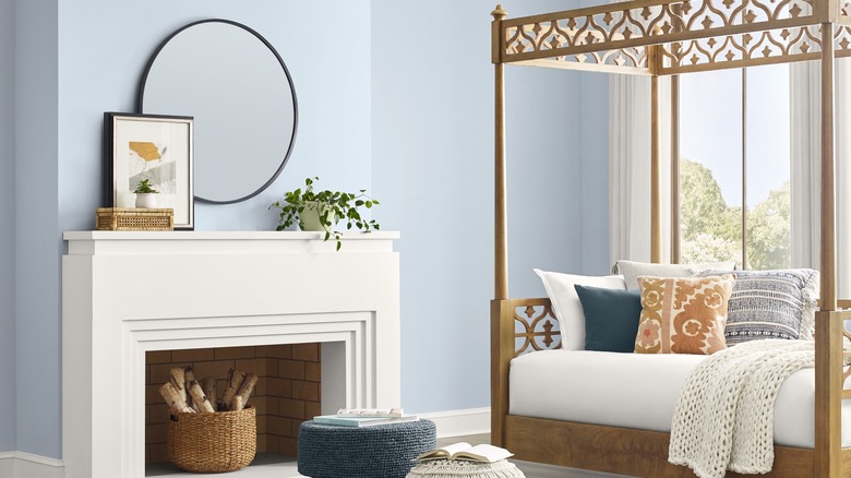
We try to aim for a Color of the Year that can be used in many different ways and areas around the home — and Upward SW 6239 is not the exception! People usually have very positive feelings toward blues, so I recommend using it somewhere homeowners spend a lot of their time, especially in a space where they want peace, like a bedroom. I also love the use of Upward SW 6239 in bathrooms and kitchens, especially as an accent color of vanities or cabinets.
What colors pair best with the Color of the Year?
One of my personal favorite colors to pair with Upward SW 6239 is white, like Snowbound SW 7004 or Drift of Mist SW 9166, because it's the perfect combination to create a coastal chic vibe in your home, and we think this is going to be the biggest trend in design in the years to come. Another favorite pairing is navy, like Gale Force SW 7605, which also goes well into creating a beachy and calm environment.
An unexpected but great compliment to Upward SW 6239 is a soft pastel green like Honeydew SW 6428, which is perfect to create a playful but subtle environment in the home.
Are there any paint trends you've been loving lately?
I love all the creative expression in paint trends. People are painting ceilings (5th Wall) and monochrome (all one color) and using elements like zig-zags, curvy lines, and checkerboards to be super imaginative. They're going beyond just the typical accent wall, and homeowners are taking risks and exploring new color selections. It's great to see.
Learn more about Sherwin-Williams Color of the Year at www.swcoty.com. Upward SW 6239 is available at Sherwin-Williams stores nationwide and online.
This interview has been edited for clarity.