Ty Pennington's Advice On How To Give Depth To A Space
One of the traps of monochromatic, neutral, and minimalistic home designs is a pervading flatness. A room without variety can turn into a vast, flat plane of visually undifferentiated surfaces. HGTV star and fan favorite Ty Pennington addressed the problem concisely on Instagram, citing his preferred way to give depth and interest to such a space. "[The] best way to add depth to a neutral space? Layers of texture," Pennington wrote. He's right, of course, and it's a classic solution. But it might not be immediately apparent why he's right, or even what "texture" really means in the interior design space.
Pennington's post also mentions the Reid Twisted Ottoman from his At Home collection, which certainly brings the texture. It's not challenging to find pronounced texture in an ottoman these days, and this one looks like nothing so much as a super-sized ball of twine, and the coarse cord wound around the ball gives its surface depth that nothing else in the room has. Coupled with the color – it's brown wool suggestive of a taupe sisal – this one element gives your eye something to fix on while peripherally aware of other textures in the background.
Here's what texture means to Pennington
Pennington studied graphic design, so he's attuned to texture in a more subtle way than your average giant ball of twine. Texture can be dramatic, but it doesn't have to be. And while we tend to think of it as something tactile – a surface with character we can experience through touch – it doesn't have to be that, either.
You can see this nuanced appreciation of texture in Pennington's work. Take, for example, his 2011 line of fabrics designed for Westminster Fibers. Pennington is, in some ways, an analog guy, so when designing these fabrics, he made wood stamps and used those to create the patterns. The process gave the fabrics an "organic feel" with "real texture, real depth," he told MyFixitUpLife. Sound familiar?
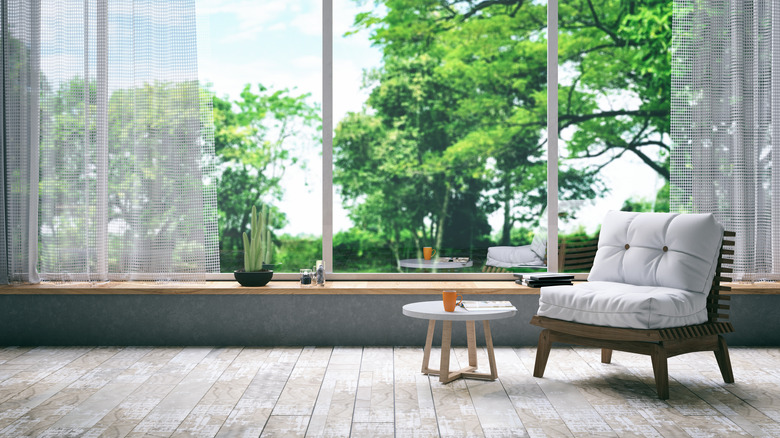
You can find texture in many places: variations in material, distinguishing colors, and differences in tactile qualities. Consider the room pictured on Instagram: The tactile properties of the materials aren't remarkably different; the coffee table, end table, flooring, and paneling are all probably pretty similar in terms of feel. However, the contrasts in color and material are distributed to differentiate one layer from another while achieving cohesion. The blue and white rug recalls the framed art. The lamp recalls the wood paneling. The bottom rug – probably a wool Berber – suggests jute and gently contrasts the ottoman.
How texture and depth work together
Pennington's formula is simple: Texture plus layers equals depth. The perception of separation among elements as your eye moves around a space creates a layered effect. Otherwise, the textural differences could appear to be random, resulting in a sense of chaos. But when layered with care, you get depth instead. But why does depth even matter? Interior design is about spaces, which are about space, and space is defined in part by depth. If your intention is to control the perception of a space, you won't manage that without influencing the perception of depth.
Lighting, textiles, natural stone, wood, leather, metals, and more all contribute to this interplay between difference and similarity. Then, depth and visual interest let you mentally inhabit a space more fully. The resulting design can inspire feelings of comfort, interest, or invigoration according to the choices you make. But, on the other hand, a space with a neutral color scheme that lacks depth and texture is unlikely to inspire much of anything.