Use This Design Idea From HGTV's Bargain Block To Make Your Shower Feel Bigger
There have been plenty of tips from experts for how to make small spaces appear and feel more spacious — especially tiny bathrooms. And while grand, glass-encased showers have been a trending option, the detail isn't always possible. Whether the bathroom doesn't have the space or you don't want to renovate to expand the shower, there are ways to make a shower feel bigger. For example, Keith Bynum and Evan Thomas from HGTV's "Bargain Block" used a bold and graphic plaid print in a small dormer shower.
When it comes to a small bathroom, it may seem like a statement print will only highlight the minimal size. However, the opposite is true. While you may feel like a small print would be better for a smaller room, it can make the room look busy. This means the space can feel cluttered and, therefore, more cramped. A large-scale print creates a bold design without having to fill the room with more decor. They can also trick the eye into seeing the room as large, visually lengthening or widening a room.
Large patterns in small showers
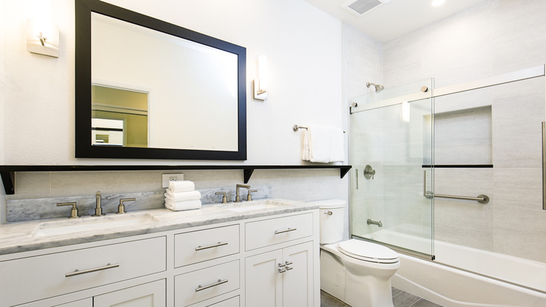
The trick to making a small space appear bigger is all about tricking the eye. Using bold, large-scale patterns is one way of making a room feel more spacious than it actually is. Another option is using larger-sized tiles in the shower. These mean fewer grout lines, which can give a shower wall a more seamless and, therefore, more airy appearance. Large format tiles like 12- by 12-inch square shapes or 12- by 24-inch rectangular ones are great options for an eye-catching feature in the bathroom. Plus, when they feature bold colors and graphic patterns, they can bring a stylish character to the space.
The layout of the tile can also make a difference in the perceived size of the room. Use horizontal and vertical lines to your advantage. Instead of an offset pattern, opt for a stacked layout so the edges of the tiles line up. This can create unbroken lines that can draw the eyes up or out and enlarge the look of the room. Vertically stacked tiles can make the ceiling appear taller, while horizontally placed tiles can widen the shower stall.
Selecting a grout that is a similar color to the tile can also be a way of blurring the tiles' edges. For example, using a white tile with white grout rather than gray or black grout will make it appear as if one tile is leading into the next. This can make the tiles appear like one solid piece, which can also help make a shower feel larger.
Room expanding colors
Choosing the right colors of tile can also visually expand the room. Of course, the go-to color for most people to help make a room look larger is white. Both stark white and off-white can make natural light bounce around the room easier, making it appear light, bright, and bigger. Conversely, dark shades like black and dark blue can add a depth that makes the walls appear further back, giving the appearance of more space.
You can also use color techniques to your advantage. Carrying tile up the wall and onto the ceiling not only creates a feature but extends the lines that make the shower walls look taller. Or you can use a monochromatic color scheme, using paint and tile to bathe the two in a singular shade. By doing this, you blur the lines of where one wall ends and another begins, giving the feeling of a seamless space.

