Erin Napier's Favorite Blue Paint Shades Will Add Dreamy Charm To Any Home
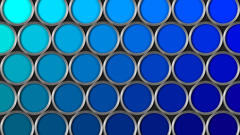
Adding a coat of paint can transform a room. Not only does it freshen up the space, but it can help add to the mood of the home. Blue, in particular, can make you feel calm, creating a serene interior that helps relax you while unwinding for the night or trying to sleep. Blue also has the benefit of acting like a neutral in many designs. The color pairs well with most other shades on the color wheel, allowing it to act as the base of a color palette. However, blue can also make a statement or be an accent color in a room.
With the versatility of blue, it's no wonder it's a go-to choice for many interior designers. Erin Napier from HGTV's "Home Town" loves using blue in designs for her clients. A variety of shades have been featured on the exteriors, the front doors, and the interior walls of the homes she designs. These shades of blue that Napier swears by add calming charm and a bit of beauty to any space.
Mount Saint Anne
Described as a medium gray with a touch of blue undertones by Benjamin Moore, Mount Saint Anne adds a sense of refinement to any space. This cool blue would add the perfect sophisticated accent or base to a design. This shade would be the perfect option for a home office or living room, rooms where the goal is a mix of elegance and calm. Mount Saint Anne would pair well with shades of off-white and other cool-toned grays for both paint and furniture. Erin Napier painted a dining room in this shade, creating a comfortable space to entertain.
Still Water
A deep blue with green-gray undertones, Still Water by Sherwin-Williams is an ideal shade if the dark and moody aesthetic calls to you. This shade would pair well with darker woods and dark gray and black tones to create an atmospheric space. However, this shade is versatile and can work with lighter tones of off-white and tan to add an accent to coastal-inspired decor. Erin Napier used this statement-making shade as an exterior paint, but it would also be beautiful as kitchen cabinets.
Quietude
Bright and airy, this blue-green is both relaxing and energizing. Quietude by Sherwin-Williams adds a bit of fun to a space. Erin Napier painted the cabinets and door in a kitchen this shade and paired it with mid-toned woods and a vibrant lemon backsplash. Quietude is a more playful blue on this list and a great way to infuse personality into a room. The shade pairs well with crisp white for a coastal look. Yellows, greens, and pinks work well with Quietude for bold color palettes.
Copen Blue
Copen Blue was named Sherwin-Williams's Color of the Month in December 2021. The light blue-green shade perfectly captures a calming color with a natural feeling. Erin Napier used this paint shade in a client's primary bathroom. Paired with white and natural woods, Copen Blue can provide a beachy look. Or elevate this shade of blue with gold and brass finishes. Outside of the bathroom, Copen Blue would look great in living rooms and bedrooms to create a cozy space to unwind.
Cascades
Cascades by Sherwin-Williams is more of a green-blue with a funky vibe. The darker shade is mysterious and rich, the perfect paint to add some color while indulging in the moody color trend. Erin Napier used this shade as an accent color on the exterior of a client's home. This shade would work well in a bedroom to create an enveloping look.
Rocky River
Reminiscent of river water, Rocky River by Sherwin-Williams is a stunning green with blue and gray undertones. This paint color is sure to bring some of nature inside your home, all while creating a relaxing atmosphere. The earthy color feels both vibrant and comforting, allowing it to work throughout the house. The exterior of a home on "Home Town" featured Rocky River. However, the color would also pop on kitchen cabinets, bathroom walls, and in the living room.
Coastal Dusk

Capture the cool, misty feeling in the late evening hours with Coastal Dusk by Valspar. This blue-toned gray perfectly encapsulates the feeling of dusk by the water. Erin Napier uses the color on the kitchen cabinets in her clients' kitchen. The comforting color would work well in a bedroom to create a retreat. Paired with more earthy tones, Coastal Dusk would be both a stylish accent and a colorful base.
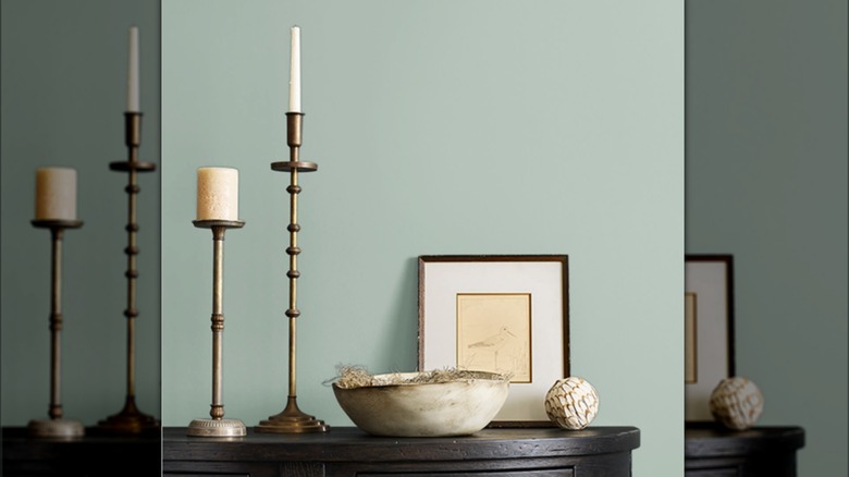
Comfort Gray
The pale blue-gray is a favorite of Erin Napier. In fact, Comfort Gray by Sherwin-Williams is one of the only paint colors the interior designer uses in every episode of "Home Town." Being gray, it'll be the perfect neutral that would fit anywhere in the home. Napier once used the color on the porch ceiling, though it would also look great on interior walls, creating a subtle backdrop for art and furniture. Paired with light wood, Comfort Gray would look stylishly natural and coastal.
Naval
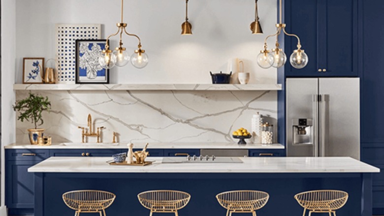
Dignified Naval by Sherwin-Williams might be the perfect shade of navy. The deep color adds a bit of sophistication to any room when it's on the walls. Paired with whites and creams, Naval becomes a classic and timeless backdrop. However, you can make it modern and indulge in the deep, moody interior trend. Naval can add that darker shade of paint while still infusing a little color into the room. Erin Napier has used the shade as an accent on the exterior of the home as well.