How To Use Different Shades Of Paint To Make A Small Kitchen Feel Bigger
Smaller kitchens don't have to look or feel small. Interior design experts have come up with plenty of tricks to make spaces appear larger than they already are. One of the easiest ways to do that is by playing with light and color to give the appearance of a larger and more open space. You've probably heard that to make a room appear larger, it's best to stick with light colors that reflect and bounce light around the room.
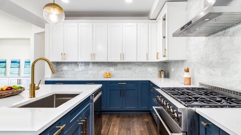
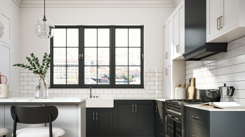
While this is true, it's not the only way to brighten and enlarge the look of a space. For example, you don't have to stick to one particular shade — you can use different colors on the upper and lower cabinets to create two distinct zones. Keep darker colors at counter height and below to ground the design, and place lighter colors at eye level and higher to help light bounce around the room.
Also, make sure to keep your palette limited when choosing multiple colors for a space. "If you choose a wall color in the off-white or pale neutral family, you can carry this over the ceiling, too," Patrick O'Donnell, brand ambassador for Farrow & Ball, told Martha Stewart. "The best way to view a limited palette of colors is to avoid too much contrast, so consider painting the upper units in your chosen wall color but in the appropriate finish; this will create a subtle difference due to the different sheen levels between wall and trim finish."
Define spaces with colors
You can also use color to create a focal point and draw the eye to a certain area of the room. Keep in mind that less natural light often means colors will appear darker. You may want to compensate by choosing lighter shades, more of a sheen for the finish, or incorporating artificial light, such as under cabinet lighting. And for the lighter shades, it's important to see how bright they look in your own kitchen.
The right color palette also makes all the difference. Hannah Yeo, the manager for color marketing and development at Benjamin Moore, suggests monochromatic, analogous, or complementary colors when it comes to choosing paint shades. Monochromatic palettes use multiple shades of one color, such as an all-white kitchen. Analogous colors like red, orange, and yellow create depth. Finally, complementary colors will have the highest contrast because they sit opposite of each other on the color wheel.
You can use these differing shades to create unique zones in your kitchen. In an interview with Martha Stewart, Yeo suggested, "Consider where you want to draw attention. The kitchen island, cabinets, or built-in features are great places to add bold color." Pink, yellow, green, and blue tones are also great for adding a pop to the kitchen.