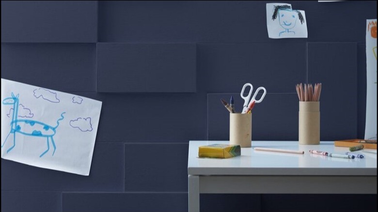
Beautiful Kitchen Paint Colors Queer Eye's Bobby Berk Swears By
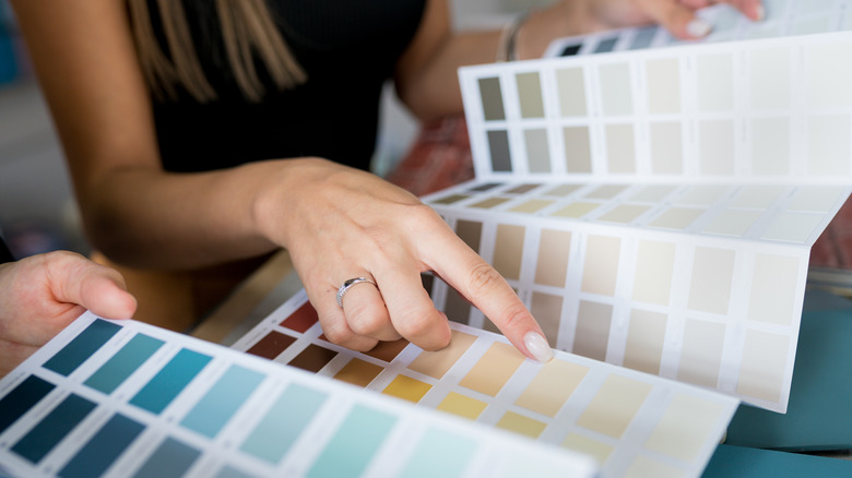
TV host and entrepreneur Bobby Berk knows a thing or two about decorating. The "Queer Eye" star is an interior designer with his own collection of decor to inspire the creative in you. In honor of International Color Day which coincides with the start of the vibrant Spring season, Berk listed some of his favorite shades for the kitchen on Instagram and shared his belief that "Color has the power to express your emotions AND transform your home!" He also provided a few other examples of gray paint shades to use in the kitchen on his blog, Bobby Berk.
His picks are a mix of neutral and earthy tones that fit a range of aesthetics, whether you like to keep things simple or are a maximalist at heart. The "Right at Home" author includes dark and light colors for both subtle and vibrant styles. Because the kitchen is the heart of the home and the epicenter for entertainment for both guests and family, it's important to choose the right paint color for the space. The correct shade for your home will ground your design and set the mood you want to create.
Clare's OMGreen
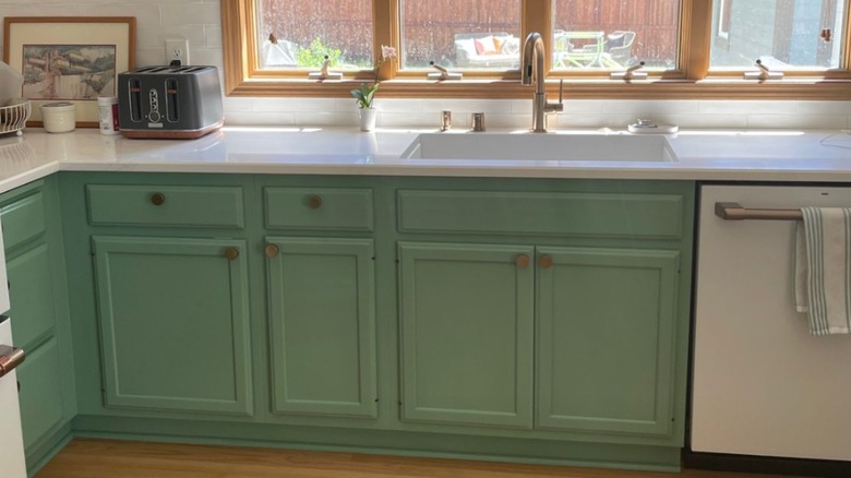
A kitchen with a pop of color is one worth entertaining in. Clare's OMGreen is Bobby Berk's first paint color of choice. This vibrant green is rich without being too bright, making it the ideal color for creating an accent wall in the space. Use the focal point to display your cookbooks, wine bottles, or favorite decor. To maximize the design, cover all the walls or cabinets in OMGreen. You can even jump on the colorful grout trend for a unique way to tie in a secondary hue while keeping your kitchen cohesive.
Benjamin Moore's Black Satin
White subway tiles, white cabinets, white trim — it's classic. However, so is black. But don't just take our word for it, as black kitchens are Bobby Berk-approved. "Don't be scared of black," the designer shared on his website. "It's a color that is not only timeless but sophisticated, and I predict we will be seeing a lot more of it in design." Benjamin Moore's Black Satin is the "Queer Eye" star's dark shade of choice. Introduce the nighttime hue as a backsplash or go big with full Black Satin walls.
Valspar's Gray-Green Linen
Gray is a traditional neutral to use for creating dazzling kitchen walls. Not as stark as white but not as daring as black, Bobby Berk's kitchen-winning gray is on the cool side — Valspar Gray-Green Linen. This shade is a calm hue to wrap the room in. You can paint the walls and cabinets and choose matching floors without being overwhelmed by one color. It complements deep greens and browns and is perfect for rustic kitchens that are warm and inviting with wood accents like hickory beams and oak countertops.
Benjamin Moore's Old Navy
If any primary color is going to coat your kitchen walls or cabinets, let it be blue — specifically, navy blue. With Benjamin Moore's Old Navy, you'll get the cool color without compromising sophistication. Bobby Berk swears by this shade of blue and likes to pair the dark hue with brass fixtures and white tiles. This color will create a high-end look in the space.
Backdrop's Mojave Gathering
Bobby Berk gave us a cool gray, and now the design expert is delivering a warm one with Backdrop's Mojave Gathering. It is a neutral taupe tone with a little bit of brown, beige, and gray meddled together. It ties perfectly with natural stone materials like marble, quartz, and granite. Incorporate it on the ceiling or along your backsplash for a subtle twist.
Benjamin Moore's Galápagos Green
Green is making another appearance on the "Queer Eye" star's list, as Benjamin Moore's Galápagos Green is one of Bobby Berk's picks for the best kitchen colors. "Green continues to be a popular choice for kitchens," the celebrity designer told Homes & Gardens. This sage is ideal for bringing in pops of color that still fall within the neutral-earthy category. Cabinetry is the easiest way to balance out this hue. Let the bottom built-ins get a taste of Galápagos or go full blast with this tone from floor to ceiling.
Valspar's Filtered Shade
Another warm gray that your kitchen is begging for is Valspar's Filtered Shade. This degree of gray could fit any style, and the warm tone brings an extra homey feel to the paint. Gray traditionally represents neutrality and balance, and that is seen here. The color is also similar to concrete, in case stone planters are on your decor vision board.
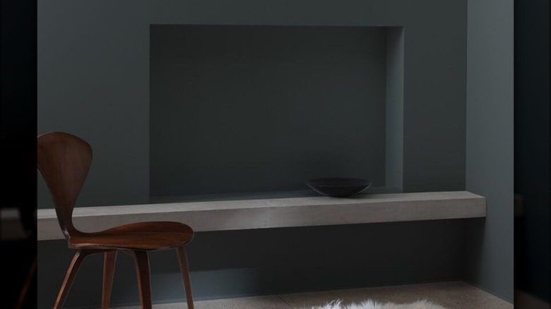
Benjamin Moore's Kendall Charcoal
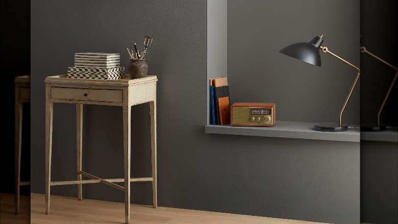
The next kitchen favorite of Bobby Berk combines the two most popular colors on the designer's list — green and gray. Benjamin Moore's Kendall Charcoal is a rich gray with slight green undertones. It pairs well with soft blues and yellows, the undertone's parent hues. According to Berk on his blog, this is another shade for brass lovers. Dark woods like walnut, cherry, and mahogany are complementary cabinet picks for this wall color, as well as classic white elements.
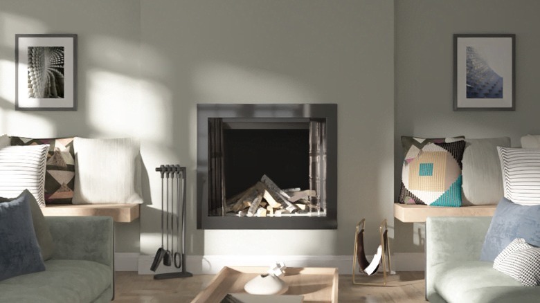
Sherwin Williams' North Star
For a subtle kiss of color, Bobby Berk recommends Sherwin Williams' North Star, which covers the walls in the above kitchen. This blue with slate gray undertones has a soft feel to it. "Light and bright," Berk shared on his blog. "This shade makes for a cheerful choice and pairs well with light wood tones, black, and ivory." The hint of blue is an ideal contrast for matte black fixtures, which are sexy and dramatic, as the "Right at Home" author put it (via YouTube).