Non-Neutral Paint Colors HGTV's Emily Henderson Can't Get Enough Of
A staple of home decor, neutrals truly are the backbone of a room because of their versatility. However, you may be getting a little bit tired of seeing the same beige, gray, and white shades on repeat. If so, enter designer Emily Henderson. The HGTV regular previously shared her tips for painting a home, and she also revealed her favorite non-neutral paint colors in a Style by Emily Henderson blog post. Amongst the colors chosen, blue is Henderson's most-reached-for color by far, with red, pink, green, and gray-blue shades thrown in the mix too.
If you are looking to decorate your home or are feeling like you want to inject some color into a space, the colors Henderson has picked out will give you some major design envy. Color can work in any room, whether you're redesigning your powder room, your master bedroom, or even just thinking about painting your front door. From deep and dark blues to bright pink and red shades, look no further for all the color inspiration you need.
The designer reaches for eye-catching shades of blue
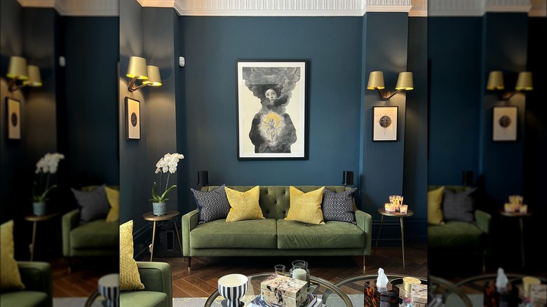
Emily Henderson is partial to shades of blue, and she specifically mentions the following as her favorites. Firstly, "Stiffkey Blue" by Farrow & Ball, an inky navy blue color that Henderson has previously used for her master bathroom and described as joyful but not too royal. The second Farrow & Ball blue is "Hague Blue," a strong shade with green undertones (pictured above). Henderson said that this color is the ideal navy shade and that she has reached for it several times due to the intensity it gives a room.
The following blue shades are all by Benjamin Moore. If you're looking for something that pulls you in, "Blue Note" is a very rich and deep navy blue shade. Henderson wrote that the team used this color for a client's office renovation, noting that it's a great way to add a dramatic look to a room. Next is "Van Courtland Blue," a refined gray-blue shade that's perfect for contemporary homes. Henderson called this color soothing, pointing out that it looks great with warm-toned accessories or wood. Finally, if you're looking for a striking color to paint your front door, Henderson wrote that she has used "Newburyport Blue" in the past to make a splash. An understated navy blue, this shade is similar to "Stiffkey Blue."
These colors are a treat to the eye
Emily Henderson also went into detail about some of her other favorite shades, including some that have gray undertones. She mentioned "Sharkskin" by Portola Paints, which she previously used in the laundry room and her son's bedroom. Inspired by the belly of a great white shark, the designer described this color as light but not baby blue, which makes it look sophisticated. Next, while "Wolf Gray" by Benjamin Moore may have gray in the name, don't be fooled — Henderson wrote that this shade is actually slate blue. She loves it because it brightens a space and also makes it look sophisticated. Still, it's officially classified as a gray shade, so it's up to you whether you consider this a non-neutral.
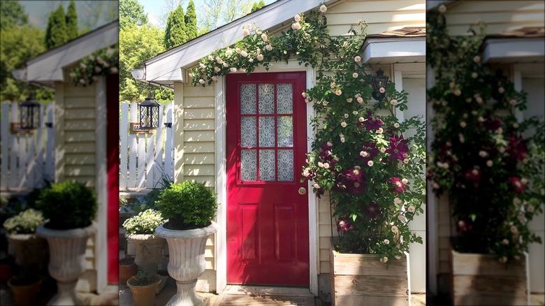
Aside from beautiful blue hues, Henderson also shared a few of her favorite non-blue paint colors. "Green Smoke" is a charming green shade by Farrow & Ball. Henderson loves this color because it's bright but doesn't look forest or apple green, mentioning that it was the color of her kitchen island. She also adores a soft pink that isn't too bright or light. While the particular shade she loves is no longer available, "Pink Ground" by Farrow & Ball looks similar. Last but certainly not least is "Rectory Red," a vibrant red color that's also by Farrow & Ball. Henderson has used this shade on her front door, stating that it's definitely not subtle but also isn't too bright.


