HGTV's Emily Henderson Reveals Her All-Time Favorite Neutral Paint Colors
Because of their versatility and calming feel, neutrals are often the first port of call for many when it comes to picking out paint colors. However, picking out the right neutrals to paint your home with is a lot more difficult than it sounds. Luckily, the pros have got you covered. HGTV regular Emily Henderson shared her go-to neutral shades when decorating, and it seems that the designer reaches for versatile gray shades and crisp white tones the most.
No longer just white and beige, neutral paint colors encompass a wide scale, from those with a warm and welcoming vibe to those with bright, cool energy, the latter being the colors Henderson prefers. While this is a good thing, as it means you can find the perfect paint match, it can also be overwhelming to even know where to begin if you're starting from scratch. Look no further, though, as Henderson's list of her favorite neutrals, which she revealed in a Style by Emily Henderson blog post, will give you all the inspiration you need the next time you're redesigning.
The designer is partial to gray shades
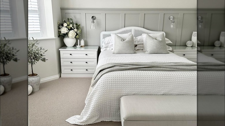
To start with, Emily Henderson's favorite grays. Her first pick is Ammonite by Farrow & Ball, a neutral, minimalist gray shade. Henderson shared that this is the color of her master bedroom and family room, writing, "I love how subtle the color is all while bringing some different hues into the home besides white." Next up is Pavilion Gray, also by Farrow & Ball. Pavilion Gray is a medium gray shade with blue undertones (pictured on the paneling in the above photo). Henderson wrote that this paint color "doesn't feel too cool or too warm and really helps to brighten up a room ... It is a very soft gray without going too dark but still being a distinct gray."
As well as Farrow & Ball grays, Henderson is also partial to gray paints by Benjamin Moore. One of her go-to's is Gray Owl, a cool-toned light gray that Henderson used in her lake house for the master bedroom and bathroom and that she described as one of her "favorite grays." Next up is Half Moon Cast, another cool-toned gray with neutral undertones. Henderson mentioned that she painted her Commonwealth house foyer in Half Moon Cast, mentioning that the shade "doesn't feel too blue or too brown so it is a soft happy color that can warm up a space."
Henderson also loves cool-toned whites
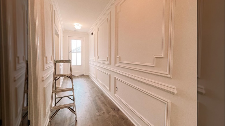
Moving onto non-gray neutrals by Benjamin Moore, and one of Henderson's favorite white paint colors is Super White, an understated and radiant white shade that the designer reaches for to create a clean, contemporary look. If you're looking for a white shade that has no yellow or cream tones, Henderson says that White Diamond is the "perfect cool white" because of the hint of blue within it. Finally, White Dove is a super classic white shade that Henderson says is ideal for bringing warmth to a room and creating a more traditional vibe as opposed to a modern one (used in the above photo).
The last non-gray neutral Henderson spotlighted was Blackened. By Farrow & Ball, Blackened is a classic, crisp white. According to Henderson, this paint has just enough contrast "to make the moldings and details of a wall pop and give the room some warmth." However, the designer did warn that Blackened can look different on various walls, writing that it came across as overly lavender in one project she used it for. A good way to avoid having to repaint is to observe how a paint sample on your wall looks throughout the day with changing light levels.


