The Design Trend You Won't See Christina Hall Embrace Anytime Soon
Known for her stylish interior designs, Christina Hall won't be welcoming vibrant colors within her home renovations anytime soon. While the former "Flip or Flop" co-host has explored numerous design trends over the years, Hall's style remains naturally chic. From kitchens to bathrooms, the design expert often embraces neutral-based schemes rather than big, bold colors. "I get a lot of my inspiration from hotels, because they're always up with the trends," she told HGTV. Like many hotel palettes, Hall likes to display earthy, grounding shades like gray, tan, or taupe, including black and white. With a minimal mindset, the designer may sometimes integrate hints of color with moody blues or muted greens through accessories, artwork, and furniture, although she never strays too far from a serene layout.
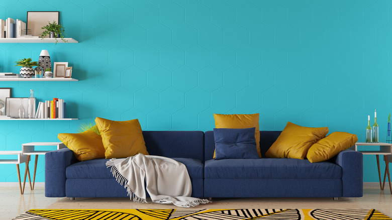
From her own Bali-inspired home featured on "Christina on the Coast" to more modern farmhouse vibes on "Christina in the Country," the real estate investor is practiced at showcasing neutrality. Instead of choosing brash colors, you may see viable texture within Hall's plans among cabinetry, furnishings, or light fixtures. Additionally, she might heighten all-white walls with a distinctive backsplash or floor tile to emphasize unique patterns. Whatever elements Christina Hall implements, it's likely you won't catch her falling for the design trend of painting an accent wall or space with a bright, pop of color.
Hall would choose pattern and texture over a bold color any day
When it comes to picking colors, Christina Hall typically starts with a white foundation, then adds an essence of gray or other complementing neutral shades. When asked about incorporating more color within her nursery, she said, "You know I really don't like color" (via HGTV). While a vivid accent color makes an instant statement, Hall looks to attractive alternatives that provide shape and texture. In a white-driven kitchen, you could install similarly-toned backsplash tile with various geometric designs, including herringbone, chevron, or star patterns. At most, you might see a dark blue hue within Hall's designs amidst the kitchen island base or cabinets while the countertops showcase slabs of striking white marble or quartz.
With the absence of bold colors, the designer also likes to play around with different decor and materials to add dimension. A woven rattan mirror with brass light fixtures would add simple elegance against a bright white bathroom vanity with a marble countertop. You could also layer things up with rugs, pillows, and curtains amidst soft, related hues to help keep a room both balanced and interesting. Overall, Hall gravitates more towards colorless depth compared to robust colors. The sleek blend of black and white is her signature design trend like in season 1 of "Christina in the Country" (via HGTV). Through the combination of wood, metal, and natural fibers, Christina Hall defines her innate style with a feeling that is dynamically neutral.

